Introducing the Gazebo
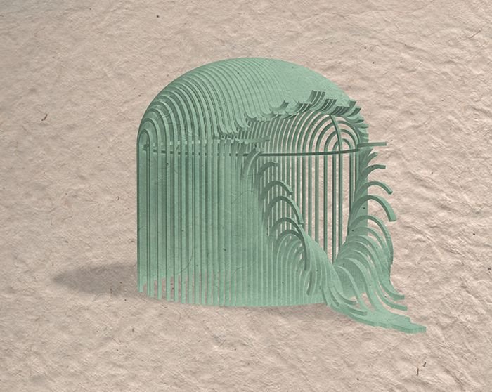
A couple days ago I introduced a new public art project in the form of a gazebo. Gazebo 001 (pictured below) is the first of what I hope will be an ever-growing series of wonderfully weird and wild gazebos which I will design and refine in the years to come. For now the designs will remain in the digital world as speculative concepts, but the hope is to one day be able to construct them in real life.
I began contemplating this series after seeing the importance of public art through some of my past experiences, and I landed on the gazebo because I saw it as a stale and overused architectural form with an undervalued potential for greatness.
Finding Inspiration
For most people, a gazebo is a wooden octagonal structure with a shingled roof, usually found in public parks or gardens. But a gazebo doesn't have to be restricted to this form and material. For me, the most important aspect of a gazebo is that it is an open-air structure which provides a place to gather or relax in a public space. As long as the structure fulfills that most important function, I think there are an unlimited number of forms that would deserve the label "gazebo." Very early in my research I came across other shapes and materials that proved this idea, such as the round cast-iron structure you see below. This particular gazebo doesn't even protect you from the elements with an effective roof, but nonetheless it designates the boundaries of a semi-private space in an open outdoor setting.
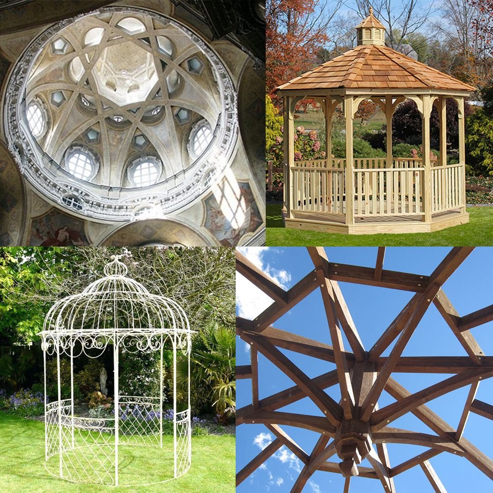
Once I accepted that the gazebo could take on many different forms, I began looking into references from all over the spectrum of architecture. I found inspiration in precedents as large as the domes of Italian Baroque churches and as small as the joinery details of a DIY timber-frame gazebo.
Settling on a Baseline Form
Knowing I wanted to create an ongoing series of gazebo designs, as opposed to a one-off construction, I decided to start my process by creating my own baseline version of the gazebo. By settling on a baseline form, I could then begin every new gazebo from the same starting point. The baseline is never intended to be built as is. The goal was to create something very simple and elegant which could then be tweaked and unraveled and squeezed and twisted and bent into the more fun and complex sculptural forms of the gazebo series itself. The baseline is nothing more than the mound of clay waiting to be sculpted into the countless forms yet to be designed and discovered within it.
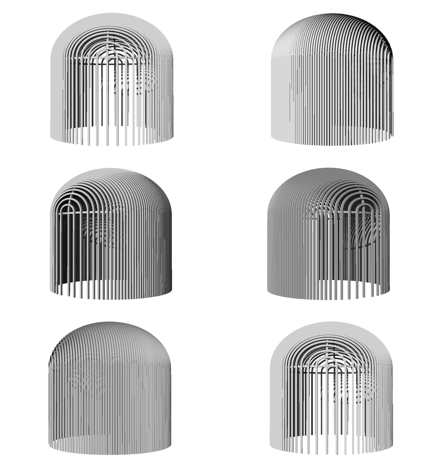
By first designing a baseline version, all future designs have an underlying visual connection, which I think makes it easier for spectators to understand that they're looking at a usable architectural space instead of just a hands-off sculpture. I also believe it's important to establish a cohesive style that brings an artist's collection together. That's not to say all future designs will be restricted to exactly these proportions and materials, only that the series retains at least some visual reference to this origin point. Gazebo 001 and all other designs to follow can be thought of as creatures which have all evolved from the same ancestor, the Baseline:
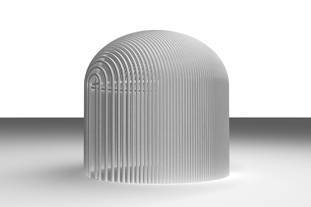
I'm sure you noticed that the above design has no entrance or exit, which was a purposeful choice to inspire all the designs that would come from this baseline form. Since the gazebo is inherently an architectural form which is both public and private, I wanted all of my designs to start from a completely enclosed origin, giving the design process the important task of creating an entryway. That way every act of transformation is literally an act of opening this structure to the public.
It was surprisingly difficult to find a form that felt right – with the right ratio between the verticals and the dome, and the right floor plan – and by chance the golden ratio ended up providing the right answer. I never underestimate the importance of that feeling in my gut when I come upon a form that inexplicably feels right.
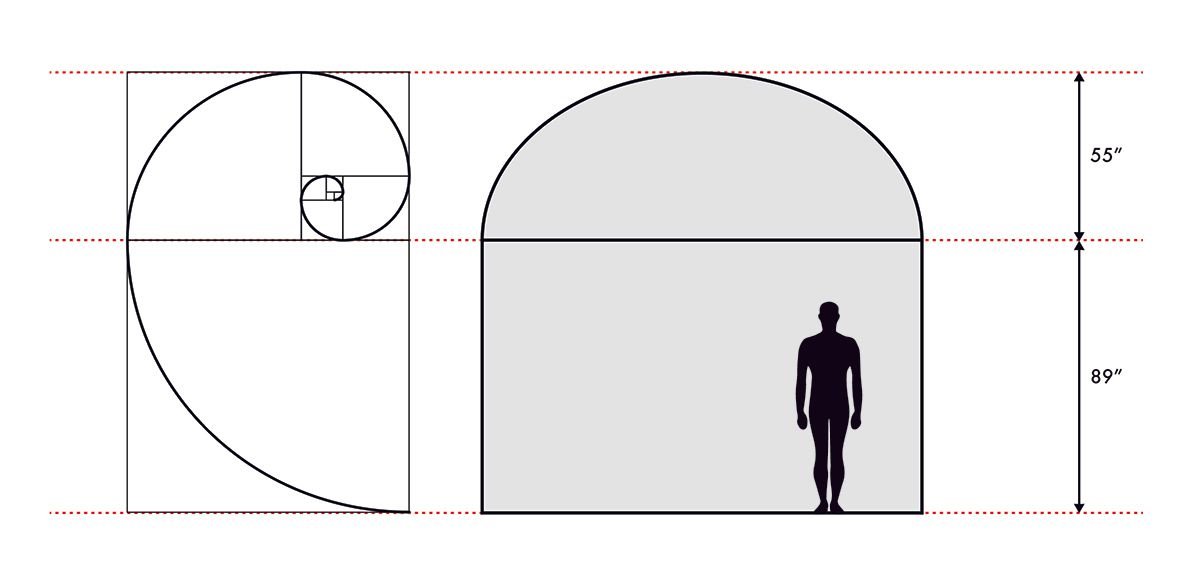
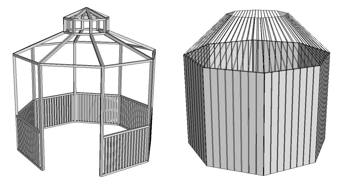
Instead of building my gazebo within the constraints of the typical octagonal form, I decided to go circular. A circular plan provides more options for the sculptural tweaks that follow. Also, the repeated lines of the vertical pillars make for a more interesting visual when curved along a circle instead of in eight flat sides, as you can see in some of my older designs below:
Sketching Sketching Sketching
I start all my design projects with a regimen of uninhibited sketching. I tend to be someone who gets caught up in the details of my ideas, so I try to force myself to let go of my overthinking and fill page after page with quick stream-of-consciousness (poorly-drawn) sketches. This helps me get out of my own way and let my inner creativity flow out as freely as possible. Most of the ideas that come out in this process get left behind because they're not good enough, but on a good day, when the conditions are right, a good idea finds its way onto the page. Below are some of my gazebo ideas, some good some bad, dating back as far as February of last year.

Follow along to see how I transform some of these sketches into fully-formed three-dimensional gazebos as I continue developing this new public art series.
Please let me know what you think of this project in the comments below!

