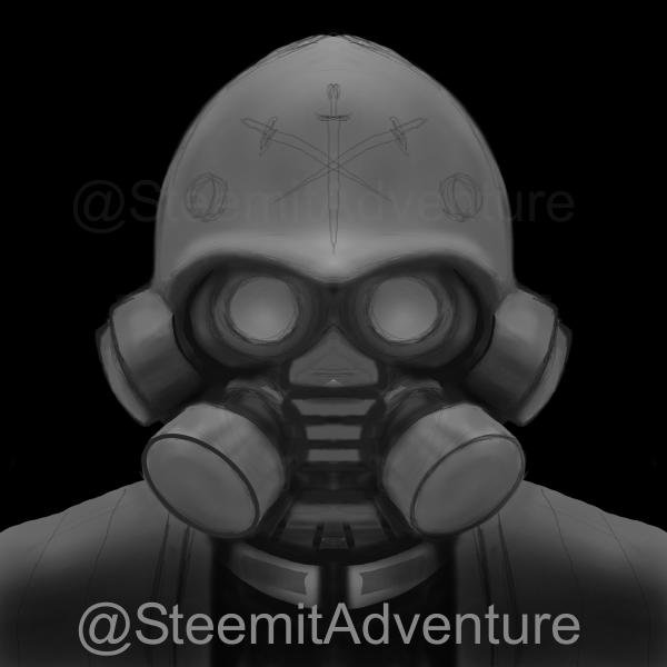
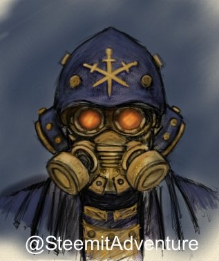
I had previously done a post featuring the picture below. I had liked the concept but felt it was too narrow in the helmet. I wanted to make it wider to increase the "ominous" feel of it and I also wanted to clean up some of the structure.
Here is the work in progress on the newer structure which I feel captures what I am looking for better. It fixes some of the issues. I am not sure I will finish it in a painterly style anytime soon because the original thought was for more of a comic book look and style. Figured I would post this incase some are interested in the process!
