Steemit launched the #burnsteem25 initiative on May 22, and the corresponding rewards started being delivered to @null on May 29. Since then, I have been playing around with PowerBI and steemdb.io to put together some visualizations of some related blockchain numbers. Here is a second weekly update..
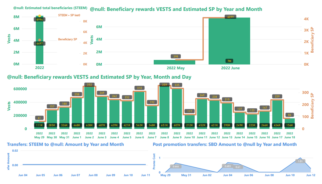
Slide 1: Burn amounts in beneficiary rewards and transfers to @null.
I swapped the visualizations in the top and middle row this week, and also added a new one with total numbers for the year.

Top-left: This image shows the number of VESTS along with the estimated numbers of SP and ( SP + STEEM ) beneficiary rewards that have been burned since May 29. This is where the headline number comes from.
Top-right: This shows the VESTS and the estimated SP beneficiary rewards burned per month.
Middle: This shows the daily VESTS and the estimated SP beneficiary rewards that have been burned.
In all three of the above charts, VESTS are shown against the left axis, SP and STEEM are shown against the right.
Bottom: On the left side is STEEM transfers to @null, and on the right side are SBD transfers to @null. As readers are likely aware, SBD transfers to @null can get a post added to the /promoted page. As far as I know, STEEM transfers to @null have no promotional value.
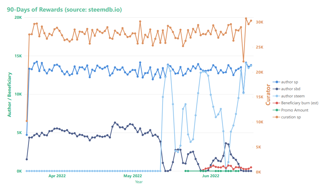
Slide 2: Rewards summary
Curator rewards use the scale on the right, author and beneficiary rewards use the scale on the left. Beneficiary rewards in this chart (red) have been adjusted in order to account for both SP and liquid rewards.

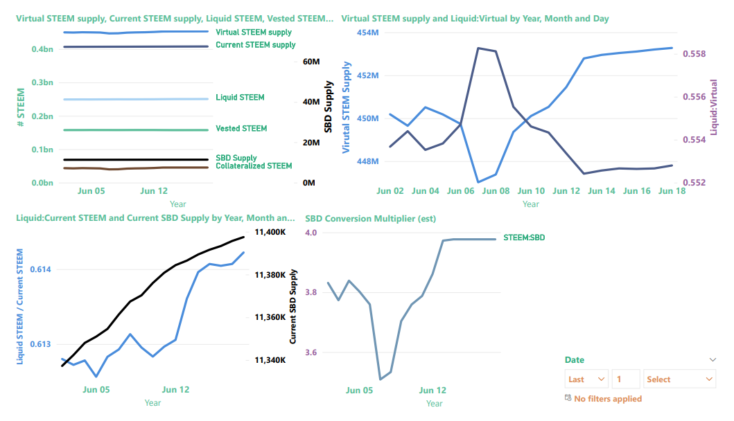
Slide 3: STEEM & SBD Supply as well as vested (i.e. staked or "powered up") STEEM
I made a bunch of changes to this slide during the last two weekends.

In the top-left image, we now find six values, instead of just two (see below for descriptions):
The top-right graphic now contains a zoom-in on "virtual STEEM Supply" (left axis) and the ratio of liquid STEEM / virutal STEEM supply (right axis). As we learned, here, virtual STEEM supply is heavily influenced by price, so with STEEM prices down, it's not surprising to find the virtual STEEM supply increasing. The up-side of this is that it's now possible to burn more collateralized STEEM per SBD with post promotion.
The bottom-left visualization now contains the ratio of liquid STEEM / current STEEM supply (left axis) and a zoom-in on Current SBD supply (right axis)
The chart on the bottom right shows the value of SBDs in terms of STEEM, according to the blockchain conversion rate, not external markets. This is basically the inverse of the price.
Now, here are some more details about each of the values
| Parameter | Axis (left/right) | Meaning | Comments |
|---|---|---|---|
| SBD Supply | right | Number of SBDs in circulation | Equivalent in value to collateralized STEEM |
| Collateralized STEEM | left | Number of STEEM needed to pay off all SBD debt | Equivalent in value to SBD Supply |
| Vested STEEM | left | Number of STEEM staked as STEEMPOWER | |
| Liquid STEEM | left | Number of STEEM that's not staked or needed for SBD collateral | Calculated as (Current STEEM supply - Vested STEEM) |
| Current STEEM supply | left | Number of STEEM in circulation | |
| Virtual STEEM supply | left | Number of STEEM in existence |
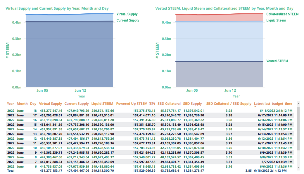
Finally, this slide is completely new. I don't think I'll keep it, but it was helpful for me to see these two images side by side in order to conceptualize the relationship between current supply and virtual supply - on one hand, and liquid, vested, and collateralized STEEM on the other.

For previous updates, see:
