Click Here To Enlarge Image
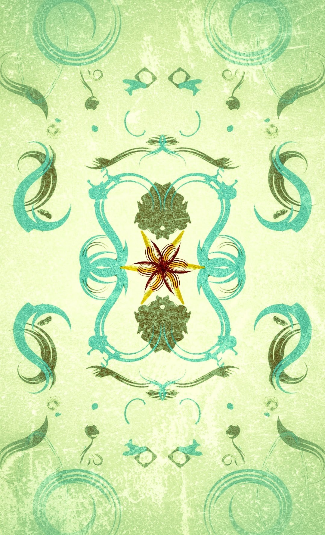
Hey guys, check out my latest abstract creation. I have used a lighter shade of blue and green for the abstract shapes so that the overall feel of the design looks simple and at the same time feels light on the eyes. I have played a gamble by using a totally different shades at the center of the design just to break the monotony. Again, I have made use of a lot of textures to give it a more classic look. I hope you like this abstract. I'm very new in this field so any kind of positive criticism is always welcome. Please share your thoughts in the comments section below
You can also check out some of my previous posts by clicking the links below:
- Black & White Abstract Art
- Minimalist Abstract Art
- Geometric Abstract Art
- Antique Finish Abstract Art
- Textured Abstract Art

