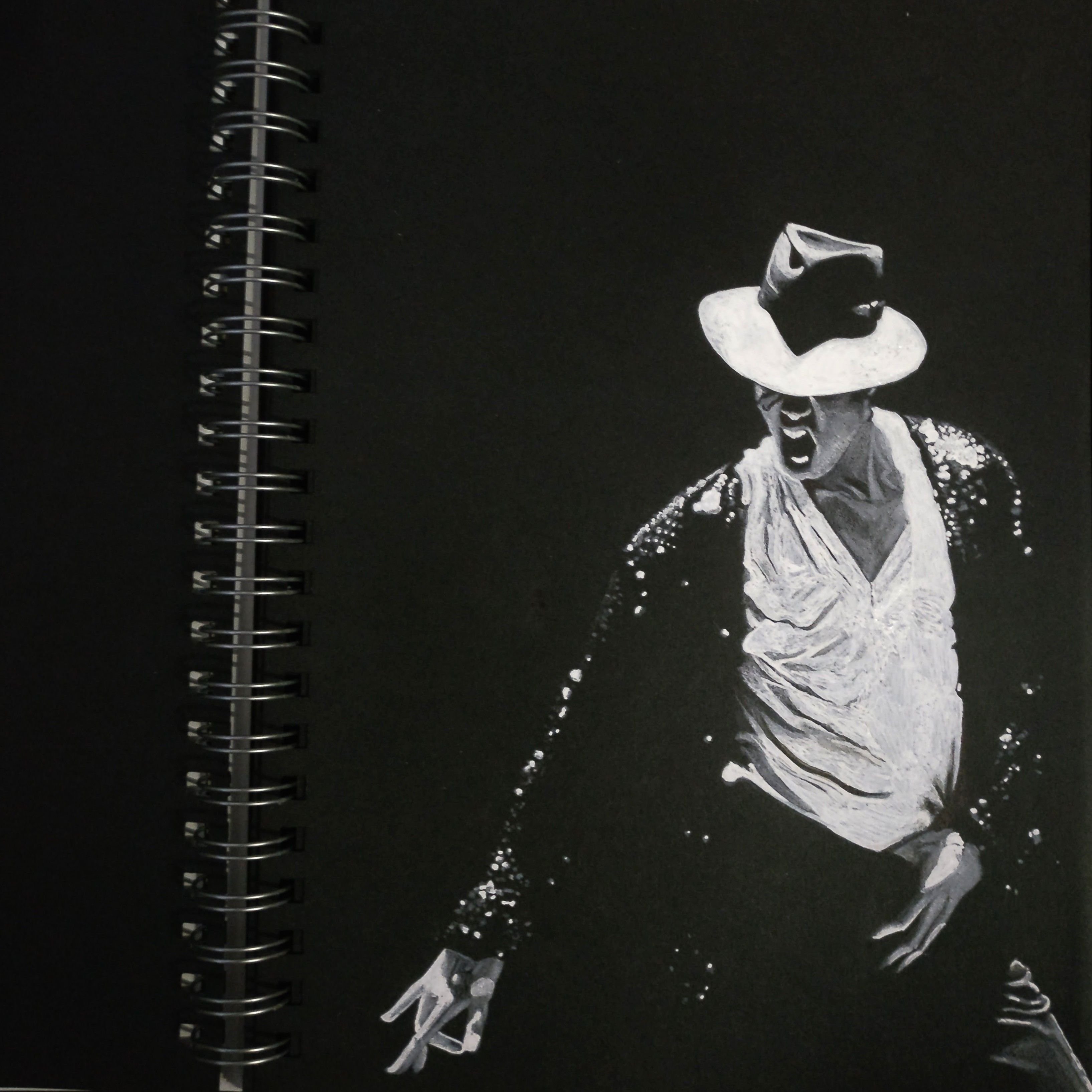
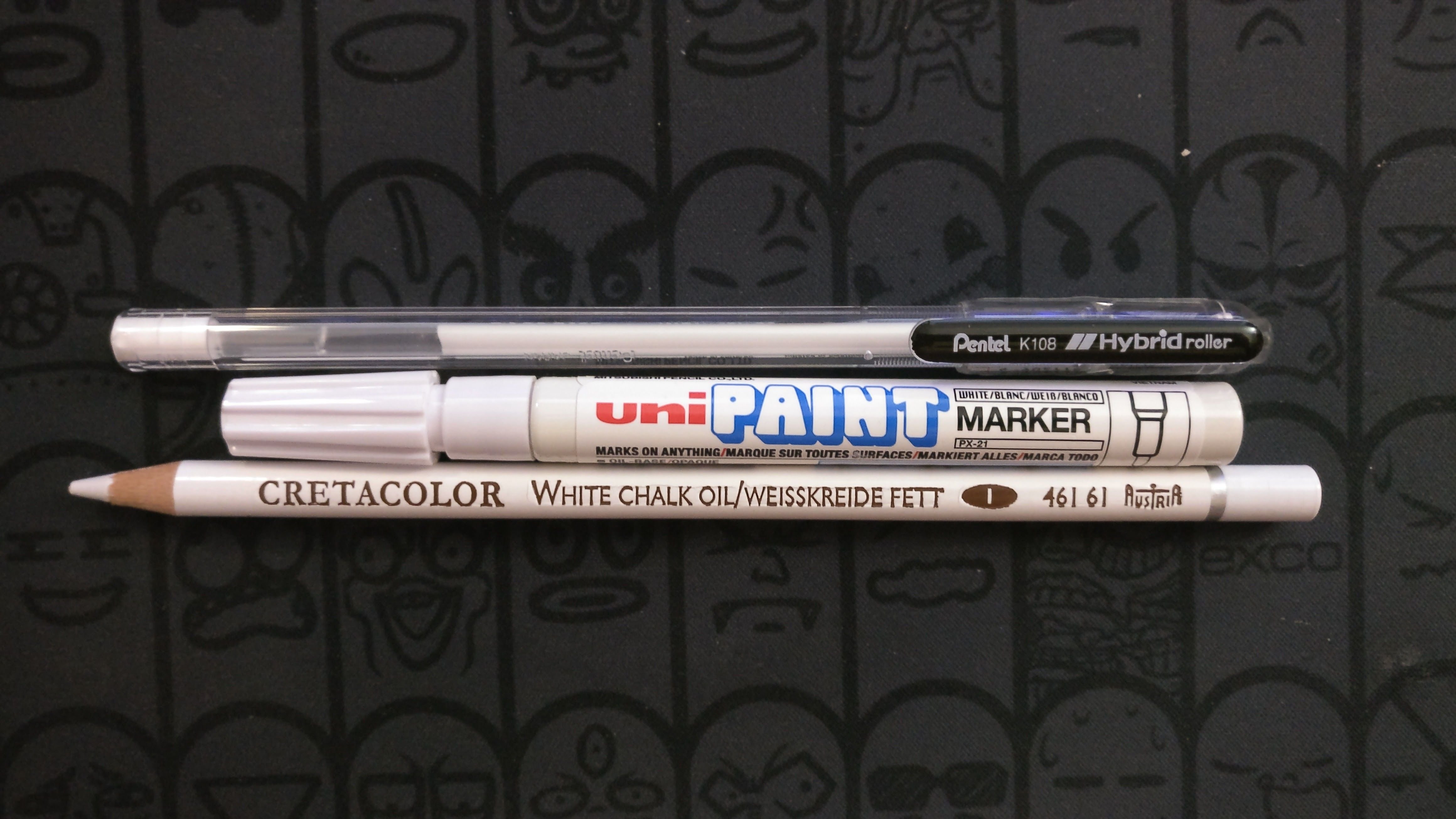
I've spent another 3 hours on this artwork after the first version. Mainly using the pens below starting from the top: Pentel white gel pen, UniPaint marker, and White chalk oil color pencil which was also used in the first sketch.
The subject is the legendary Michael Jackson and his classic hat.
Ironically, I fell for Michael the day he passed away as the television mourning him with the “You Are Not Alone". I fell in love with this song and immediately searched for all his songs and MV for the next few months, wondering how could I miss this astonishing artist when he was alive. I wished to draw a portrait of him as a gesture of tribute for a long time and this is the chance now.
The is an official entry for the Hat drawing contest bosted by @helene.
I've mentioned this artwork could be improved further, by making the white portion more vivid will enhance the contrast and makes everything pop on the paper. Seems like I was right. In the section below I put the previous work and the completed version side by side, you are the judge.
Comparison breakdown
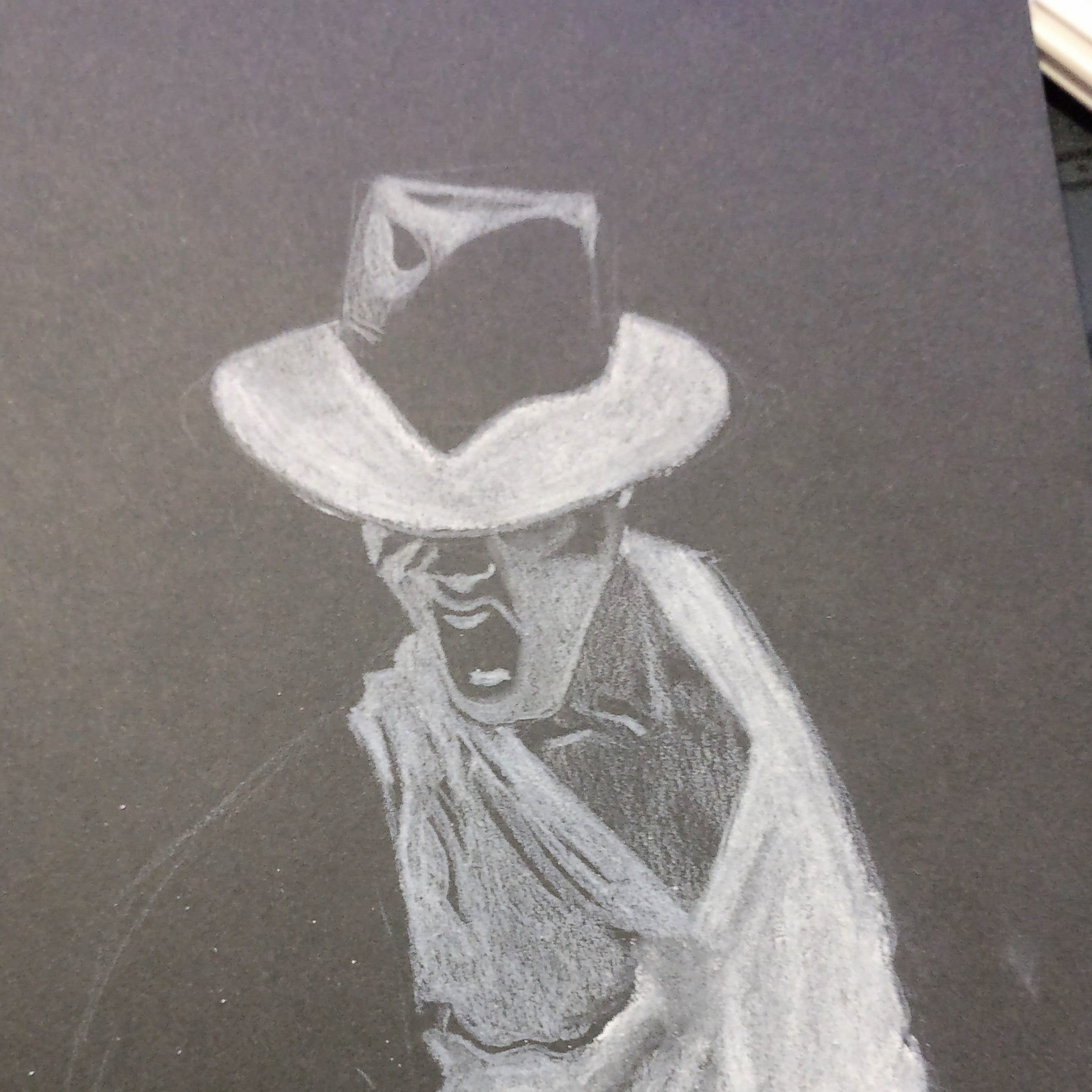
Before: Hat and face portion
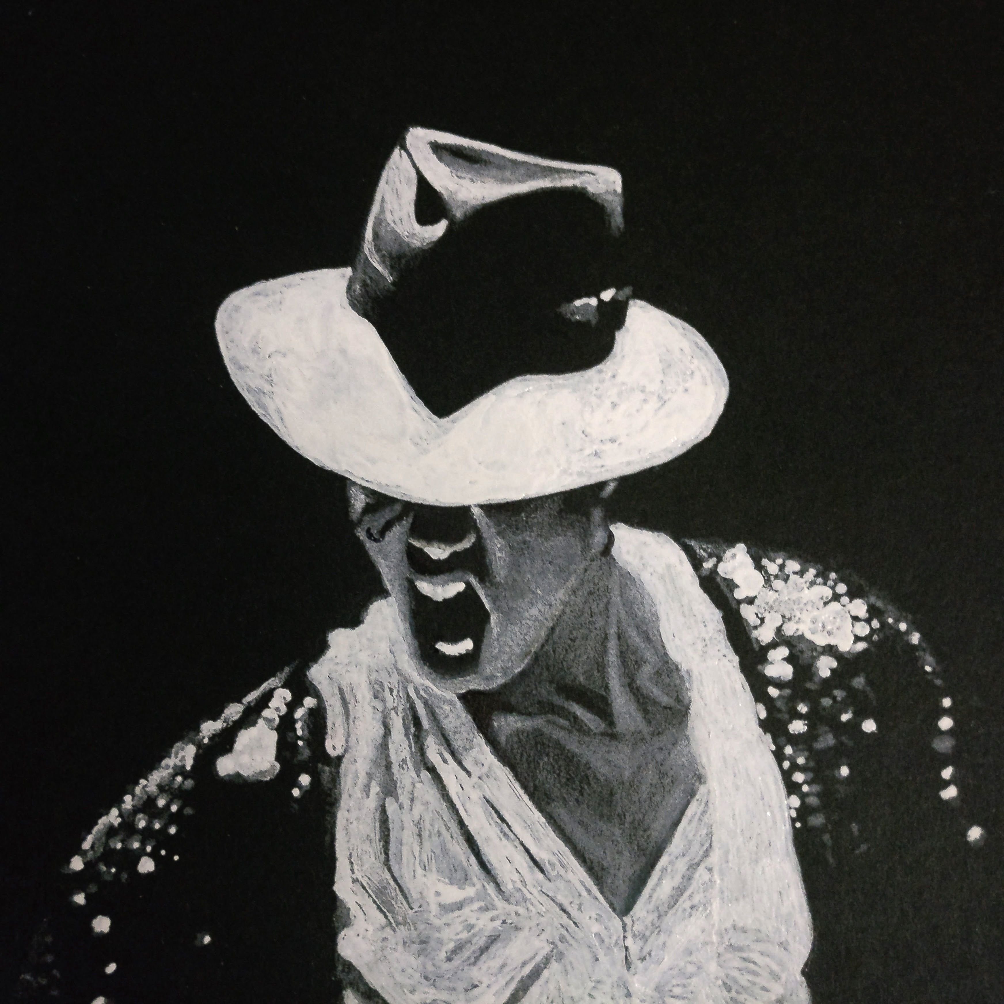
After: Enhance the hat detail and emphasis the light spot
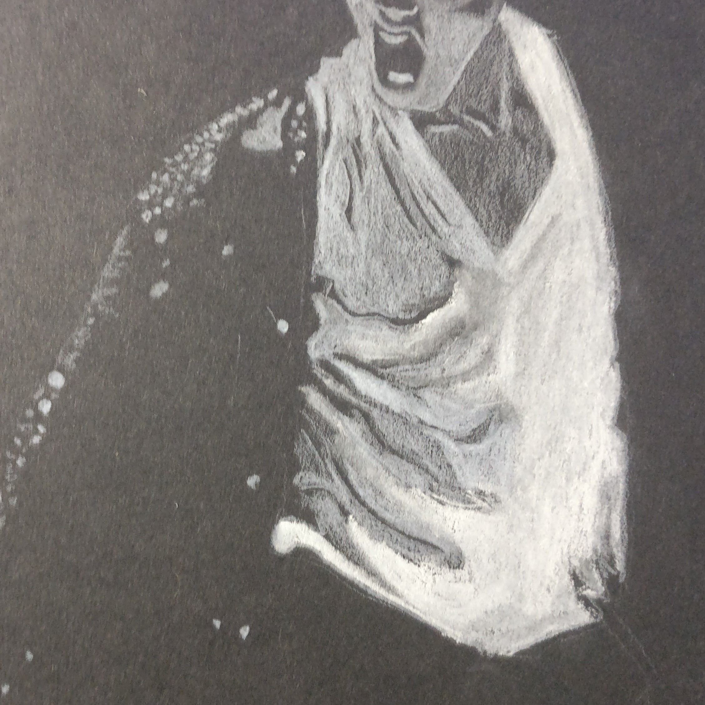
Before: Shirt image was dull
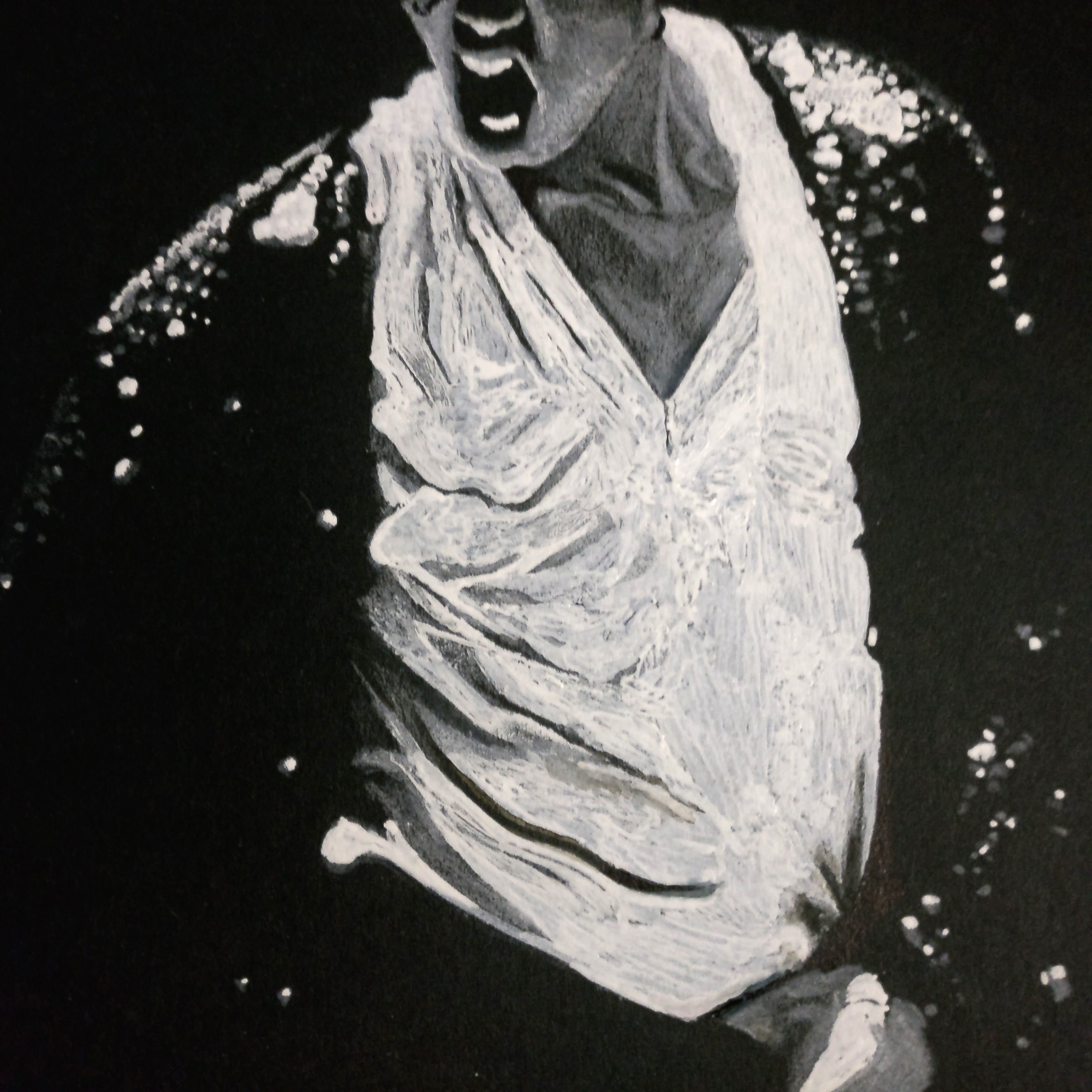
After: Contrast is way stronger. Shining spots on the coat are really shining now.
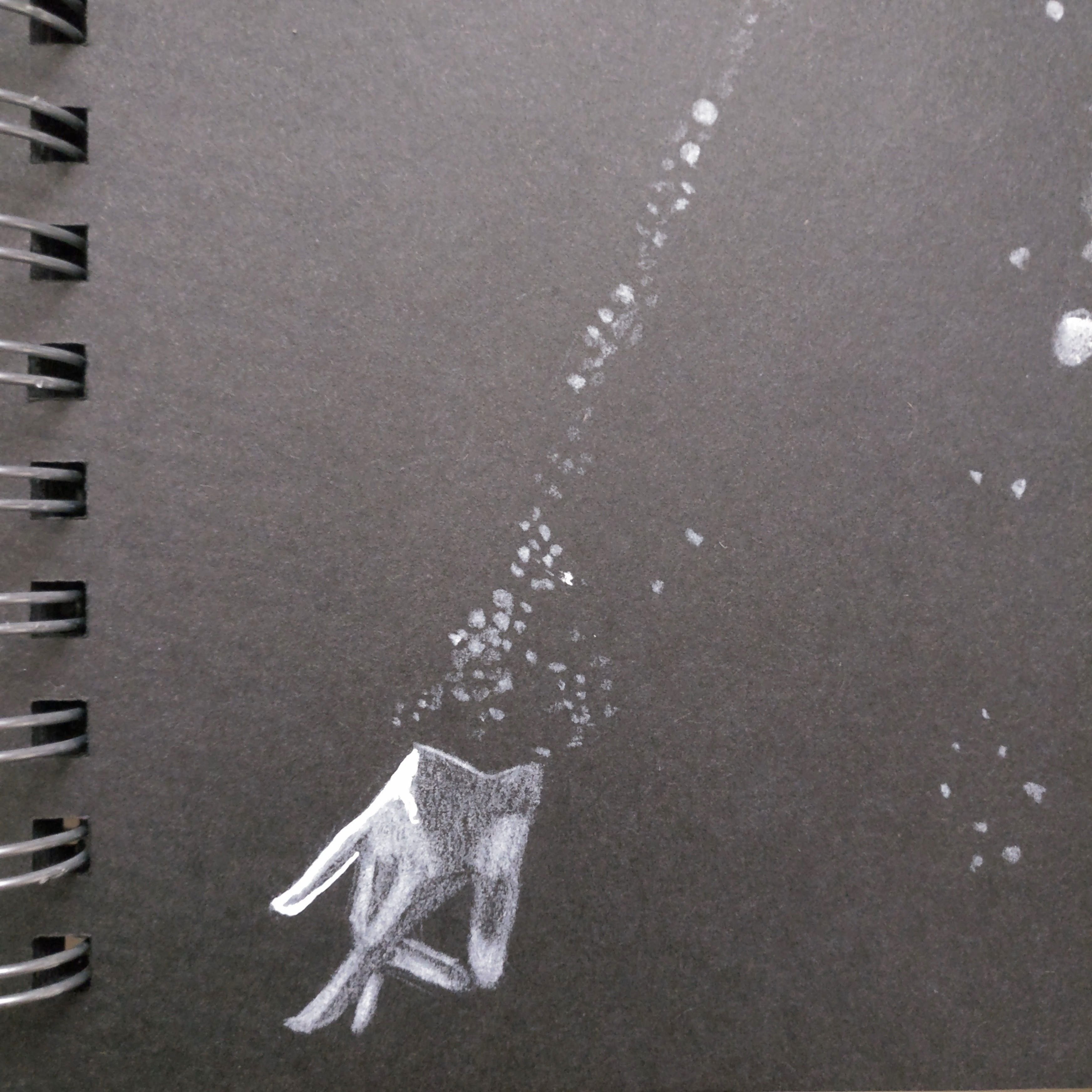
Before: Bright part was lacking.
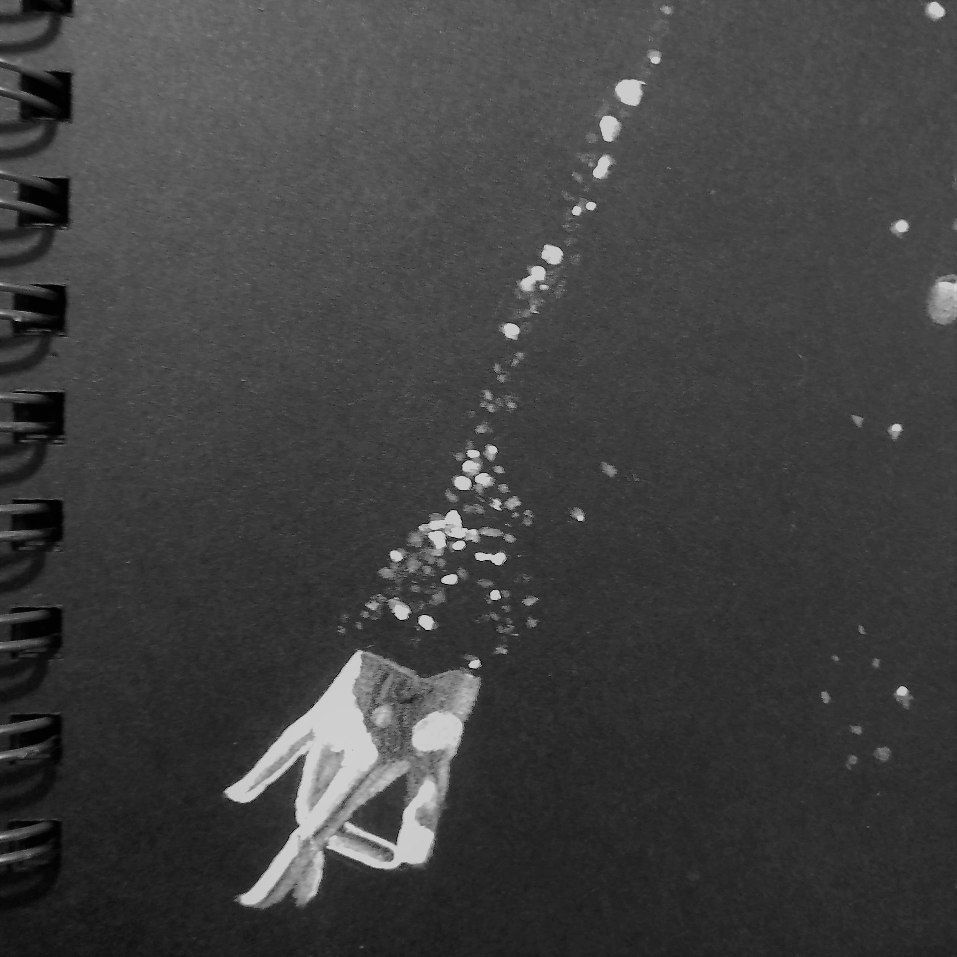
After: Improved the hand and sleeve details.
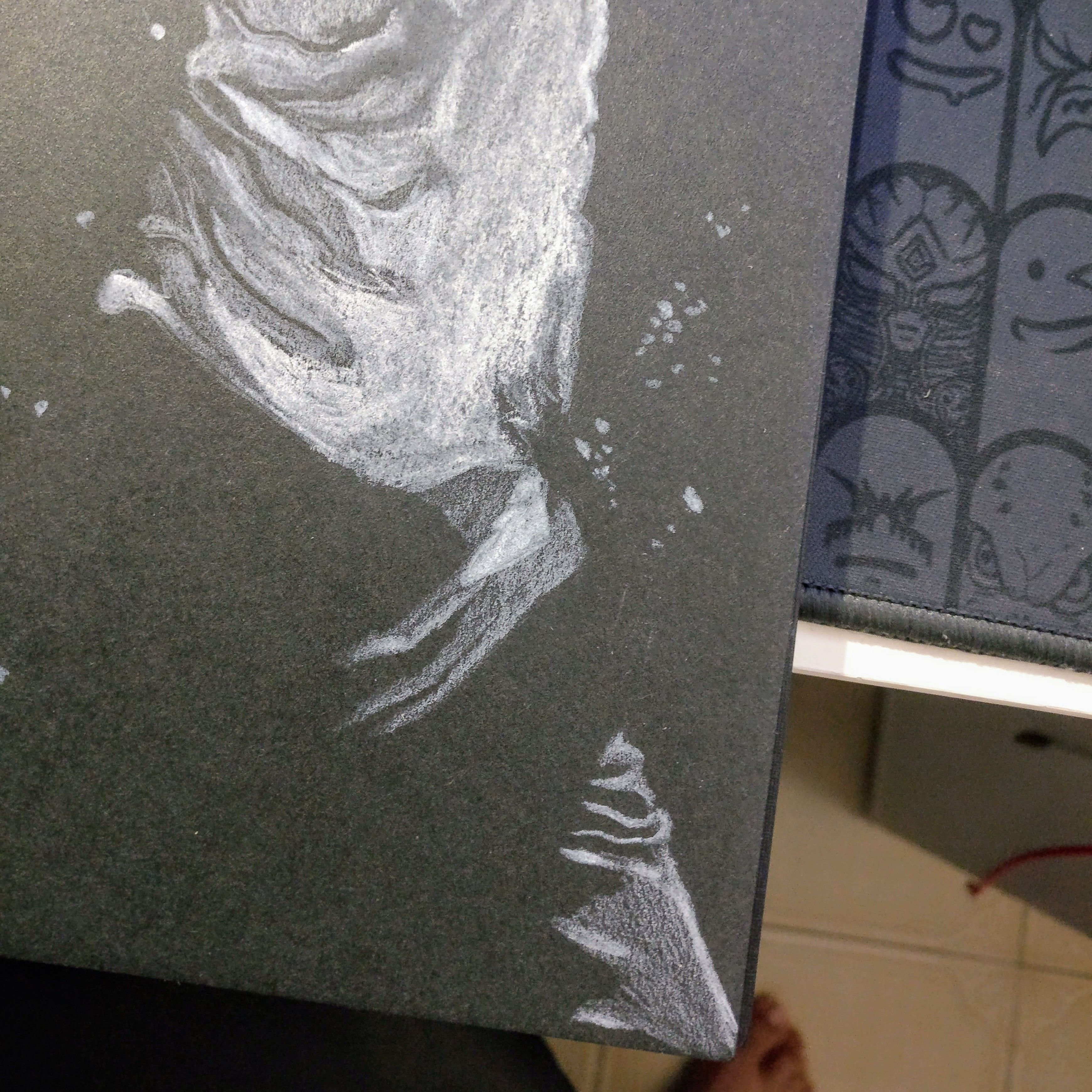
Before: Contrast was lacking.
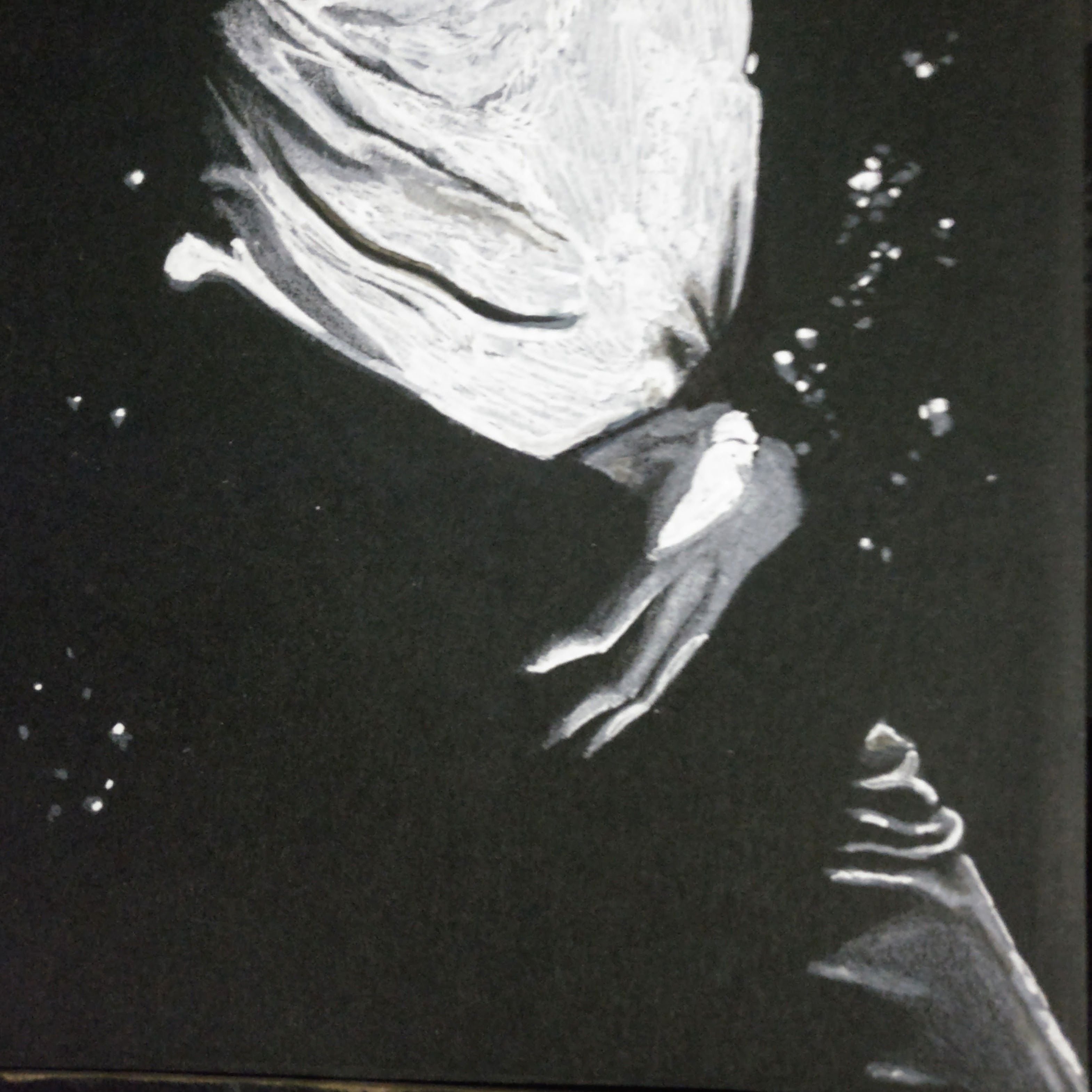
After: Some simple highlight on the hand can really make the hand and pant outstanding.
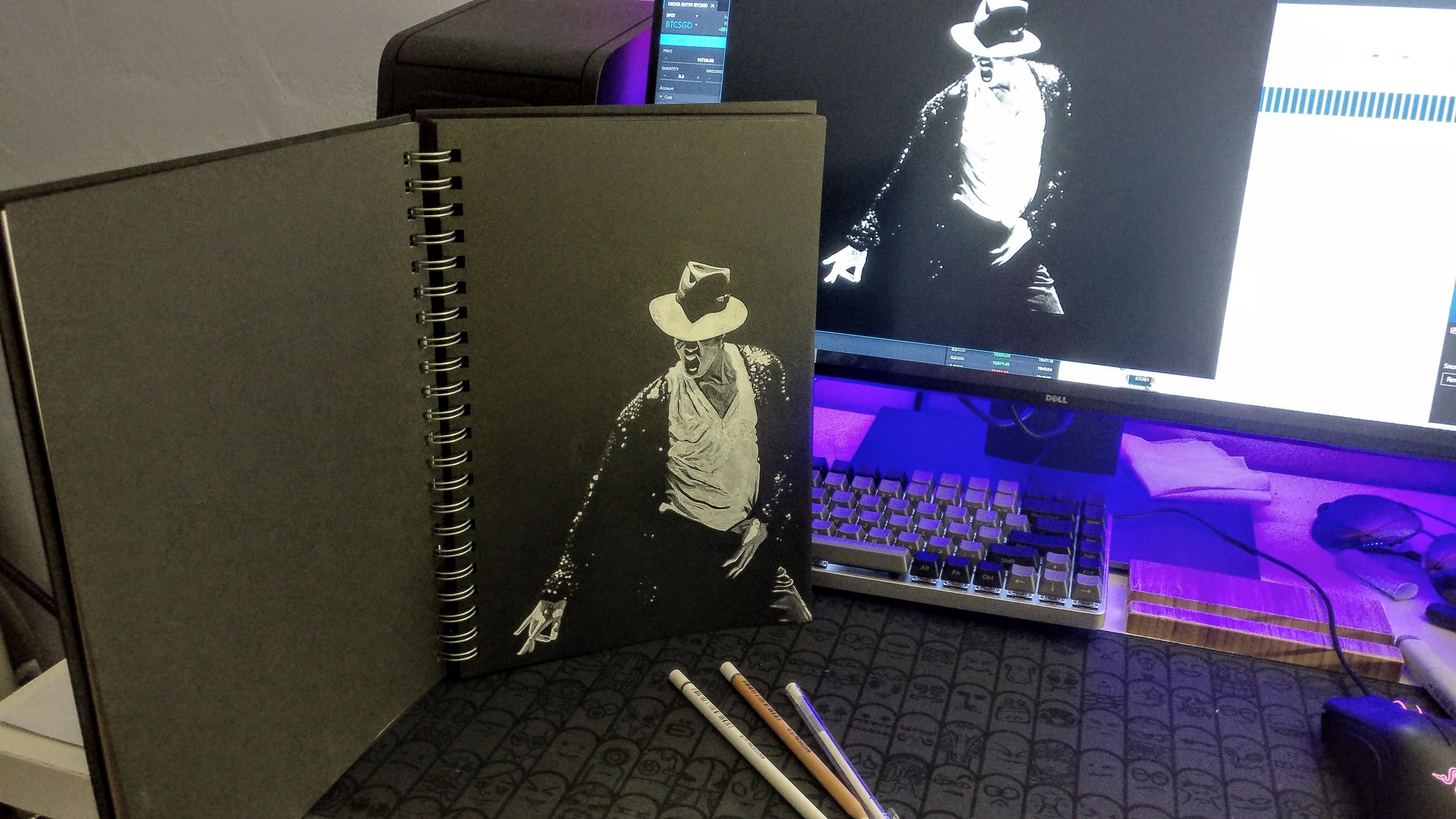

There is a way to improve everything.
Don't forget to preserve artwork by using the fixtatif spray in this guide too.
这次的主题是万古不朽的 Michael Jackson 的经典戴帽形象。
很讽刺的,我真正认识 MJ 就是在他去世的那天。当时电视上播放着缅怀 MJ 的《You Are Not Alone》,听到的当下就立马爱上了。接下来的几个月把他所有的作品和 MV 统统翻出来欣赏研究,对这位传奇般的人物彻底心折了。一直想要画个人像来向他致敬,这次机会终于来了。
基于第一个版本,这次的加强功夫用了额外的三个小时来完成。主要功臣是图上的白墨笔和马克笔。在黑纸上要让图画变得更突出立体就是增强对比,其实也就是要有办法在应该显亮的白色部分使之变得更白,这时候单纯的白色铅笔比起白墨笔就逊色许多了。
上面的部分我将各个部分用第一版本和完整版本来对比,没有对比真的就没有伤害啊。看来我所相信的一切都可以变得更好是正确的。
完成了别忘记用正确的方式保存作品。
正式用此版本来交功课,有兴趣的可以去参加由 @helene 举办的帽子绘画比赛。
