Titles & Headlines
Get your title nailed down first in blogging is the best tip I learned over the past decade. When you write the title before any other content you end up writing to that title. This allows you to make a good, catchy headline to grab people's attention and deliver on the promise the title gives. People never mind 'click bait' when the content fulfills the promise they clicked on.
There are a few tools out there to help you check your headlines. One of them is the Coschedule Headline Analyzer. This does an awesome job, showing you all kinds of statistics and information about your title. I would like to point out I do not use tools like this for my poetry but do for my daily posts. Let's see what the tool has to say about my headline for this post.
The first section we come to after entering our title is the overall score of the headline. For my title I score a seventy-two out of one hundred. Quick tip, don't worry about getting one hundred as the title score; if you are above seventy, you will be fine.
To the right of the score you see the parts that make up a good title. These include common, uncommon, emotional, and power words. Common words are, well, common and they include words like "to", "your", and "the". Common words should make up only thirty percent of you headline.
Uncommon words include "heart", "more", and "ways"; make sure you have about fifteen percent of your headline uncommon. That brings us to emotional words that include "absolutely", "worry", and "spotlight"; aim for fifteen percent of these.
Last we have power words (or phrases) some examples are "pay zero", "improve", and "you need to know". Make sure at least one word in your title is a power word or the words make up a power phrase.
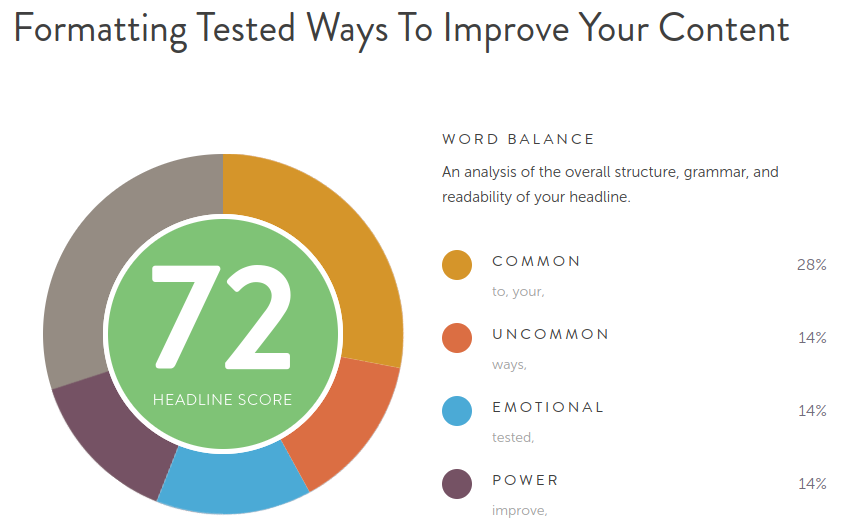
image from CoSchedule.com
Headings
Headers are super important for your readers. This gives them context on what is coming and gives them the awareness that you are changing the sub-topic. This not only gives your readers a heads up but also helps space out your main content. As we will talk about in the next section, the last thing your readers want is a big wall of text.
Most people will not read your post word for word. It is a shame since we put a lot of time and effort into our work but that is how this craft plays out. The one difference is a story or poem. With those the person has to read the whole work to know what is going on. If you are like me and make more educational posts, you should assume people are skimming the text.
The reader is the only person you need to please when writing your posts. When I say this, I don't mean they have to agree with you on everything. What I am saying is to please their style of consuming content. Some people want to read everything and others want to skim. So make it easy for them to read what you have to say the way they prefer.
Paragraphs
Keep your paragraphs in easy-to-read chunks. I come across so many posts that are three large blocks of text and it overwhelms me. Do you readers a favor and chop it up! Having a paragraph with over four sentences will look unwieldy. This has a dependence on the site that is displaying your work so look over the preview before pressing submit.
When our paragraphs are too chunky and bloated, the reader will dread reading the work if they don't skip it. I've been a perpetrator of both writing big chunks and skipping them. That is why I do my best to have manageable sized blocks of text. If I get anxiety looking at my work, then other people will.
That is a good way to format your posts. If we think about it, the people who will keep coming back to our blog are those that like what we have to say. There is a good chance they are similar to us mentally. If you think the text is too chunky, then your regular readers probably will too.
Pictures
Photography and clip art are a great way to help break up the text of your post. Be sure to not overdo it though. To many images will make your writing look crowded while not enough will make your work feel like a textbook. There is no hard and fast rule to how many images to use.
What I do is aim for a relevant image every three hundred words or so. This allows the reader to focus on the content of your writing and still have a nice visual break. If you are writing less than six hundred words in a post, have one image at the top and then use the small paragraphs as we mentioned. Any more and your work will feel crowded.
As we talked about above, look over it yourself. Does the image crowd the text or make it hard to read? If so than find another. It does not take long and helps the presented text look great.
Thanks For Reading!
Thanks so much for taking the time to read my post! If you have any questions about formatting please feel free to ask. Also if you have a topic you would like to hear my decade long blogging experience option on let me know and I'll shout you out in the post!
<< J. R. >>
Other Steem Exclusives:
Jealousy: How to tame the green-eyed monster.
Forgiveness: The Crucial Virtue
Criticism & Opinions: How to conquer your emotional dragons
Without Compassion You Will Never Succeed
Rocket Yourself To Genuine Growth
You Need More Patience