 |
|---|
Hi famz, I trust you're good. Welcome once again to our beginner's Graphic Design class. I hope you got value from the last lesson. Today is another opportunity to explore another interesting lesson.
We won't be designing today, we will actuall be looking at an interesting topic which I tag, Image in Design. We would actually be looking at the role images play in design and how to mximize it use. You would find it interesting just tag along as I take you on this journey.
- Introduction
- Image application in design
- Sourcing for image
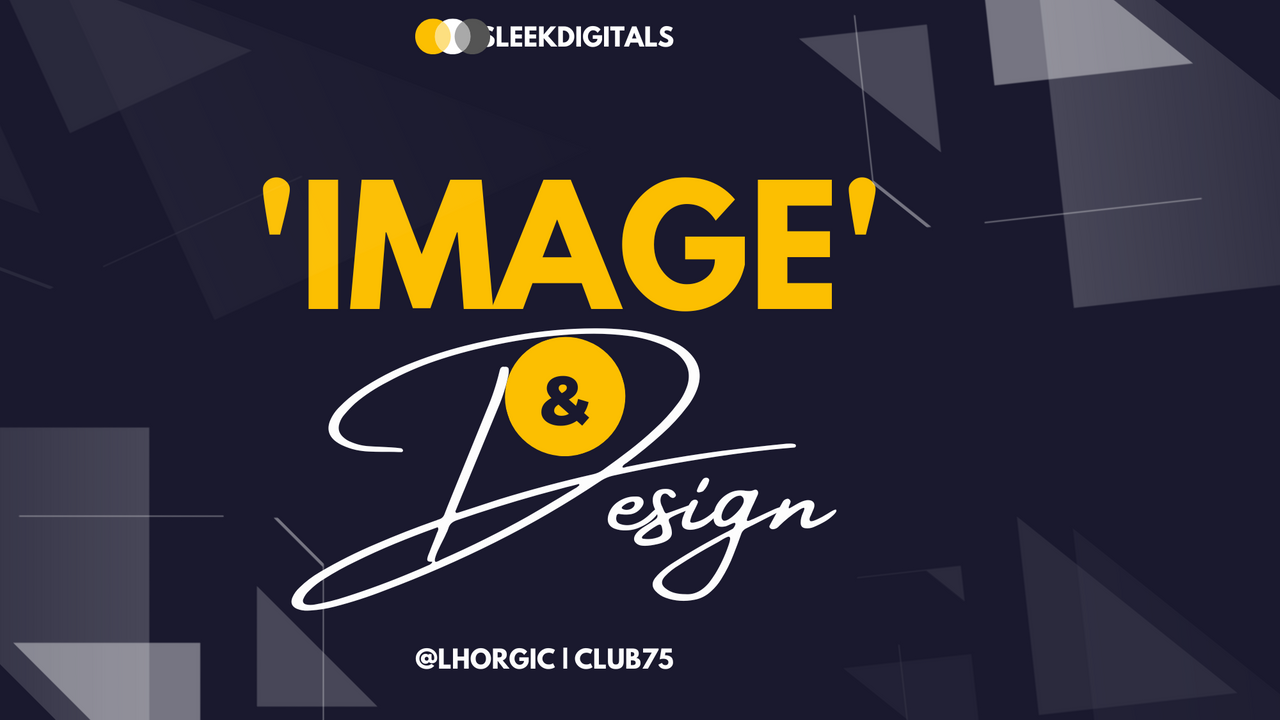
Images are part of design asset, I mean images are part of the components or elements that makes up a design. Not all designs contain images just like the one above yet they look great and simple but to spice up your design and make it more visually appealing, you can employ the use of images.
Images help communicate your ideas better. For example you want to make a design that talks about a school or summer coaching, the use of text and icon design might not be sufficient enough to properly communicated the idea even though the design looks beautiful.
There will be a need to add an image(s) of students learning or a school coupled with your text so that viewers can relate better and get the message clearly. The truth is people have become very busy even to look upon a poster or billboard for 5 minutes. They just want to get the message in seconds. Hence the need for hierarchy, priority and relevant image(s) in design.
We will be a bit practical here. I will share with you some designs for you to observe. I want you to see from them how images complements designs and how it helps pass an intended message.
 |
|---|
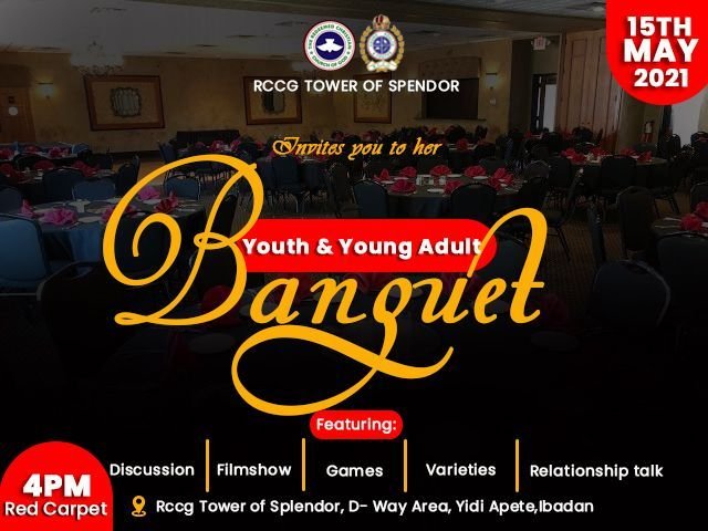
From this image what can you deduce? Just take a minute...
Okay let me come in now. With the principles of hierachy in design, we can spot the central message "Banquet" which stands out via it size and weight.
Then you can also see how the message is complemented with an image showing a hall with well decorated tables in the background...ready to receive guests.
 |
|---|
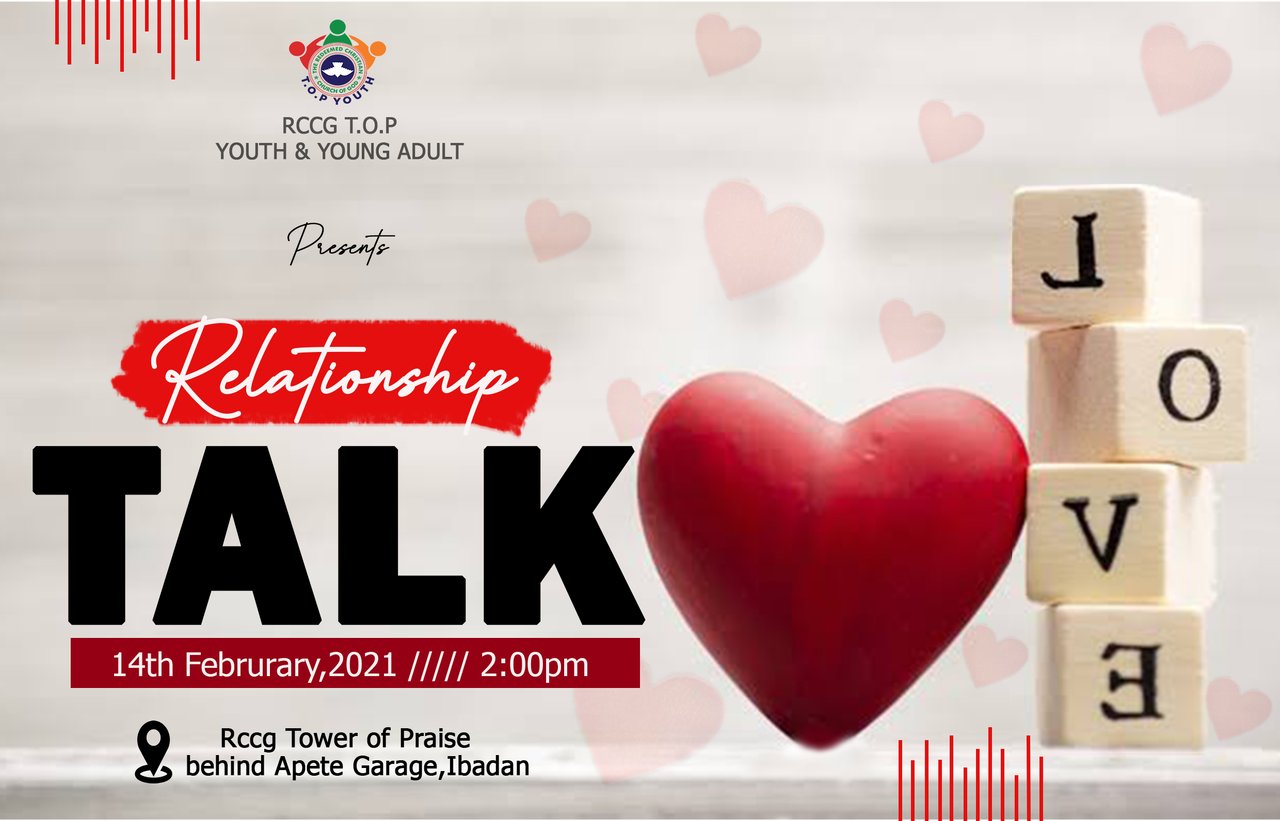
Can you also see the synergy between the written text and the image used in communicating the message? The program is actually for singles who are actually in relationship or in search of true love. The image used added beauty to the design.
 |
|---|
I remember doing this design for an organization that was into herbal product. Neem leaf and seed was their raw material for making their products. You do not need to be told that they deal with herbal product with just the very first glance at the design.
Even though the organizations name (TFC Network limited) do not carry anything herbal. The colour used in the design also helped in passing the message. Anything herbal is associated with green. You can also see the image of neem leaf in the background.
One important tip I need to share before I move on to the next section is...always understand what your client wants. Do well to ask questions about the design before starting, it gives you more insight on how the design should look so that you can satisfy them with your output.
There are few guidlines to take note of when sourcing image for your design. I will mention some here which I believe will be very useful. You can as well explore online to get more.
- Understand the purpose of the design.
Before going all out to look for an image, ensure you already know and understand the design you're creating. This will guide you in getting the exact image that will communicate the message perfectly.
For example your design is about learning, the question now is what kind of learning? Classroom kind of, online or skill acquisition, all falls into the category of learning. Your image will go a long way in making the message direct and clear.
- Choose high-quality images
Now that you know the kind of image you want, the next thing is to go for quality. Get an image that is very sharp and visually appealing amongst the various option presented to you online or wherever.
 |  |
|---|
Low quality or blur images will be a dent to your design if you fail in this area. High quality images are key in design. I have seen people go the extra mile fine-tuning image just to fit into their design. It's that serious...smiles.
- Utilize Crop & resize tool if need be.
This is just an addition anyways. Every design is always with a size, to be on a safe side, download an image that matches the design dimension you have in mind. But in a case where you have an image that does match, do well to explore tools that can help resize.
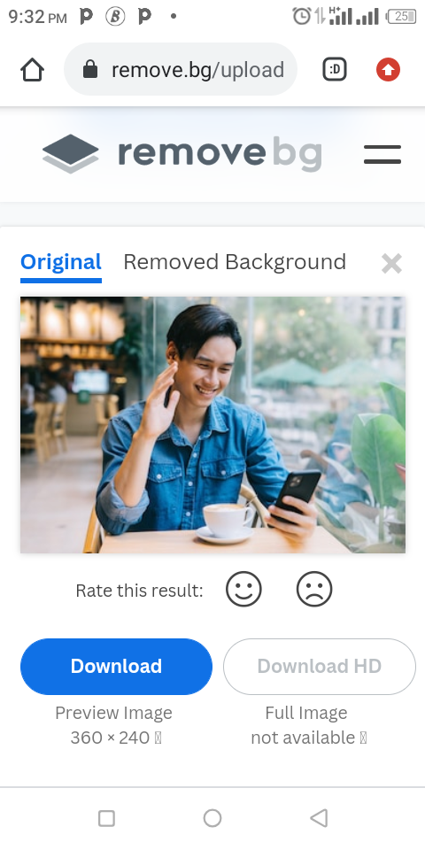
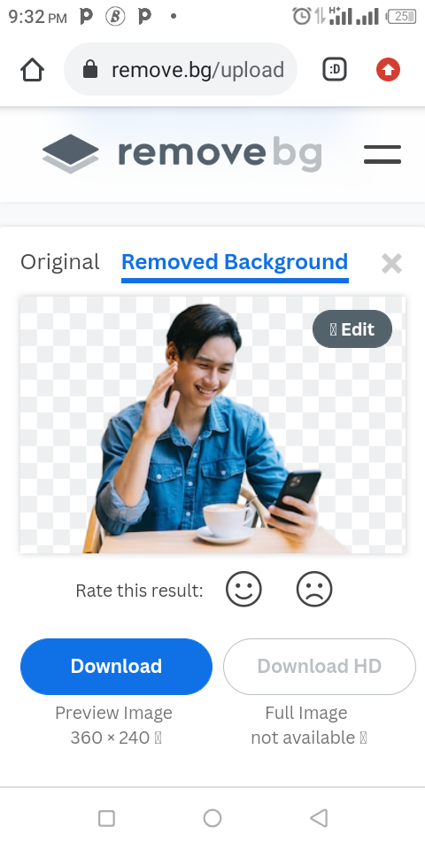
In addition, you might have images whose background is irrelevant for your design, you could crop it out or employ sites like remove.bg to help do away with the background. Do well to check that site. It's user-friendly, quick and easy to use. A typical example is as seen below.
 |  |
|---|
Lastly sites like pixabay, unsplash pexels etc are sites where you can get free images. I means high quality images for free. You can take advantage of these site for your next project.
This is where I will be wrapping up our lesson for today. I really appreciate you for coming this far with me. I trust you got value from this lesson. Feel free to share your thought on today's lesson. If there is anything you would love me to add to improve the lesson, be free to share in the comment section.
If you missed the previous posts on this beginners class, kindly check them out here.
G101 introduction post.Lesson 1.Lesson 2.Lesson 3.Lesson 4.Lesson 5.Lesson 6.Lesson 7.Lesson 8.Lesson 9.Lesson 10
Graphic Instructor
@lhorgic♥️
Cc: @ubongudofot.
