This update documents the sitemap of steemit.com (and then rambles for a while).
The sitemap below shares more information than a traditional sitemap would as I wanted to break down the structure of each page into its core components -
- The Header (or Masthead)
- Left Menu
- Main (Body) Content
- Right Menu
I wanted to do this to see/demonstrate the limited "contextuality" in the Left and Right Menus - I've got no doubt that I'll speak about these areas more extensively in a future post. (Having now completed this post, I probably have little more that I'd want to say 😂)
Sitemap
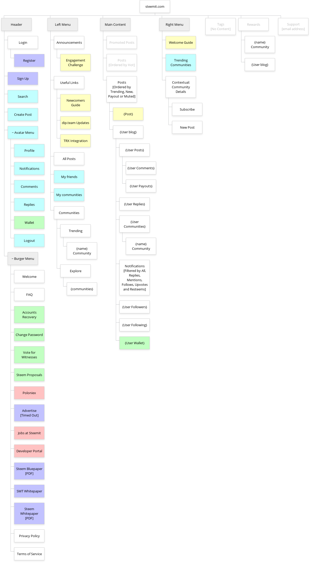
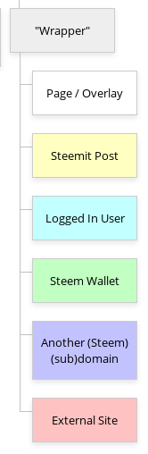
🔑 Key
| Colour | Description |
|---|---|
| Grey | Indicates a sub-menu or page group |
| White | Indicates a page or overlay |
| Yellow | Indicates content displayed within a Steemit post |
| Cyan | Indicates links which are only available to logged in users |
| Green | Indicates links to Steem Wallet |
| Magenta | Indicates links to Steem content outside of Condenser |
| Red | Indicates links to External Websites |
| Greyed out text | Accessible via an unadvertised URL |

🤔 Thoughts
1. Lack of Contextuality
I originally started by writing points 2 and 3 below but they started to feel like a rant (and perhaps off-topic). Hopefully, this won't become a rant too!
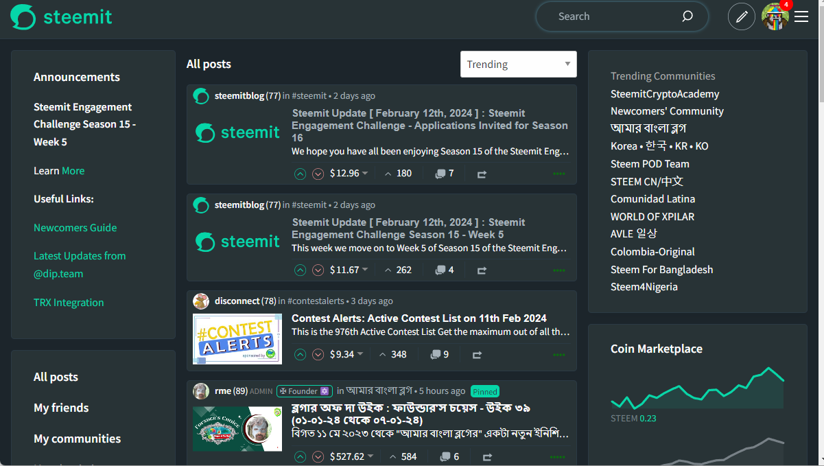
The Left and Right Menus appear on all content discovery pages. These additional Menus/information account for anything between a third to half of the page real estate.

The Left Menu partially acts as a route to navigation - Friends and Communities perhaps providing the most utility as they appear to be the only routes to this information. But why the inconsistent "navigation" style when the Profile page has helpful, space saving tabs across the top?

The Announcements and Useful Links are also areas of question for me. I know what the dip.team are, but surely their updates are more appropriate in Announcements? TRX Integration is somewhat meaningless now that TRX rewards are no longer being paid.
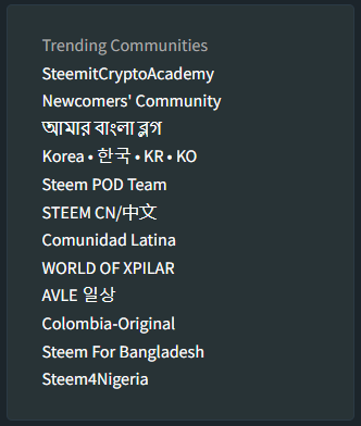
In the Right Menu, we see Trending Communities and I would love to hear in the comments - Who cares?
The only time that either of these menus are used appropriately (in my opinion) is the contextual use of community information.
These areas definitely need to be reconsidered and reconfigured in my opinion. To lose up to half of your screen to this just seems mad 🤪
This became a rant didn't it?
2. New Users
I was initially going to produce a separate sitemap for logged out and logged in users but after producing the logged out version, I realised that almost all of the functionality is visible, you just can't use it until you log in.
One thing that jumped out to me for the New User mindset was quite how badly the site is designed for new users. The "Welcome Guide" in the Right Menu suggests some kind of guide or tutorial to help you get started...
The first thing to do when you come to Steemit
Can you guess what it is?
Post your first comment? Read the top paid posts to learn how to earn rewards? Upload your profile photo? The answer is, none of the above!
What do you think?
The very first thing is: write down your master/owner keys on a piece of paper, and keep the paper in a safe, secure place.
But I don't have an account.
Maybe the Useful Link in the Left Menu, "Newcomers Guide", will be more helpful.
No, it links to the same place.
How about "Welcome" in the Burger Menu?
No, it once again assumes that I have an account already.
3 welcoming links, no actual welcome.
So what's the sales pitch? Where's the "Brochureware"? Is that what steem.com is for? (I hope not.)
Compared to a site like medium.com, we're seriously letting ourselves down.
Is this beyond the score of #proposal-86? Maybe.
3. Outdated / Irrelevant Content
If you look through the Burger menu in the header, links such as Advertise and Jobs at Steemit either don't work or are probably no longer applicable. Other functionality is only relevant to registered users who are logged in, so why overcomplicate things for all users (linked to point 2 above)?
📃 Do we need a new Information Architecture (IA)?
One of the early stages of website design (before writing any code or making anything look pretty) is the relatively dry process of creating an Information Architecture, and/or Wireframes.
This encompasses deciding what content is required, what pages this content should sit within and the importance of that content within each page. To use an analogy, you're planning your book before starting Chapter 1.
Steemit.com clearly hasn't done this. We've got content discovery here... we've added communities... I made some graphs, let's add some graphs... that's a good welcome guide... Oooh, Engagement challenges... there's a gap here, a gap there... that'll do. It looks ok. Individual user stuff can go up there, behind that avatar in the corner. Everybody knows that the avatar will hold the key to your activity. What about all this other crap? Just chuck it in a Burger Menu, why not eh?
I'm ranting again.
How much of the IA actually needs changing? Do we need to think about a more consistent navigation? Some primary navigation so that we're not relying upon our existing knowledge of where things are?
- All Posts
- My Feed (aka My Friends) [logged in only]
- Community Feed (aka My Communities (logged in only)
- Announcements (links to a single blog post which steemitblog maintains, containing latest SEC news, contests, etc.)
These 4 simple links across the top, styled like the Profile navigation will free up approximately 260px of usable space, removing the need for the Left Menu.
- Profile or Feeds
- Wallet
- Settings
Floating to the right, again reflecting the Profile styling.
This is thinking as I type - surely this consistency of navigation will simplify the usage of the site - give it a clear and obvious structure and remove the assumption that people know to:
a) click the logo to get to feeds
b) click the avatar to view your profile.

✅ This completes part 1(b) of Stage 1.
I've perhaps over-stepped the purpose of this post - producing and sharing a sitemap - but in doing so, I've explored a can of worms which I feel that I've rationalised without too much difficulty.
I'll park these thoughts here for now - I'd love to get your feedback, especially with the suggestion of "formalising" the site structure. Should this be the first step before making things look prettier?
Part 1(c) is perhaps the biggest chunk of work in Stage 1 which will come next.