Since sharing my proposal to update steemit.com's Interface a few days ago, I've been involved in a lot of discussions about the scope of the project, planned communication and general clarity regarding the project.
Whilst updating the original Proposal Document could have clarified matters, I'm aware that many users won't revisit that after forming their original opinion so I've chosen to include more detail here and link to this article from the original proposal post.

1. Clarification
I've noticed a few people suggest that the updated steemit.com interface will turn Steemit into my alternative interface which is hosted elsewhere. Whilst it may be possible to incorporate some of the design elements from that, I won't be able to filter out the reward-farming spam that we see so often. It might be possible once the redesign elements are complete that I visit the "Trending API Algorithm" but this will be a decision for the community once the original scope is completed (more on this later).
2. Communication
I've been requested to update the community at a minimum of once every 2 weeks - so that there's some visibility of the work being undertaken.
My intention is to communicate more frequently than this - Weekly at a minimum but more likely, twice per week depending upon progress.
Within these updates, I plan to share ideas, mock-ups, code snippets, screenshots - whatever is appropriate for the work being undertaken at the time.
3. Scope
Within the original proposal, I stated that phase 1 would:
...involve documenting the structure of steemit.com - identifying what source code is used in each page and the associated CSS files. Steemit.com's "all.scss" file imports approximately 70 other .scss files which needs understanding.
This will go a long way to understanding the entirety of the redesign although I understand that as things stand, deliverables are vague which makes some people uncomfortable with a year long project.
I'll try to outline some initial thoughts and ideas here, along with the statement that once the planned work is complete and the community is satisfied, votes (and therefore funding) can be withdrawn and the project can draw to a close.
My intention is to update the majority (if not all) of steemit.com.
These thoughts aren't in much of an order... they're possibly in the order of a user journey from initial sign up...
Sign Up
Registration is on a separate subdomain and doesn't appear to be in Condenser. This isn't in the initial plan.
Welcome
I've never looked at this page before... not that I can remember anyway. It definitely needs updating - could include some hyperlinks to navigate around steemit and introduce the Newcomers' Community. Or the Newcomers Guide which is in the "Announcements" section.
FAQs
Would benefit from an update - Perhaps, instead of the questions being hyperlinks, they could be expandable to save jumping around the page. How many of the questions are still relevant and which of those linking to community articles are still available? Could this become more targeted to new users?
Explore Communities
Could this be more visually appealing? https://peakd.com/communities looks prettier although our communities don't currently have the option to upload a logo... perhaps the @hive-.... account image could be used when the community is created. The option to view in grid display or rows could work well... oh, and the search. Surely a "predictive" style search is possible so that as you type "Spo" then the available "Sports" and "Spots", etc. communities are suggested - perhaps even dynamically updating the communities being displayed as the user types. This might be a stretch. We can definitely make it prettier.
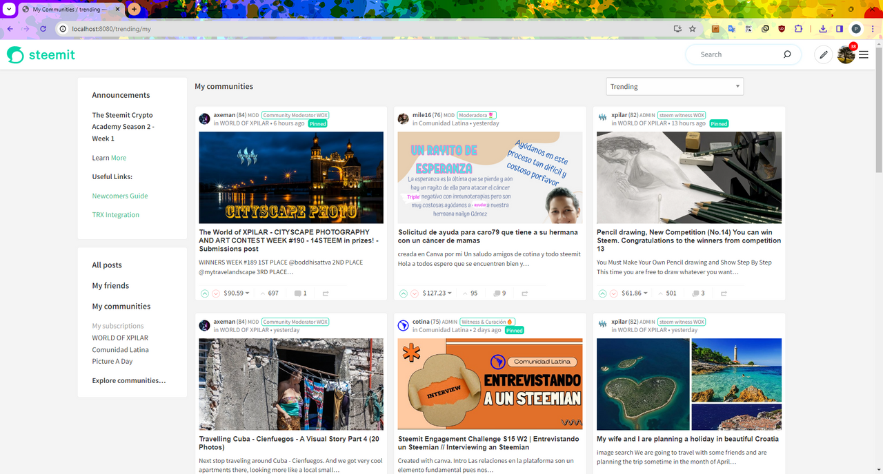
User's Communities
As above, can be prettier. Could also include details like the "Explore Communities" results so you can see if any of your subscribed communities are no longer active. A link to "Explore Communities" makes contextual sense here too.
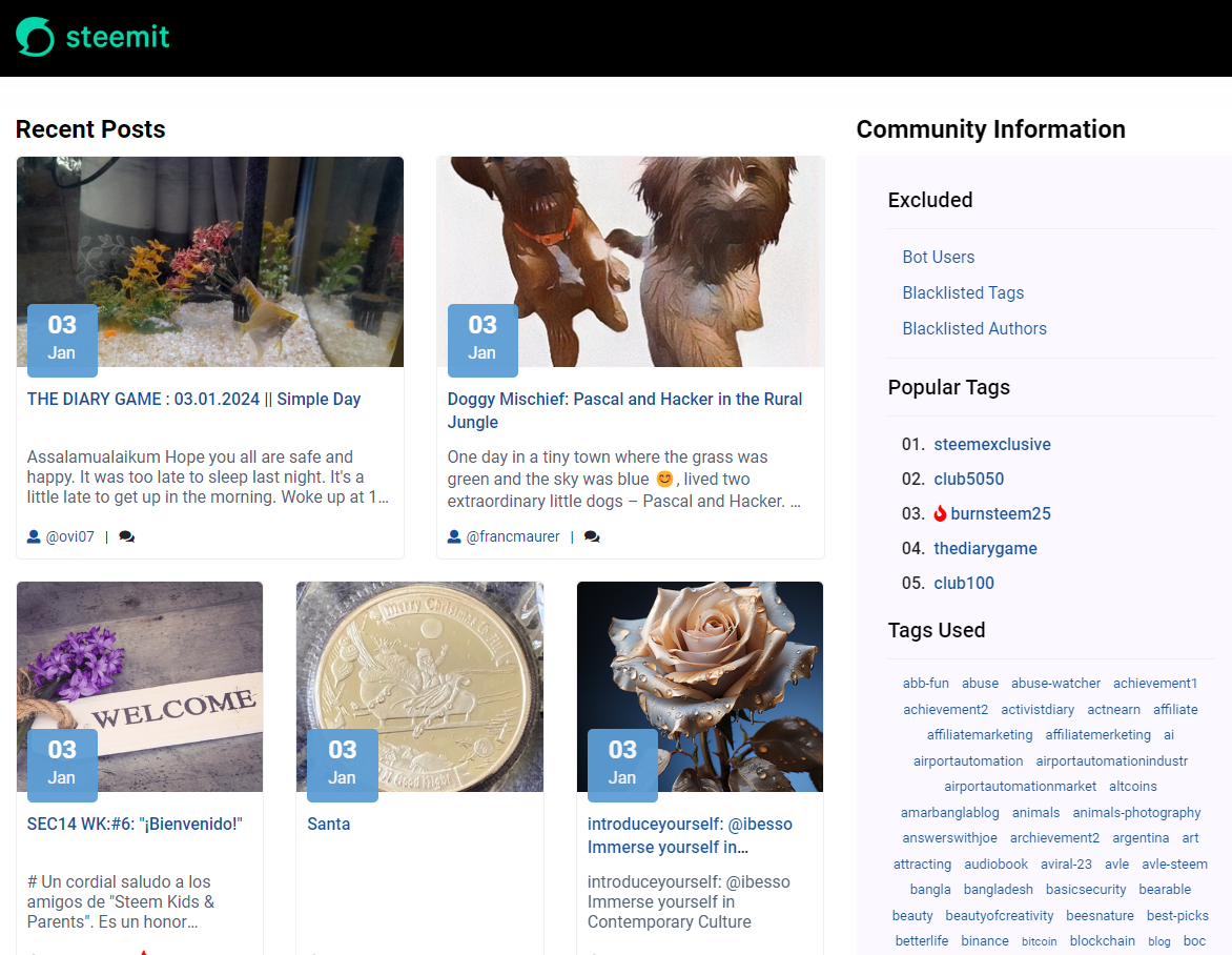
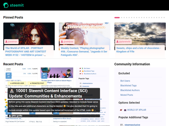
Main Trending Page
I've previously shared a suggestion for this:
Thought needs to be given as to what "contextual" information is beneficial in the left and right sidebars. Should "Announcements" have more prominence? What makes a "Useful Link"? Does anybody care about "Trending Communities" and should "My Friends", "My communities", etc. be tabs across the top - all freeing up valuable space for more content above the fold (yes, "the fold" is still a thing!)
Should "Hot" and "Promoted" be reintroduced into the dropdown?
A toggle to switch from "List" to "Grid" view allows the user to customise their experience.
Community Page
In the original proposal, I shared a suggestion for this:
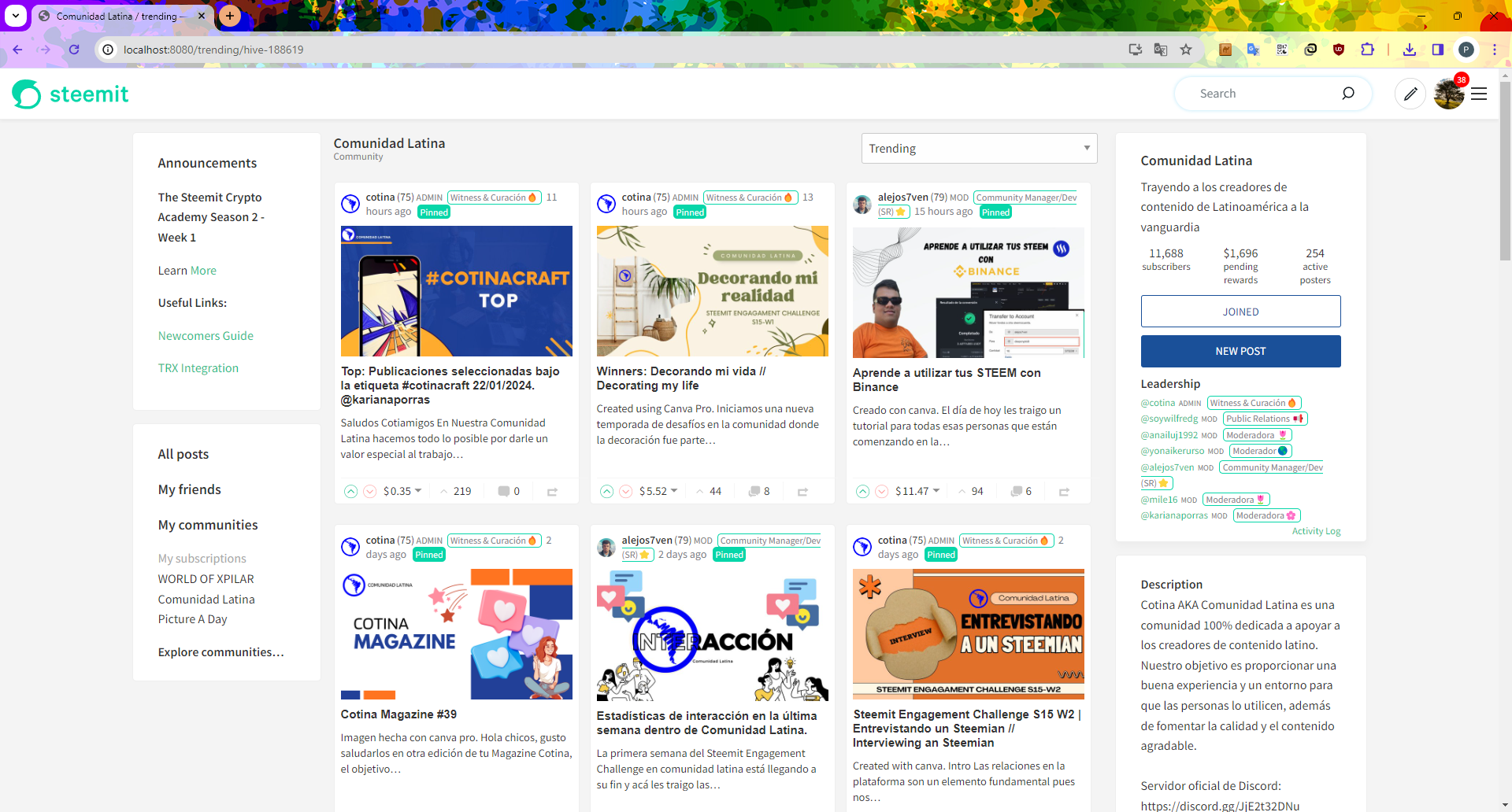
Same questions to the above as well as... Can we do something with "Pinned Posts" so that community admins who pin 100 of their own posts aren't penalising community members (similar to the carousel idea on my interface - a fixed sized area).
New Post
Include @faisilamin's community drop down. Could introduce "resizeable" areas so that the user can put the preview next to the editing area if they wish.
More prominence to things like "Advanced Settings" and "Markdown Styling Guide" (which I've only just noticed).
Contextual help, linked to the "More prominence" point - to help users get the most out of their posts. Could include some contextual FAQs - which could also be introduced as a concept across the site.
Replies and Comments
Could do more with the "Visited" state so that it's clearer which comments you've clicked on (rather than the subtle white to grey text change (I'm in dark mode)).
Notifications
Would be interesting if we can do more - I recently noticed the little iconography for each action - it could be interesting to split out "vote" notifications with "calls to action" - i.e. replies and mentions. Does the varying percentage colour on the background work? Is the green on green contrast bad? Is there a better way of displaying who's voted on your content with the bigger votes? The contrast on this mention on my notifications is ineligible:

Expanding Scope
Beyond this, I'd also like to consider initial landing pages - i.e. a better "shop window" upon visiting steemit.com for the first time as well as a better "starting point" for logged in users - A dashboard displaying recent activity. Any other ideas that arise on the journey (e.g. the Trending API).
Brain Dump
This is somewhat of a brain dump to give an idea of the scope of my thinking so won't be exhaustive of every page on the site. If you have any initial thoughts, I'd be interested in hearing them.
Please appreciate that I'm very busy at the moment responding to queries and messages (both on and off chain) so apologies if I'm slower to reply than usual.


the-gorilla's Alternative Steemit Interface
In case you didn't know, I've created an interface to help you find content that you're interested in more easily.
Posts by voting bot users, abusers and spam tags are hidden and you can search by multiple tags - allowing you to find the content that you're interested in more easily.
👉 Launch Alternative Steemit Interface 👈

the-gorilla's Club Status Tool
I've also created a tool to help users review their club status - showing them where their power's coming from, how much they're powering up, transferring out and who they share a wallet with amongst other things.
Please use it wisely.
👉 Launch Club Status Tool 👈