Having covered the changes made to existing files, this post documents the new code introduced to display the Primary Navigation.

Desktop
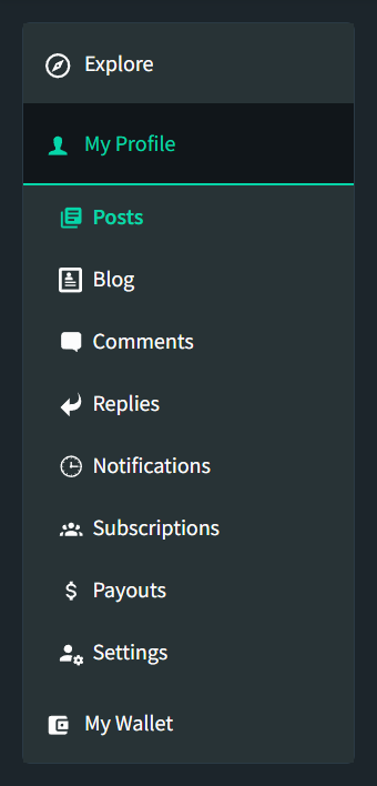
The Primary Navigation was designed to look, and function differently on mobile and desktop devices.
On Mobile, the Primary Tabs will always display at the bottom of the screen to be consistent with the Tabs on a Mobile Application. The sub-level items would appear directly above this, with the concept of "Thumb-Driven Design" at its core. When there are more than 5 sub-level items to display, the "most important" items are displayed with the remaining items appearing behind a "More..." option. This is discussed further in my Initial Mobile Implementation Post.
When the user scrolls down, the sub-level items will hide and reappear when the user scrolls up. This is consistent with the existing behaviour of the Masthead.
On Desktop, the navigation will appear on the left of the screen with the Top Level items always displayed - expanding to show their respective sub-level items when selected. As the user scrolls down, the menu will pin to the top of the screen. If the navigation is taller than the screen height, it will pin to the bottom. In the scenario that the navigation is taller than the screen height, as the user scrolls up again, the navigation will repin itself to the top (i.e. pins to the bottom when scrolling down and to the top when scrolling up).

Semantic Structure
Whilst the Primary Navigation is a single component, it can be split into chunks for ease of understanding.
Explore
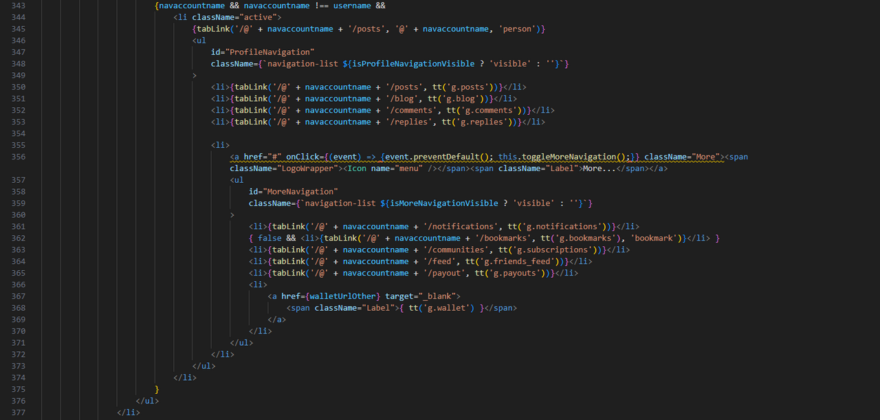
The "Explore" tab (identified as "FeedsNavigation" within the code) contains links to "All Posts", "My Friends", "My Subscriptions" as well as the links within another user's profile (identified as "OtherProfile" within the code).
The "All Posts", "My Friends" and "My Subscriptions" menu items will only appear when the user is logged in ("username" is truthy).
The "active" className is added when the "FeedsNavigation" or "OtherProfile" is visible, to highlight the tab. This className only changes the display properties. (The logic to explain when "isFeedsNavigationVisible" and "isOtherProfileVisible" will be explained later.)
The sub-level items are nested within their own unordered list, as is customary with a hierarchical list and are toggled via the ID "FeedsNavigation". The use of an ID allows the code to dynamically add and remove classes from that element (the logic will be explained later).
When the "My Subscriptions" link is selected, the "Topics" component is included which displays the user's subscribed communities.
The "tabLink" function is used throughout the primary_navigation for a consistent handling of links.
This function uses react-router's "Link" component to render links and Steemit's Icon component to display the icon. It also dynamically adds the 'active' class if the link being rendered is equal to the "navSection" variable (explained later).
It also calls the "clearMoreNavigation" function which sets the "MoreNavigation" menu to hidden on mobile devices (i.e. when a user navigates to a new page, if the "More..." menu is open, we don't want it to remain open on the new page).
Completing the "Explore" tab, we also have another user's profile.
This section displays when navaccountname is truthy and is different to the logged in user's username.
This section can only appear when it's "active" so the className is always added.
As mentioned earlier, on mobile devices, some navigation items are nested within an additional "More..." menu. This has been given the ID "MoreNavigation" so that its display can be targeted within the code. Clicking on "More..." calls the "toggleMoreNavigation" function and prevents the default action (an href to '#' which would jump the user to the top of the screen).
Since the displaying of the "More..." menu item is dependant upon screen width (i.e. on Desktop, it is always visible), the toggling of its visibility will only happen on smaller screens (snapwidth is defined in the state as 760px) with the state and visibility changing to be the opposite of what it was initially set to.
The "more" class on the "a" element is used within the CSS to hide this text on wider devices.
The "bookmarks" menu item has been included in the code, but set to false (i.e. it won't display) in preparation for @moecki's deployment of bookmarks functionality.
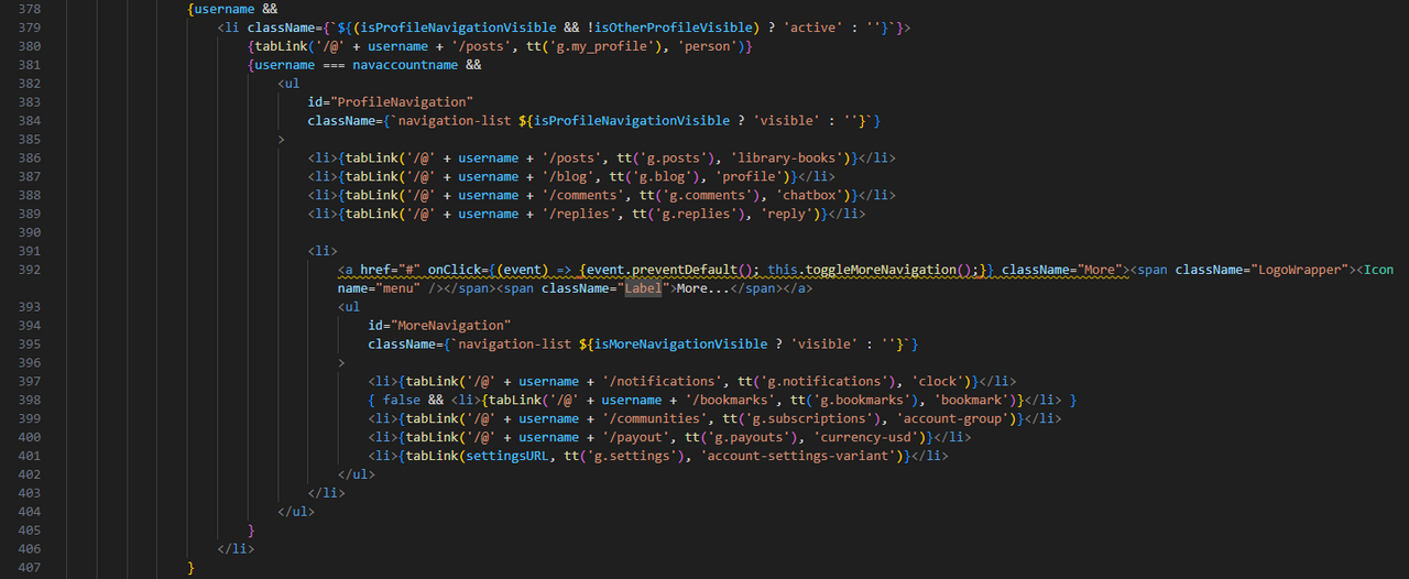
The only other thing to mention, is the use of another ID, "ProfileNavigation". As I'll discuss later, this ID is used to toggle the visibility within the code and is also the ID used when discussing the "My Profile" section. This ID can be repeated and the functionality used in both the logged in user and another user's profile due to the impossibility that both navigations being present concurrently.
My Profile
The "My Profile" logic works the same as the FeedsNavigation and other users' profile mentioned above.
It displays when the username equals the accountnavname (i.e. the account being viewed is the user who's logged in) with the only difference being the variable used in the links and the absence of a "Friends Feed" or "Wallet" (which appears as its own top-level menu item).
My Wallet
The final top-level menu item is "My Wallet" which has no sub-level items and opens a new window to their wallet.
Logged Out
The above outlines the menu items when the user is logged in (i.e. username is truthy), with only the "Explore" item displaying so when the user is not logged in, the "My Profile" and "My Wallet" items still need to appear, but render the "Login" overlay, as it would do if you try to write a new post when logged out.
The showLogin function calls the showLogin action from the Redux UserReducer, replicating the aforementioned functionality.
render()
The above is nearly all of the logic contained within the render() function, other than the constants and variables defined as well as the Return logic.
Constants and Variables
The majority of the variables are retrieved from the existing page properties.
All of which are self-explanatory.
The constants defined in the state are explained later.
Return
The code returned is simply a navigation div (the appNavigation ID will be explained later), wrapping a 'nav' element with another div inside, containing the primary_navigation output.
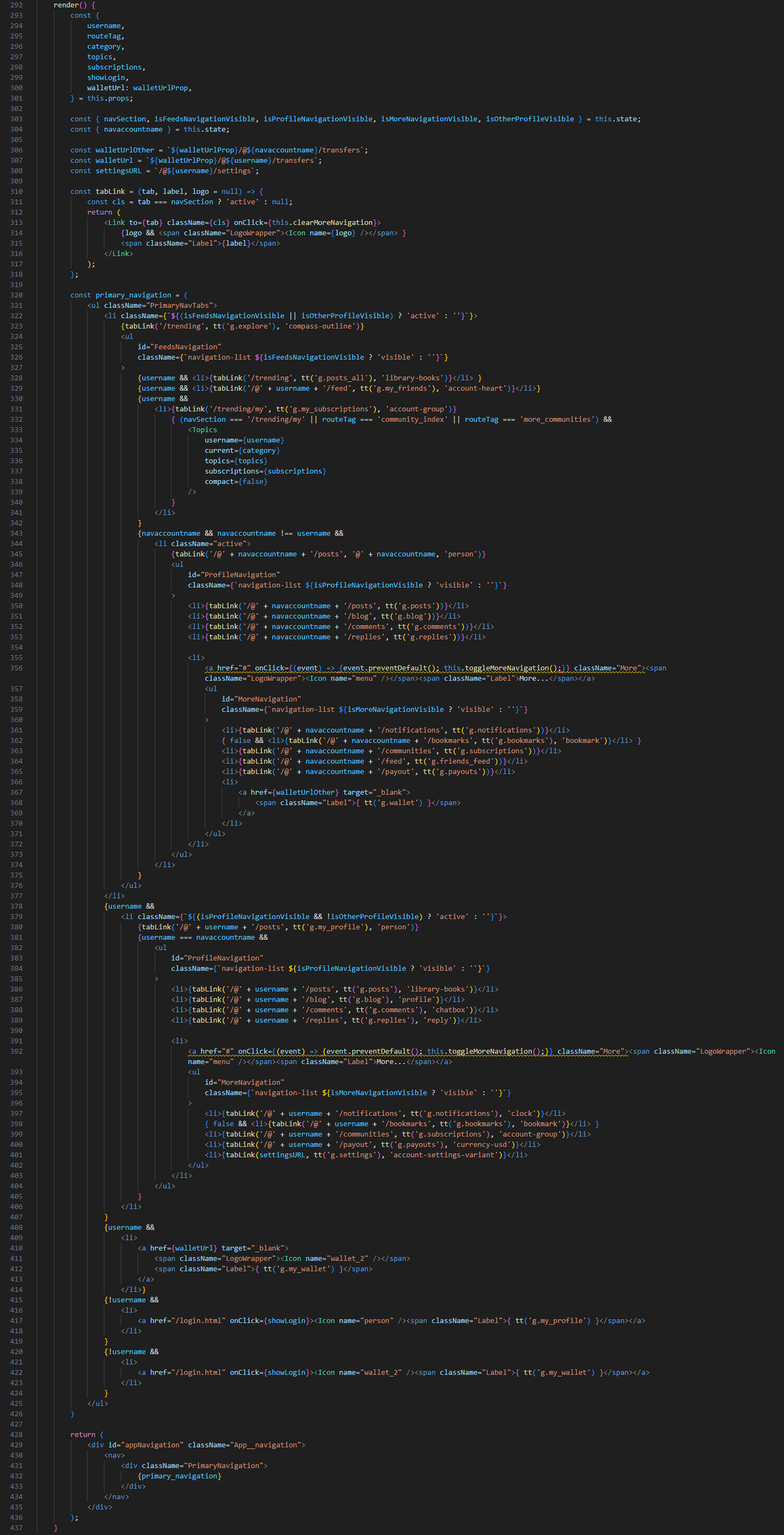
Complete render() Method

Display Logic
As alluded to above, the display logic is based around 5 key variables - isFeedsNavigationVisible, isProfileNavigationVisible, isOtherProfileVisible (these 3 identify the "tab" the user's in), isMoreNavigationVisible (to identify if "More..." is open) and navaccountname (to identify if it's the user or another account being viewed). These are supported by another variable, "navSection" (also referred to as "section") so that the screen knows which is the active tab.
The state of each of these variables is all controlled through a function called "renderVisible()".
In order to calculate what these variables are, it uses the routeTag that is passed to this component from its parent component, the username and the pathname taken from the app state.
As mentioned above, the screenWidth is also used to differentiate between device sizes.
We also set the visibility of each element to 'false' in order to simplify the logic (i.e. if each condition sets a value to true and others to false, it's more difficult to read and understand than setting all to false and then highlighting the true values).
One challenge that I faced throughout, was deciding which navigation item to highlight when the user is viewing a post, since there are multiple "homes" for a post's location. The decision was taken to highlight the post's referring page and the most reliable way to implement this so that the "knowledge" persisted through a page refresh was to use the user's Local Storage. This is the same solution as used in the "Drafts" functionality.
This localStorage is all handled within the PrimaryNavigation component.
If the user is viewing a post, the 'prevoiusUrl' is retrieved from localStorage and if the user is elsewhere, the 'previousUrl' is saved to localStorage (if it differs from what's currently stored). If the localStorage URL is retrieved, then this value is used to set the navigation display / highlighting, otherwise, the App's pathname is used (set in the variable navUrl). This allows me to use the same display logic for both scenarios.
Once navUrl is set, we split it into its component parts which are used as the conditions to set our key variables.
Conditions
The first 2 conditions apply when the logged in user's username appears within the URL. This happens when they are viewing their own profile (My Profile) or viewing their friend's feed (Explore > My Friends).
Since there are many sub-sections within "My Profile", by querying the "Feeds" URL first, we can simplify the "My Profile" logic, taking the 2nd navUrl component to set the highlighted section. The only difference in the key variables between these 2 is that "My Friends" appears within "Explore" (isFeedsNavigationVisible) and "Profile" pages appear within "My Profile" (isProfileNavigationVisible).
It's also possible to navigation to a user profile with a blank 2nd component (e.g. @the-gorilla) which the App defaults to '/blog' (it took to long to identify where this was happening and change it to '/posts').
Whilst a similar top-level logic applies to another user's Profile, the key values differ which also need to cater for Desktop v. Mobile devices.
In both cases, we want "isOtherProfileVisible" to be true and for the Profile navigation to be visible (isProfileNavigationVisible). Since we want the "Explore" menu item to be open on Desktop devices, we also want "isFeedsNavigationVisible" to be true (if isSnapWidth).
The render() logic shared above uses the value in "isOtherProfileVisible" to know which tab to apply the "active" class to.
This logic covers the majority of scenarios leaving the "subscriptions" / "communities" logic.
When the user has selected "My Subscriptions", or are viewing another community, then the "My Subscriptions" tab is active, regardless of whether it's a community they're subscribed to or not.
The final state is a default state of "Explore" so that the user is always "somewhere".
Update the Screen and State
Once the variables have been defined, they need to update the screen display (via a function called "setNavigationVisibility") and store the variables in the state so that they're accessible to the render() method above.
setNavigationVisibility(navigationId, isVisible)
setNavigationVisibility is a simple function that takes 2 arguments, the ID that needs its visibility set and whether it should be displayed (true) or not (false).

Event Handlers
The display and interaction of the navigation is heavily reliant upon the document window state. If the user narrows their screen, we want to switch from left to bottom navigation and vice versa. If the user scrolls up or down, we want the navigation's visibility and positioning to adjust depending upon their device and action.
To achieve this, "scroll" and "resize" event listeners have been added to the componentDidMount method which are removed when the component is Unmounted.
Within the componentDidMount method, we also retrieve the scroll position (window.scrollY) and screen width (window.innerWidth) as well as setting the snapWidth to 760px wide and the initial position of our navigation (appNavigation.offsetTop) (the reason for this is explained later).
Default Constructor Values
So that there aren't any "variable is undefined" or similar warnings before the "window" is available to the app, some default values are stored in the constructor to be overridden by the component.
Screen Resize Event
The handleResize is a simple function called by the "resize" even listener. This function updates the state with the new screen width, removes the "More..." menu from being displayed (if it is active) and then calls the renderVisible() logic to update the screen.
Scroll Event
The handleScroll function is called by the "scroll" even listener and it's functionality relies upon the screen width.
The current scroll position is accessed by the window.scrollY attribute and the previous scroll position is stored at the end of this function.
Narrow Screens (i.e. Mobile)
When the user scrolls, the "More..." menu should collapse (updating the visibility and state of isMoreNavigationVisible).
When the user scrolls down, we want the secondary navigation to be hidden ("FeedsNavigation" and "ProfileNavigation") and when the user scrolls up, we want the relevant secondary navigation to be visible again. Since this is showing / hiding elements, the state is not updated.
Wide Screens (i.e. Desktop)
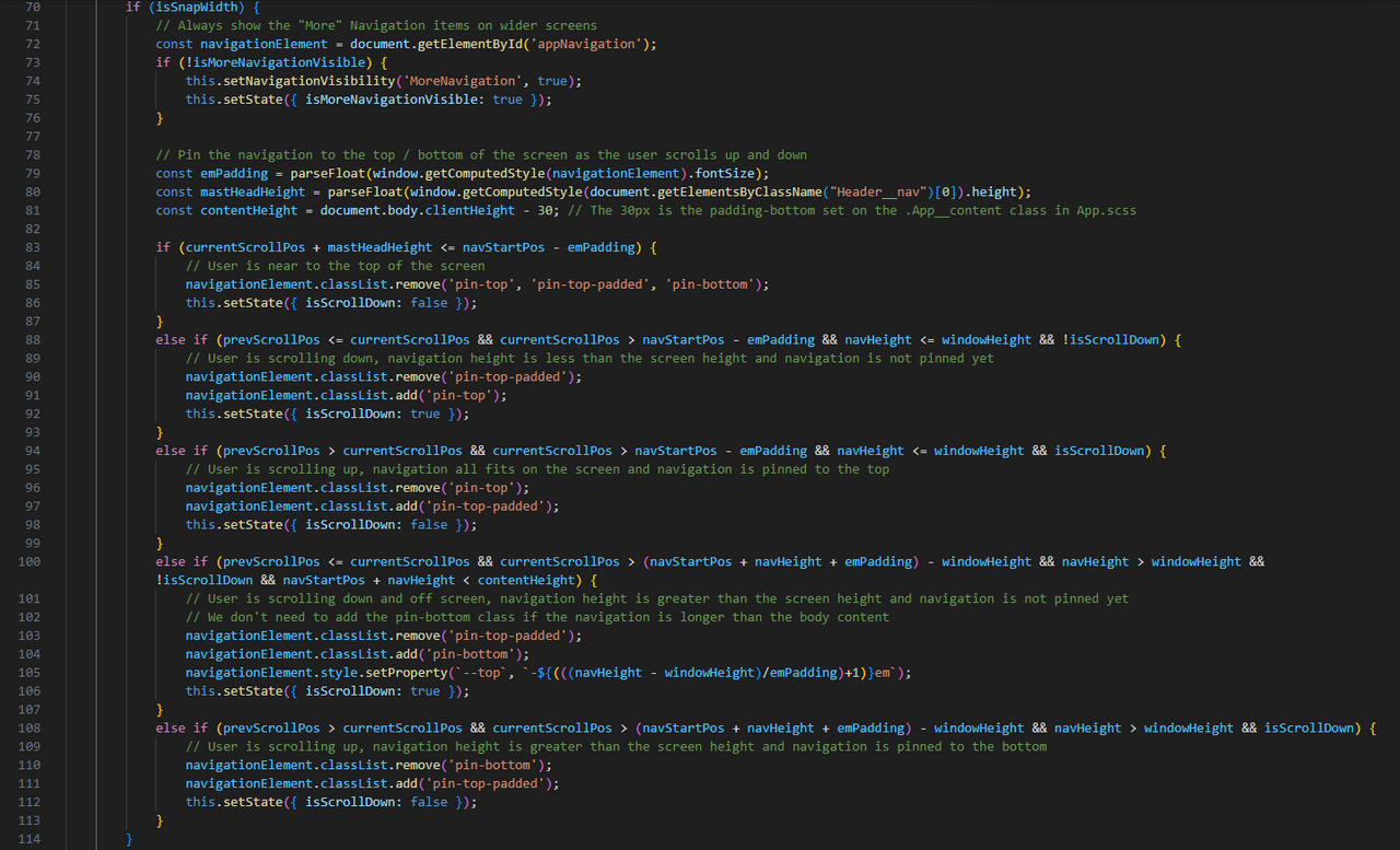
When the user scrolls down, the navigation should pin to the top of the left column unless the navigation is taller than the screen height in which case it should pin to the bottom. Whilst pinning to the bottom would be achieved through a CSS style of "bottom: 0" and pinning through the top with "top: 0", this would result in the navigation "jerking" from top to bottom instead of with a smooth transition. To get a smooth transition, only "top" or "bottom" can be used so additional calculations are required to get the navigation height and position which is passed to the CSS file (through the variable --top).
The maths behind this took a lot of effort to figure out so I'll probably find it difficult to explain!
Since the display is working in pixels and most of the CSS spacing is defined as 'em', I needed the value of 1em in pixels.
const emPadding = parseFloat(window.getComputedStyle(navigationElement).fontSize);
I also needed the starting position of the navigation (navStartPos mentioned above):
document.getElementById('appNavigation').offsetTop,
and the height of the navigation:
const navHeight = document.getElementById('appNavigation').offsetHeight;
In addition to this, I need to know the height of the body content:
const contentHeight = document.body.clientHeight - 30; // The 30px is the padding-bottom set on the .App__content class in App.scss
and the height of the masthead so that when the user is scrolling up, the navigation doesn't display behind (or on top of) it.
const mastHeadHeight = parseFloat(window.getComputedStyle(document.getElementsByClassName("Header__nav")[0]).height);
Based upon these elements, there are 5 scenarios:
- The scroll position is above the navigation (i.e. at the top of the screen) (unpin).
- The user is scrolling down, the navigation is shorter than the screen height (pin to top / remove padding for masthead).
- The user is scrolling up, the navigation is shorter than the screen height (add padding for masthead).
- The user is scrolling down, the navigation is taller than the screen height (pin to bottom).
- The user is scrolling up, the navigation is taller than the screen height (pin to top).

componentDidUpdate
The only other part of the component that I haven't mentioned is that if the pathname changes, the navigation should update.

CSS
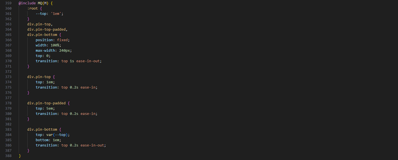
It would be difficult to document every line of CSS so forgive me for not doing so. The key principle followed was that of a mobile-first design and the stylesheet reflects that. Each style is defined for mobile first and if Desktop requires changes, these are overridden using existing Mixin properties. In addition to this, where colours are used, themify is used to load the appropriate theme.
An example of each of these principles in action can be seen below:

Hopefully this all makes sense. I'll include a URL to this post within the component as a reference for future developers so if anything is unclear or requires additional explanation, please leave a comment and I'll reply / update this post accordingly.


