When I initially wrote about navigation 3 weeks ago, I expected a relatively quick implementation that involved duplicating the existing design from the Profile area into the Feeds area, as well as introducing a more intuitive link between the 2 different areas of the site.
As you already know, this led to some critical feedback that redirected me to a different path and a completely new implementation.
As expected, this also led to varying options and opinions upon how the design could be delivered, in particular with regards to mobile devices. This then led to some intensive research into Mobile Design Patterns and a preferred way forward - with visibility being the core concept in the deliverable.
Knowing that the Profile section has too many sub-sections to have every option visible (8), I asked you for your opinions on which sub-sections are most important to you.
So this post brings us to the output of that work, an initial progress report for its implementation, some issues encountered that need resolving as well as the opportunity for you to take part in testing the mobile version of the site.
Sub-section Priority
| Sub-section | Average | Median |
|---|---|---|
| Posts | 1.3 | 1 |
| Blog | 3.3 | 2 |
| Notifications | 3.4 | 3 |
| Replies | 3.6 | 4 |
| Comments | 3.8 | 3.5 |
| Communities | 6.1 | 6 |
| Payout | 6.9 | 7 |
| Settings | 7 | 7 |
Posts was by far the "go-to" sub-section within a users' profile with Communities/Subscriptions, Payouts and Settings the lowest ranked.
There wasn't much to separate Blog, Comments, Replies and Notifications.
There's an intuitive link between Blog, Posts, Comments and Replies that makes me believe that there should be a "grouping" of these elements - i.e. put them next to each other and not separate them by putting Notifications inbetween. There's also the consideration that the Avatar displays the "Notifications Badge" which smartphone users are familiar with as an indication that there's "unread messages" (or similar) that require attention - increasing the likelihood that "Notifications" will be noticed via this route. With this in mind, I've ordered the sub-sections as follows;
- Blog - User + Resteemed Generated Content
- Posts - User Generated Content
- Comments - User Generated Content
- Replies - Generated in reply to User Generated Content
- Notifications - Of User and Tagged Content
- Subscriptions - User Generated List
- Payout - Repetition of User Generated Content
- Settings - User
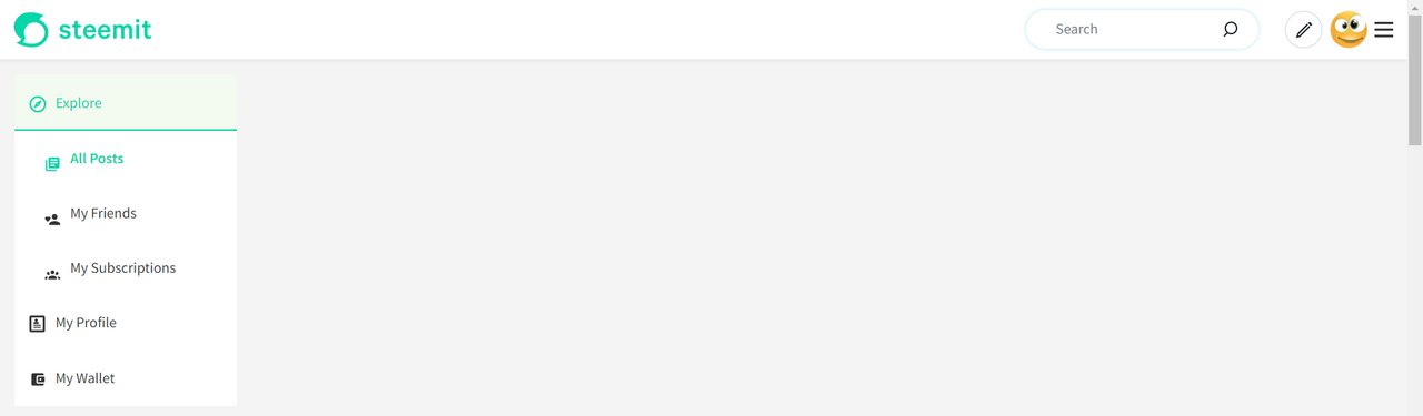
Mobile Implementation
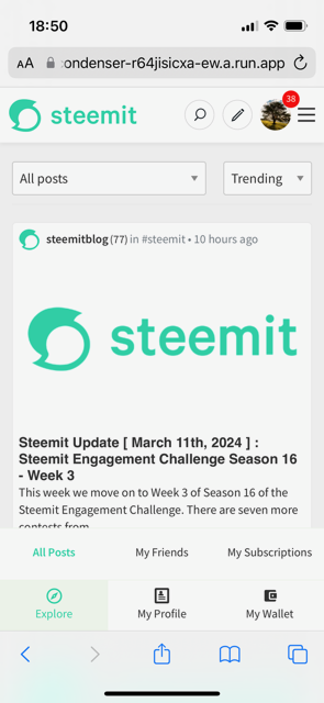
This information allowed me to implement a "Visibility" driven, "Thumb-first" design for mobile devices.
The Primary Tabs are always visible and will not change as you navigate through the site (other than to highlight the section that you're in). If you're not logged in and select "My Profile", you'll be prompted to log in.
The implementation of this is consistent with sites like Twitter, as well as the majority of native iPhone apps.
Diverting slightly from the secondary tabs being at the top of the page, I experimented with them being closer to the Primary Tabs and was surprised by how intuitive the result felt.
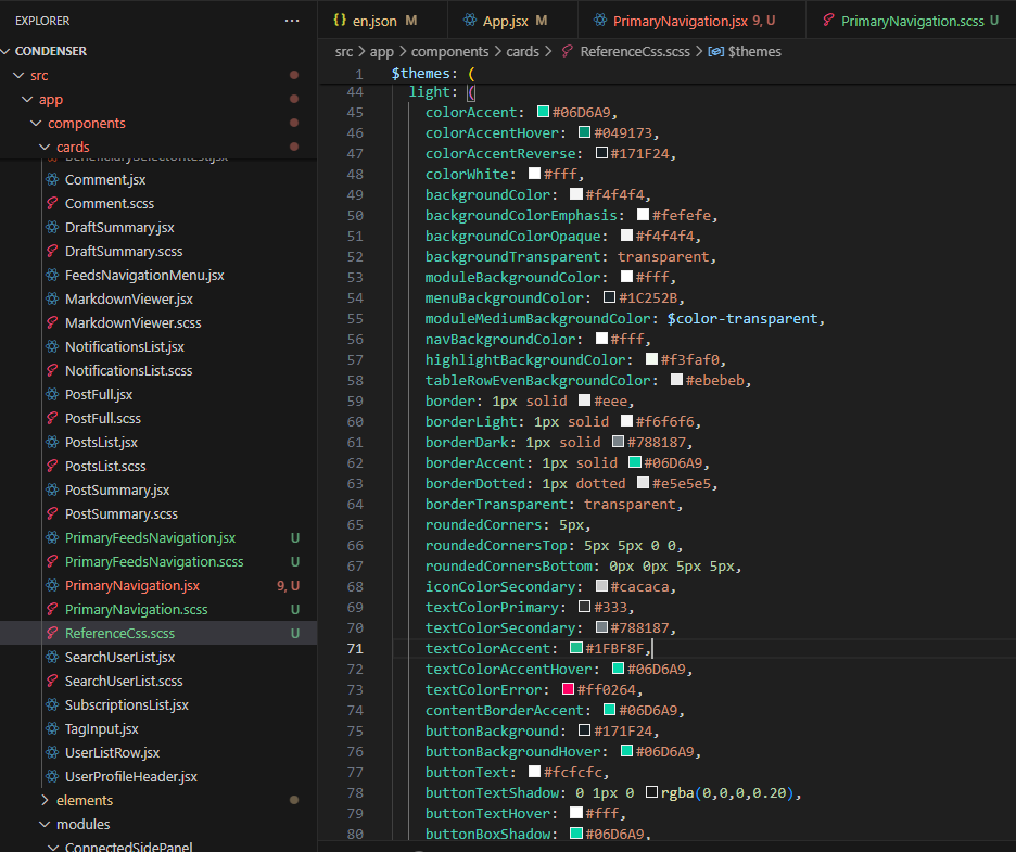
Whilst it would be fun to rebrand Steemit, I used their existing colour pallette and chose appropriate colours for the design (I created a "Reference" CSS file to make this easier).
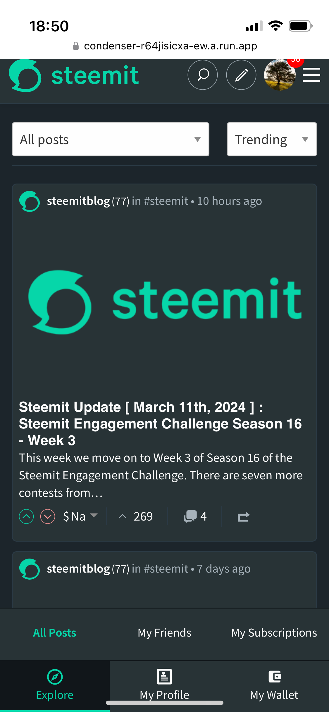
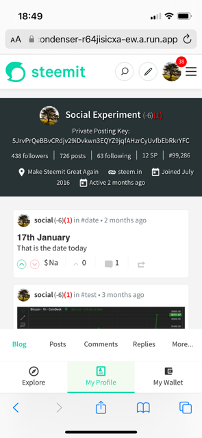
As you'll see from the Profile implementation, there's room for 4 sub-sections and the "More..." option which is why I grouped the 4 visible options as mentioned earlier. The use of "More..." (rather than a Horizontal scroll that is often used) is consistent with the "Visibility" that I've prioritised. Selecting "More..." opens an additional menu with the remaining options.
As the user scrolls down the page, consistent with the hiding of the Header bar, the secondary navigation also hides until the user chooses to scroll up again or navigates to another page.

The expected smooth transitions of menus changing, showing, hiding, etc. have also been implemented.
Testing
If you'd like to test out the new interface on your mobile device, please contact me on Discord - hopefully the you can find me via the revamped usernames but please reply if not (thegorilla). I'm limiting the testing which is why I'm not inviting everybody.
Desktop
Whilst I've been working to a mobile-first-thumb-friendly-visibility-driven design, I've also implemented a first phase of this for desktop users.
The implementation displays icons from screen widths of 760 pixels or greater and anything smaller picks up the mobile version (the 760px snapping point is easy to update).
Amongst all of the various challenges that I've met along the way and not spoken about, the desktop has presented even more.
I want the solution that I implement to change the layout purely within the CSS and not have a "show for desktop" / "show for mobile" in the components. This has worked well so far but whilst I wanted the Navigation component to sit within the "App.jsx" (the parent display file), the way that the rest of the page is compiled (specifically the User Profile Display) probably means that I'll need to implement the Navigation Component within Lower level components (i.e. within the Pages). Not impossible but certainly not as clean as I would have initially liked.
This is something I'll continue to look at in the coming days.

Please let me know what you think and also ping me on Discord if you'd like first sight of the Mobile Version.