In his latest update, @the-gorilla called out:
Please let me know what you think and also ping me on Discord if you'd like first sight of the Mobile Version.
So I didn't hesitate to reach out to @the-gorilla to test the Mobile Version. I originally planned to write a review exclusively for him in Discord, but then I decided to post it here so that maybe more people would be interested.
It is worth noting that during testing I used an extremely old mobile phone, on which Android has not been updated for a long time due to the fact that it is no longer supported. But that didn't stop me from successfully being one of the first to see the Mobile Version 😛.
Login
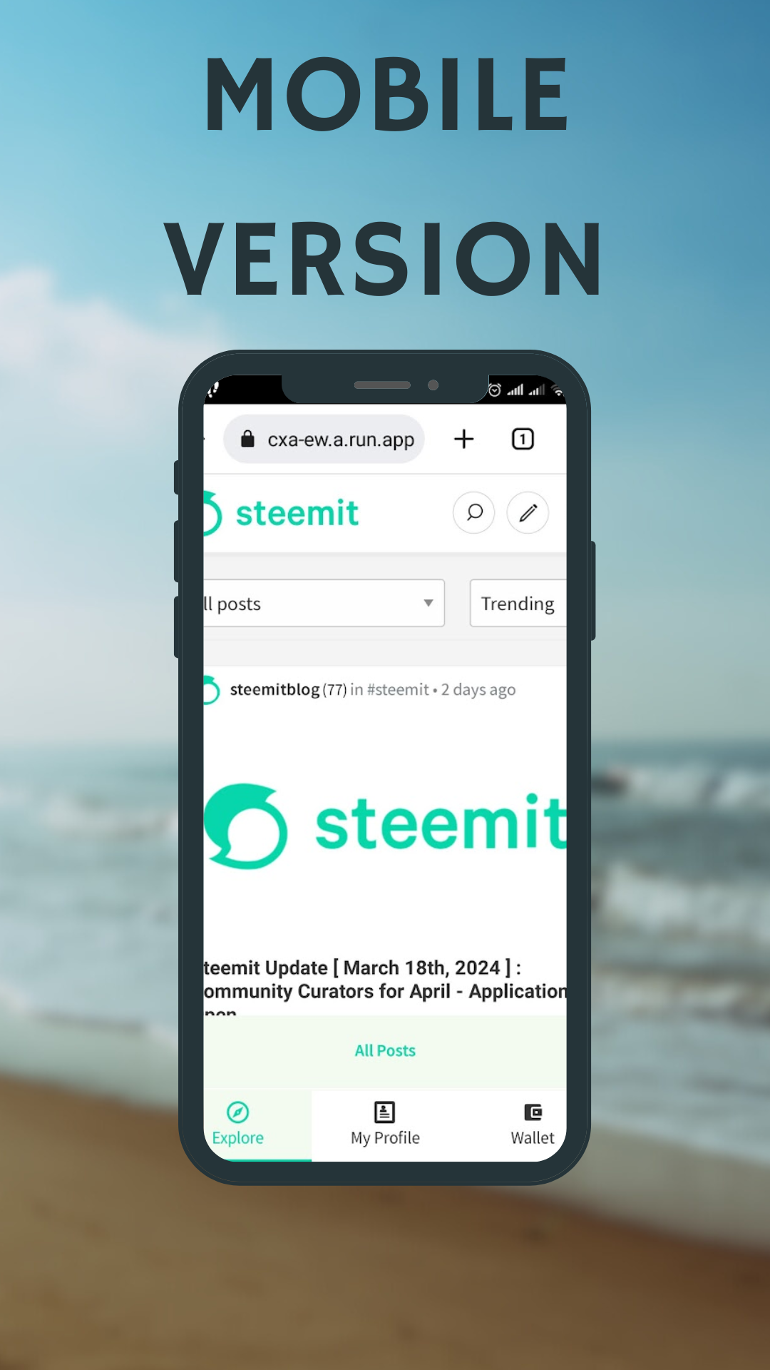
So the first thing I saw when I followed the link @the-gorilla gave me was this:

At the bottom of the screenshot you can see the updated navigation, which is intuitive. Since I'm not really interested in the All Posts section, I immediately went to my profile. The login page has opened:

However, when I entered my details, the login button never became active:

I reported this to @the-gorilla and after a while he figured out that you can log in using the hamburger menu.

With this method, I successfully logged into my profile. And @the-gorilla will have to work on the problem of the login page.
After Logging In
After entering your credentials, you will be taken to the My Subscriptions page.

I didn't notice it at first, but when I started scrolling through the posts feed, I saw the full version of the bottom navigation, which looks like this:

So, as you can see, we have three navigation points:
- Explore
- My Profile
- My Wallet
and two of those items have sub-items.
Explore
The Explore navigation item has three sub-items:
- All Posts
- My Friends
- My Subscriptions
Personally, I don't use the All Posts and My Subscriptions pages, so I immediately went to My Friends. Here I saw the usual feed of subscriptions, which I use the most. It is interesting that in order to increase the free space, the All Posts, My Friends and My Subscriptions buttons were hidden:

My Profile
Let's go to the My Profile section. Here, the navigation is organized as follows - the most popular buttons appear at the bottom:
- Blog
- Posts
- Comments
- Replies

You can find the rest under the More button.

Some Conclusions
I think it's no secret that the mobile version of any site is now more important than the desktop version. Most people read and curate from their mobile devices, and some even write posts. Therefore, the convenience of the mobile version plays an extremely important role.
Is it possible to work from mobile in Steemit now? Yes of course. Am I more comfortable with the changes made by @the-gorilla? Certainly! With the new navigation, all the most needed elements are, so to speak, at hand. The addition of icons made the panel more intuitive, and the new design resonates more with modern mobile pages of other sites.
Personally, I liked the new navigation and I did not find any shortcomings that I could talk about here. So my feedback isn't very helpful to @the-gorilla. However, that's why I posted this, to encourage you to test the Mobile Version yourself and give your opinion. To do so, contact @the-gorilla on Discord.
And the last thing I wanted to say. I am a bit alarmed by the silence of the Steemit team regarding this project. I don't think they support it. There are probably reasons for this. I would not like all this work to be in vain. In any case, if this project is not destined to be completed, I believe that changes to the navigation in the mobile version should be made. Even now.