It is really enjoyable to read so many quality posts on Steemit everyday. It is neat, clean and stylish.
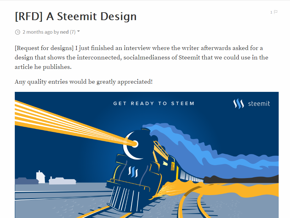
Even a simplest post with a nice picture may look very comfortable. Like this one, borrowing from @ned 's 2 months ago (link):

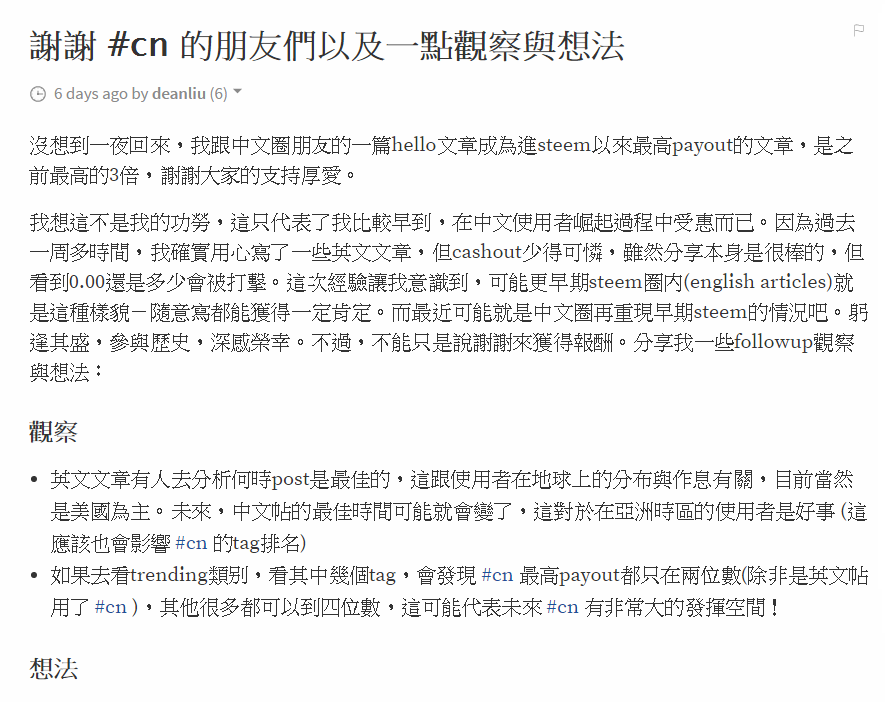
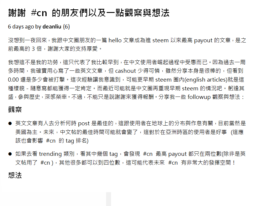
However, it not so when we encounter posts in Chinese (simplified or traditional). See the following example (select one with only words as pic doesn't matter): Top: my hello post to the #cn community in Chinese; Down: I use Word to re-edit the left one.


What do you think?
Personally I think the original one is really reader-unfriendly. And the second one is, after my not-at-all-professional 5-min editing, obviously better. I think my fellow Chinese friends here would agree with me (the case with simplified Chinese might be a little bit worse, but I am not 100% sure).
Maybe English readers can't really tell, but I assure you that there is definitely room for improvement. I have also checked posts in Japanese and Korean, but I think they are alright aesthetically.
So far, I think the only obvious problem right now is in Chinese posts. Users in any other languages are welcome to comment as well.
Why is this important?
With good graphical design, good posts become great posts. I have read so many English posts that are on par with many quality online articles, in terms of content as well as art design.
If we are to embrace users from all over the planet. Except for translation (see my post here: Translation and how we tackle it affects the future scenario of steemit.), we have to consider the aesthetic factor - the design of post editor, so that online personal publishing will become possible for EVERYONE in every languages. After all, human beings are visual creatures, even more so for potential Steemians.
