The deadline for submitting my logo entry is Sunday, August 13 at 6 pm EST. I submitted mine at past 5pm EST, and I'm just making this post! Had delays because of the requirements set by Ace, but all is good - he suggested I download a free trial of Photoshop and it saved my life. I missed using that wonderful tool. I will really have to have my good old laptop fixed. (Trial expires after 6 days, I'm gonna make the most out of it!)
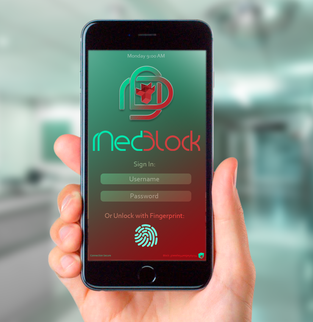
Preview of Design in a Mobile App
Requirements for the MedBlock logo contest:
Logo Type: Vector based logo, 300 dpi
Theme: A decentralized electronic health record (EHR) system on the blockchain. Or you can also think of illustrating MedBlock as "Medicine on the Blockchain."
Format: .ai or .psd file that must be emailed to journeyoface@gmail.com.
Create a new post entitled “MedBlock Logo Contest Entry" and include your logo entry and your BitShares account name.
Use the following tags when creating your post so that I can find your entry: medblock, medblocklogo, art, contest, steemgigs.
Email your logo file(s) to journeyoface@gmail.com and submit your logo entry post BEFORE August 13 at 6:00 pm EST.
MedBlock
A Logo's Journey
Logo Type: Vector based logo, 300 dpi
Theme: A decentralized electronic health record (EHR) system on the blockchain. Or you can also think of illustrating MedBlock as "Medicine on the Blockchain."
Format: .ai or .psd file that must be emailed to journeyoface@gmail.com.
Create a new post entitled “MedBlock Logo Contest Entry" and include your logo entry and your BitShares account name.
Use the following tags when creating your post so that I can find your entry: medblock, medblocklogo, art, contest, steemgigs.
Email your logo file(s) to journeyoface@gmail.com and submit your logo entry post BEFORE August 13 at 6:00 pm EST.
A Logo's Journey
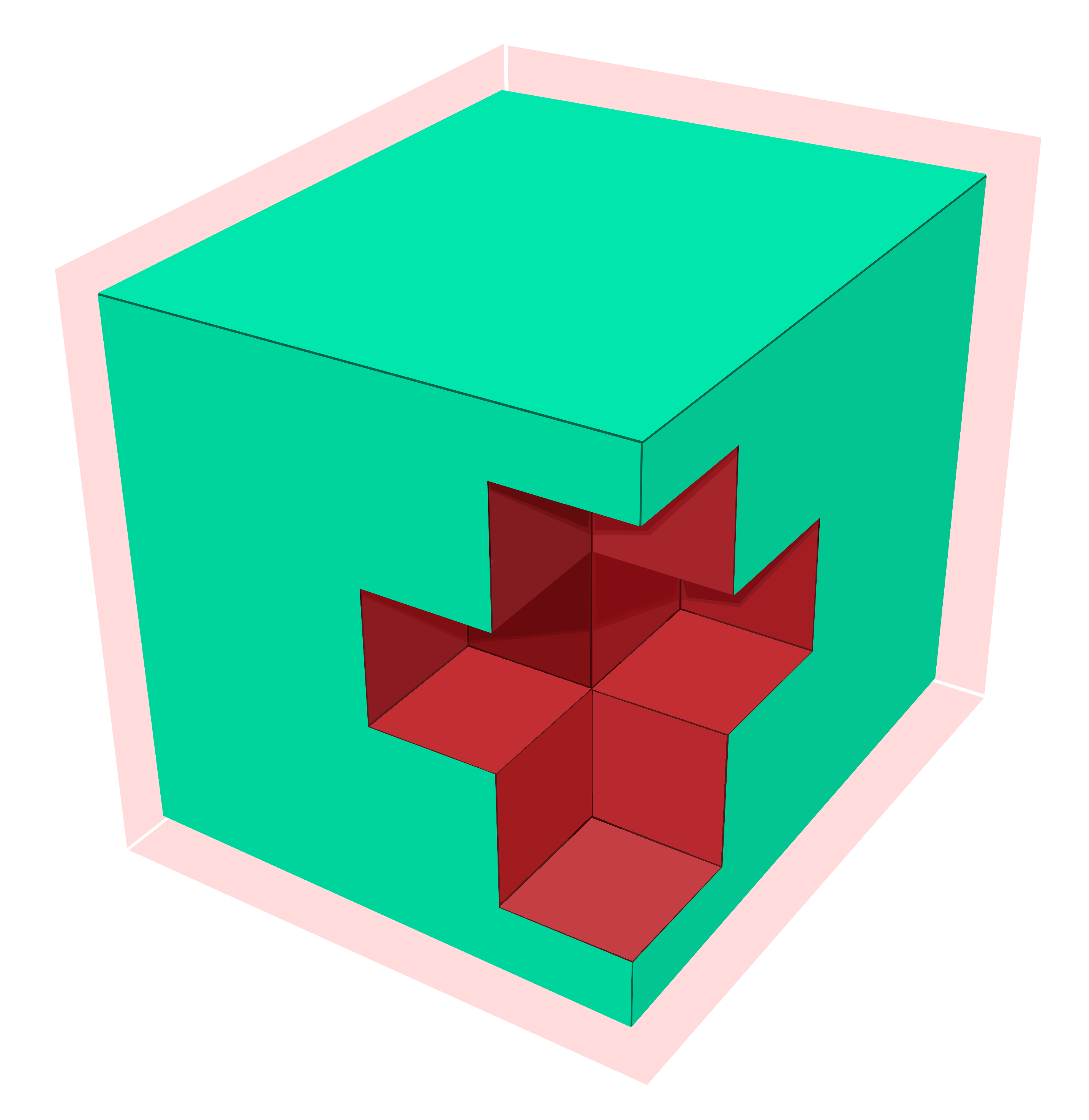
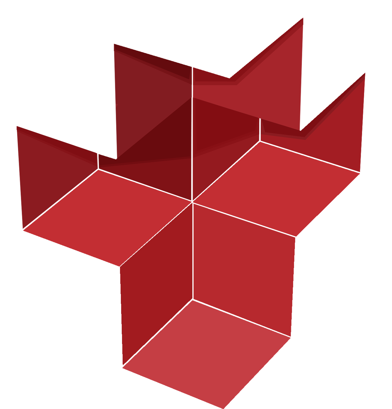
This was actually very hard - I've started thinking of how their logo would look like as soon as their project launched - they even haven't announced that there will be a contest for it. I was thinking of a cube - a block. And a cross - for Med'icine. So I started doing things with Photoshop 'the hard way'. I forgot how to use this little baby - I'm not even sure I'm meeting the guidelines set by their team, but I continued anyway. I had fun making this yesterday. Here's how I started working on it:
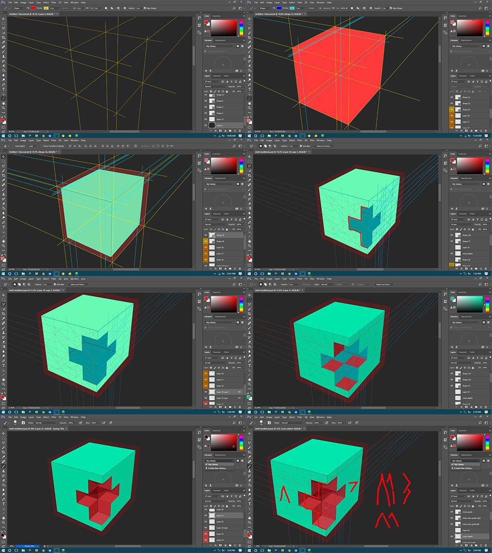
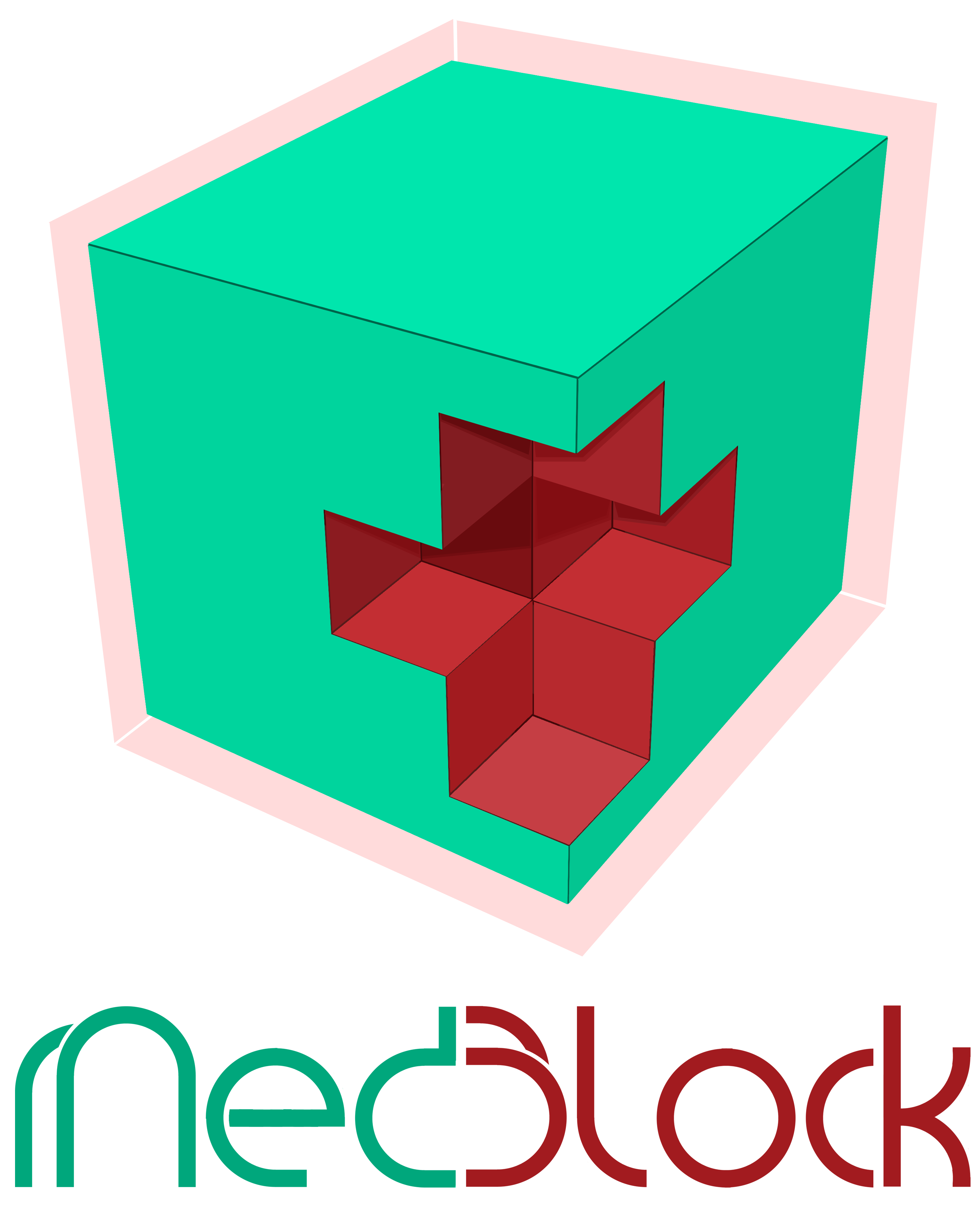
I made the cube! - I don't know how t use 3D in PS, so slash that! I did drafting back in high school and college and so I had to make tons of lines to get things right. This was already the 2nd draft - the first one lacked a few fundamentals so the cube wasn't physically possible to exist cause its perspective was all wrong!
There you have my cube - the base of my logo submission - it's pretty simple - I tried thinking of adding a few more elements to it - but in the end I kept it that way.
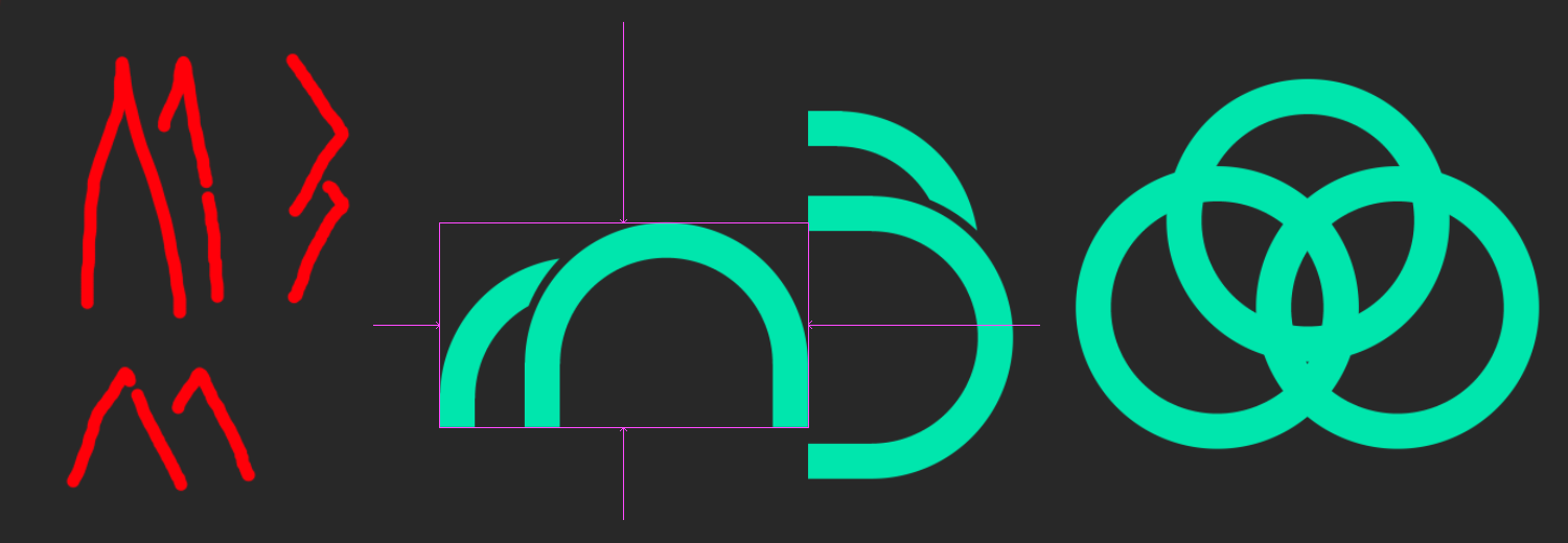
I had to make a MedBlock name/typeface from scratch too - just looking for existing and random fonts over the web isn't worth the prize of 900 Beyond Bits. Above is the draft
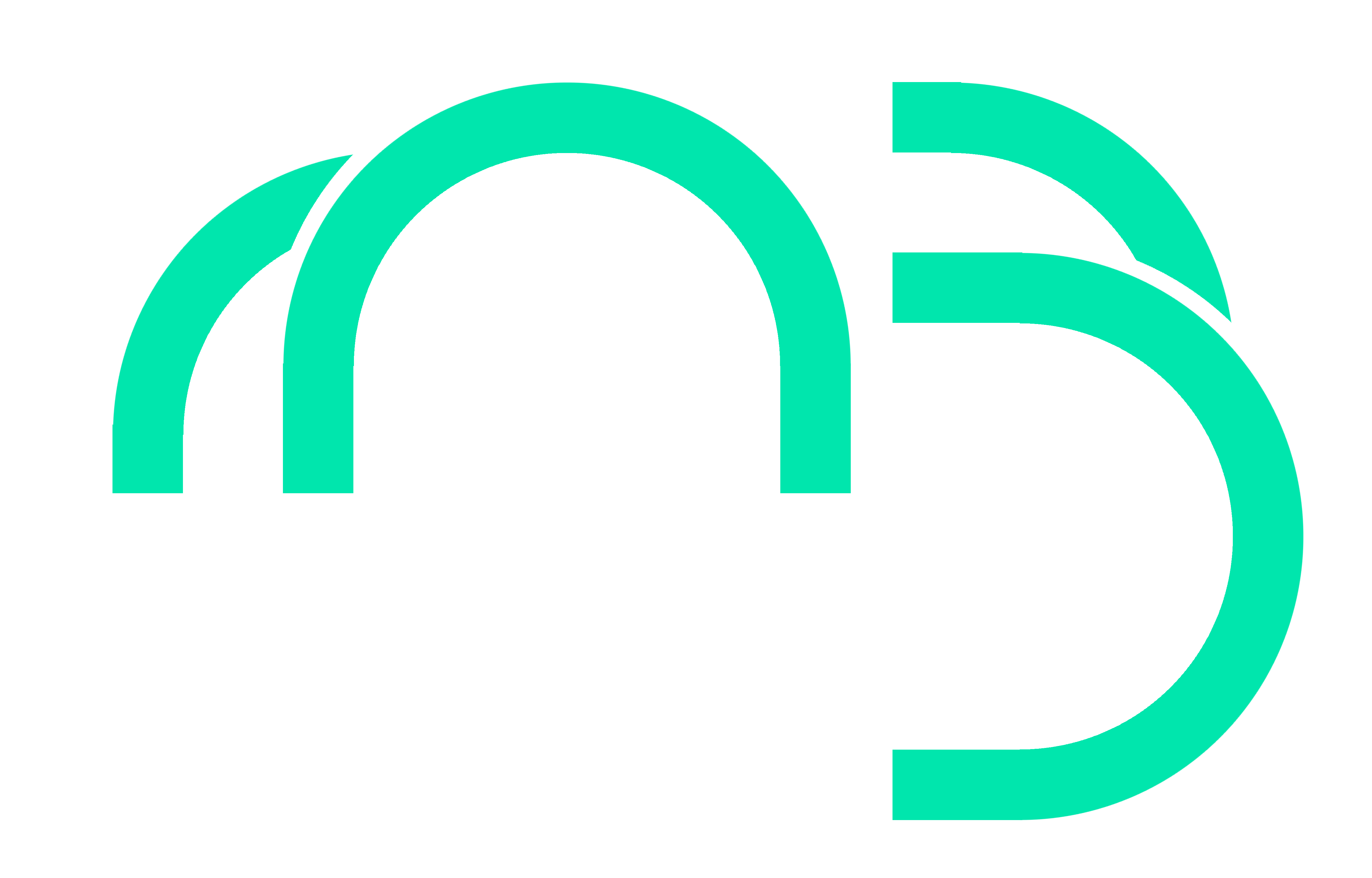
The M and the B are basically from the same image - altered a bit to make them recognizable.
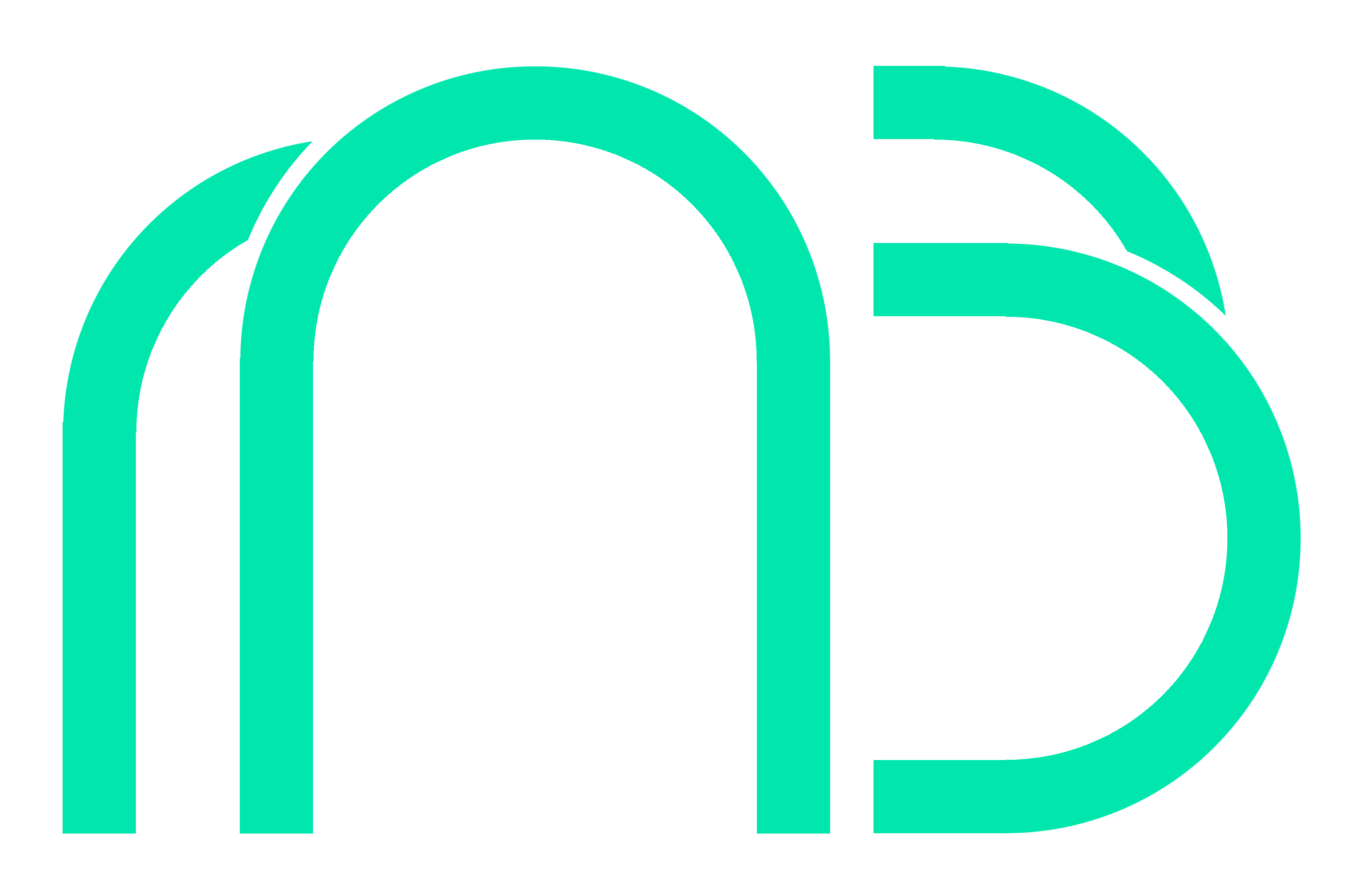
This became the basis of the typeface of MedBlock's name. I edited the same layer until I completed all the letters in 'MedBlock'

Here's what the final 'MedBlock' name looks like.
As you've seen earlier there was an image that's 3 circles fused - That's the secondary logo for MedBlock - it's the base for the M and the B in it being fused. Which looked like this in the start:
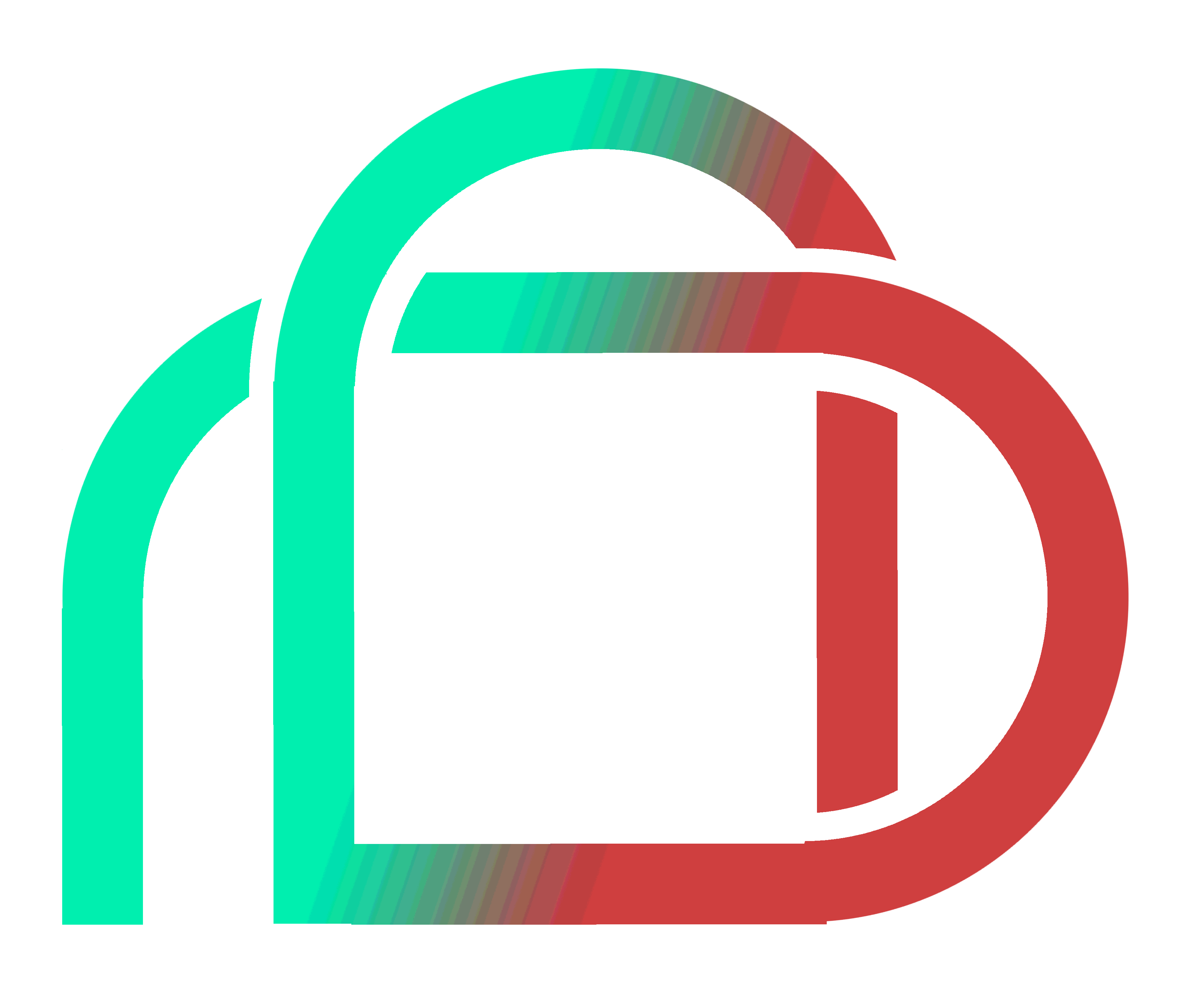
After some alters, I decided to make it more symmetrical like this:
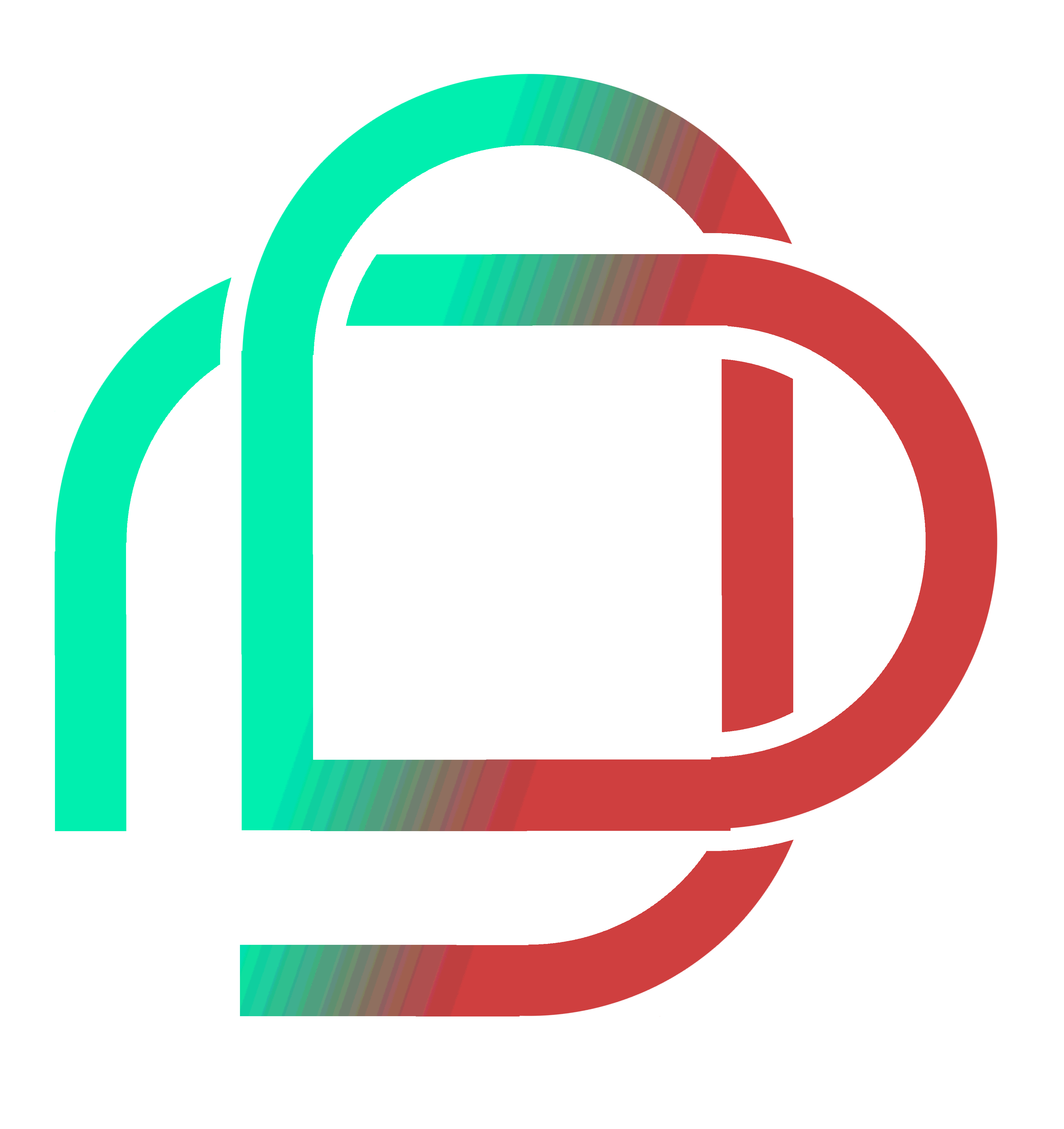
Those are the bases of my logo submission.
Making the Actual Logo
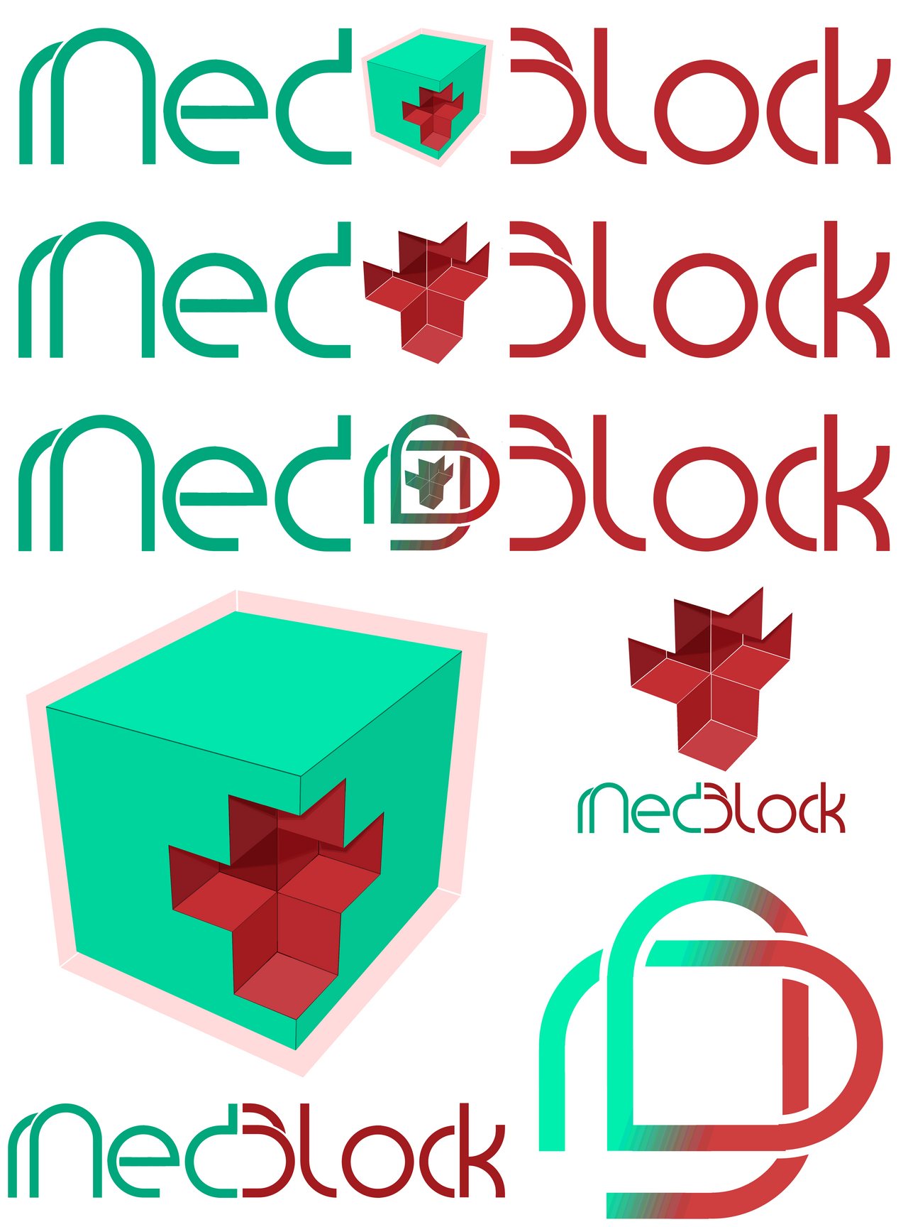
After getting all the base, namely: The Cube, The Name, The M-B Fusion, I started crafting my final logo.
The base images:


Here's the Variety of Logos I made from them:
They can have a white background, a dark one, and can be changed to be more colorful:

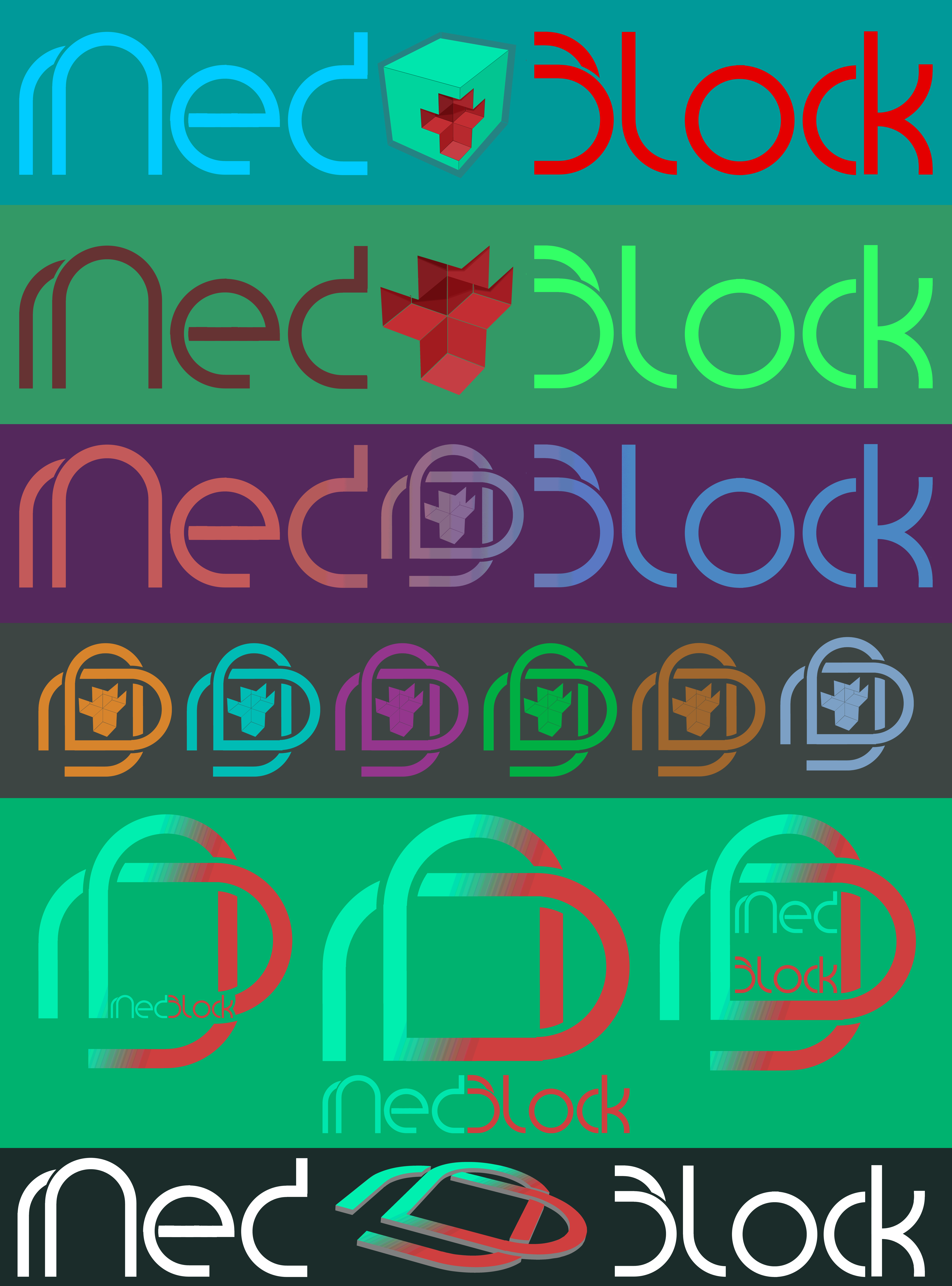
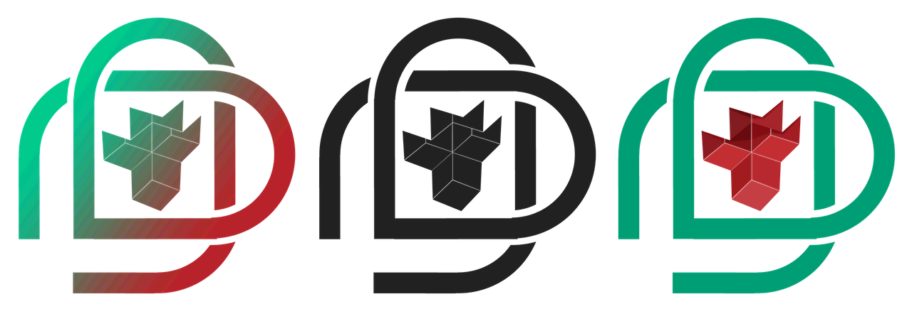
There are basically 6 main varieties:


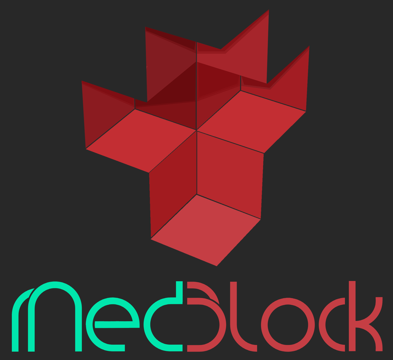

Here's my final pick:
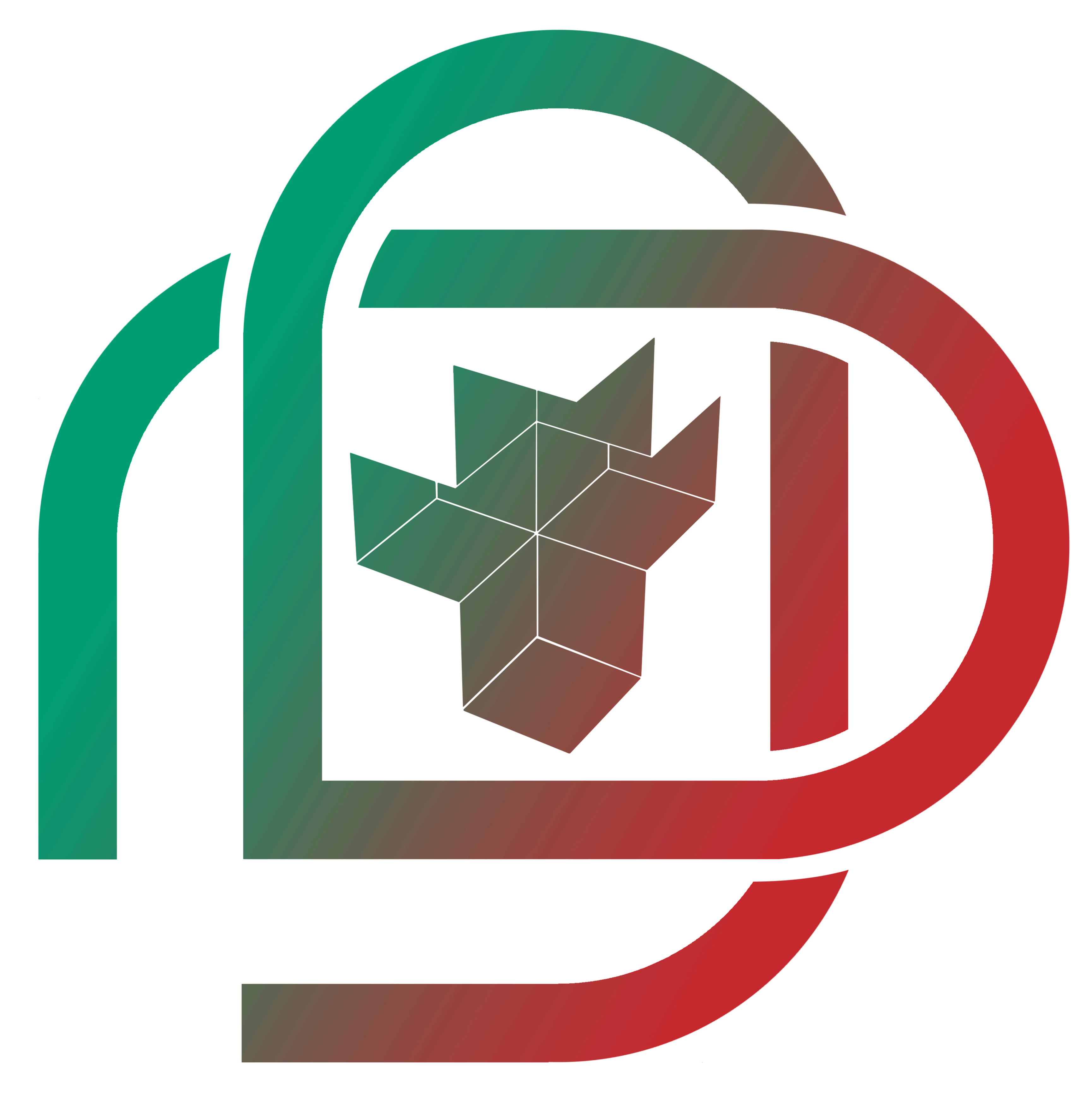


Final logo and image colors and positions can always be changed to whichever best suits the taste of the team. I have submitted the necessary .psd file to @cerebralace. The draft for the whole thing was 170MB so I tried sending that and failed. Lol. Hopefully, they like my work. I have finished this sentence 5 mins before the deadline.
There are a few things highlighted by the logos I made:
The cube - A block (also blocks and medicine and security - cause of the cross in it and the shield aound it)
The cross - blocks and medicine
The M-B logo - Looks like a Chain or the Rod of Asclepius.
The shield on the cube - Security of the block chain.
The Medblock name's d+b looks like a medicine capsule too.
The logo also forms a heart.
The MedBlock Team is free to use all images in this post as well as all images submitted to them - I can compile the rest of the images and upload them in the cloud for them to get access to all of it, if requested. I apologize for some hiccups in my work - if image cleaning is further needed I will be more than happy to fix it. Thank you so much MedBlock team and Ace!
My bitshares wallet name is dev-eerei.
Contest submission required tags, this post is from a Filipino residing in the Philippines. Go @steemph family!
Thanks for viewing my work! Happy Steeming!
More info on MedBlock.com
Look at This Mess:
Look at This Mess:
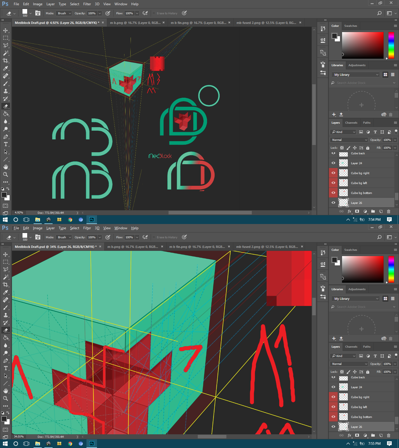
The Workspace Drafts


