Hello, everyone!
In the reply sections of my last two digital pieces ("Dreaming of Trees", and "Lee Can't Sleep"), I noticed fellow Steemians expressed interest in me blogging about my digital art while it was in progress instead of just showcasing and trying to explain what I did after the fact. I really wanted to do that anyway (this being a blog and all) so it was great that it was suggested.
As a result, what you've stumbled upon here is actually my drawing post series. I'll attempt to upload these posts every week... ish. That'll be explained. I'll be documenting progress on whatever piece(s) of art I worked on most over the past week. I'm committed to short story/poetry pieces on Fridays, and writing a 'Choose Your Own Adventure' series with @mandelsage and @poeticsnake whenever my brain lets me format the poor posts right. I have to put the most effort into that since it's already hectic. Suffice to say, these other posts might not get as much love. But, by golly, I'll try.
Character Art
"The Garden Kingdom" project is a massive source of inspiration, so I already started drawing potential characters. Rightly, there's only four known right now (as of the time of this writing): A little girl named Sarah, a pixie called Dipity (or Dip for short), and two minor characters. One is Harold, a fungi who is allergic to grass, and a hummingbird named Belle, who I'm tasked this week to fully characterize. My brain is whirring with ideas for other characters, and rightfully so because stories need illustrations!
So this is who I've spent the most time on so far.
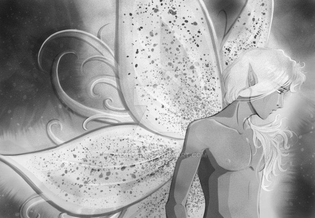 Yes, your eyes do not deceive you; that is, indeed, a male fairy.
I'm calling him Enity, who, just like Sarah and Dip, has a name that's going to flirt with a little play-on-words (Sarah + Dipity is 'serendipity'). Sarah and Enity are going to compound for 'serenity'. This names helps to explain his demeanor, just like Dip's name explains her whimsical nature. I'd like him to be a direct fairy counterpart to Sarah, but Snekky, Mandel, and I have to get together to explain plot and world-building before I commit to anything. That means Enity might not be written in at all.
Regardless, I'm going to give him a potential story anyway. Because that's what I do.

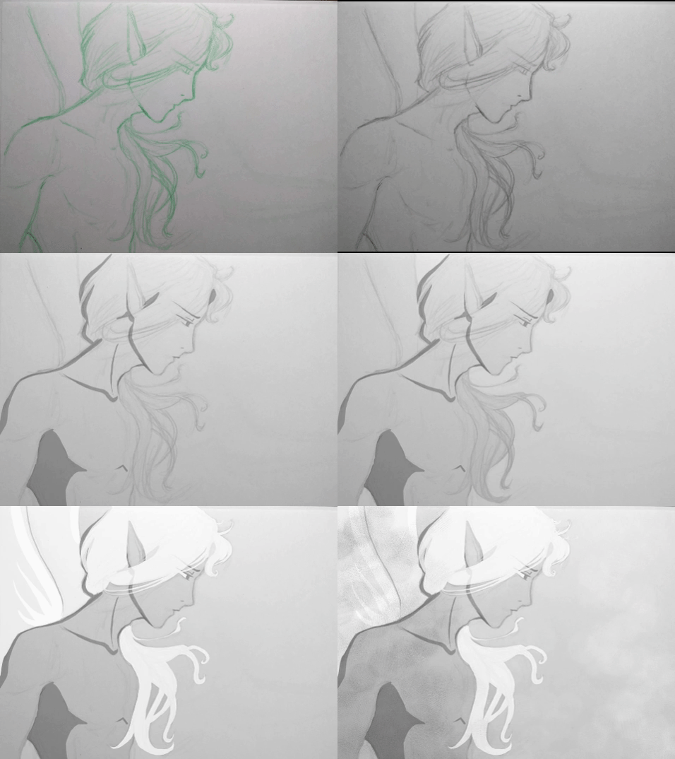
The analog drawing was done in a green erasable colored pencil. For some reason, the waxiness gives me a better fluid wrist motion. To digitize it, I took a picture with my phone's camera, and drained the color in Krita. It's interesting that desaturating it made it look like it was in graphite all along.
I first made a transparent white layer, then followed with rudimentary shading and lighting. Each step in the .gif here is a separate layer, one on top of another. The technique I ultimately ended up using doesn't need line art despite that I had a line art layer; I threw it out in the end; lines were too dark.
In "The Garden Kingdom", fairies are like Tolkien's elves. Their society is prestigious, their government fair (ha), and the fairies themselves graceful and elegant. According to Dipity, fairies are, "oh-so-perfect and know it". But this is Dip's opinion, and I can already tell she's like most pixies who can't tell what a fairy is thinking. It kind of explains why it's so difficult for pixies to tolerate fairies. At least in this garden. In many old myths, fairies were also mischievous.
Enity is a diminutive narcissist, and is a bit prissy (he doesn't like dirt under his nails, for instance). He has a complex about his wings being too generic, and like most fairy-kind, he isn't particularly pleased with the state of the Great Tree (where the fairies live in the garden). Unlike most fairy-kind, however, he wants to force the pixies, who live at the water fountain in the garden, to share their water. He really likes the Great Tree, and doesn't want to leave it, but without water, the Great Tree will die, and the Fairies will have to move.
Probably not surprising, he takes an interest to Sarah because of her status as part of the family which owns the Garden Kingdom now. Among other plot points, whoever has Sarah also has a huge political advantage of getting what they want.
I'm getting ahead of myself now, of course, because us writers have to get together first before I determine major plot points all by my lonesome.
I took a day off from working on it (and this post). When I came back to it I realized that, with how little I had, you couldn't really tell if he had wings or not.
So I fixed it. And this post became longer.
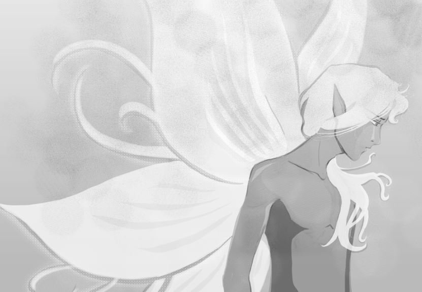 (NOW he definitely has fairy wings.)
While working on it, though, I forgot to document what I was doing. I'm not used to keeping a record of every little detail... Summary of things that ended up happening:
- canvas size increased
- original drawing was butchered so the background could expand
- a gradient was applied to the background
- all the layers were filled in or stretched out
- the wing layer expanded into more wings (imagine that...)
- two new layers were created to shade and lighten the wings further
- the hair layer was used to add the white designs inside the wings
- another new layer was added for the dark designs inside the wings
- some screentoning happened... and when should it not?
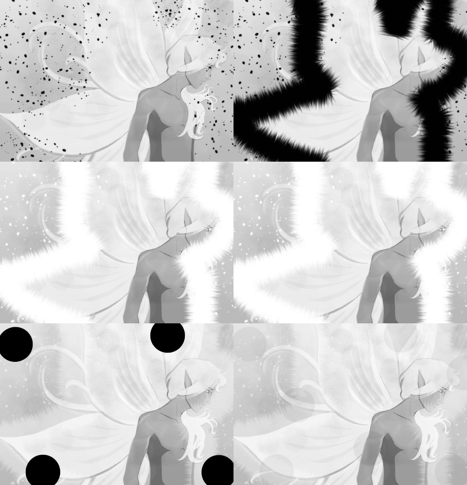
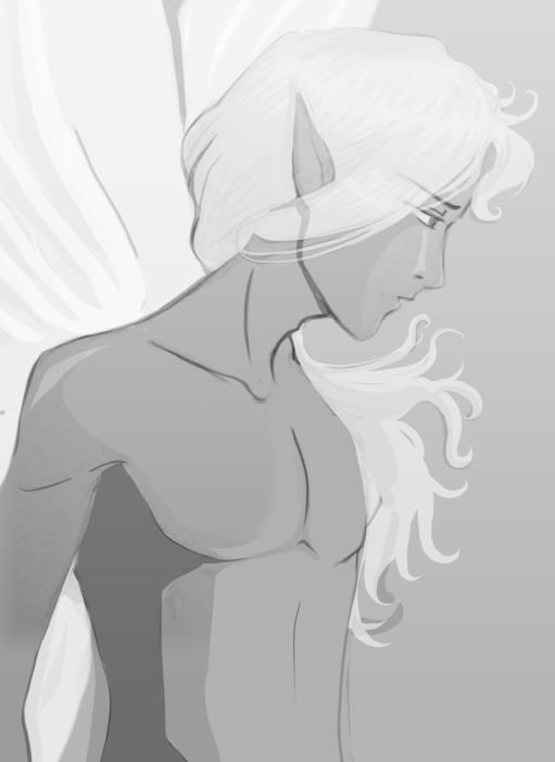
There was a lot of work done which was thankfully auto-saved, but I didn't record. I didn't have the history steps to click back through for good places to screenshot.
Before the crash happened, though, I deliberately took a screenshot of fixing Enity's mane. It was a little too eager to take over his chest. So I clipped it.
(I think he's happy I did that... I think. I can't tell.)
Before the crash, I finished the background - added some leaves with a leaf brush and resized them because fairies in this story probably aren't more than 5mm tall. I added some vignette to the background as well to make the glowing pop. There were also more tendrils added, background masking, some more shading and highlighting...
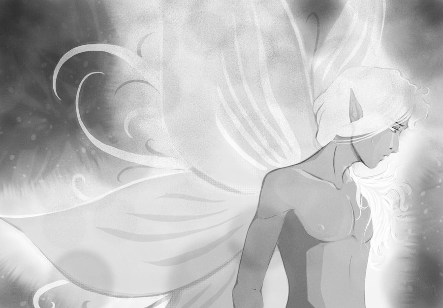
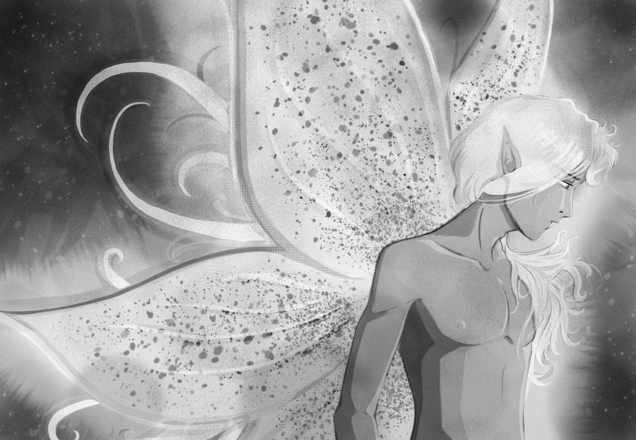
The first image is what Krita auto-saved for me (thank goodness). The second only has two major differences: the speckling on his wings, and the depth. It looks like a lot, but really, all I did was take a copy of the image when it was flattened, then paste that image as a layer with a multiply effect on it. It's an easy way to create both more depth and more highlights - erasing part of the wings in the flattened image, for example, allowed me to make a teardrop shape in the middle of the wing. You'll see it better in the last image.
Everything after that was me fussing around with the curve of the wings/tendrils, and finishing up highlights.
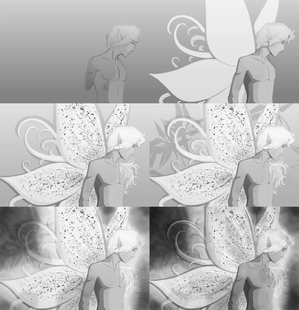
I did take one last screenshot round of the layers once I was done. This .gif is all 24 layers being superimposed upon one another. Some of the images are more than one layer, but the combined ones all had small details. You can tell how much of a difference that flattened image layer does right at the end. It almost hits you in the face. It's awesome.
Honestly, it's tedious to write this much and format it. I'm certain I can be more thorough, too (I just need Krita to cooperate). What would you like to know more about? Let me know in the comments.


;-P
