I've been quite excited recently about getting condenser up and running and being able to make changes on the fly that I've neglected my other coding plans to see how much I can change. And I'd say that if you've been complaining about Steemit's interface looking dated, this might cheer you up (assuming the powers that be see this and approve)...

👎 Existing "Challenges"
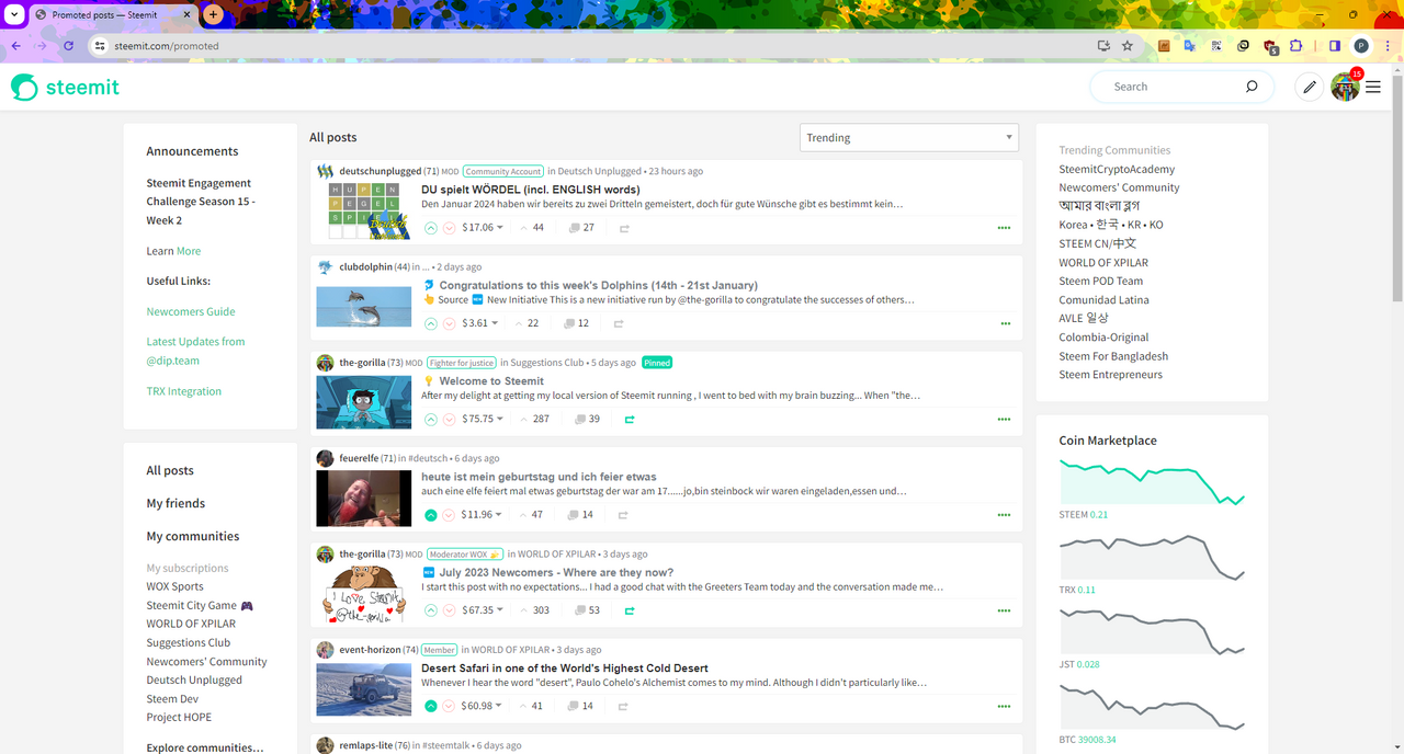
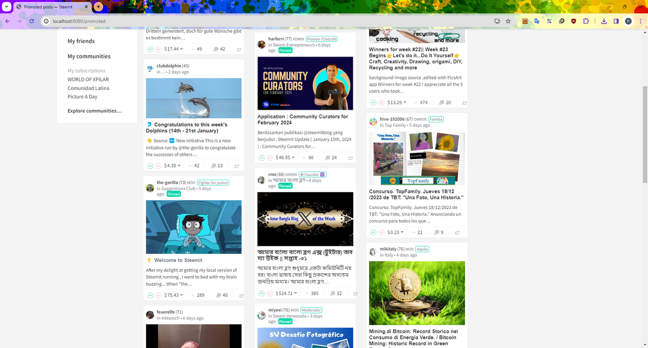
It's fairly common now for people to say "Steemit's interface looks dated" and those that have been here for a long time will probably say "it looked dated when it launched" so I'll start by looking at the promoted page and identify what some of the problems might be... from a blogger's perspective.
1. 🗝️ Importance
Let's start with a question... What's the first thing that your eye is drawn to when you load the "Promoted" page?
Is it:
a) The Post's Image
b) The Post's Author
c) The Post's Title
d) The Post's Summary
e) The Post's Rewards
Answers in the comments below.
For me, it's (e). The rewards stand out, more than what the author's actually written. The subject is secondary - front and centre is the rewards.
It's not surprising - I'm not a designer but from a design point of view:
- The title is approx. 17 pixels high
- The summary is approx. 15 pixels high
- The rewards are approx. 17 pixels high
So the title's the same size as the rewards which leads me to why "Rewards" appears to be the most important...
2. White Space
I was a developer well before I became interested in User Experience (UX). As my role within my first company grew, so did my interest in this field, to the extent that when I left work, I was more UX than I was developer. And perhaps I'm rare as a developer in that I have more of an interest in design.
I'm going to stereotype, perhaps unfairly, but hard-core developers care far more about function than (...I can't think of a (suitable) word beginning with 'f'...) appearance. If it works, great. The more we can squeeze into the screen, the better.
We think that the interface looks dated because of the poor use of white space. Or lack of its use. The only element to have any white space, is the Rewards element. Which'll be why it appears to be the most important element on the page.
So when thinking about redesigning the /promoted page, I wanted the blogging element to be more important than the rewards, I wanted more white space and what I really wanted was to make it look more like my Steemit Interface (shameless plug). Knowing that I was restricting myself to using the existing page elements (within minimal HTML / .jsx changes).
3. ☠️ Dead Space
Without looking back at the page, can you tell me what appears in the right column?
Answers in the comments below.
If a space isn't working - or is considered "dead", as I believe the right sidebar is on the /promoted page, let's make it work.
🕺 A Fresh Look
With all that in mind and bearing in mind that what I've done isn't perfect (this might never see a world beyond my localhost so why should it be?)... I've had a look to see what I can do in with Condenser's CSS. I had to make a couple of code changes (to return 24 posts instead of 20 - 24 has more useful dividing factors and image return sizes) but nothing particularly significant. The CSS was more involved and I'd have like to have done more with the boxes to make them more "Pinterest stylee" (maybe I'll share a test case later) but I'm happy.
So, what do we get... 🥁
Looks a bit different doesn't it?
More modern? More engaging?
And notice that there are still 6 posts displayed on the screen.
Like I said, it's not perfect. I think that the author should have more prominence. The font sizes of the text should be bigger - to reflect the size of the images... and perhaps I should have done this before writing this post but I'm too keen, I would like to hear your thoughts and I've spent too much time tinkering already.
Of course, I nearly forgot... what about communities? The Right sidebar has a bit more importance here...
or
Are a couple of options. The 3 column looks better than I'd expected so maybe the /promoted page will work well with 4 columns. Tinker, tinker, tinker. Must stop tinkering.
My final tease - is the "Pinterest" style. I like this but the posts run top-to-bottom then left-to-right rather than left-to-right then top-to-bottom.
The "flow" can be changed using the "react-responsive-masonry" but that's significantly more work because all of the existing styles would need stripping out.
🦕 dip Proposal
I think that the next step for this is to know that it's wanted for steemit.com. We must remember that just over a year ago, we were told:
We would love to see proposals that are evolved from suggestions next time – don’t forget that the program is designed for the long term and we have $450,000 for the first-year budget!
From what I can see, the budget is still available with 2 of the 4 selected projects getting delivered (and 1 being deemed too expensive).
I'd be interested in hearing from Steemit or the @dip.team to understand the appetite that there is for this either in the comments or via Discord (thegorilla 👈 My Discord (the-gorilla#4289 is my old one which might still work)).
the-gorilla's Alternative Steemit Interface
In case you didn't know, I've created an interface to help you find content that you're interested in more easily.
Posts by voting bot users, abusers and spam tags are hidden and you can search by multiple tags - allowing you to find the content that you're interested in more easily.
👉 Launch Alternative Steemit Interface 👈

the-gorilla's Club Status Tool
I've also created a tool to help users review their club status - showing them where their power's coming from, how much they're powering up, transferring out and who they share a wallet with amongst other things.
Please use it wisely.
👉 Launch Club Status Tool 👈