A while back, I added the equations from Steemit Corner #2 : Understanding Steem Inflation by @kouba01 to my weekly reporting in order to visualize the new STEEM per day and the current inflation rate. As I noted at the time, knowing that the percentage is constantly decreasing, I was surprised to see that the number of new steem produced is getting bigger -not smaller- every day.
After a moment of reflection, this made sense. Even though the inflation percentage is decreasing, when the supply grows, it's taking a percentage of a bigger number.... so it really shouldn't have surprised me. This did make me curious about the long term shape of the curve, though.
So this week I played around a little bit with the numbers in a spreadsheet and finally with python - and here's what I found. These numbers were produced by a short python script and visualized using PowerBI.

A couple of things jump out at me:
- We are somewhere near the peak of the curve. If this prediction is right, the numbers of new STEEM per day are going to start going down sometime around the end of 2023 or the beginning of 2024.
- The predicted numbers are lower than what we're actually seeing (current supply is around 480 million, and new STEEM per day are around 90K vs. predictions of 380 million & 71K.)
I suppose there could be multiple reasons for the discrepancies:
- My program could be wrong.
- The formulas from the post I referenced could be wrong.
- The predictions might deviate from reality for reasons like missed blocks and chain reorganizations.
- Inflation/deflation might have varied due to STEEM/SBD price ratios, as described here.
- Burning STEEM or SBD would introduce a discrepancy, but that would have gone in the opposite direction.
- Anything else?
Of course, I'm in love with my code, so I'm assuming that the answer must be a combination of "3" and "4", and possibly "6". ;-)
One other thing I experimented with in the spreadsheet was to introduce a "fudge factor" that produced the right numbers at the present time. With that fudge factor applied, the curve looks like this (produced in LibreOffice Calc):

And that leads me back to the main question that I wanted to answer... will the numbers of new steem per day keep going up indefinitely, or will they change directions and start declining?
According to both graphs, a change in direction is coming. According to the first graph, the turning point is at the end of 2023 or the beginning of 2024. According to the second, it's more like 2027. Either way, it's never going to be easier to collect STEEM than it is during the current phase of the curve (or at least not until well after 2050).
Here's the python code that I used to feed the PowerBI visualization. Feel free to use & improve it, and please let me know if you see any errors.
#!/usr/bin/python3
from datetime import datetime,timedelta

startBlock=7347268
startSupply=226094339
startDate=datetime(2016,12,6,11,00,00,00)
blocksPerYear=10512000

def inflationPCT ( block ):
   APR=( (978 - ( block / 250000 )) / 10000 )
   return 0.0095 if APR < 0.0095 else APR

def newSteemPerBlock ( inflation, supply, bpy ):
   return ( inflation * supply / bpy )

def block2day ( n ):
   return ( n * 20 * 60 * 24 )

loopBlock=startBlock
loopSupply=startSupply
loopDate=startDate

print ("Date, Block #, Inflation Rate, Supply, New Steem Per Day")
endDate=datetime(2050,1,1,0,0,0,00)
while ( loopDate < endDate ):
   inflationRate=inflationPCT ( loopBlock )
   inflationPerBlock=newSteemPerBlock ( inflationRate, loopSupply, blocksPerYear )
   inflationPerDay=block2day(inflationPerBlock)
   loopBlock+=1
   loopSupply+=inflationPerBlock
   loopDate=loopDate + timedelta (seconds=3)
   if ( loopBlock % 250000 == 0 ):
      print ( "%s, %s, %f, %d, %d" % ( loopDate, loopBlock, inflationRate, loopSupply, inflationPerDay ))
The starting block came from SteemDB on Dec. 6, 2016 at 11:00 AM US/Eastern time (when HF16 was scheduled to take effect). The virtual supply on that date came from here.
Thanks for reading!
Update (June 24):
FWIW, Here's what the visualization looks like if we seed it with a block number and STEEM supply value from today. It peaks at 89,969 new STEEM per day in January/February, 2024, then declines by 76% over the next 13 years.

Update 2: (a new puzzle, June 25)
It occurred to me that I could use the witness payouts in the current blocks to validate the formulas. However, when I did this, it just led to a new puzzle.
First, I used excel formulas to reproduce the numbers from @kouba01, in Steemit Corner #2 : Understanding Steem Inflation. Then, I applied those same formulas on a new block from today. These results went as expected:

Next, however, I went to the same block and observed that the witness was paid 461.229335 vests. Knowing that the witnesses get 10% of new STEEM and that the current STEEM/MVEST ratio was 568.047. I used that to calculate the actual observed payout in the same block. That went like this:

So now I have two numbers for new steem per day. The first one (89,823.87769), based on the formulas is broadly consistent with what we're seeing reported by SteemDB, here and here. The second one (75,455.983), working backwards from witness block producer rewards is much closer to the first chart in this post. However, this number is off by about 14-15 thousand from what SteemDB is reporting during recent weeks.
I'm not sure what to make of the mismatch...
In the end, I'm fairly confident about the basic shape of the "new STEEM per day" curve, and I'm reasonably confident that we're currently near the peak of the curve, but I have very little confidence about the specific dates when it will start moving downwards.
Update 3: 2nd puzzle solved.
With help from @moecki (see comments), I think we solved the two main issues. 1.) The web site I used gave me the "current supply" value, but I thought it was giving me the "virtual supply" value; and 2.) The witness rewards are different for standby witnesses, which I wasn't accounting for in "Update 2". Based on a historical post, I estimated the December 6, 2016 virtual supply at 243,000,000 and reran the graphs for 30 years from 2016 and 30 years from today. Here's what I got.
2016:

In this estimate, new steem per day peak between January 23, 2024 and February 18, 2024.
30 years from today:
startBlock=75825583
startSupply=485932967.414
startDate=datetime(2023,6,25,11,00,00,00)
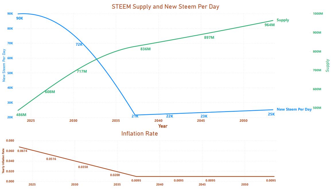
This model shows a peak between Feb. 3, 2024 and Feb. 20, 2024.
So, at this point, I'm starting to feel better about anticipating a peak in the early part of 2024 followed by a 13-year decline of about 76% in the number of new STEEM produced each day (subject to influence by other factors such as burning STEEM and price changes of STEEM and SBD tokens).
Update 4 (June 25):
Just for fun, here is the forward-looking model, broken down by reward type.

Pixabay license, source
Reminder
Visit the /promoted page and #burnsteem25 to support the inflation-fighters who are helping to enable decentralized regulation of Steem token supply growth.