Hello Steemians ,
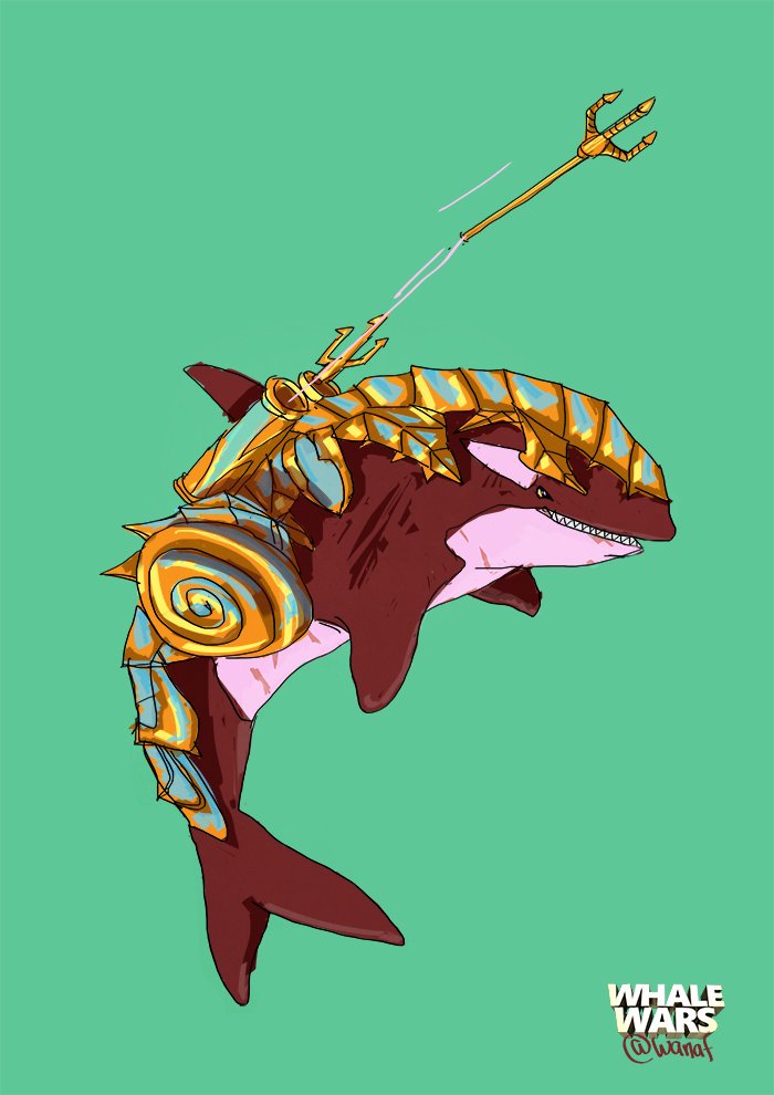
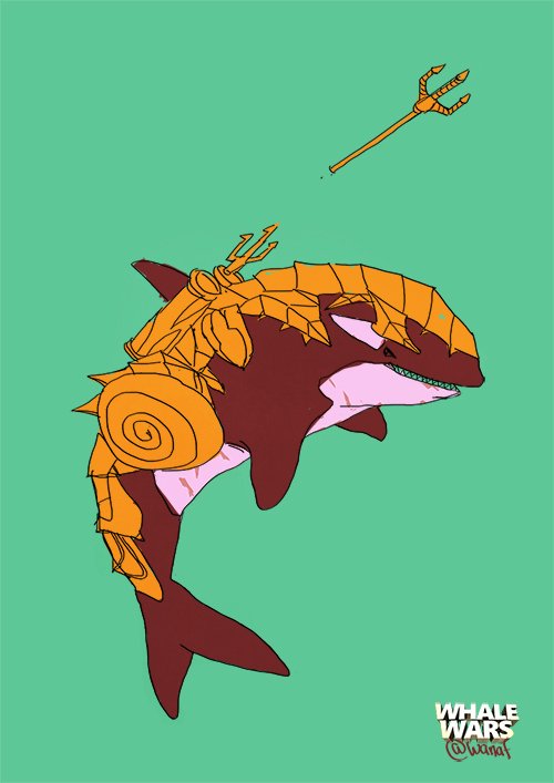
I made a new piece for the Whale Wars series that I am doing . I decided to do an Orca or also known as Killer Whale . Fun Fact : Orcas are actually categorised as dolphins not whales. If you are curious as to why ? check out this article here
Orcas are usually considered quite friendly and harmless in the wild. I recommend the documentary "Blackfish" which will change the way you think of "Free Willy". A small pool is not where these majestic animals belong.
The Process
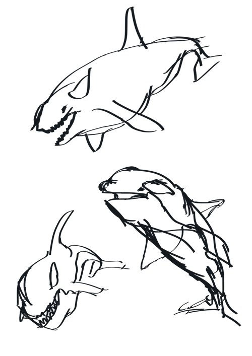
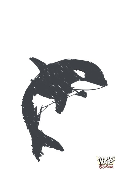
So I started with doing some rough sketches while looking at reference pictures of killer whales, I try to keep things loose and be in the moment as possible. I don't really know what kind of accessories I am going to give him yet, I just want to get that silhouette right. A good silhouette is a key to making a good image.
Here is an example that sadly I didn't make, but excellently illustrates the silhouettes. The idea should be that just by looking at the silhouettes you can tell what it is. If it is a character, it's even better if you can show the emotional state he/she is in. The more information you can portray in the silhouette the better.
I ended up settling with this one because I feel it showed the best silhouette.
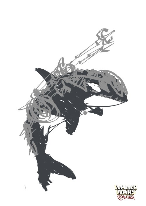
Next stage is blocking the accessories over him. I knew I wanted to have armor but as for weapons I was at a lost for while. As I was googling around for inspiration I came across a trident. A trident is most famously associated with Poseidon, A Greek god of the sea.
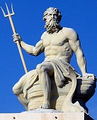
Check out those abs
image source
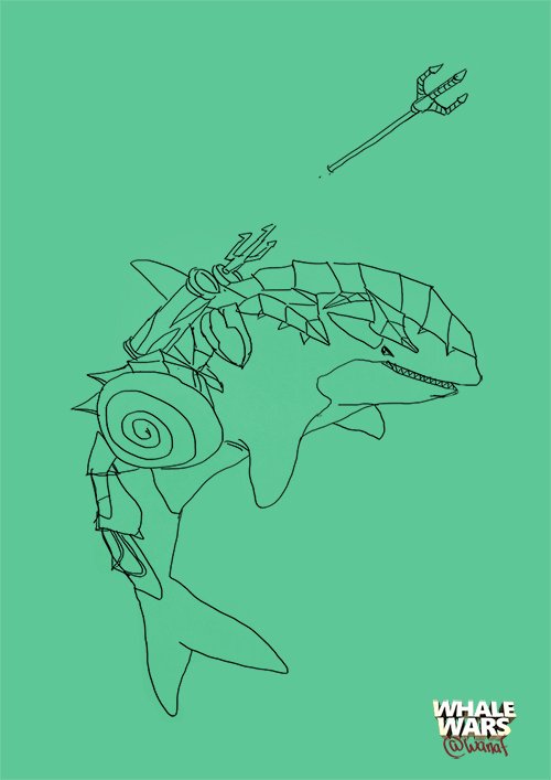
That's it! He is gonna shoot a trident out of some launcher. But then I thought, how is he going to retrieve it? He's got fins for hands. So I decided to add a line at the end of the trident that he can pull it back and also use it as a grappling hook . I should be in the action figure industry, lol
So now I trace over the line art .
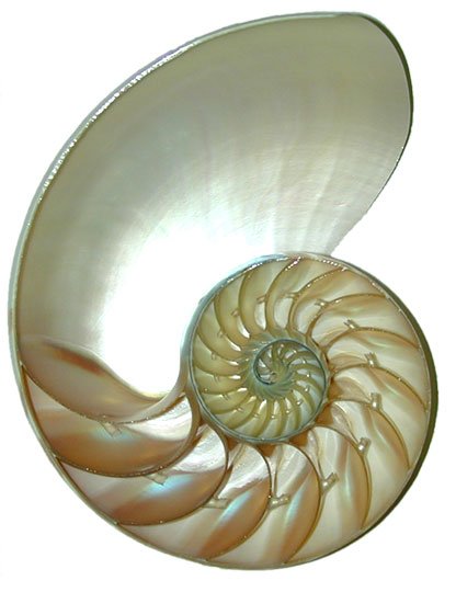
Picking the basic color. I wanted the material of the armor to be like those sea shells that reflects different colors, I am not sure whats the word for it but here's an exemple.
Adding shadows.
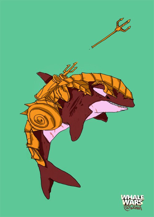
Adding highlights.
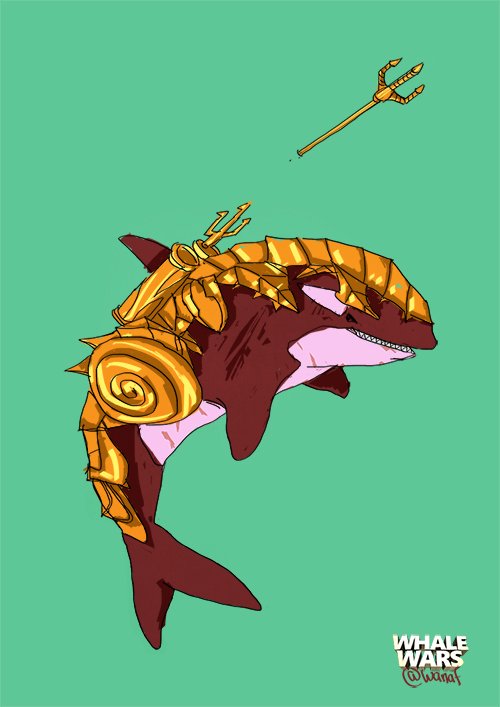
Blue secondary color to the armor.
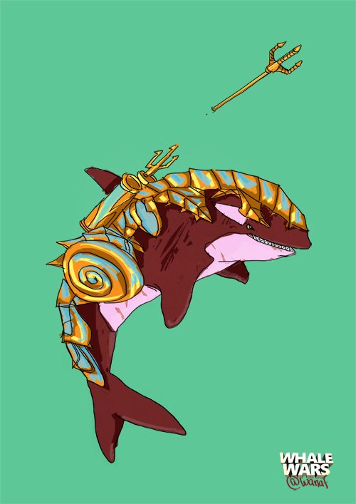
A little bit more details and that's it! Here's the finished design.

What do you think? Thanks for watching and have a great day :D
The logo designed by @cartoonistpandan and the banner by @orenisme!
Previous Posts
Wo-Owl Retro Musical (Steem Cartoon)
Whale Wars (Steem Cartoon)
Team Malaysia Polo Design
My Introductory Post
Life Is Strange : Before the Storm review
