Hi, steemit friends!💙
When I woke up this morning, I opened webpage of steemit as usual. Suddenly, I found there was something different. The page style has changed, and then I thought it was my slow network that made this. But I reloaded the page again and again, only to find it had been adjusted. It looks awesome. Now, Let's take a look what was changed!
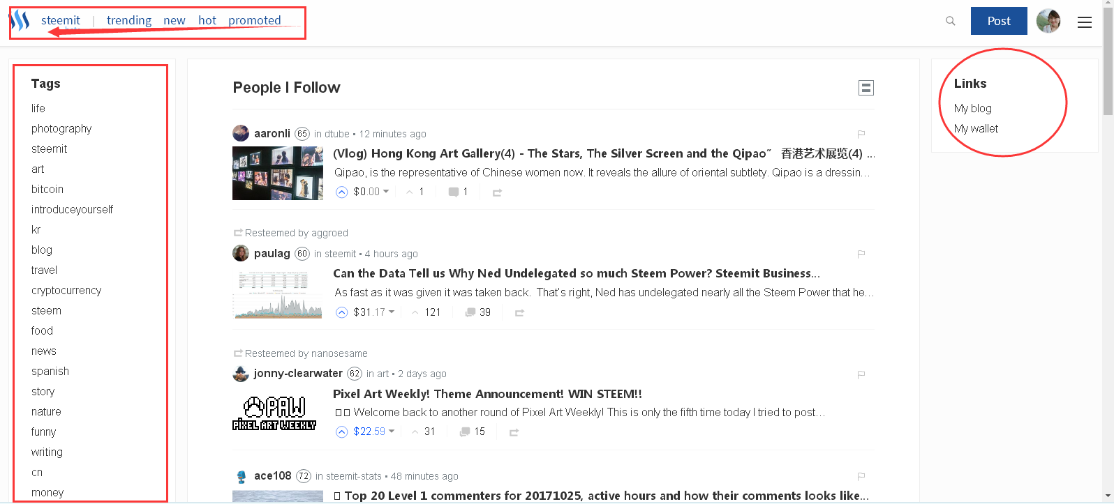
1. The head protrait added

I like this change, which makes us familiar with the friends. You can recognize your friends through the name and picture.
2. More choices for home page

The labels on the upper left corner is the same as before. The tags has been moved to the left side and there exit two links on the right side. In the middle are the people that we followed. We can change its size by click the icon. What impresses me most are the two links, which include my blog and wallet. It is much more convenient for us to check.
From these little changes, I know that the creator @ned and his team has been devoted to improving this platform. Even if it is tough, but I'm still confident in the future of steemit. Have you found these new functions? :P
今天早上醒来,像往常一样,我习惯性地点开steemit的主页。突然发现,页面风格有微小的改变,当时我还以为是网络慢的原因。后来一次次刷新,发现主页和home页都做了调整。看起来棒极了,让我们一起来看看,增设了什么新功能吧!
- 发帖时新增头像
主页里面最大的改变就是发帖可以看到头像啦!这样我们能更好地识别出我们的好友。给steemit点个赞!- 主页的新变化
首先,左上方的标签依然不变。原右边的tag移至左边区域,并且新增了两个链接。中间时关注的好友的新动态,增设了放大功能。让我印象深刻的是右边的两个链接,这样对我们来说更方便去查阅我们的账户和博客信息。
从这些细微的改变可以看出,steemit的创始人及其团队一直致力于优化平台的工作。这让我对steemit的未来很有信心,即使现在很艰难。不知道你们是否和我一样注意到了新功能呢?:P
Recent posts
Write a Poem for You---My handwritten copy of the poem #20: We are Looking for a Lamp 为你写诗--我的手抄诗歌#20: 我们去寻找一盏灯 Drawing Challenge # 8 : A dolphin swimming under the blue sky and white clouds /绘画挑战赛 #8 : 云朵下的蓝海豚 家庭自制鸡汤火锅 Home-made hot pot with Chicken Soup 地球以外的宇宙到底是什么样的? I am always wondering the secrets of the universe
