Hello Steemit friends,
today i stumbled over a post about SteemConnect 2.0 by @steemitblog which offers a whole new experience of Steemit! Yes we evolve to the next level. I wanna give you a first impression of from a user perspective. Remember this a really early stage but shows already advanced development, i'm excited about!
Why i write a post about that?
Because i found it by accident and i think many should know about that great development from a user perspective! That's my opinion after a quick check of the features which were at least surprising! Ok let's take a look what's behind SteemConnect 2.0 project:
picture by @steemitblog
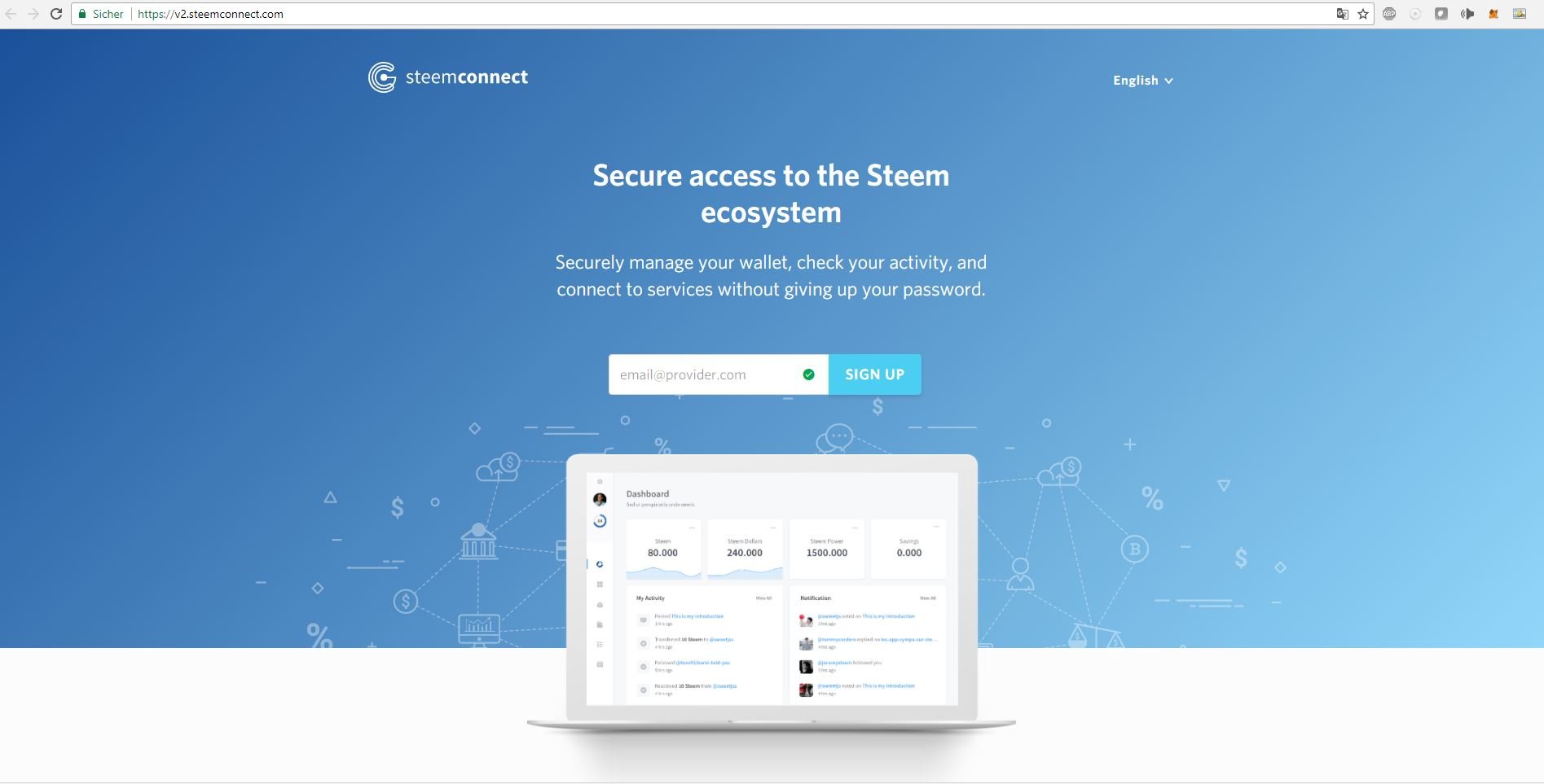
1. Visit the site https://v2.steemconnect.com/ and sign up with your Email adress
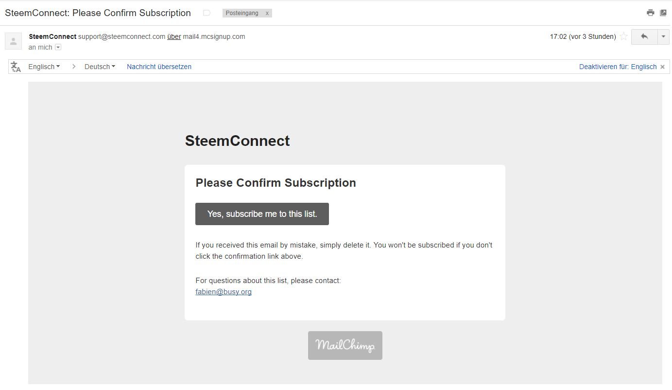
2. You've got email - "confirm the subscription"
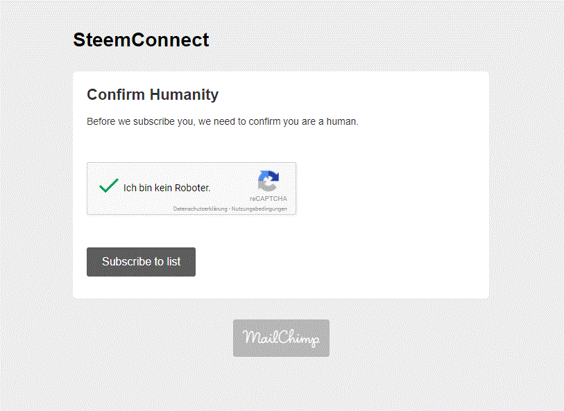
3. confirm your humanity and "subscribe to list"
4. after confirmation you have two options to continue, we look into "continue to our website"

5. Aaah! Now you get a first impression how a new Steemit could look like! Press "Sign In"
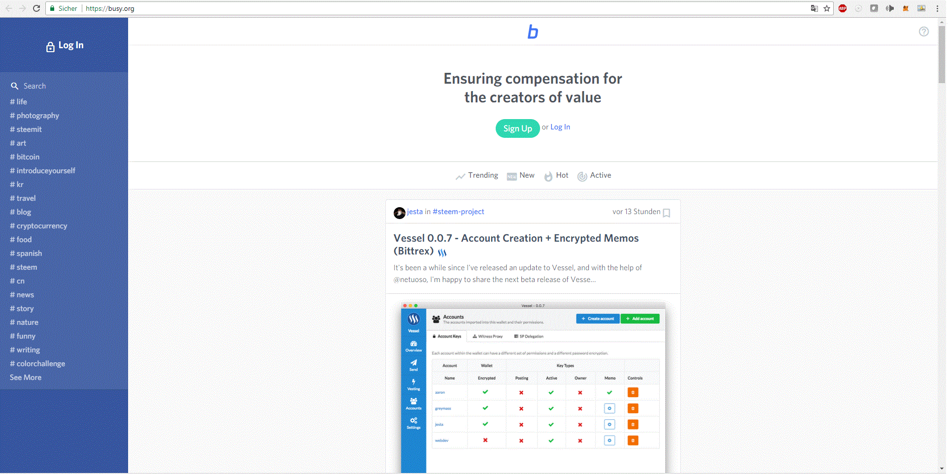
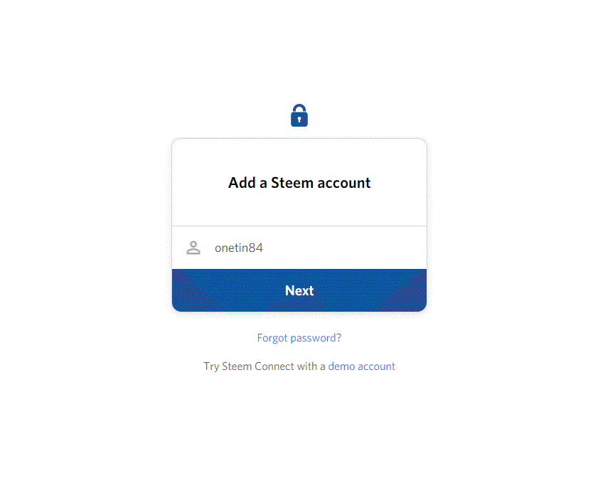
6. now we are on the form to connect our Steemit account

7. enter Steemit username
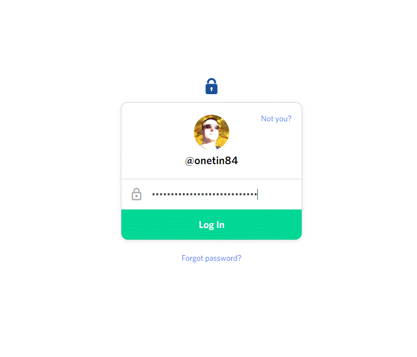
8. enter WIF (private key) and press "Log In"
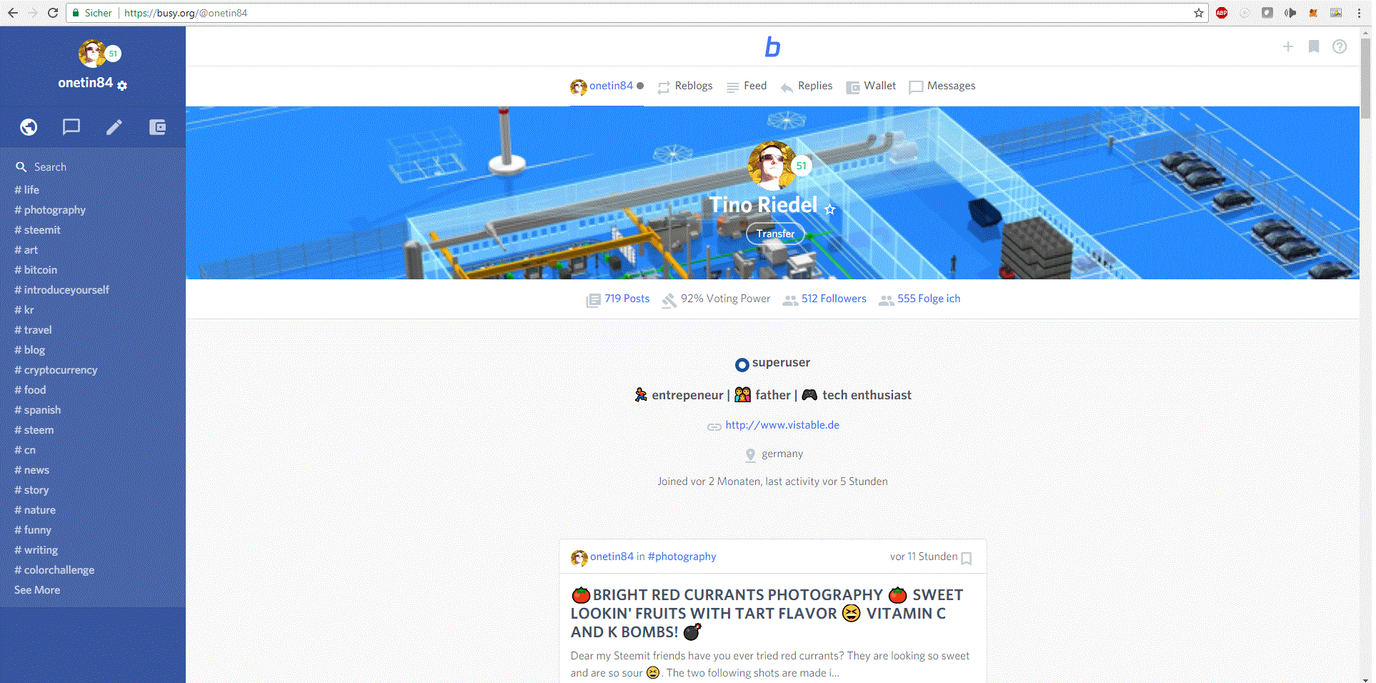
9. Wohaa!! The future of Steemit!
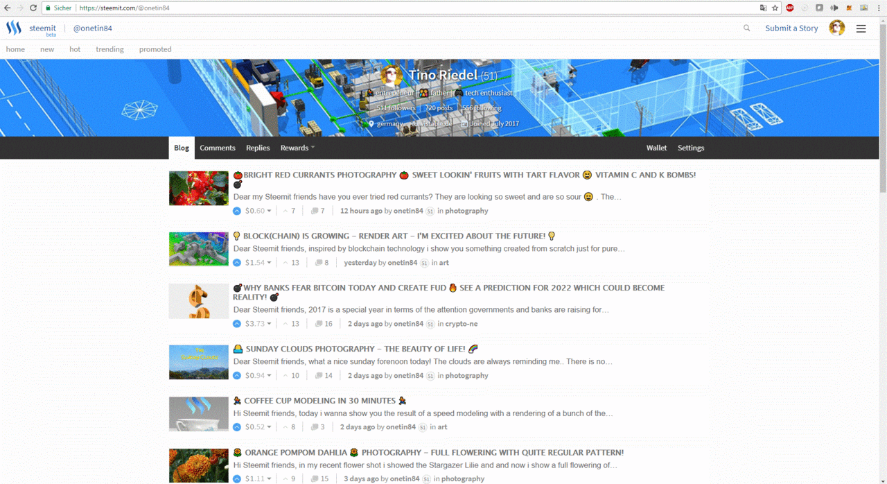
now we compare to the existing Steemit site
We get the tags and topics right on the start screen, posts are not directly visible because they are now shown with a much bigger preview picture, if we scroll down, see below, nice, but there is much more in the pipeline
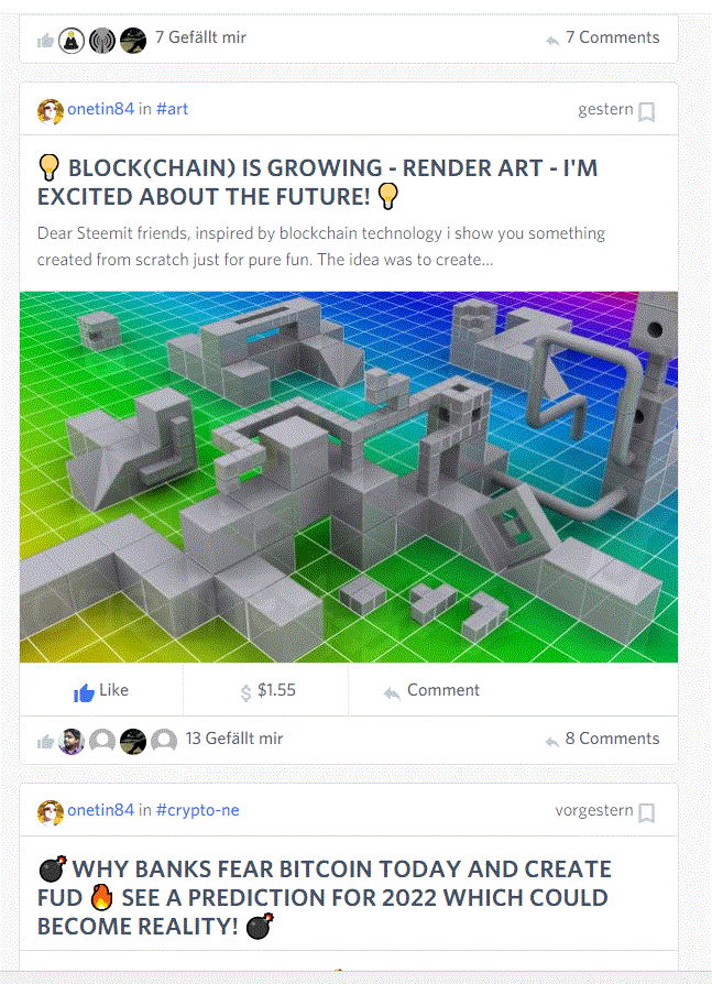
Now we come to the details and that my friends is very surprising, no amazing! First let's look to the well known GUI

and now the fresh SteemConnect GUI
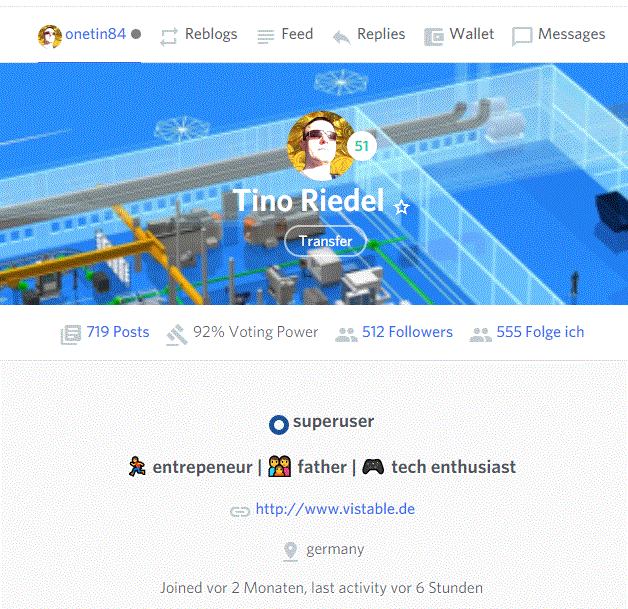
I'm a superuser! 😎 Thanks Steemit Team! But even more interesting is now you have direct visibility and access to
- voting power
- transfer of SBD and Steem
Until now i used steemd.com to see my voting power and for transfer you had this multistep-procedure (goto wallet (s. screenshot right side) - goto transfer dropdown - transfer). Now it's supereasy!
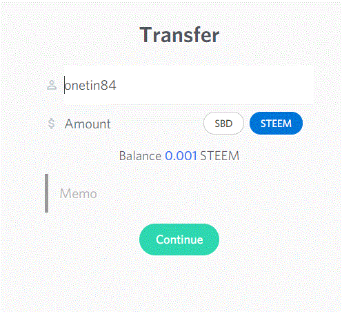
Let's look at the new direct "transfer" form, very lean and clear i think.
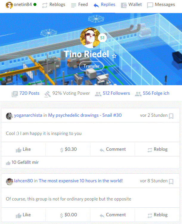
Above my profile pic we see 6 menu entries. I think the beauty now lies in the separation of own posts and Reblogs. I didn't resteem anything until now so that category is empty, but from what i know it was one of the biggest concerns of users to have a messed up blog mixed of own and resteemed posts.

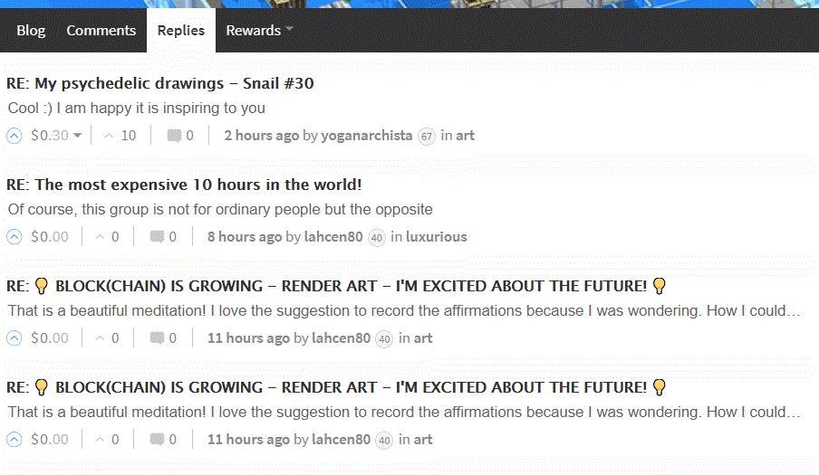
The "replies" is in new fresh design with visible avatar, but i missed the "comments"?
In comparison the older GUI as we all know
If i press "Wallet" it appears a fast recognizable overview, love it!
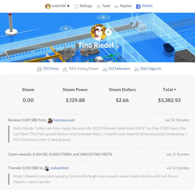
Wait a minute there is also a star for favorites

If i go to another profile i can switch the star on and off, but don't see any list or function for that, anyone who knows?

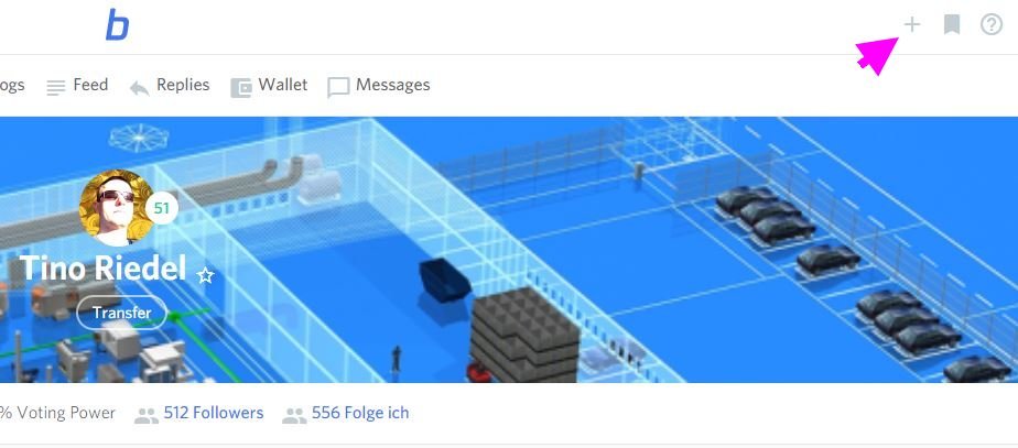
To write a new post simply click the "+" in the right upper corner
and see a very minimal form to start writing
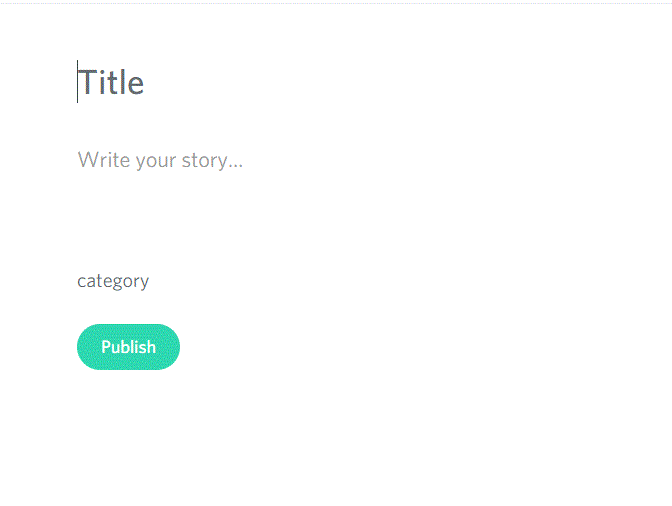
but what happens if i click a second time on the "Title"?
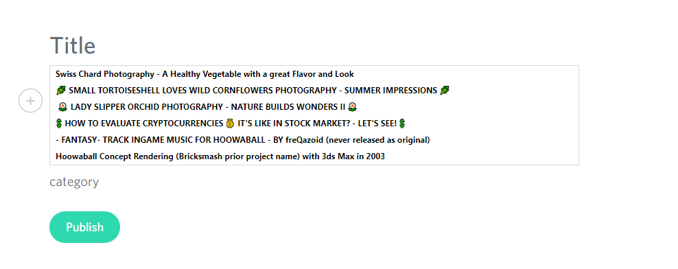
Surprise, surprise here we can choose from older titles as template, very nice idea!
Now i write some text..
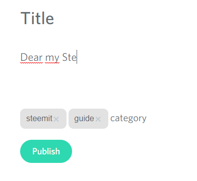
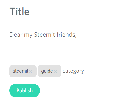
..and after finishing the line i mark the line per drag with left mouse button, what? another surprise! We can directly format the text! Nice!
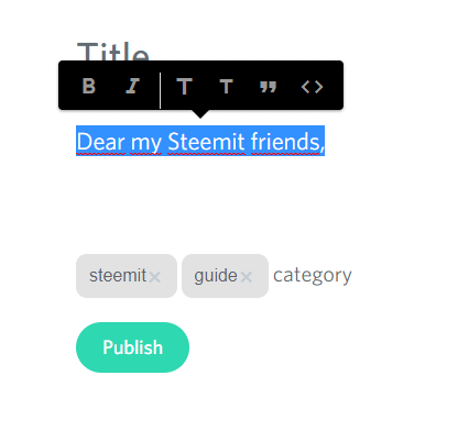
There are limited options for ease of use, you select just a "T" to make it one grade bigger or smaller
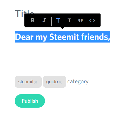
after breaking the line, the format is reset to normal font size, very nice! 😄 to continue with writing..it works smooth like a breeze!
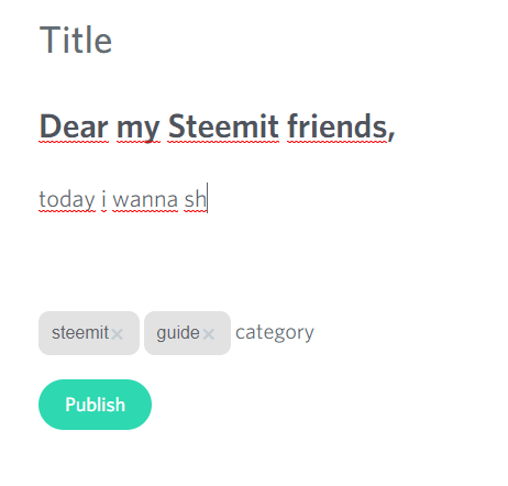
Now we look to the "+" icon a bit below.

If we press the "+" a camera symbol is shown..
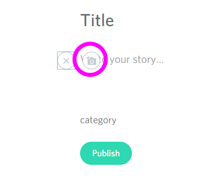
if we press the camera symbol a file browse dialog opens
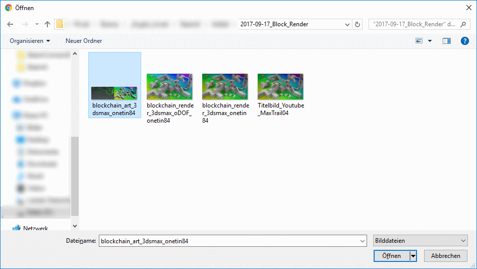
after choosing the exact picture we see the picture is inserted and grayed out

after a few seconds it is uploaded and clear visible i think, that's the time for waiting here
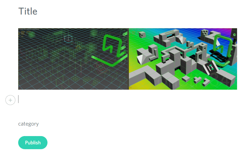
if we click again on the picture a "waste bin icon" appears
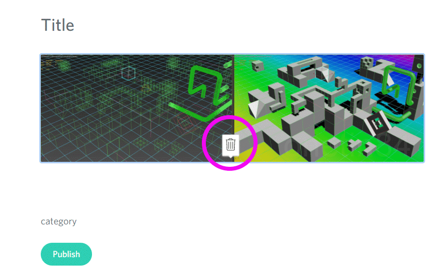
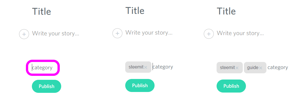
and we can with a click on the icon delete the inserted picture instantly. Next we look into category, that are the up to 5 tags you can choose. Specialty here after you typed in one and pressed spacebar you see how the tag is changing into a capsule, nice visual feedback!
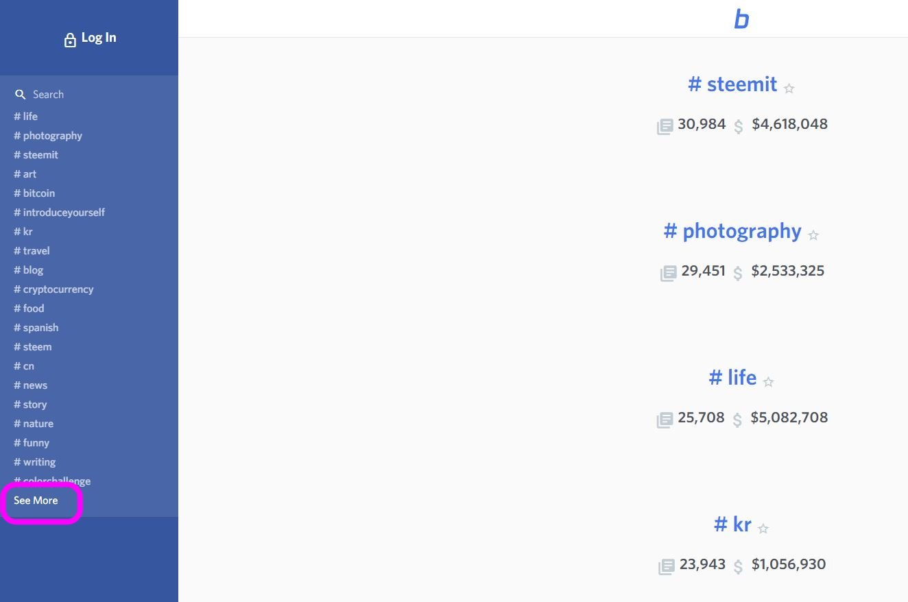
Finally for today i'll look on the left side where we have our tags and topics but also a few other options

If we press "See more" category we see a nice overview how many Steem Dollars are earned in each category i think
If we choose another category for example "steem" we see as usual the current posts in this category.
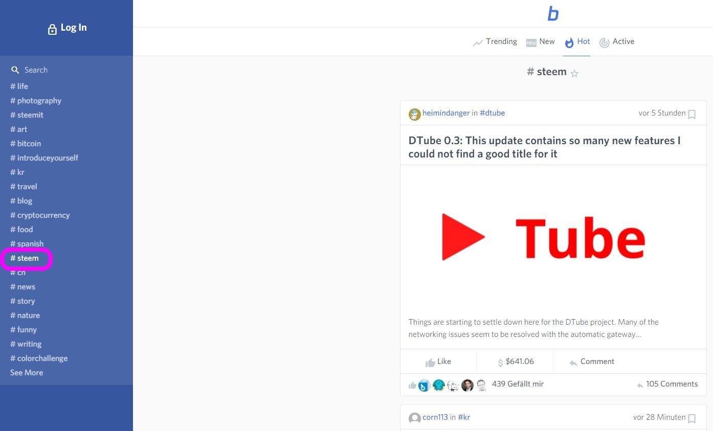
If we are here the top menu has changed to the well known main categories like "trending", "new", "hot", "active"

note: I didn't know to get back to the start site from here. There is no avatar icon or back button. Anyone who know how to get back via UI?
My conclusion?
👍 This will strengthen 💪 Steemit massively! 👍
There are so many improvements, to summarize the most important from my point of view:
- very easy post creation, writing, formatting
- fast access to important stats, information
- modern, sleek UI
- claimed security by the team on top!
That's the future my friends for our beloved platform Steemit! We're a few steps further for mass adoption!
Please notice that there is a lot of development on the new platform. For example i tried to edit a post and the content was not visible, just the Title.. but to get a sense what's in the pipeline i see it as great opportunity for feedback to the developers!
I strongly recommend to try it by yourself! Happy Steemin'! 😉

👍 If you like the read please follow me and vote me up! 👍 Thank you! 👍
see also my other posts
Don't forget my current CONTEST for $10 SBD + post rewards, see following post..
😃 Currently there are just 2 intriguing stories 😍 and i distribute the $10 SBD + post reward among the 3 best entries! 😃
🙌 500 FOLLOWERS - THANK YOU! MY GIVEAWAY CONTEST OF 10 SBD + MY POST REWARD! 🙋
🔥 SECOND "IMPORTANT" CHINA EXCHANGE IS CLOSING SOON! 🔥 WHAT IS THE FUD ALL ABOUT? 🔥
🔥 FIRE IN THE CRYPTO MARKET 🔥 TIME TO BUY? REFLECTING SOME RUMORS 🔥
💰 BITCOIN A FRAUD? - BANKS ARE VERY CONCERNED TODAY - WHAT'S BEHIND? 💰
DSound - HEARED OF IT, USED IT, LOVE IT! - WHY I SUPPORT THAT GREAT PROJECT!
Exciting times ahead steemit friends!

3D logo steemit recreated by author
Please click my referral link to Steemfollower
Thank you!


Don't forget to vote for up to 30 witnesses to maintain the greatest social platform STEEMIT!
unmarked pictures/animation from giphy.com, pixabay.com

