Lets build a new Home Page for Steemit!
Intro
So I was on a radio show about a week ago on @mspwaves #mspwaves with @ma1neevent and @poeticsnake and met with @aggroed on the show. It came up in conversation since Im a Sr. UX Lead Designer for the studios here in Hollywood Ca, would their be time available to work on a few ideas to help improve the current site for easier usability for new users and equally logged in returning users.
After taking a first stab in this process. I started brainstorming on what or how would it be easiest to have new users and returning users check out the site.
First Stab
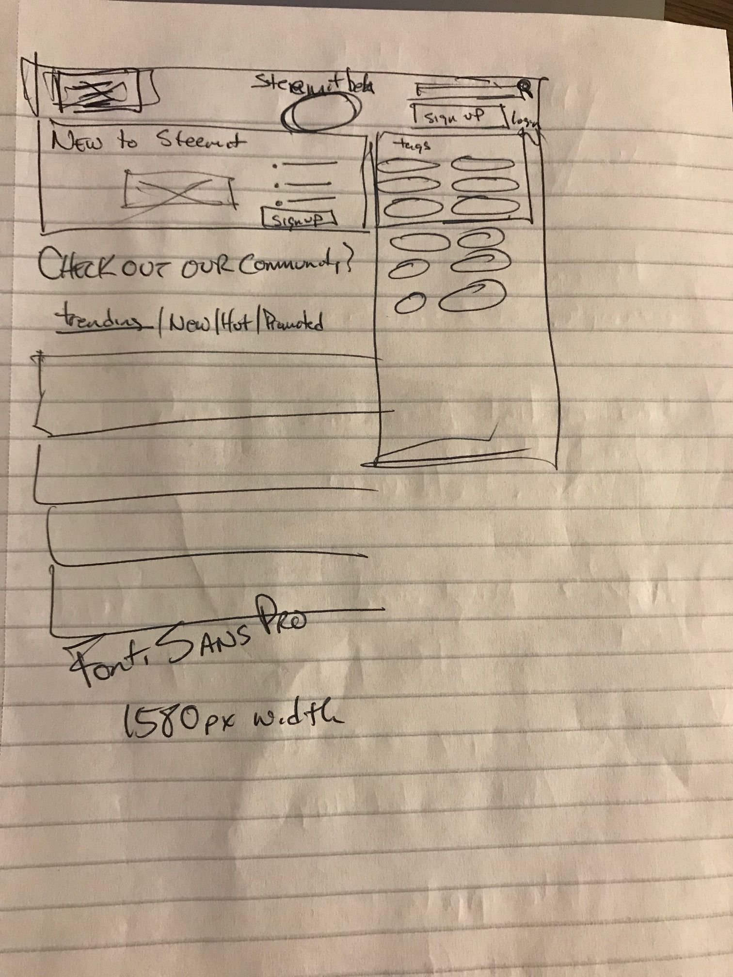
So I started by getting rid of the 3 column set up and forcing a much more digestible above the fold design. I wanted to surface the on boarding tools into a banner splash screen with CTA buttons inside it. Next I wanted to surface as many if not all the tags so people could get into the content quickly. There are a few communicative conflicts with the POST button on the current, forcing a user to register after crafting a post. thats a bit misleading so for me I wanted to surface joining as quick as possible. We want users right ? haha
First Stab - Logged In
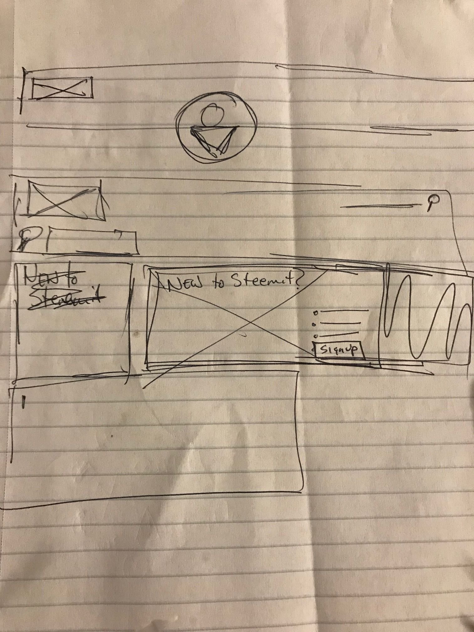
Here I wanted a user to feel personalized. I needed to add in some personalization. Increase the Avatar photo, and pull the smart tags drag / drop window to the top. I have a feeling that Im going to use realistically the same tags that Im interested in, and for me having that above the fold and at the top would be ideal.
Next Stab - Wireframes
Here I am starting to build out the sketches into more refined UI that has balance. After building this in sketch and then really fine tuning the wire as shown above, I added solid icons to help the reader read faster and become engaged in the UI. I pushed the tags up above the fold for easy scanning, and have removed the smart tags feature until you are logged in as a user.
I moved the burger menu to the left which is more standard for web and responsive mobile. Surfaced the search tool more prominent for easy use and added messaging of what you could commonly search for for easier usability.
For the logged in user, I've heightened the value of having a personal dashboard or landing page. Increased the avatar image a bit, added the icons for familiarity. Added the smart tags feature to allow easier search and providing a shortcut.
For me the design needs to be easy. Easy to use, Easy to maneuver and to keep the user engaged.
For my first stab, Id love to hear your comments.
How much did that excite you? did we seem to make some motion in this steemit ocean? If you'd like to check out Part II i finished it a few days back and it can be found here
Click on Steemit Home Page Redesign PART 2 here

@theUXyeti - This is me! Hilarious, funny, ex reality tv guy, loves app and web UI, competitive card player, scuba instructor, dart thrower, MTG player, WSOP player, gamer, hearthstone mechanic exploiter, sports handicapper, Geek of all trades.
How to find me
Steemit: www.steemit.com/@theUXyeti
Discord: TheUXyeti or TheUXyeti#5698
Dtube Channel: https://d.tube/#!/c/theuxyeti

@dtube / #dtube - gotta follow these guys for all new videos coming out everyday...

@adsactly / #adsactly - a great group of steemians paving the way for learning, educating, teaching, listening and talking humor and all kinds of great things in a community where i can add my uniqueness and feel like i fit in too. Add these guys.

@minnowsupport / #minnowsupport - a great discord server with great steemians helping everyone learn the platform by encouraging advocacy to all members new and veteran by assistance through education and onboarding in this great place via @aggroed vision
@thealliance / #thealliance - another great group to belong to. a good team to upvote and resteem your posts. Check these guys out as well.


Give it up for @originalworks @dorabot @msp-creativebot @msp-lovebot @msp-shanehug @discordia @curie @lovejuice @minnowsupport @msp-africa
