Steemit Home Page Redesign Part 2
After reviewing all of your comments, direct messages, and chatter in discord here's part II.
Burning the midnight oil and thought I would complete out the request for Steemit Home Page Part 2
I wanted to take all comments into effect in this 2nd iteration for the home page for steemit. I received a large response from many high profile advocates in the community like @aggroed @themarkymark, @velimir, @fredrikaa and @fulltimegeek. I also received great constructive comments on how best to build the 2nd iteration wireframes from @brandonp, @geofftk, @fourfourfun, @dlew, and @venalbe just to name a few. I greatly appreciate the communities involvement to push forward my ux work to assist the community and the comments to not only better the design for steemit but to improve my skillset to meet the demands of the users that use the platform. Thank you!.
Comments on Iteration I
- Insert the sorting methods for feeds into the header
- Proportions for tiling of tags too wide and adjust alignment
- (Add) a smart sort for things I’m interested in to surface to the top (will add this as a featured in logged in)
- Establish additional ways to personalize the dashboard for the user
- Perhaps adjust the actual short post of the user feed ( we can do this once we explore the "blog" section )
- Remove cosmetic things like “beta” it deters new users
- Rework a pull down for personal stats: voting power, vote value, bandwidth, etc. (also will address in the "blog" view section )
Additional Comments
- Many different requests about 3rd Party Plugin metrics for posts, and how to display it. Make this content centric around posts as well as my blog section.
- Create in a preferences panel a way to turn on metrics for specific posts for advanced users vs standard users. When I really become engaged in posts and comments I want to know my metrics for them easily
- Allow a better dashboard for logged in users to access their page vs a general home page.
It has been brought to my attention about additional constructive features to place on pages outside of the home page as well as described above. I have a list of additional requests for fixes on other steemit pages.
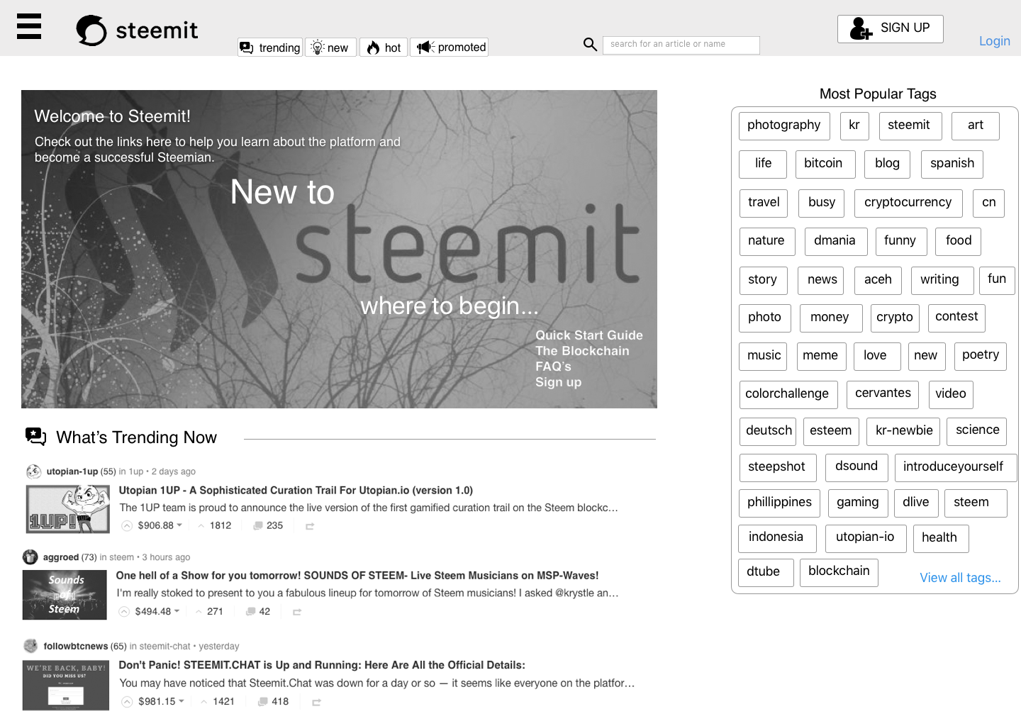
Below is the newly revised version of "Logged Out New User Home Page"
Logged Out New User Home Page
Persona: I am a new user coming to Steemit for the first time. I have possibly been to Quora and Reddit before.

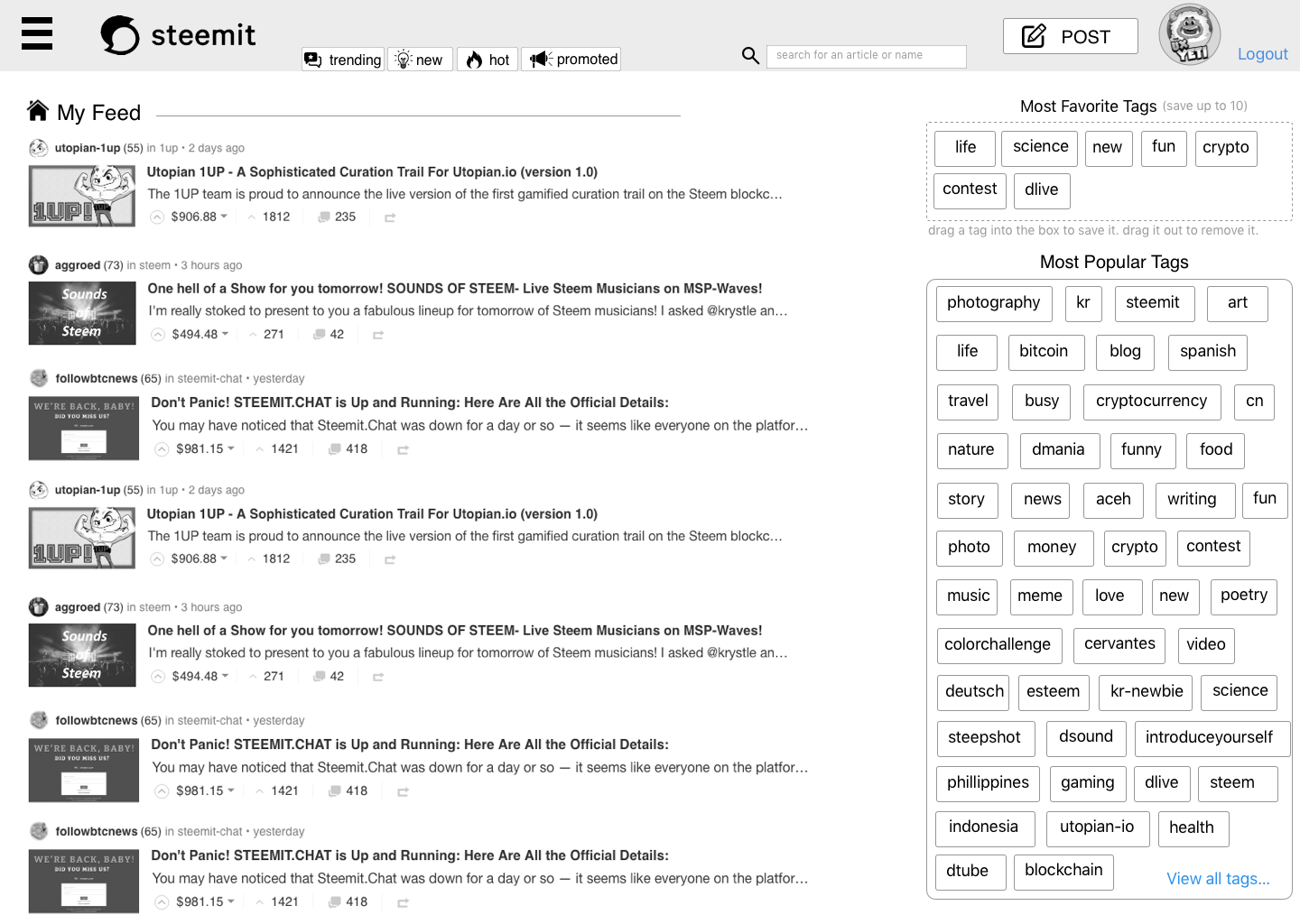
Logged In - Returning User Home Page
Persona: I am a current user. I am returning back to the home page after I have logged back on. This is my home page not my blog page.

Before I work towards part 3, for the actual visual aesthetic and design, I wanted everyone to take another round at the UI and provide comments, improvements, adjustments?
Some things to note. this is NOT the Blog page. I will address that in the next iteration coming in a few days.
This strictly is for a new user to the site, and second a returning user accessing the home page. Once I can establish enough of a style and pleasing approach here I can then start to rebuild the interior pages like blog, wallet, settings etc.
Did you MISS Part I of this redesign document? Did you want to check it out still?
To review Part 1 of this ongoing iteration story check it out here
Interested in seeing more content from THE UX YETI

@theUXyeti - This is me! Hilarious, funny, ex reality tv guy, loves app and web UI, competitive card player, scuba instructor, dart thrower, MTG player, WSOP player, gamer, hearthstone mechanic exploiter, sports handicapper, Geek of all trades.
How to find me
Steemit: www.steemit.com/@theUXyeti
Discord: TheUXyeti or TheUXyeti#5698
Dtube Channel: https://d.tube/#!/c/theuxyeti
Check out some great Steemian Communities that I'm a part of as well.
@dtube / #dtube - gotta follow these guys for all new videos coming out everyday...
@adsactly / #adsactly - a great group of steemians paving the way for learning, educating, teaching, listening and talking humor.
@minnowsupport / #minnowsupport - a great discord server with great steemians helping everyone learn the platform by encouraging advocacy to all members new and veteran.
@thealliance / #thealliance - another great group to belong to. a good team to upvote and resteem your posts. Check these guys out as well.
@cryptoempire / #cryptoempire - a new community I found that is everything from on boarding to crypto chatter.
