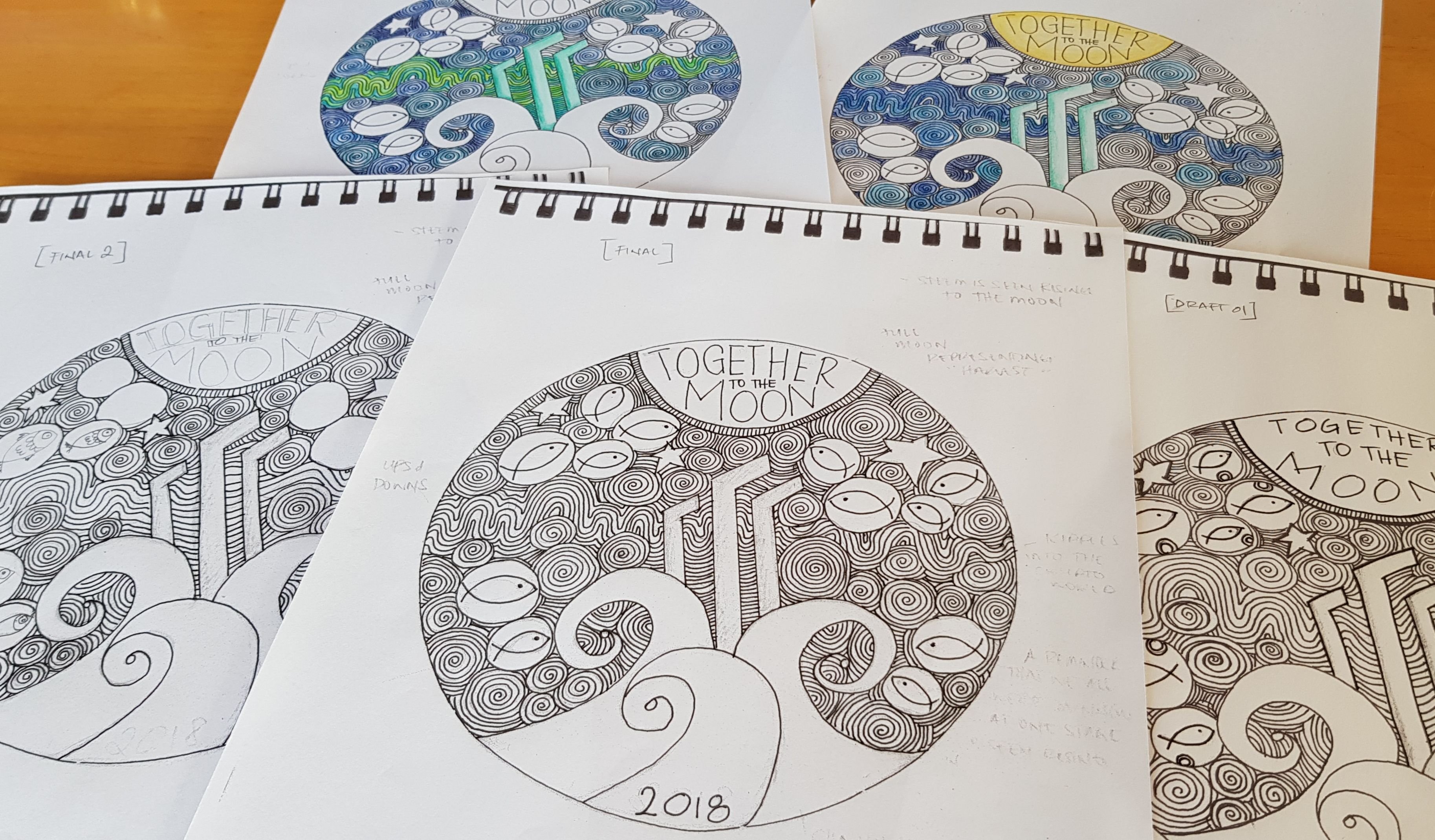
It's been about two weeks since I first drafted my coin design and with the cut off date looming I figured I better get a move on and do the edits to the original that I wanted to do.
To recap, here is the first draft.

As you can see the wave at the left hand side isn't proportioned.
You can also see the writing isn't centered.
@ejr, (aka ELI from PhELImint) mentioned in the comments that he would like to see different style fishes as we are all different.
So I tried to draw fish various ways.
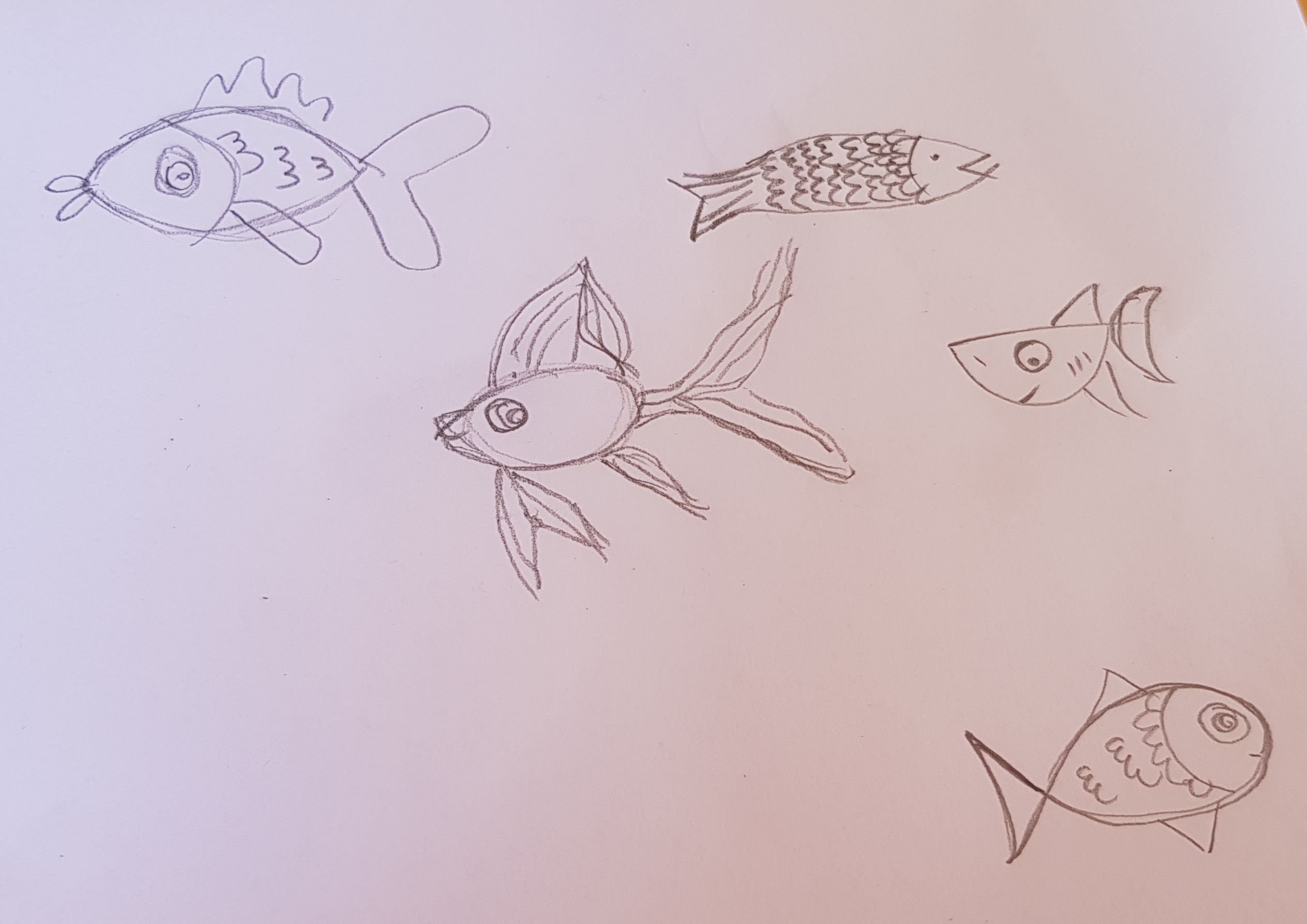
But I always go back to my original. Why?
Because the fish aspect of this design was actually born in @TheAlliance discord server.
We had been discussing the Adopt a Minnow program and a few of us referred to ourselves as plankton lol. But I don't exactly want to translate that plankton sentiment on to the design, so I opted for "larvae" instead lol that's why the fish is in the "bubble".
Baby fish are initially called larvae, then fry and finally fingerlings before they mature into adult fish. Larvae are totally dependent on their yolk sac, while fry are able to feed themselves. Fingerlings have functional fins and scales that are comparable to adult fish anatomy, unlike fry. Source
In this regard, in response to Eli.
Yes we are all different, but in some ways we are all also the same.
And for the sake of continuity within the design, I'll be sticking with the same fish. It also looked too busy with different types of fish and the details that came with them.
I did try to colour it in.
Steemit green on the "monoliths".
A overwhelming sea of blues, that seemed a little too blue.
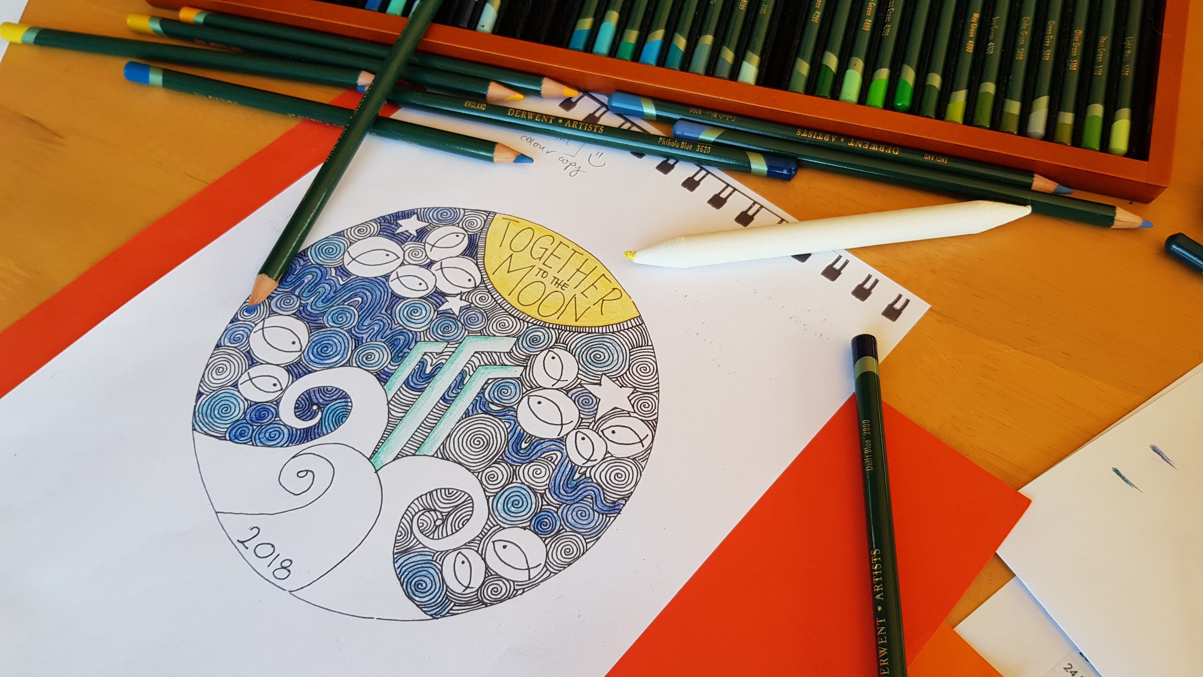
I thought maybe green to represent the "Gains and Dips"...
And it's still not working for me.
I'm terrible with colour theory so the colour version will just have to sit on the bench.
I imagined a special, limited print, coloured version of the design. 😁
I've seen a few coins that seem to really come to life in colour and I thought it'd be cool to take this year's coin a little further and get the special coloured version printed.
This coin is a stark contrast from my 2017 design in that it has a ton of detail on it. I wanted the 2018 design to be unique in so many ways. From the style to the amount of details.
There are some amazingly detailed coins out there and each and every single one looks incredible. I'm hoping this design, if it wins, will look as good.
Here's one of my fave coins in silver and colorized, design by Amy Brown, pictures from JMBullion
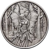
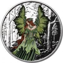
Amazing right??
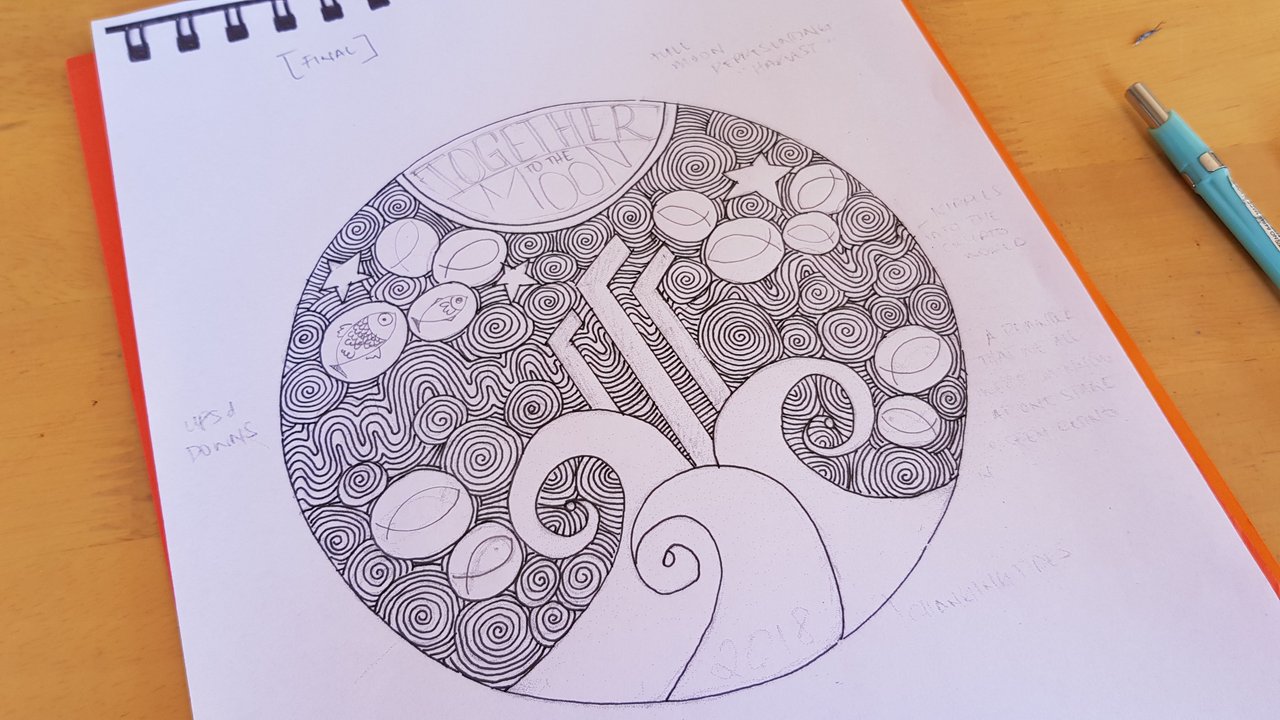
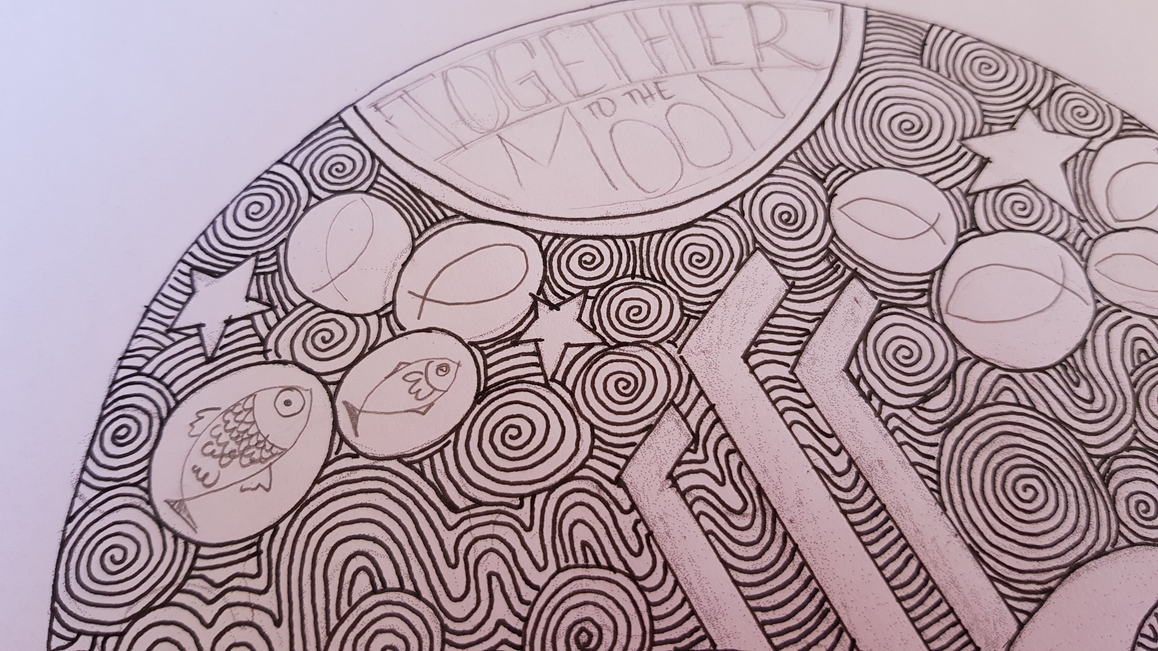
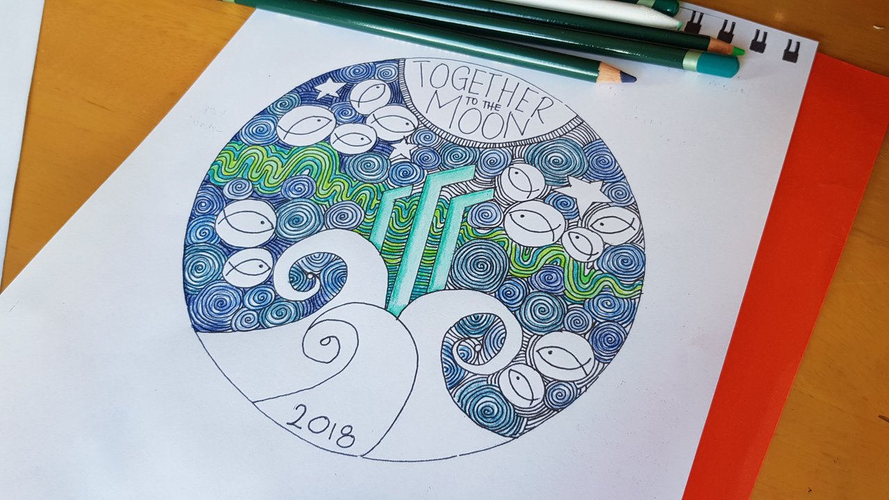
Without further ado here is the final draft and my submission for the 2018 Steem Silver Round design.
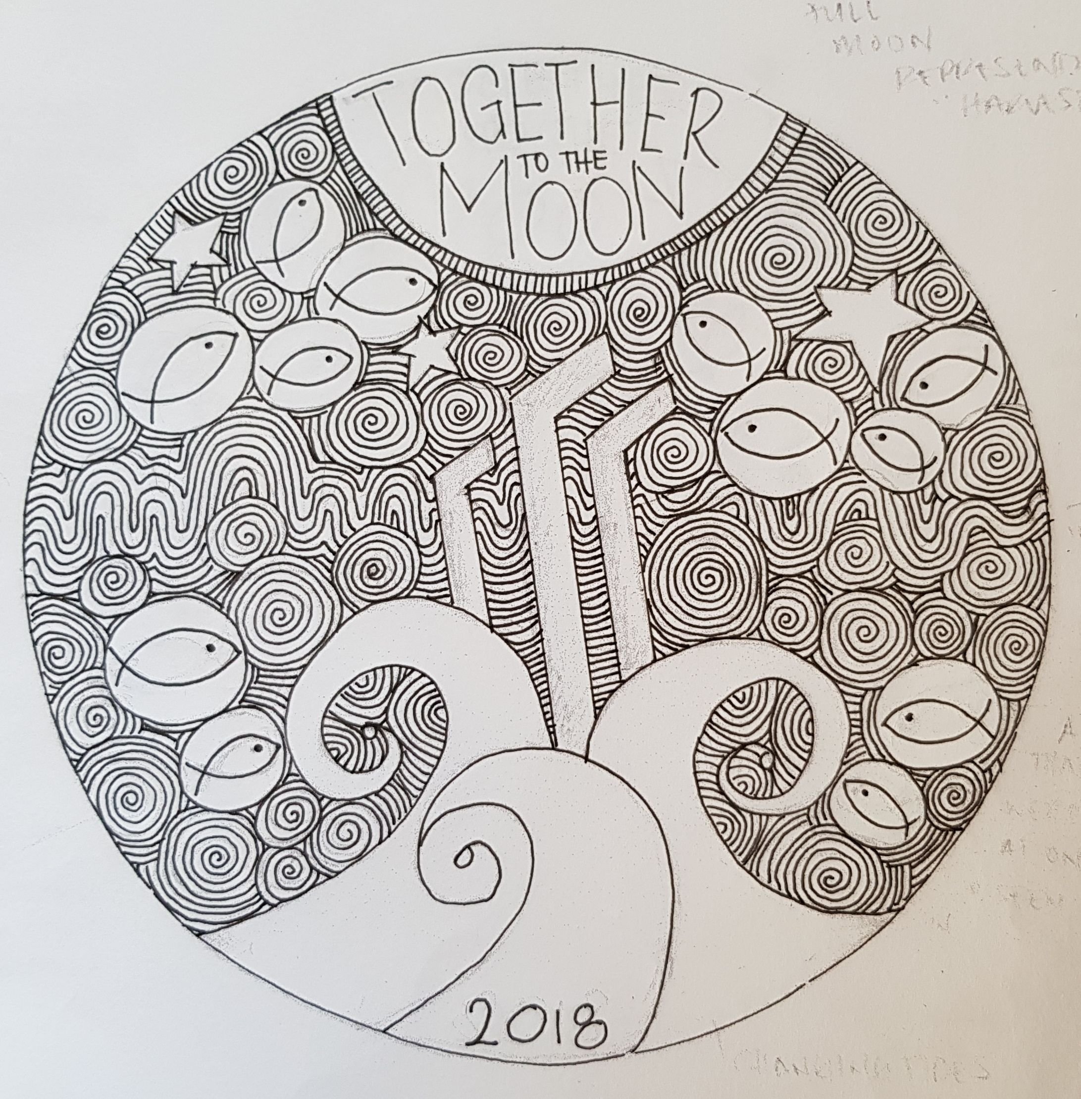
About the design
Steemit to me is all about community and that is represented by the MINNOWS. Yup the minnows. No dolphins and whales this time, just the minnows.
I feel it's important that we remember what it's like to be a new fish swimming in new waters.
The SWIRLS represent the constant movement and changes on the platform.
This constant change was emphasised when I took a week off for The Move, when I got back this week I found so many new things going on within the communities I am a part of. I was only semi gone for a week.
The 'CHANGING TIDES' when you look at it, looks like it's propelling the "Steem" logo towards the full moon.
This is exactly how I feel about Steemit. It's just a matter of time before the tides change and people really embrace the next generation that we represent.
The RIPPLES represent our interaction with each other and how we have the ability to touch each other's lives.
I find this especially true in my time here. It has been my pleasure to have come across many beautiful souls and because of Steemit, we are able to touch other people's lives outside of the platform.
What we do here, now, makes a difference wether we realise it or not.
The long WAVES represent the dips and gains, the ups and downs, that we as a community go through.
The STARS...
"Reaching for the Stars. Going to the Moon."Lastly. You would have noticed I revamped the STEEM logo.
Honestly? I was having issues getting the proportions right to make it look exactly like the logo so I sketched in a rough outline, which ended up sticking because it reminded me of the 2001 Space Odyssey Monolith.
Which in this design seems so appropriate, as the Monolith, in the movie, triggered a shift in evolution.
Steemit certainly is the next step to evolution.
There are still little bits that need fine tuning, like the writing at the top, and my design doesn't include the rim around the coin.
If I was to go by last year, I'm prepared for edits, if I win this year that is.
I hope you guys like it! I'm in love with it, but it's my design so I'm totally biased. lol
❤ Arly