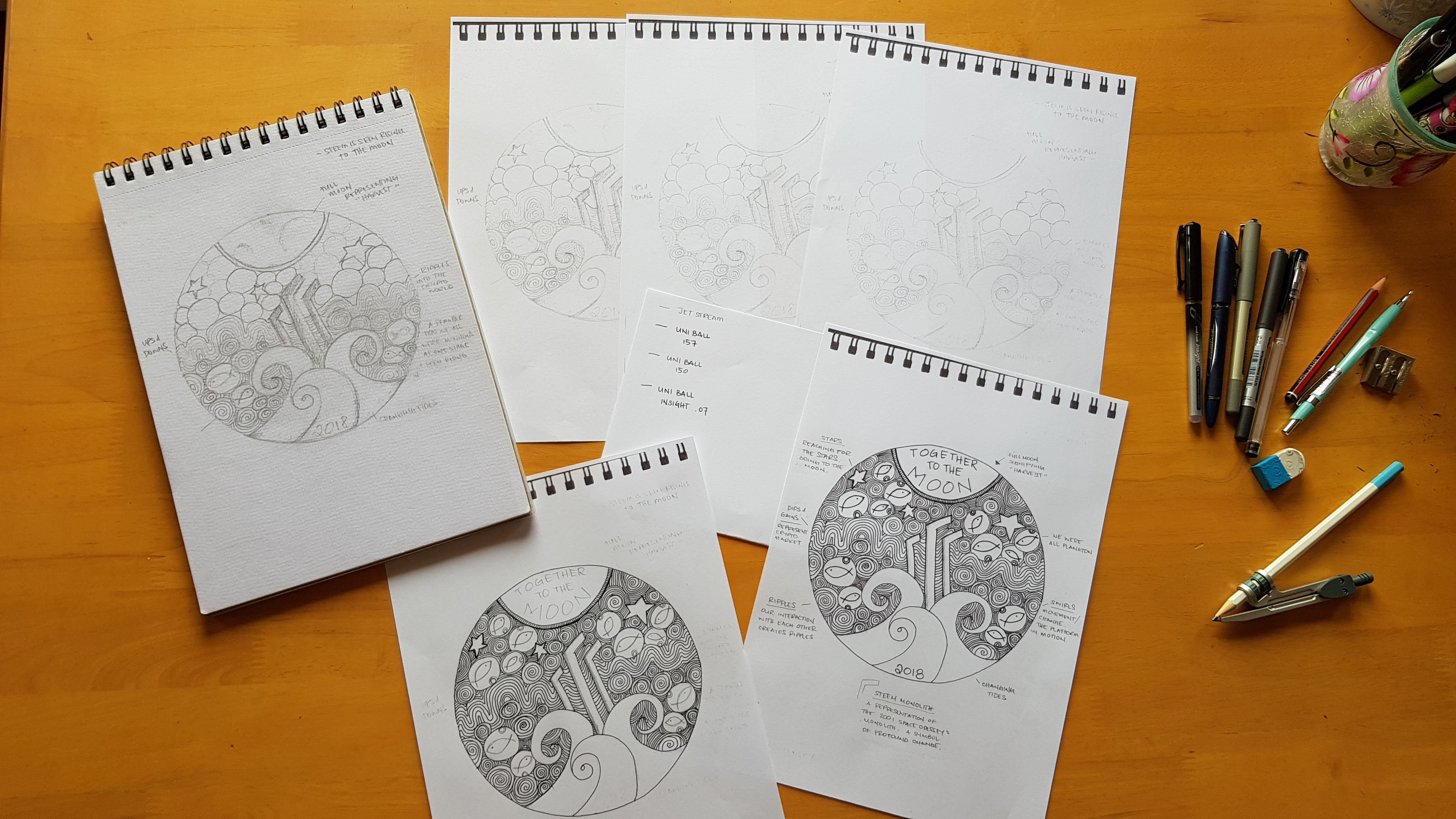
I can't even think right now I'm so nervous lol
Last year when I designed the 2017 STEEM Silver Round, I wasn't a stacker and I really had no idea about the significance of the coin.
This time around, I am a stacker and I know better, thus the nerves lol
THE PROCESS
As soon as I read @Phelimint's comp post I immediately saw an image in my head of the design, and knew I had to go old school pencil and paper on this one.
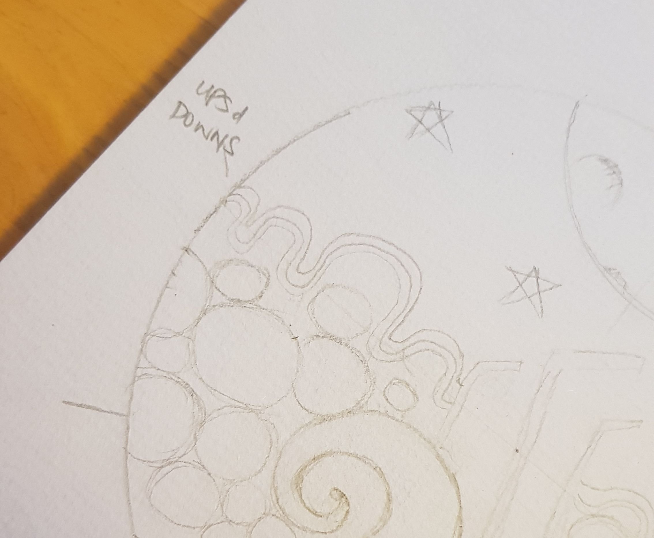
I began designing this coin yesterday afternoon gaining inspiration from the 2017 round, I decided to follow through the sea theme and began to draw in the waves.
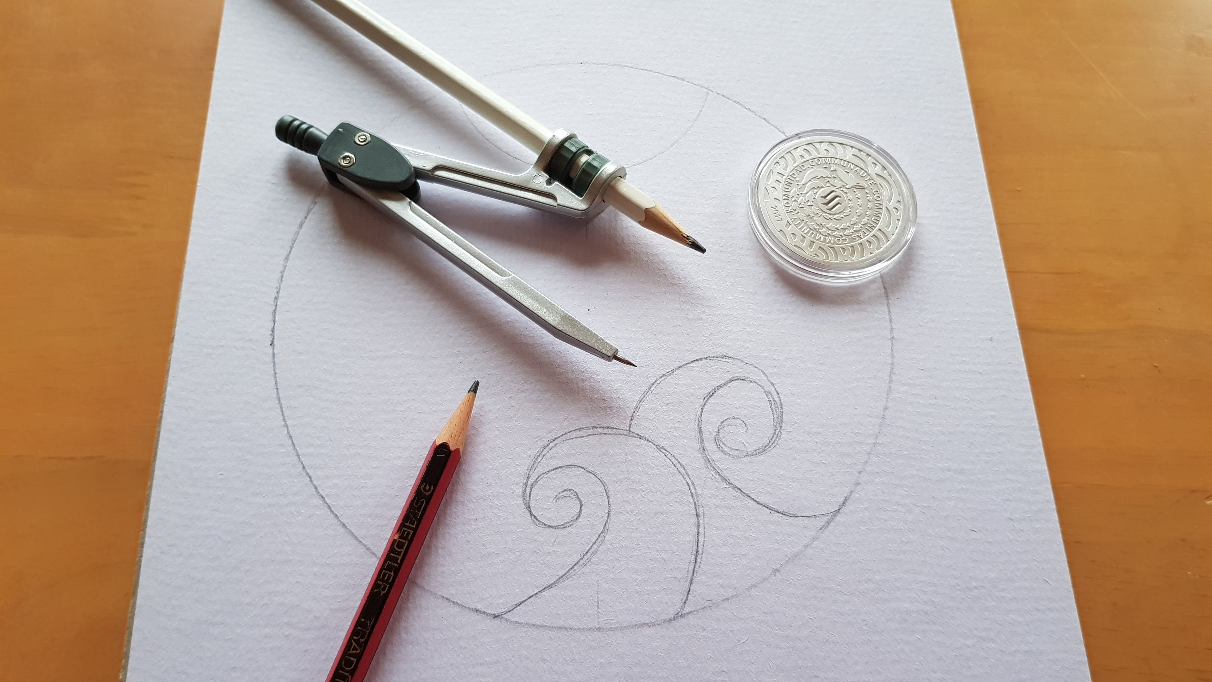
Working through the night I began adding elements to the design.
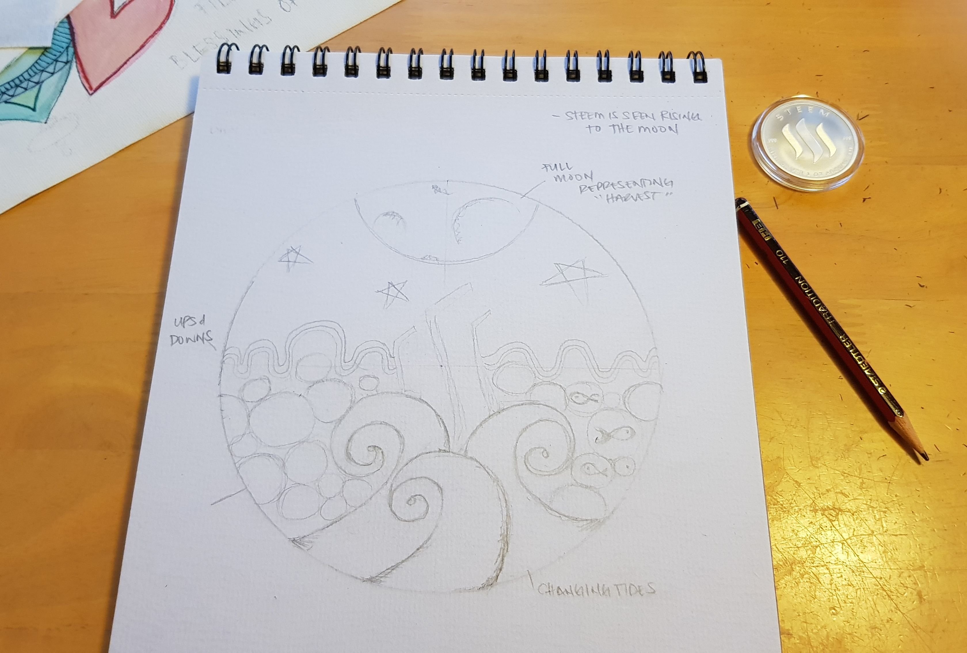
Tides representing the ever changing motion of the platform.
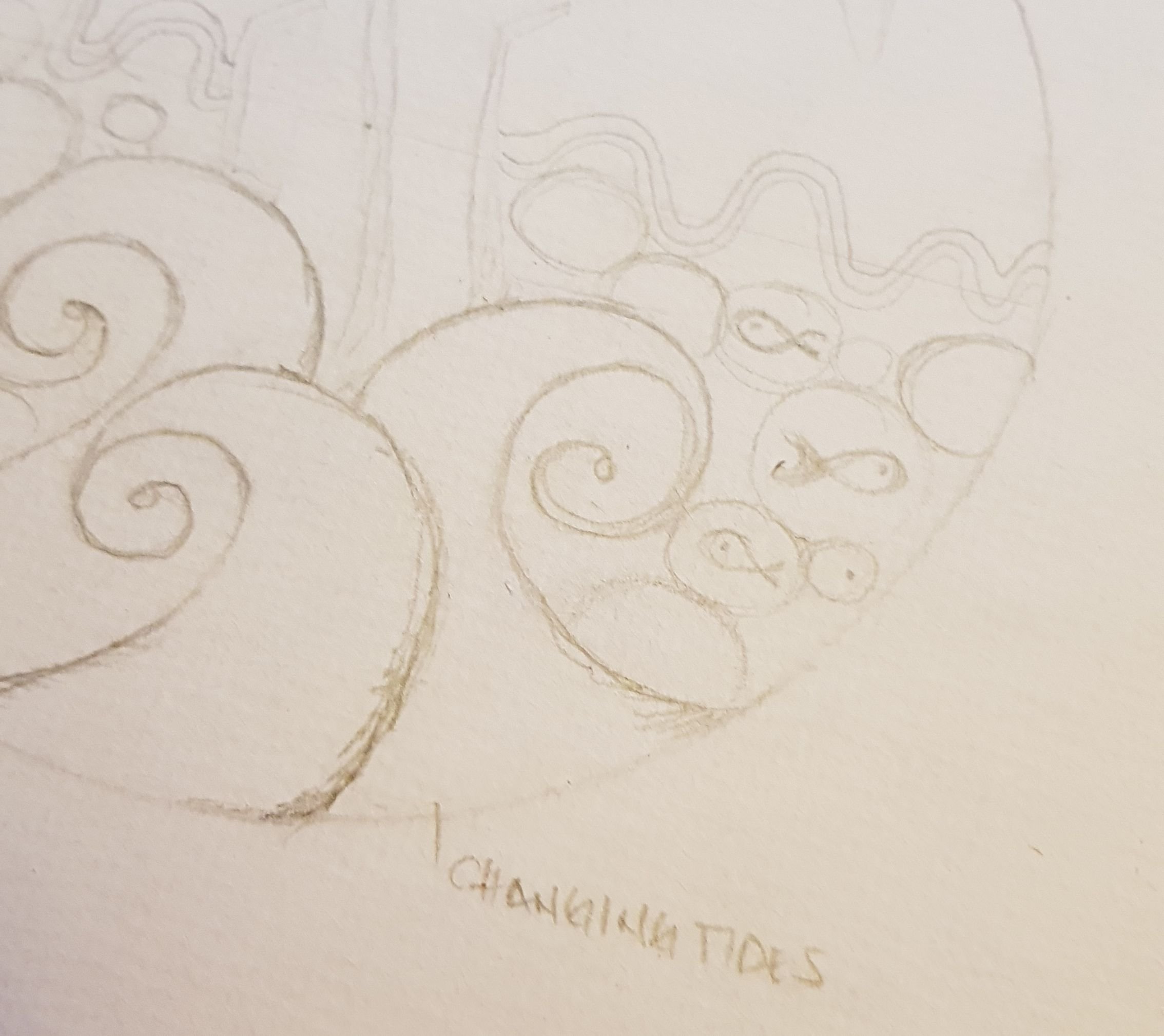
Full Moon representing a time for harvest.
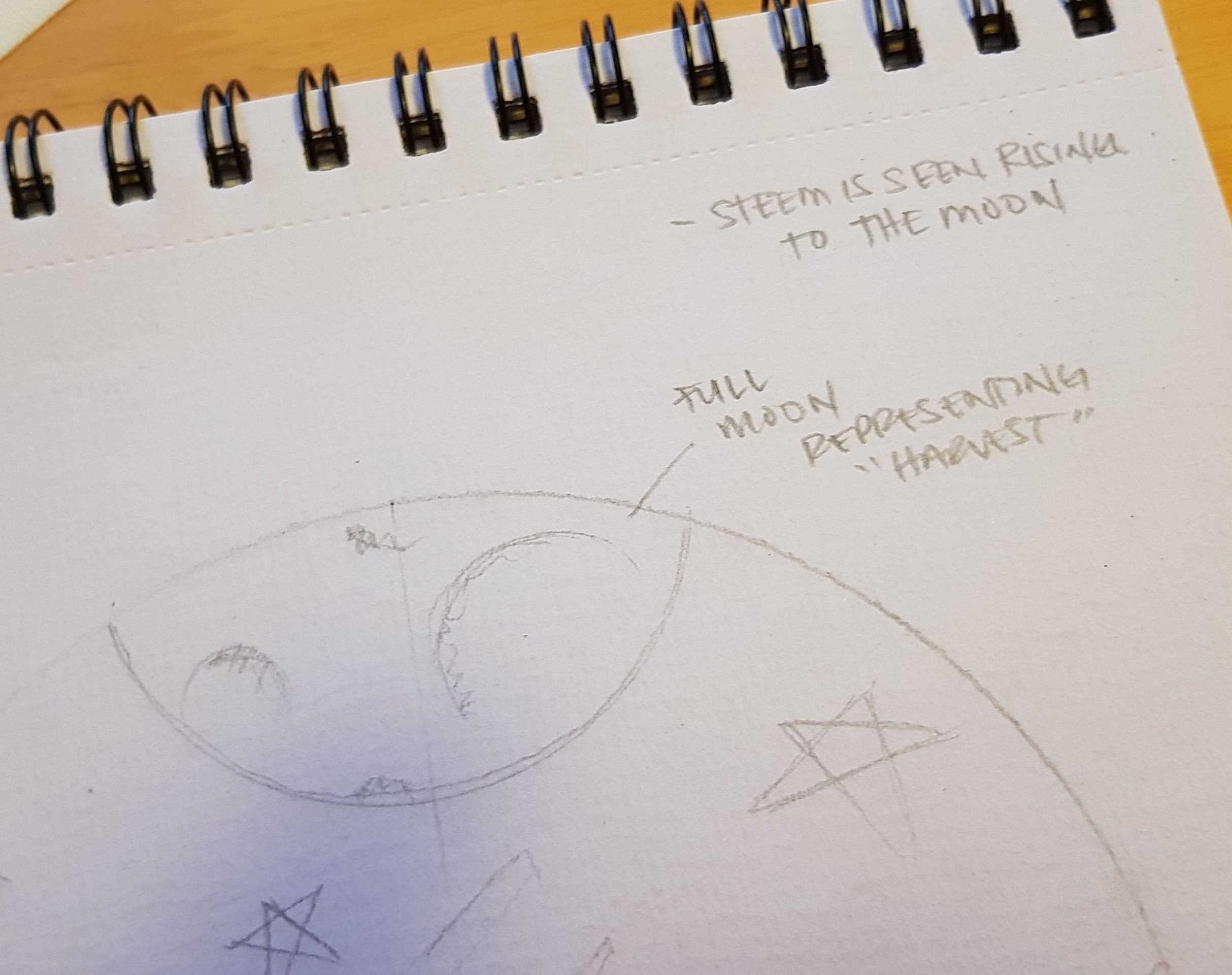
Waves representing the cryptos dips and gains.
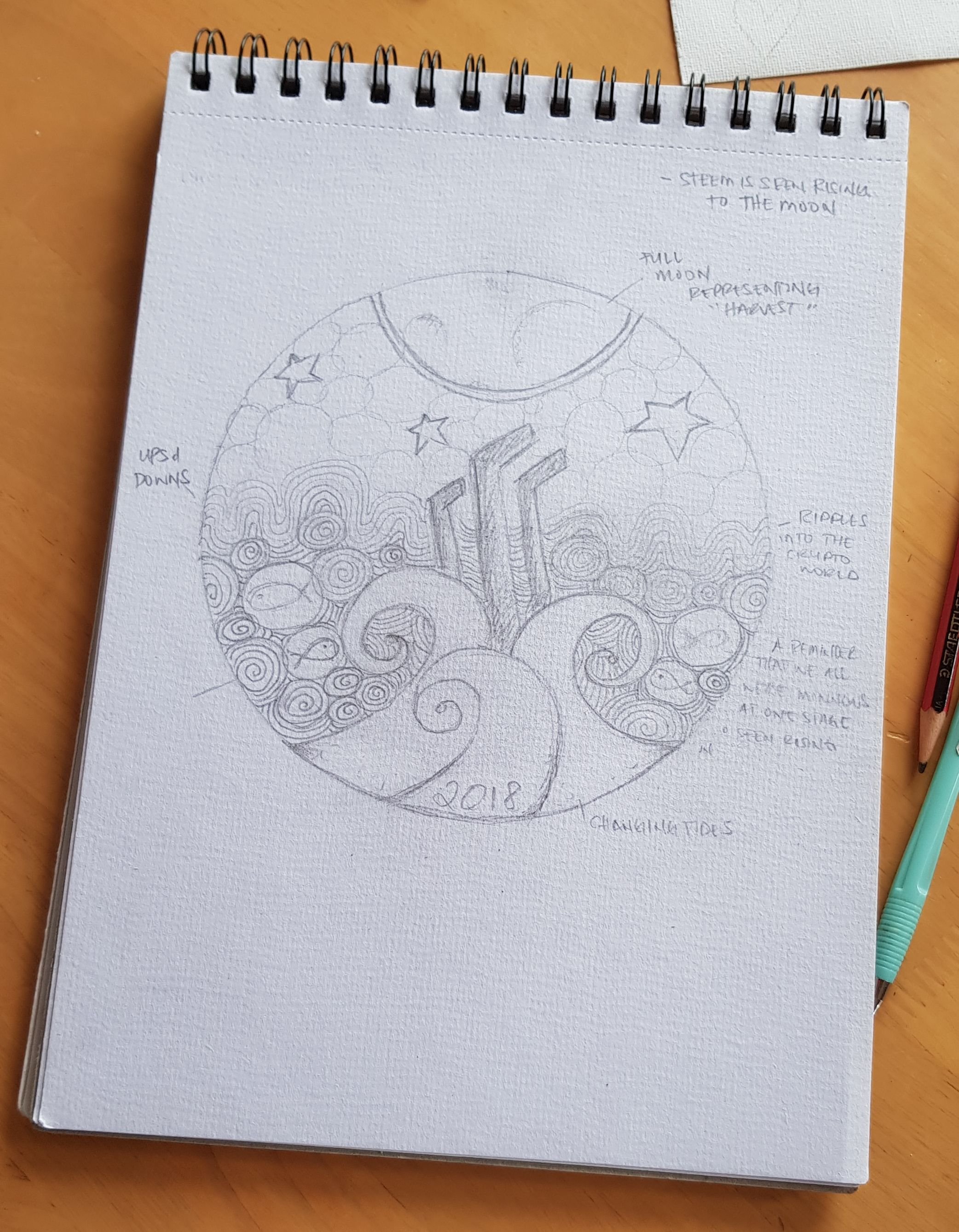
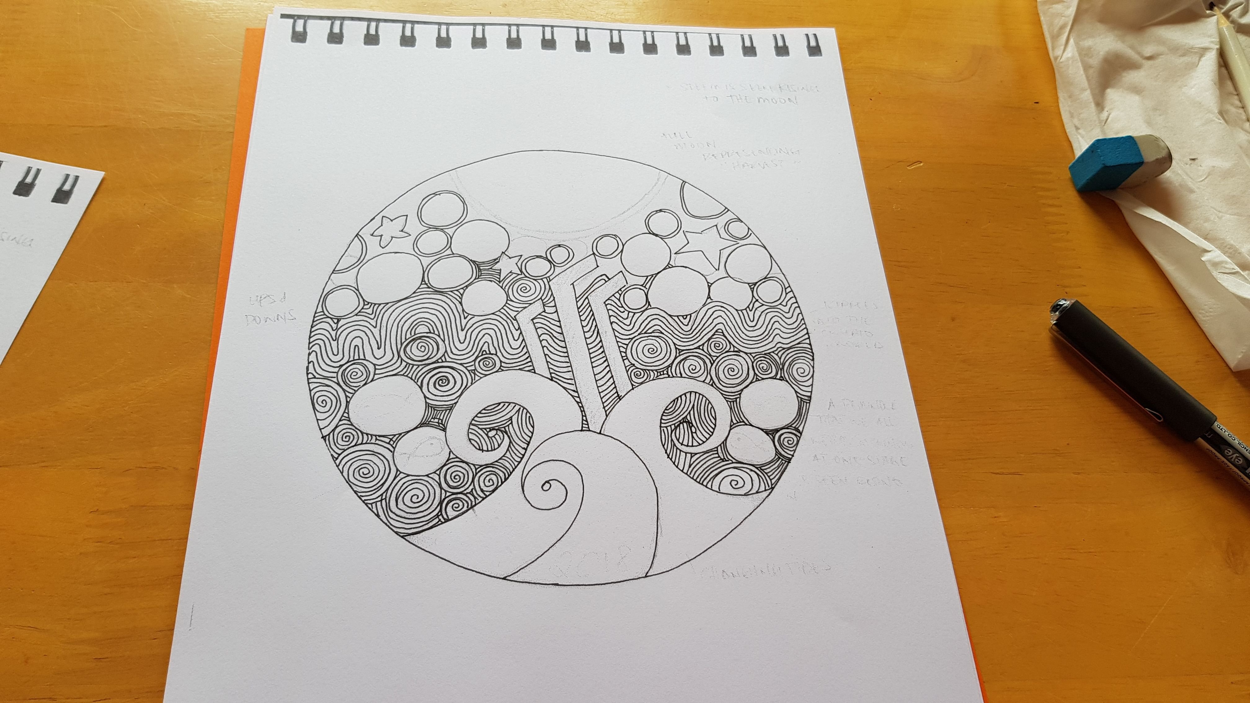
I got to this point when I began freaking out. This was my only copy and I needed to ink it, luckily @allylou came to my rescue and suggested I use my scanner, so I did and this is what I ended up with.
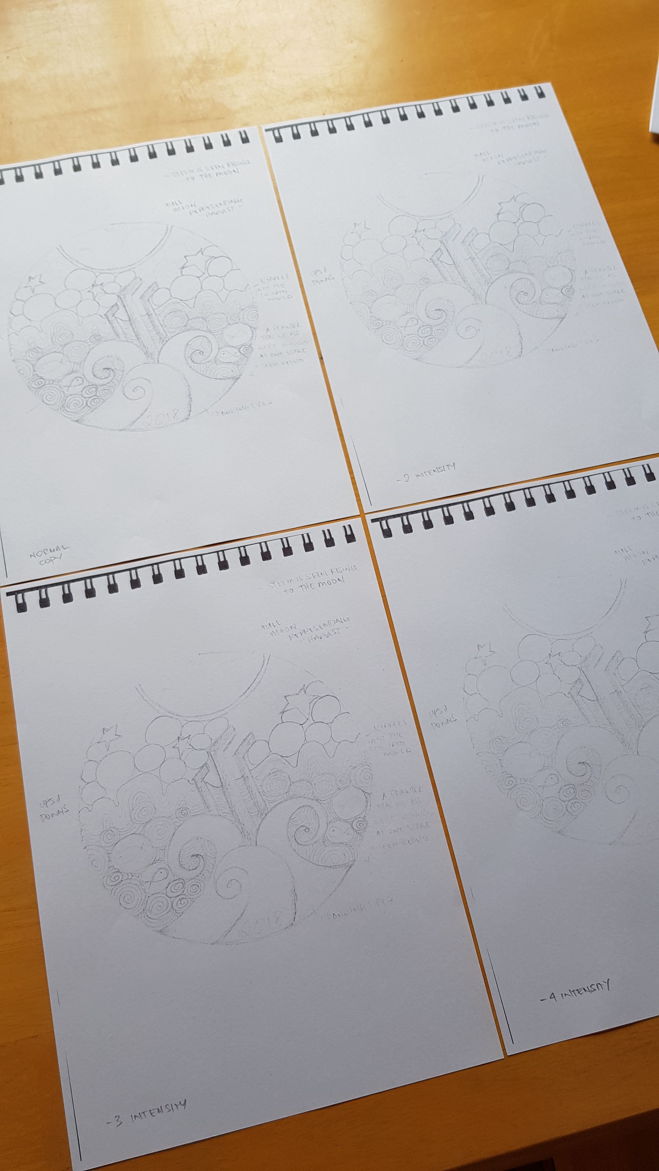
I had to work my way down the intensity settings before I found the right one that fit my needs.
-4 Intensity still had the main lines visible allowing me to simply trace over my major elements and light enough to draw over sections I wasn't happy with.
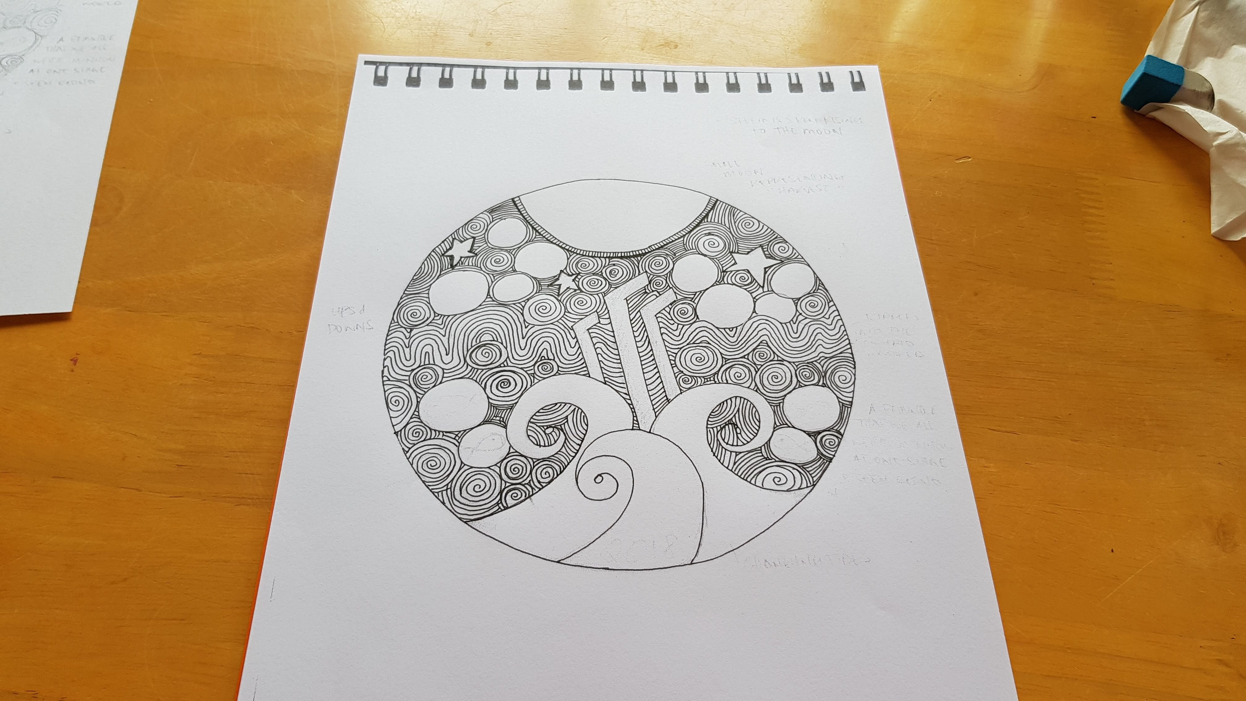
I worked the ink on to define the lines and fill in the gaps.
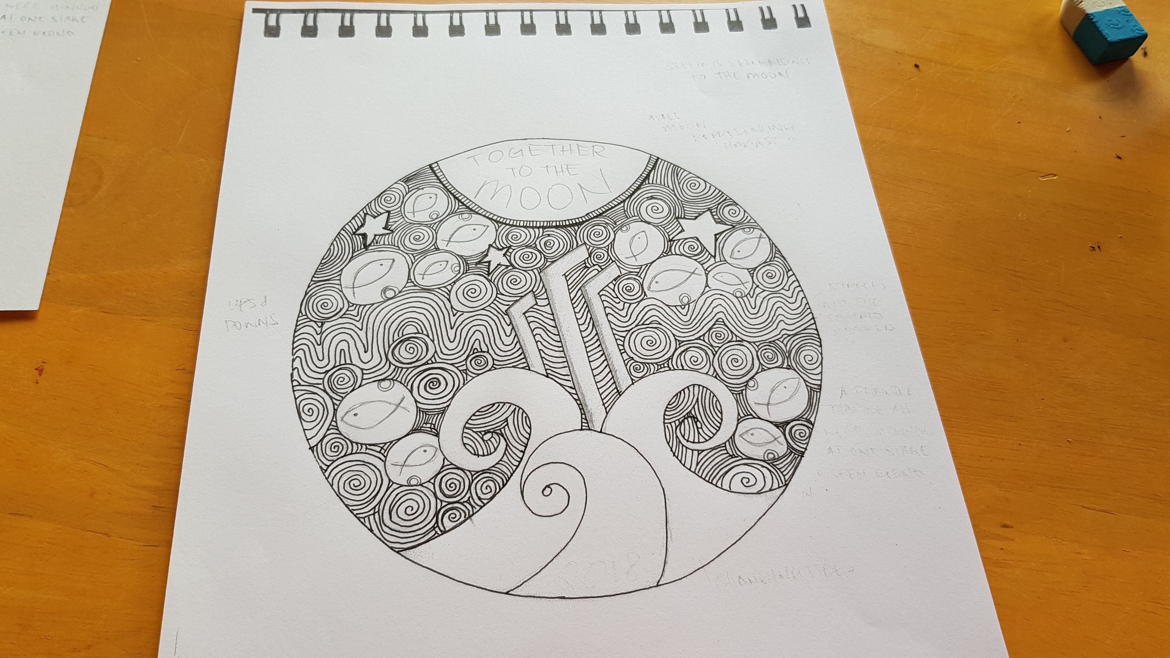
It's slowly coming together.
ABOUT THE DESIGN

Steemit to me is all about community and that is represented by the MINNOWS. Yup the minnows. No dolphins and whales this time, just the minnows.
I feel it's important that we remember what it's like to be a new fish swimming in new waters.
The SWIRLS represent the constant movement and changes on the platform.
This constant change was emphasised when I took a week off for The Move, when I got back this week I found so many new things going on within the communities I am a part of. I was only semi gone for a week.
The 'CHANGING TIDES' when you look at it, looks like it's propelling the "Steem" logo towards the full moon.
This is exactly how I feel about Steemit. It's just a matter of time before the tides change and people really embrace the next generation that we represent.
The RIPPLES represent our interaction with each other and how we have the ability to touch each other's lives.
I find this especially true in my time here. It has been my pleasure to have come across many beautiful souls and because of Steemit, we are able to touch other people's lives outside of the platform.
What we do here, now, makes a difference wether we realise it or not.
The long WAVES represent the dips and gains, the ups and downs, that we as a community go through.
The STARS...
"Reaching for the Stars. Going to the Moon."
Lastly. You would have noticed I revamped the STEEM logo.
Honestly? I was having issues getting the proportions right to make it look exactly like the logo so I sketched in a rough outline, which ended up sticking because it reminded me of the 2001 Space Odyssey Monolith.
Which in this design seems so appropriate, as the Monolith, in the movie, triggered a shift in evolution.
Steemit certainly is the next step to evolution.
Edits? Thoughts?
The longer I look at the design the more things I see that need fixing, like the writing at the top is off. One of the tides is off too. Little things that are niggling at me.
In terms of changing the concept all together. I really like this and all the symbolisms it holds.
I also like the amount of details on it.
One of the things I wished the 2017 coin had was finer details. Back then I didn't know how intricate these coins can get so I made it a very simple design, now that I know how much detail they can add, I might even do a coloured version just for fun.
Stay tuned for the Final Edit and the Coloured version!
I hope you guys like my design 😊
💗 Arly
