This post will tell you how to use the div tags to make pictures in post float to the left or to the right, to give more visual interest and variety in your blog. It's done at the request made yesterday by @joeyknowsbest asked a question of my Rare Replay review.
You need to do a guide on how to get the pictures next to the text like that. Mine posts always comes out all wacky looking when I try to do that.
@mattclarke chimed in asking for help too. So here is how to do it!
Example 1: Pull Right
I'm going to re-use a block of text from the most recent review in order to demonstrate below:
The line breaks (br tags) help to space the text and the images to make a more natural, spacey layout. Without them, it would look very compressed, and the text wouldn't flow all that well, like this sentence.
This 'code' produces the following result:
Snake Rattle N Roll
I don't know why Rare enjoyed torturing people so much with isometric platformers in the 'good old days' of gaming, and it is very apparent that this title does not belong in the 'Rare Replay' collection. I think it is there so I can write this very special review.
The original source code should be eaten by a Snake.
Example 2: Pull Left
The same, but we change one word:
Snake Rattle N Roll
I don't know why Rare enjoyed torturing people so much with isometric platformers in the 'good old days' of gaming, and it is very apparent that this title does not belong in the 'Rare Replay' collection. I think it is there so I can write this very special review.
The original source code should be eaten by a Snake.
Example the Third! Captions!
I'm going to use some new material here, shamelessly promoting my steemit number plates for my car, again. Deal with it.
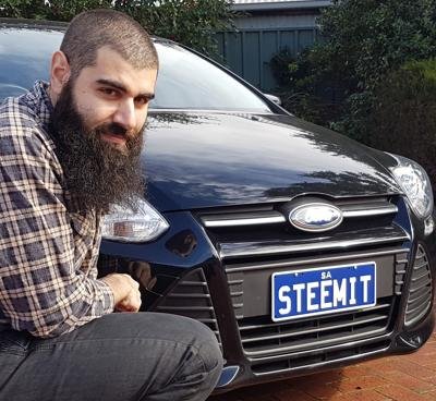
OMG another Title
holoz0r writes about gaming, movies, and other stuff that he finds interesting. He doesn't believe in F4F (except when F stands for ... nevermind) and he enjoys writing stuff for Steemit even though it is sometimes not very interesting. He also has to start a new paragraph.
Here's a new paragraph of random text to fill the space next to the picture where he kind of looks like a lumberjack.
And the code:
The key is to use the br tags to add spacing within the div so you don't get a garbled mess. Captions look best when they're centered, and I decided to make it smaller using the "sub" tag.
This post is waffling on, so here's one final example, and a tribute to a fellow Steemian, @lauralemons, who drew the comic of me below:
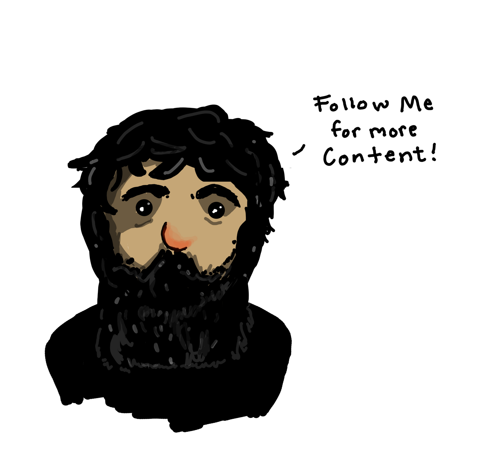
She writes about what she likes. It is interesting and challenging and confronting at times, unlike these crappy rhymes.
More words for the space, beside my drawn face.
And the code:
The layouts that really challenged me where the adaptation of some of the academic material that I had written in the past for Steemit. The layout for this post really challenged me.
You can find out more about how to do this stuff properly, if my post here isn't all that clear via: "Mastering Markdown" - hopefully my examples helped.