Hello steemit community, I'd like to introduce myself to the people of Utopian.
My name in Federico I'm a graphic designer based in Punta del Este, Uruguay, I;m 31 years old and been working as a free lancer since 2009 and recently been working for an advertising agency based in Argentina.
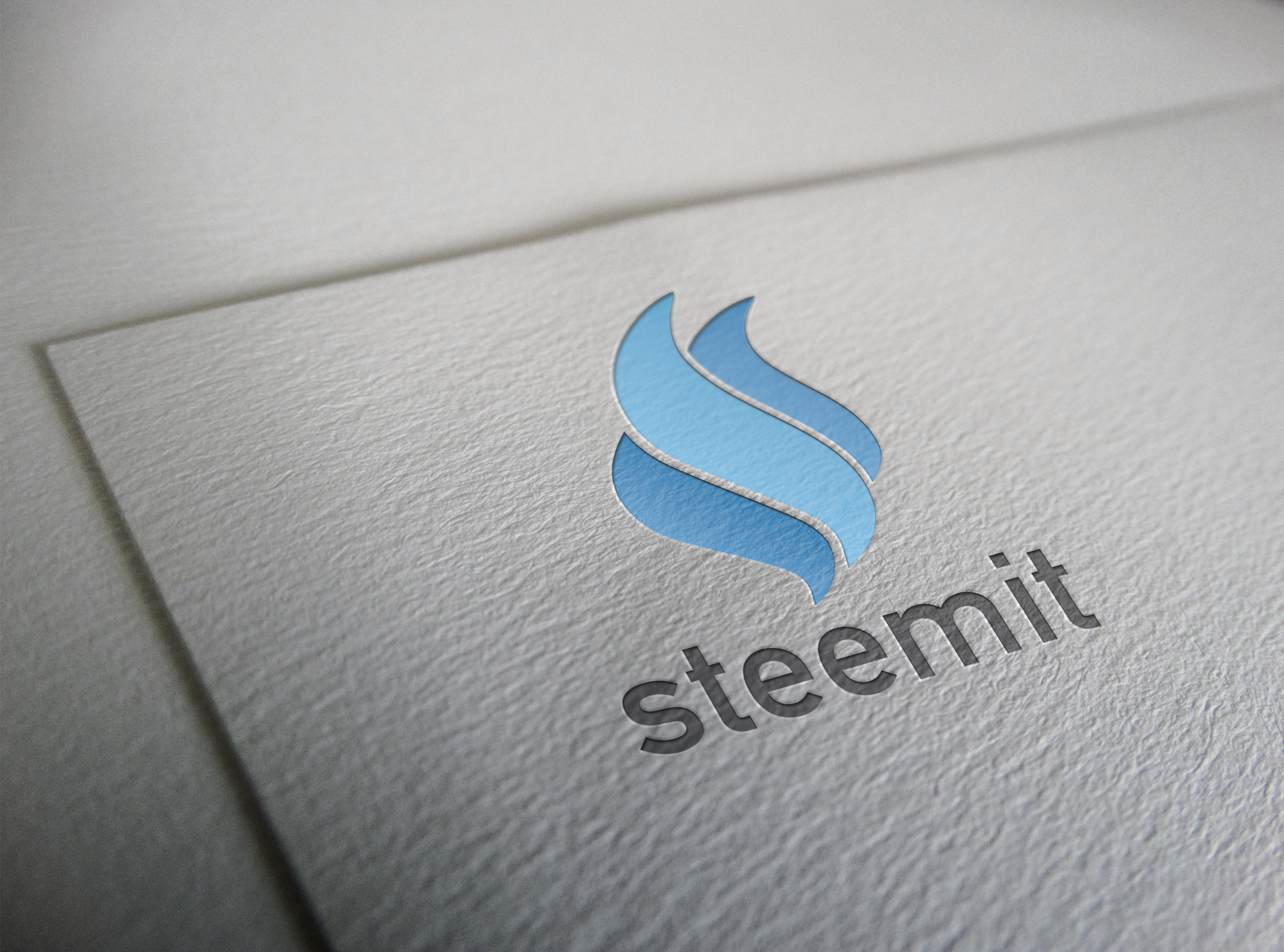
In my opinion the steemit logo is not that bad, the whole idea representing the steam as the steam powered mixed with the colors and wave shapes as the sea is going in the right direction, but somehow it looks kinda old, or maybe is just my point of view.
Anyway I've been working for a couple of days about a steemit logo redesign trying to keep the same idea, about the steam and keeping the color pattern as well.
Here is a preview of the first version of it, as I said the main idea about this redesign is to keep it as much as the original as posible keeping the same structure but a bit more stylish. I keep the same colors but I added some kind of blending shade to give it more movement with the lights/shadows effect, with the typography I kept it all in lower case to make it more a typewriter style in relation to blogging and writing, I used a typo a bit more strong to enhance the name a bit more.

Here is the process I did to get to what is the final result, I started with the steemit original logo, and get it into a vector file to star working with each dot of the original drawing. As you can see on the process image, I made them a little more round and thicker than the original logo and try to put them together in order to unify the main icon. It could be read as a fire flame or even a torch, which is not that far from what this have to represent in my opinion, the power of steam, or even fire is one of the most powerful and old ways to pump an engine, which is exactly what steem is doing powering this amazing platform.
I leave you a couple of version of the new redesign, such as the original a black and white version in positive and negative application. I've been trying to improve this logo and made some other versions of it to in order to have a better aspect in terms of visual.
A couple of days ago I made a post about 5 things that could improve steemit for all of us. You can check the post if you want to get more informed about it, but if that's not the case I took the time to apply some of those changes into the profile and home site.
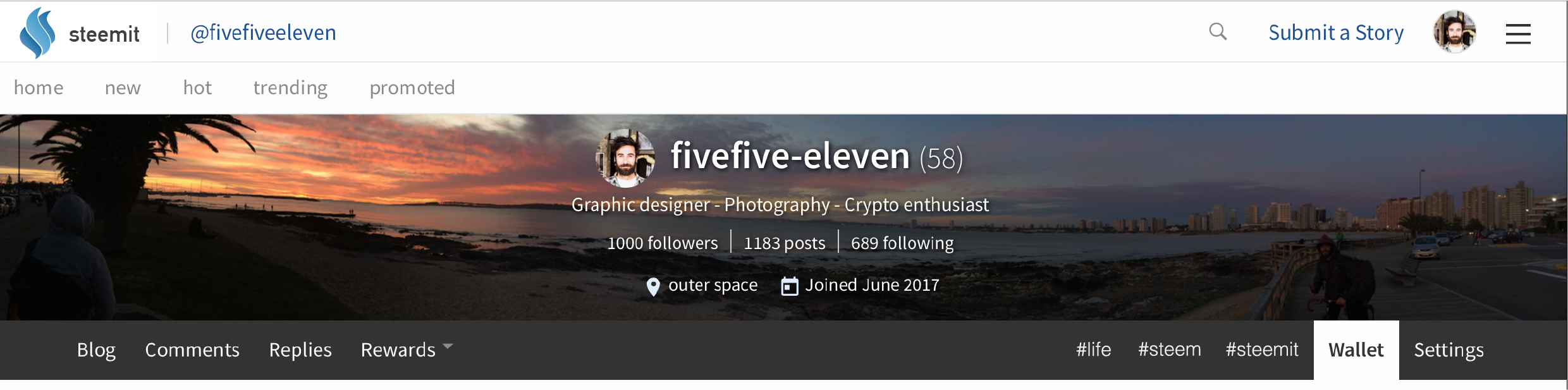
As you can see I added the new logo and a couple of new features such as "personal tags" that means you can pick maybe three or five tags to keep pinned up to your profile in order to maintain your favorite hashtags in your own profile, it means you can get access easier and faster to find content of you interest.
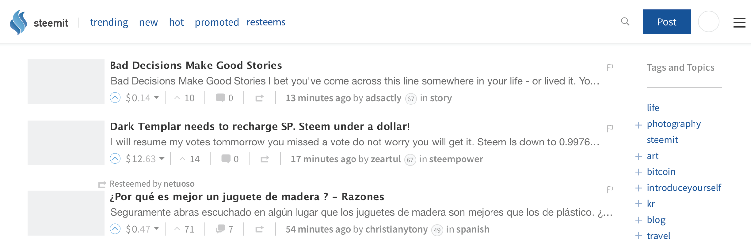
In the homepage I also added a "resteems" tag to look to what our subscribers resteem not mixing it with our subscribers original content, in the way you don't have to see what other people you follow resteem, and keep your feed with only interesting content, the plus sign next to the tags is to add this tags to our profile.
I'm open to all kind of critics and opinions to help improve the new redesign of the steemit logo, also if you want me to check some other possibilities related to the design of the template please let me know that to. Feel free to comment what you think about this work. Big thanks to the utopian.io people, they are taking this contribution thing really serious and I feel truly happy for this to happen.
Open Source Contribution posted via https://utopian.io