Previous updates: First Commit & Initial Styling
Note: I attempted to post this on the morning of Monday, March 26th (EDT), but have had trouble getting my posts to go through on Utopian. Please keep that in mind when you compare my updates here to the current code on the repo.
Project Info
I’m working as the developer for the new project by @sndbox called The Creative Crypto. Here is the announcement post that explains the project:
The Creative Crypto will be an online journal (thecreativecrypto.com) and bi-yearly publication of blockchain’s impact on the creative world. The journal will strive to present the best new projects, people, ideas, and community developments in order to empower the next revolution of crypto-powered production.
Lessons From This Week
My main lesson for last week was that using new tools makes everything take longer at first. I still got to just about where I planned on being, but my brain is a little angry with me for pushing it harder than usual. 🙂
I also underestimated how much I’ve been leaning on my coding teacher/mentor each week. I usually meet with him for an hour on Monday, Wednesday, and Friday to ask him questions and get advice about my code, but last week we only met twice. I ended up having to dive deeper into the documentation and Stack Overflow to get answers to some of the things I was looking for, which was great practice, but it also slowed me down.
Updates
Apologies for not organizing the code into branches from the beginning, but I tried grouping the new work better for this update. Please let me know if there’s a better approach for this that would make my code easier to read/review. The titles below are links to the corresponding commit or branch in my Github repo.
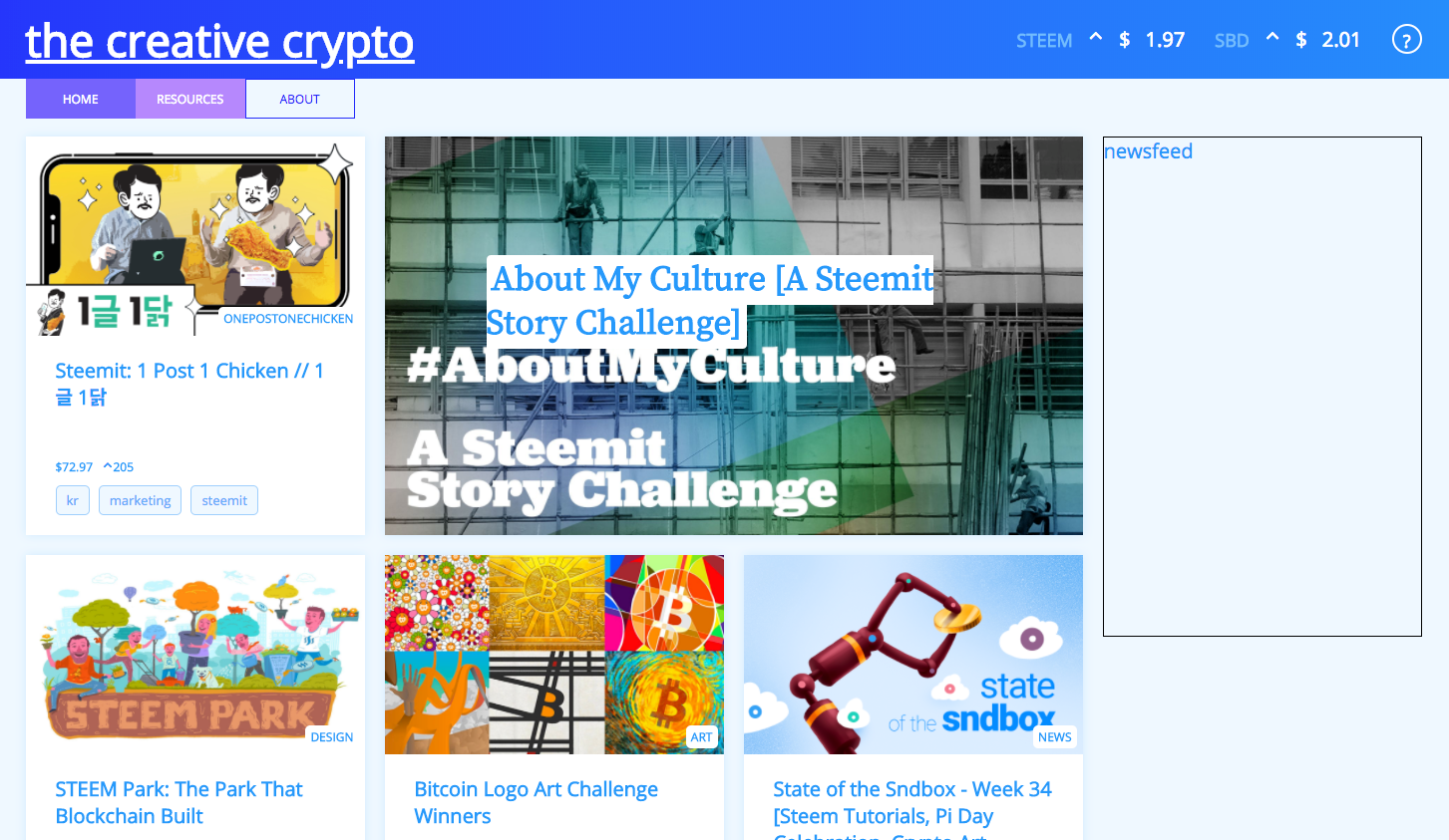
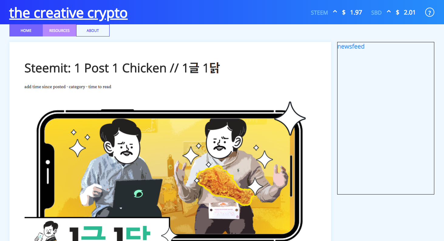
In its current state the site has a home page that loads up a batch of posts. I’m currently testing it with posts from the @sndbox account just so I have more to work with. If you click on a post tile on the home page it will replace the grid with the contents of a single post. The price tickers now get the current prices on page load, and show an up or down arrow depending on the price change in the past hour.

Get single post from permalink
One challenge during this new update was figuring out how to handle using the two different API calls for displaying a single post. If a user clicks on a post on the index page to view the contents, it will use the post data that got pulled in on the home page load for the 11 posts in the grid. If a user goes directly to the specific URL for a post (thecreativecrypto.com/permalink-goes-here), it uses a different API call to get the info for only that post. I had trouble figuring out how to specify when to use each API call, but I think I have it working now.
Speaking of that API call to get a post based on its permalink, it was much more challenging than I originally expected. Based on the API docs for Steem.js, it seemed like it would be pretty easy to set this up, but I had to search around for awhile to figure out exactly how to structure the query parameters. Here’s the way to do it if you’re curious (this post was my savior):
const currentDate = new Date().toISOString().split('.')[0];
steem.api.getDiscussionsByAuthorBeforeDate(accountName, permlink, currentDate, 1, function(err, result) {
    if (err) rej(err);
    else res(result);
});
Connect price tickers to Coin Market Cap API
The price tickers are now hooked up to the Coin Market Cap API. This was easier than expected — basically just a call to https://api.coinmarketcap.com/v1/ticker/bitcoin/ with the proper cryptocurrency name.
Post grid formatting
When I posted my last updated I still hadn’t gotten the grid to line up properly on the home page. I updated the styling so that it works now.
If you look at the picture of the grid above, you’ll see that the most recent post is displayed as a bigger tile with the info on top of the image. Currently I create both a small and large version of that tile on page load and add them to the DOM. I haven’t implemented the responsive design yet, but right now the small tile gets hidden and the goal is to hide the large tile on smaller screens and display the small one.
Initial styling for single post
I added really basic formatting to display the body of a specific post along with a markdown parser. Still having trouble with marked so I might experiment with some other markdown parsers to see if they work better.
Test stock Twitter newsfeed
I tried out the stock Twitter embeddable timeline to use as the newsfeed, but there are very few styling options. I think I’m going to have to add Node to this project just to handle the authentication for the Twitter API, which would let me pull in the timeline data and give it a custom format.
Update post grid styling
In this branch I spent some more time styling the tiles on the post grid. Still some work to do, but getting closer!
Next
Still quite a bit of work to do, but I’m getting there. I keep getting really frustrated with the amount of work I’ve gotten done, but then when I take a break and come back to it, I realize how far it has come since I started and feel a little better. I think I need to get away from the computer more often!
Still some big features to implement this week, but the list is getting more manageable:
- add node
- hook up to Twitter API and add newsfeed to home page
- add responsive design
- refine styling of grid to match design image
- fix markdown formatting for single post
- refine styling of single post
- add social share buttons on single post
- add icons and header image
- add favicon
Feedback
Please let me know if you have any suggestions to improve my code in any way. Feel free to leave a comment on this post, or on the Github repo. Even if you just have some basic advice about learning to code, I’d love to hear it. 🙂
Thanks for reading!
