Hi, I want to bring attention to a display bug I noticed in Steemit's new dark mode display theme both on the PC and on a mobile device.
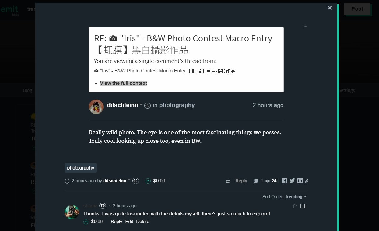
Below is a screenshot after clicking on a reply on a post, from a PC browser:

This is not the main bug but here you can see that the white section of text near the top doesn't look like it has the dark theme applied (not sure if this is the intention or not). Also my username is hard to read, the one beside my icon and reputation score.
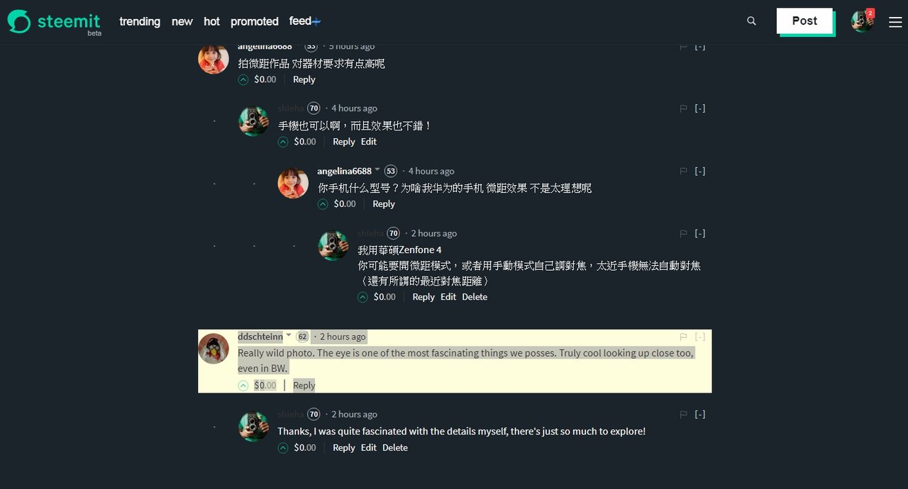
Now onto the main bug I wanted to report, if I click on the "View the full context" as highlighted in the above image, I get the following:

As you can see, it takes me to the original post showing the reply, however, the reply text is unreadable and is clearly a display bug with white text on a white background.
Just to make sure the reply text is really there, I took another screenshot showing the highlighted text:

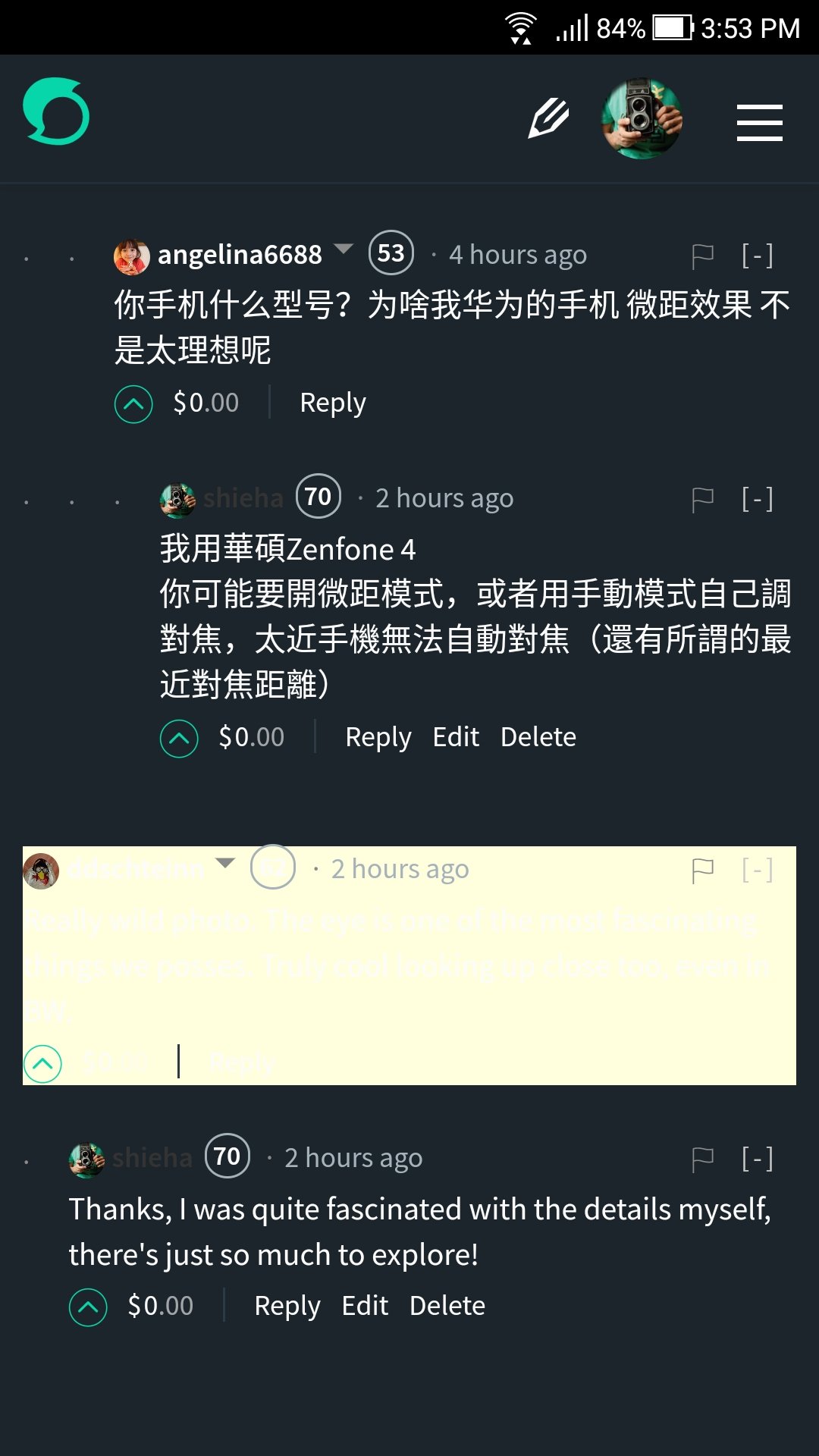
The same problem occurs on a mobile browser as well:

I like the new dark mode but this bug breaks the immersion!
PC info:
Date: 2017/11/1 4:07 UTC+8
Browser version: Google Chrome 61.0.3163.100 (Official Build) (64-bit)
OS: Windows 7 SP1 64-bit
Mobile info:
Date: 2017/11/1 4:07 UTC+8
Phone: Asus Zenfone 4
Browser Version: Google Chrome 62.0.3202.73
OS: Android 7.1.1
Open Source Contribution posted via Utopian.io
