Details
I have done an earlier analysis on Account Creation Trend, and pointed out how the sign-ups seem to be breaking through in recent months. I wanted to dig deeper and have more understanding on what happens to accounts post signing up. In this contribution, I attempted to slice the entire account table by category to understand how much of the accounts turns active, rises in reputation, and builds Steem Power.
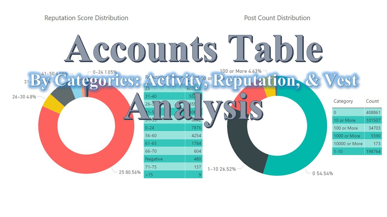
Outline
This analysis will cover these points in this analysis.
- Account Creation Trend for the Past 19 Months
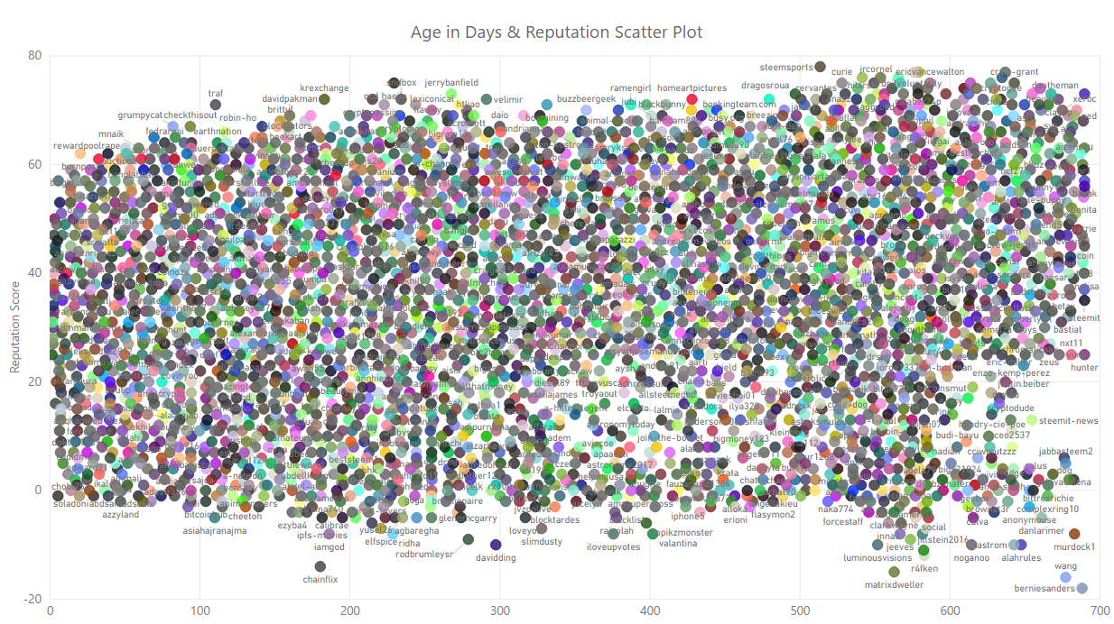
- Scatter Plot Showing The Relationship Between Age of the Accounts, and Reputation Score
- Reputation Score Distribution & Posting Activity Distribution
- Scatter Plot Showing The Relationship Between Post Count, and Reputation Score
- Vesting Share Holding Distribution
- Scatter Plot Showing The Relationship Between Vesting Share Holding & Reputation Score
- By Witness Vote Distribution & Unused Power to Vote for Witness
Scope of Analysis
This analysis shows a 19 months worth of data to present trends, distribution, and relationships between variables of the Accounts table. I generated the data to capture all information from inception in March 2016 till the time the data was extracted on February 11 (2:00 AM GMT). I removed the February 2018 data when presenting trends since that month will only have partial data, they were included however for overall distributions and relationships.
In presenting relationships via scatter plots, I have had to remove outlying dots to draw stronger correlation or non-correlation between the variables. Here are the accounts excluded per scatter plots:
Exclusion From Age - Reputation Scatter Plot
temp, null, initminer, cynthialiu, poloris, galant, ebethhand, crislar
Exclusion From Post Count - Reputation Scatter Plot
steemitboard, cheetah, minnowsupport, randowhale, originalworks, minnowpond, drotto, photocontests, bootster, minnowbooster, steemcleaners, screenname, minnowpond1, appreciator, buildawhale, resteemable, boomerang, stealthgoat, upme, cleverbot
Exclusions From Vesting Share - Reputation Scatter Plot
steemit, misterdelegation, steem, freedom, blocktrades, ned, mottler, jamesc, val-a, val-b, proskynneo, michael-b, jamesc1,, safari, batel, created, jaewoocho, alice, goku1, michael-a, bob, alvaro
Tools
I used arcange's Steem SQL Public Database to acquire the data-points related to the variables studied in this analysis under the Account table. I ran a simple query in a Microsoft Excel spreadsheet to get all the variables used:
SELECT name, created, post_count, vesting_shares, witnesses_voted_for, reputation
FROM Accounts
GROUP BY name, created, post_count, vesting_shares, witnesses_voted_for, reputation
- To get the age in days of the accounts, I used the formula: =Now()-(created)
- To get the value of vesting_shares and remove the text VESTS at the end, I used the formula: =VALUE(LEFT(vesting_shares),LEN(vesting_shares)-6))
- To categorize by vesting_shares, I used the formula: =IF(N2>=1000000000,"Whale",IF(vesting_shares>=100000000,"Orca",IF(vesting_shares>=10000000,"Dolphin",IF(vesting_shares>=1000000,"Minnow",IF(vesting_shares>=1,"Red Fish","Dead Fish")))))
- To get the simplified reputation score, I used the formula: =ROUNDDOWN(MAX(LOG10(ABS(reputation))-9,0)xIF(reputation>=0,1,-1)x9+25,0) and defaulted the ones that returned with errors to 25
I used Microsoft's Power BI to plot the results in charts.
Results
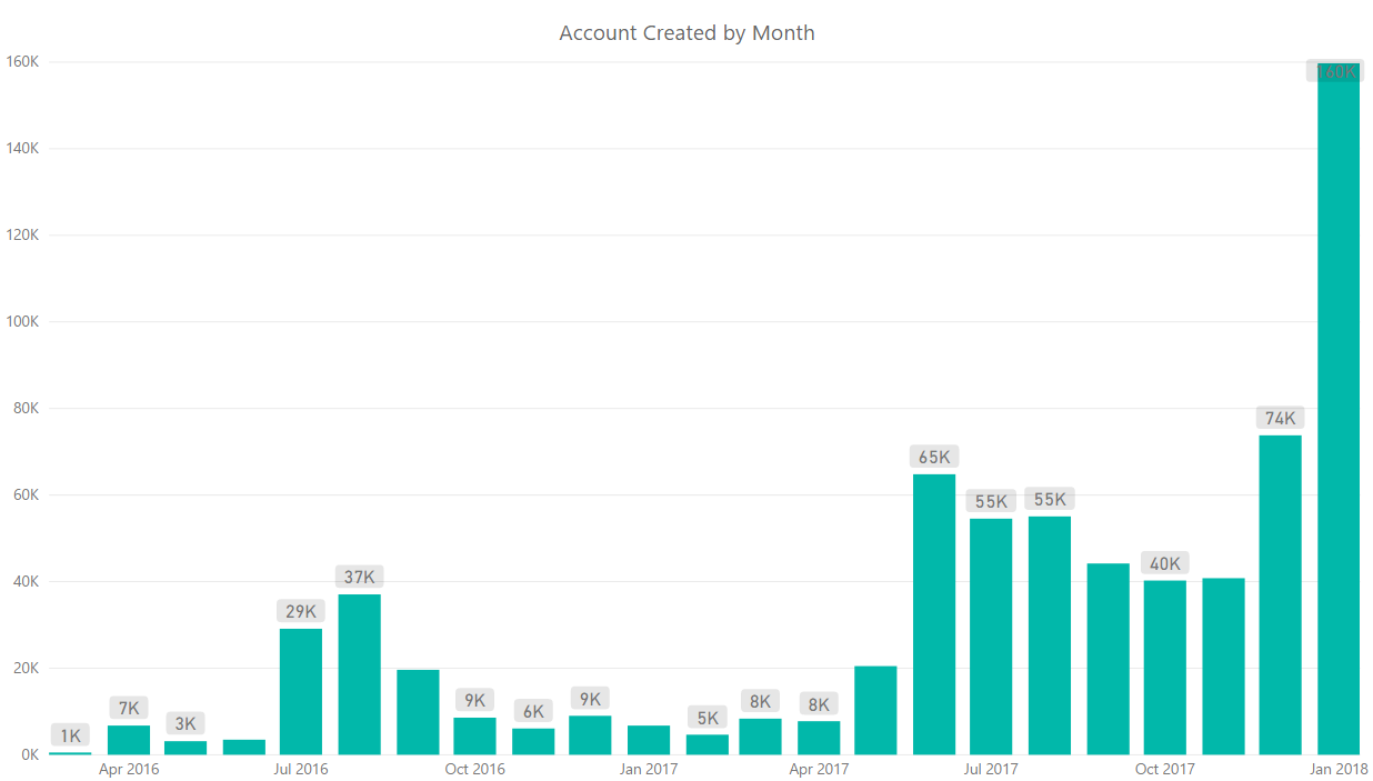
You've seen the table above in the Account Creation Trend contribution recently. I used the data on the date of creation per account to find correlation between age, and rise in reputation.
The dots in the chart below are representation of account names plotted against age in days (X axis), and simplified reputation (Y axis). I have seen many scatter plots, but not anything as scattered as this. This shows that there's hardly any direct relationship between when an account got created and reputation score. This point will become clearer as we explore more variables in the Accounts table further into this analysis.
This proves that it is not too late, and will probably be never too late to sign up to Steemit. I myself had the thought that the earlier adopters were lucky to have found Steemit before we did. This chart tell us how that thought is pure non-sense.
Reputation & Post Count Distribution
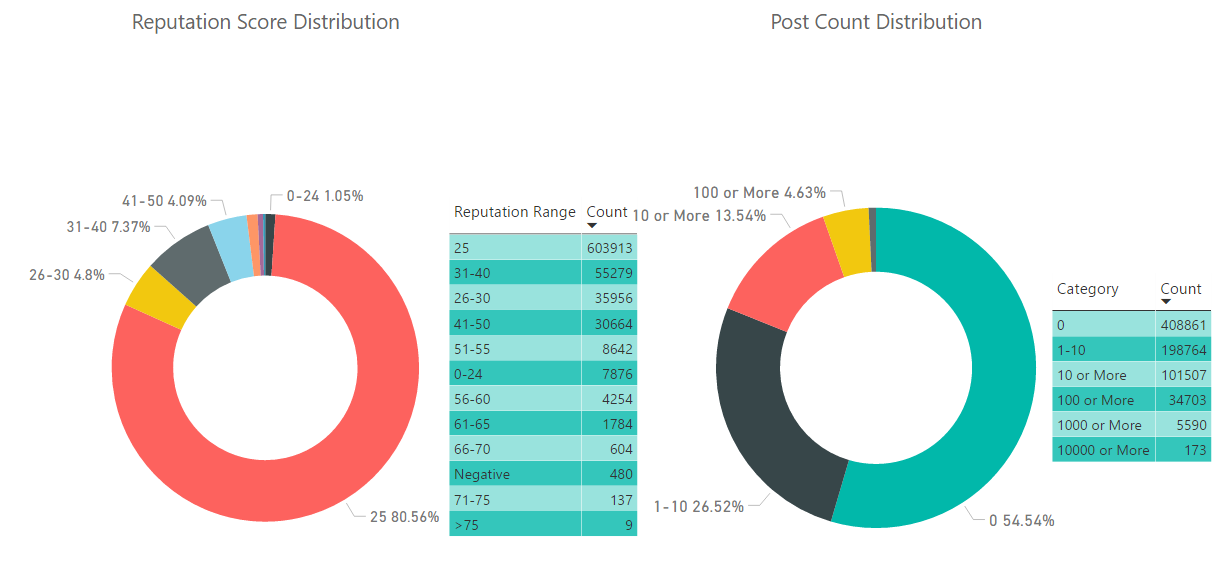
The chart in the left hand side above shows how 80% of the 749,598 accounts haven't moved from the default simplified reputation score of 25. Looking at the chart right hand side explains why. The combination of the 54.5% accounts that have not posted anything, and the 26.5% of the account that have only posted no more than 10; is also 80%.
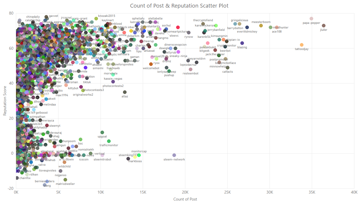
In the scatter plot below, we can see a strong correlation between posting activities and rise in reputation. I called out some exclusions I made in the section called Scope. I removed some known bots who are automatically commenting on posts. On purpose, I left some auto-post bots in the lower than zero reputation to show how the community responds to those type of activities.
Vesting Share Distribution By Category
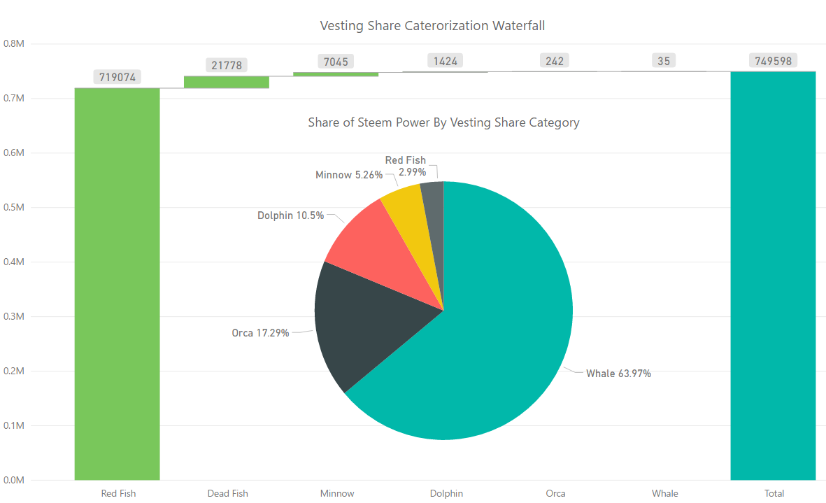
I combined two charts in one page of Power BI above. The bigger chart is a waterfall chart showing the make up of the entire user-base of Steemit by vesting share category, inside in the white space I inserted a pie chart that shows how much share of influence each of the category has in Steem Power.
Here we can see that 81% of Steem Power rests with the .04% of the entire user-base between whales and orcas. Please note that the definition of dead fish in this analysis is not based on activities like in steemitboard, but based on having <1 vesting share.
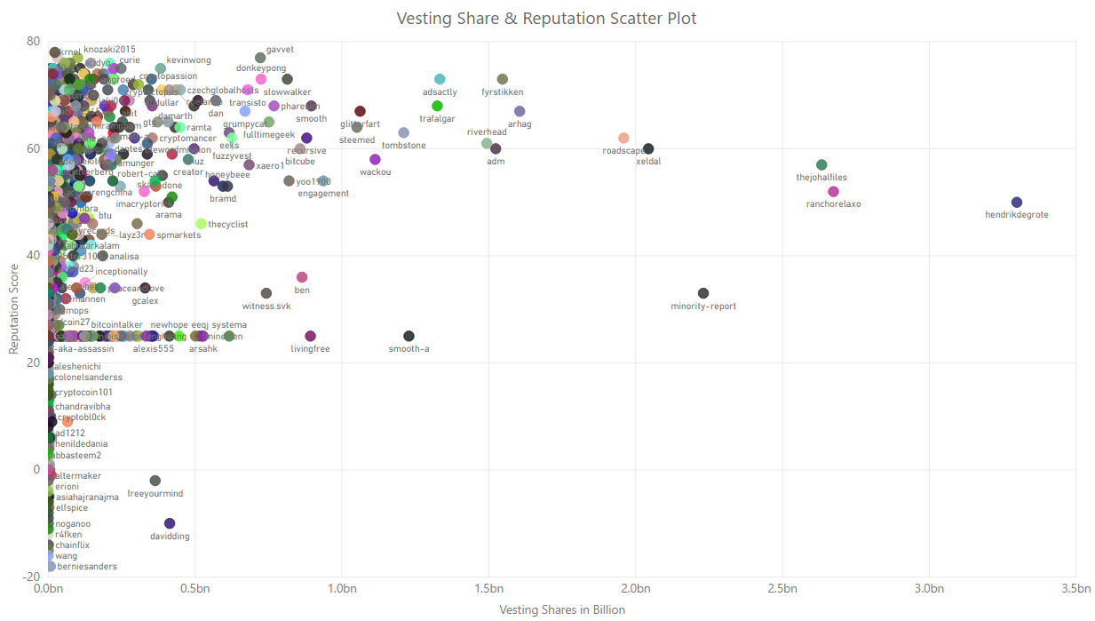
The scatterplot below shows the relationship between Steem Power holding and reputation. This is like a chicken and egg scenario. Do people really follow the money, and because of that people who are invested rise faster in terms of reputation; or because the authors are popular and choose to power their earnings up, they got to build their Steem Power holding? It is a combination of both is what I found in doing this analysis. Detailing each of the instance will make this a very long contribution. The objective of plotting this chart is to stablish the relationship between the two measures, which we can clearly draw from looking at the chart.
Like in the earlier scatter plots, I called out exclusions in the Scope section, this would otherwise have looked a very flat chart. Most of the exclusions are known accounts connected to Steemit Inc. and are mining accounts from back in the days when Steem was being mined.
Witness Vote Distribution By Vesting Share Category
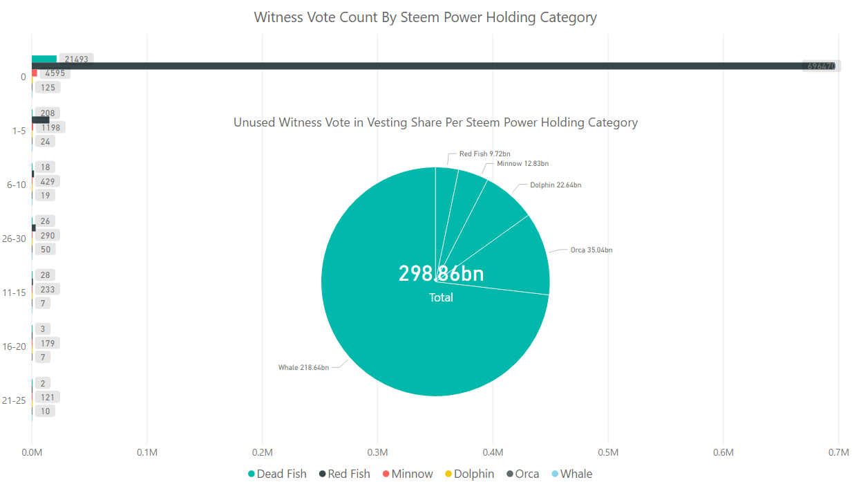
This combination of two charts show how only 3.5% of the entire user base have at least one witness vote, it also shows how some 298 billion vesting share which is the same measure used to rank witnesses are still unused. We need to exert more effort in educating users on the importance of voting for witnesses is what I can draw from this chart. The votes will never be close to 100%, since only 18% of the entire user-base had post in the last 30 days, but 3.5% can be brought close to double with enough education.
Conclusions
I have already shared my thoughts about the data-points presented throughout the analysis. Here is just a summary of the conclusions:
- We cannot stablish any direct relationship between age of account and rise and reputation. This means that a new sign-up today can surpass anyone who signed up earlier with activities that the community will appreciate.
- There are stablished direct correlation between activity and rise in reputation, and vesting share and rise in reputation.
- A huge percentage of the accounts have very less to no activity. In which case the rise in account sign-up hardly makes any difference.
- A new witness can potentially rise to the number one spot with the unused votes today.
Making this analysis took the longest around figuring out the computation of the simplified reputation score. I will appreciate feedback around that if anyone think it is wrong, and a more simplified formula is available.
Posted on Utopian.io - Rewarding Open Source Contributors
