Hi Steemit Devs,
I have found this minor bug when I toggle this "Article Layout Selector" button.
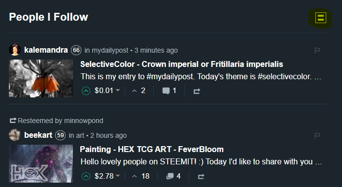
Article Layout Selector button can be found on the home page or the user's feed. Refer to below image. Button is highlighted in yellow.
Steps to replicate:
Go to your home page (feed) by pressing the steemit logo on the top left of the page. Or navigate to url: @username/feed, i.e. @wens/feed
Look for the "Article Layout Selector" button and click to toggle view.
Default page view:
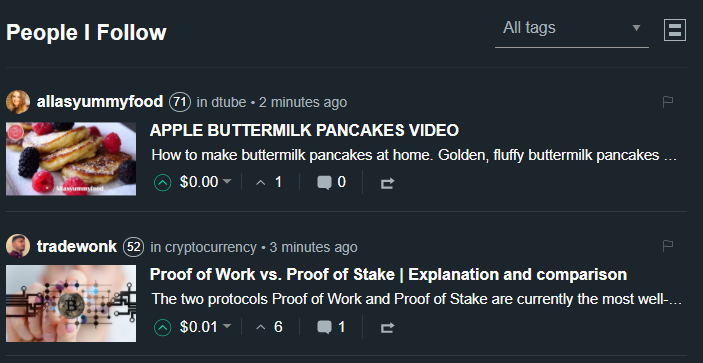
Page view when "Article Layout Selector" button is clicked
Note: Button image is changed. On default view, button shows 2 lines. When toggled, it shows 3 lines.Go to your page by clicking the link "My Blog" found on the right side bar or navigate to url: @username, i.e. @wens
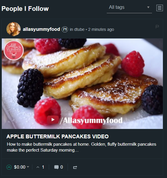
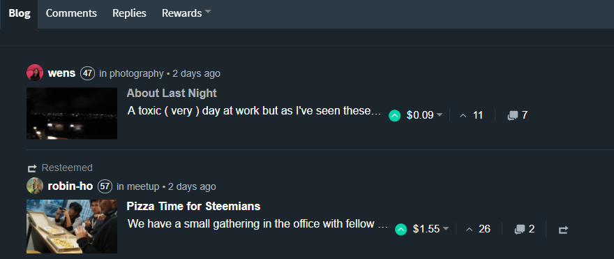
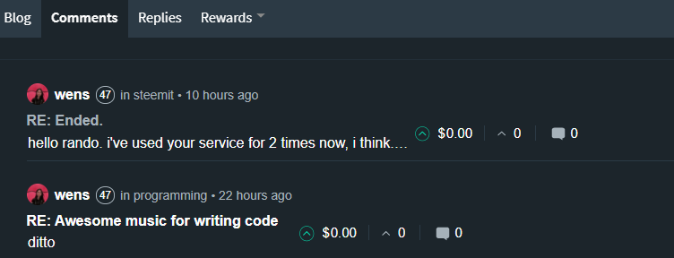
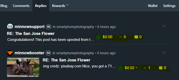
Make sure that the Article Layout Selector button is selected (icon has 3 lines).Check the article summary footer from Blog, Comments, Replies tabs.
Article summary footer refers to the payout, # of upvotes and # of comments.
Blog:
Comments:
Replies:
My Solution [Noob ;)]:
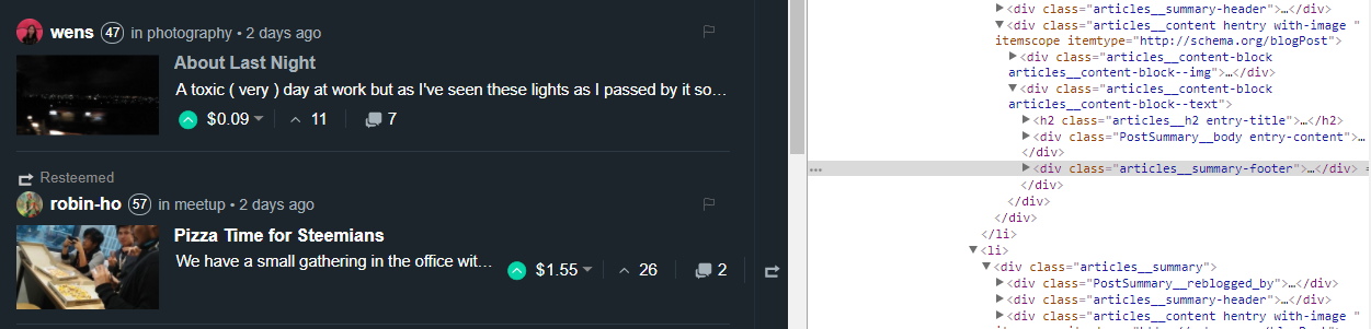
I've checked the html page using Google Chrome's developer tool and inspect the html elements.
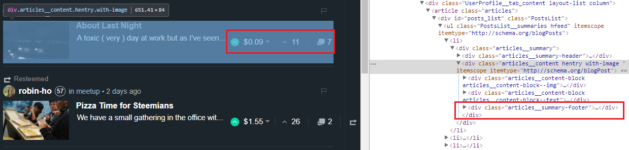
Notice that articles__summary-footer is a direct child of articles__content hentry with-image
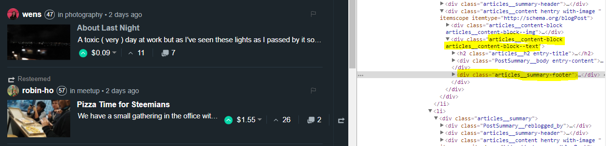
Moving articles__summary-footer as a child of articles__content-block articles__content-block--text puts the article summary in place.
Test Environment
| * | Details |
|---|---|
| Operating System | Windows 10 |
| Browser | Google Chrome (Version 62.0.3202.89) |
Open Source Contribution posted via Utopian.io