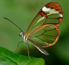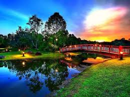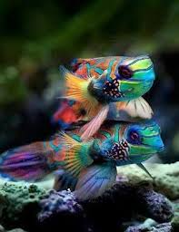
Notice the colors you use in the featured images.
A week-ish ago I began feeling better from a terrible health episode which also left me a little blue. I have a debilitating disability which rears it's ugly head and knocks me down a couple feet from time to time.
But it does get frustrating and depressing.

Looking at my wall, I realized on my good weeks there's primarily brightness and color, and on my not so good weeks I chose more mundane and monotone hued images...
The brightness level of my page truly reflects how I'm feeling during that time!

Is that the case for your wall?

Images courtesy of Yours Truly, Pixabay, or Creative Commons.
♡
Follow @ArbitraryKitten for more
Colors, and how to use them to improve your mood and more!
♡
💲 Enter the Title and Blurb Writing Contest! $ SBD Prizes while becoming a better Steemit blogger! 💲
♡

Please Upvote and Resteem
I appreciate your support ♡

