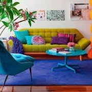
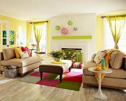
The colors we wear and surround ourselves with directly affect our mood, energy levels, finances and even relationships.
There’s no denying how mood and color are linked when you think of how we use colors to describe emotion- she was green with envy, or I saw red, and I’m feeling blue today.
The colors we wear reflect how we feel, but even more importantly, the colors we choose change how we feel.
Bright colors are used in children's hospital cafeterias to stimulate appetite. Dull, dusty beige hues are painted in prisons to subdue prisoners. Google encourages a colorful work-space to make workers brains think faster. Fast food restaurants incorporate the colors red and yellow because they want you to get hungry and eat quickly.
Here are colors and their properties, along with ways to use them to improve your life and change how you feel.
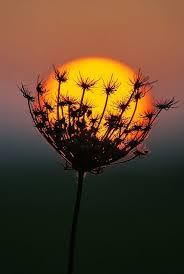
Red
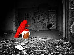
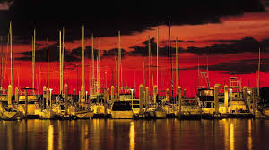
Red is a very powerful color. It is often associated with love and passion, danger and anger. It has the longest wavelength, so time appears to move faster and a red object appears closer than it really is. Red can make you stronger and faster yet impairs performance on mental tasks.
Since ancient times, red has been associated with danger, thus should be used carefully and in small amounts.
Wear red accessories when you have a speech or important meeting, but stay away from it during tests or exams. You can use red to your advantage by wearing red accessories when you have an important interview, meeting, or speech to capture your audiences attention and for a splash of confidence. And wear red to a race and to the gym for a boost of energy and endurance.
Orange
Orange is a combination of red and yellow and as such has similar effects. It evokes positive feelings of warmth, sensuality, fun, physical comfort, abundance, passion, and security, yet in abundance can make you appear frivolous, immature and frustrating.
Orange cheers people up, and makes others consider you the life of the party. It enhances the feelings of happiness and vitality. Like red, it draws the eyes attention and shows flow but is not as overpowering. Orange feels aggressive yet balanced; it portrays energy and still be friendly and inviting. Orange is a smart call to action color to buy an item.

Yellow
Yellow has an emotional effect and is the most powerful psychological color. It is associated with hope, sunshine, and laughter. It boosts confidence, emotional strength, self esteem, creativity, optimism and friendliness. Yellow improves your spirits and intelligence, so wear something yellow during your next test. Have splashes of yellow in your creative work environment for inspiration.
In abundance, yellow can negatively effect anxiety and fear. It also reflects the most light so too much of it can irritate the eyes.
If you need a cheerful, energetic and comforting mood boost wear and surround yourself with bits of yellow.
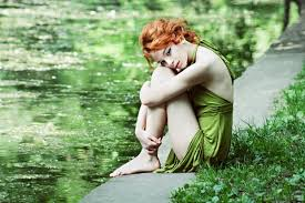
Green
The color easiest on the eyes, green reduces fatigue, balances your mind, and promotes relaxation. Green accents in the bedroom and for meditation is perfect! Green promotes peace, refreshment, balance and harmony.
I’m sure you’ve heard that walking in nature relieves stress, rejuvenates and refreshes. Of course! It's because you’re surrounded by the healthful calming effect of green!
Too much green can bore and stagnate.
Green is associated with new beginnings, health and wealth. It’s a good color to use to portray security and growth, or to inspire possibility.
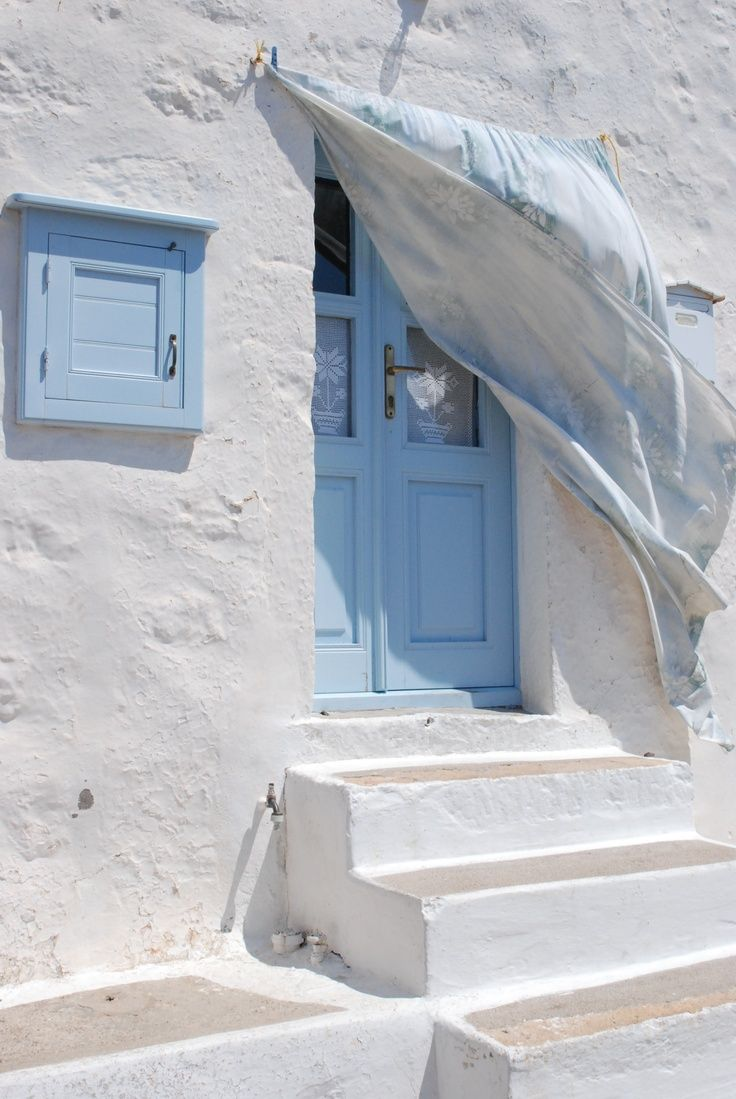
Blue
Green may be great to reduce stress, but blue brings the most calm. It stimulates the body to secrete serotonin and the body’s other feel good hormones, lowers blood pressure and creates feelings of trust. That’s why many banks bathe their lobbies and brands in blue.
I trust STEEM… Is that because it’s blue?
;)
Darker blues such as navy give a professional, corporate feel while light blues such as the ones used by facebook and twitter invoke a friendlier, relaxed feeling.
Being an intellectual color, it’s good to use blue to enhance mental clarity. And wearing it to interviews will help you appear dependable and trustworthy. But if used in excess you may appear cold, disengaged and unfriendly. And avoid using blue when you’re sad.

Purple
Purple is a regal color. Combining calm blue and exciting red, purple boosts creativity, pride, devotion, and mystery.
Purple calms the viewer, and is used in many high end beauty products for this effect.
Associated with royalty, purple helps you appear dignified, independent, and ambitious. Incorporate purple for a boost of ambition, and to make you appear wealthy and proud. Darker purple help to make a product or person look more luxurious and wealthy, while a lighter shade adds mystery and romance.
Too much purple can be associated with stigma of magic, and can make you appear pompous.

Black
Black is all the colors, and creates a protective shield from energy coming toward you. Wear black when you need security and emotional stability. It is associated with sophistication, glamour, and control.
Too much black conveys coldness and menace. Hence the reason the movie villains wear all black.
Wear a black shirt when you need to feel in control and during negotiations. It also helps you look more serious for an interview or promotion.
Colors are subjective.
What makes one human energetic might make another angry depending on past experiences, culture, etc. All colors have positive and negative aspects, the key is to use in moderation. Add splashes and highlights here and there.

Follow @ArbitraryKitten for more
❤
Title and Blurb Writing Contest! $ Prizes!
Reflections as I near 1500 followers and my 2 month Steemitversary
DON'T STEAL IMAGES! Where to find 'em free for your Steemit posts
How to write a good introductory post
August 21 TOTAL Eclipse of the Sun, What you need to know
Two Birds, But the Stone Only Gets Thrown at One
What is a Rescue Home?
The Cosmetic Industry is Killing you. Plus natural eyeliner that improves your eyesight
WARNING: Crypto Scam Alert
The Pinocchio Paradox

Please Upvote and Resteem

I appreciate your support and ♡ your comments and questions :)