Click Here To Enlarge Image
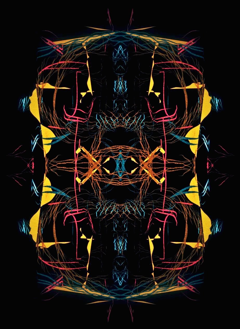
Hey guys, check out my today's abstract creation. In this abstract, I have tried to experiment a little bit. My intention was mainly not to stick to the conventional norms of abstract creation. I was very clear that I will use some bright colors in this abstract because if you check out my previous abstracts the color tone was very light and subtle, so thought of doing things differently this time. To make colors and design stand out I used a black background. Also, if you look at the lines they are not at all straight, I have intentionally done this just because I wanted to give it a more scrawled effect. I hope you like this abstract. I'm very new in this field so any kind of positive criticism is always welcome. Please share your thoughts in the comments section below.
You can also check out some of my previous posts by clicking the links below:
- Textured Abstract Art
- Black & White Abstract Art
- Minimalist Abstract Art
- Geometric Abstract Art
- Antique Finish Abstract Art

