 |
|---|
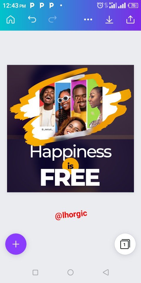
Did you just whisper Wao! on seeing this design?....smiles. I wasn't expecting less anyways. Trust me I expressed the same feeling when I stumbled upon the design. Yea you heard me, I know you are like what does he mean by he stumbled upon the design... isn't he the one who design it.
Well the truth is, as graphic designers not all our designed are pre-meditated, it's a funny but real fact. There are times we sit with our devices and do not even know what to design, we just start anyways.
This was what gave birth to the design you see here, I was traveling in one direction before my trial and error gave birth to what you see here. Artists have the belief that every mistake is a design it works here in graphic design too... that's if you are indeed creative.
...so just before I get carried away with my pep talk, let me officially welcome you to today's beginners Graphic Design class. We would be having a practical class, at least you will get to see how I made this design. Shall we?....leggo😀
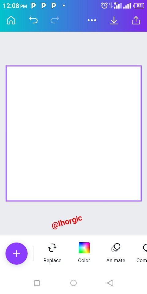
As usual select your template and wipe clean the template by removing every element on the template until you have a clean slate just like the one in step 1 below.
Step 1
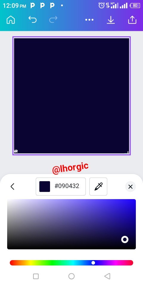
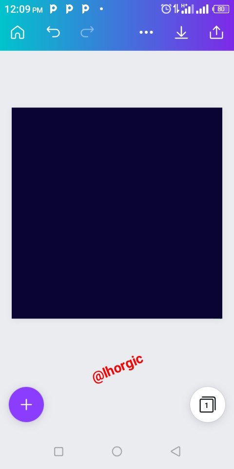
After wiping clean my template,I changed default (white) colour to blue, you can see the hex code there, #090432. Should in case you want to reproduce the same colour.
 |  |  |
|---|
Step 2
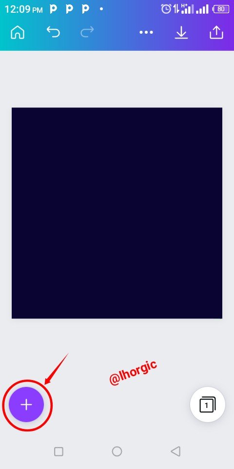
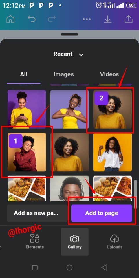
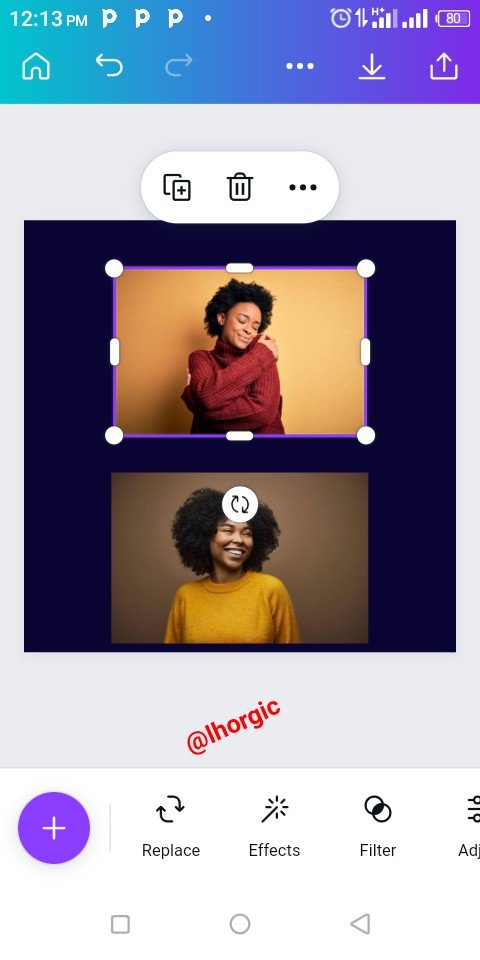
I selected the "+" icon to bring in from my gallery the images I will be using for my background effect just as seen in the images below.
 |  |  |
|---|
Step 3
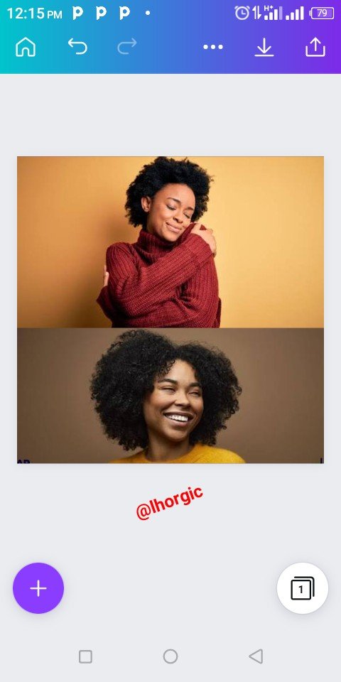
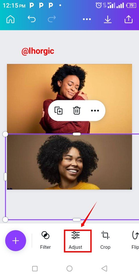
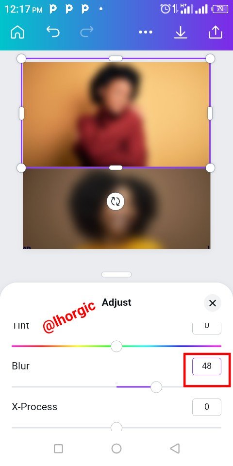
When the images came up, I resized them by dragging the edges to fit in and totally cover my background, I then selected the Adjust icon where I got the blur option to blur the images just as seen in the images below.
 |  |  |
|---|
Step 4
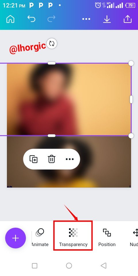
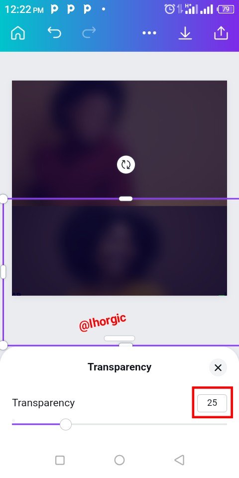
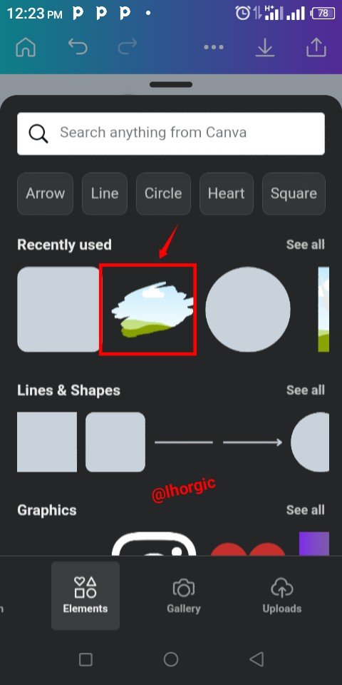
After masking the images blur, I used the "Transparency" icon to reduce it opacity in other for it to faint into our initial blue background. I used 25% for my transparency. I then brought in my frame by clicking the "+" as usual. If it's your first time locating frame, just type *"frame in your search bar under elements.
 |  |  |
|---|
Step 5
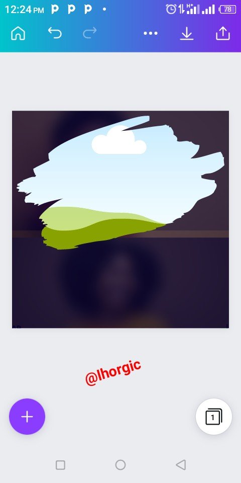
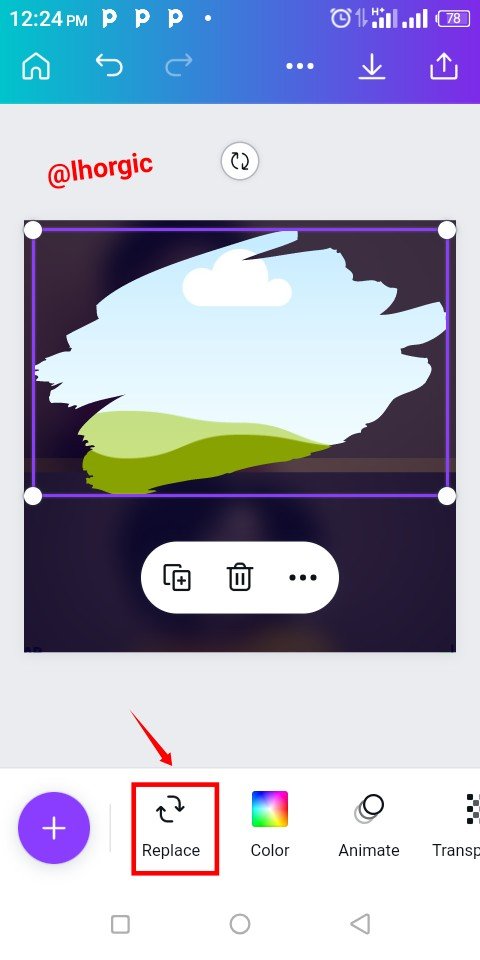
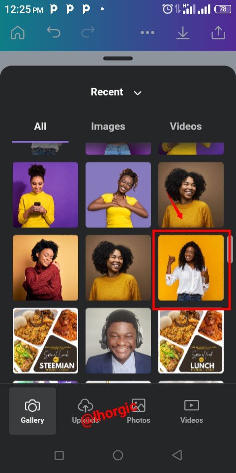
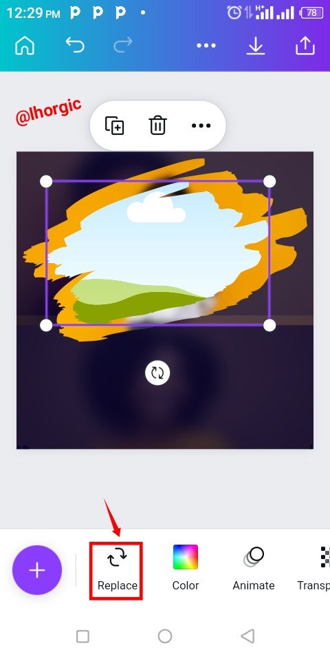
The frame came up, I then used the the "Replace" icon to bring in the image I want on my frame, just as seen in the screenshot below.
 |  |  |
|---|
Step 6
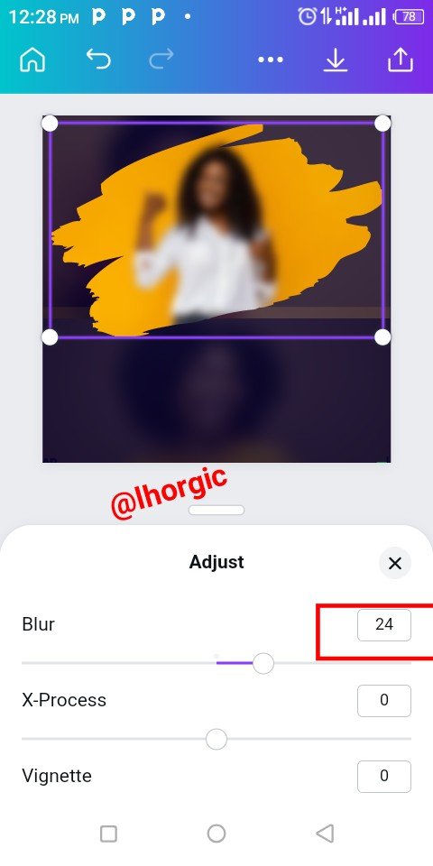
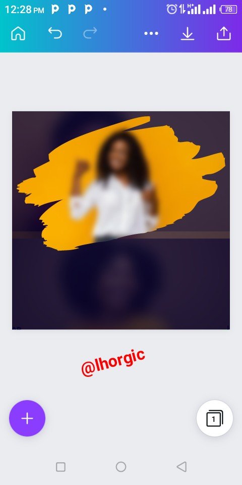
The previous action automatically brought the image into my frame. I then blur the image using the blur icon which I used in step 3. Actually this was where my trial and error played out...I initially wanted to use the image without making it blur. I had also planned stoping here until I tried the next step.
 |  |  |
|---|
Step 7
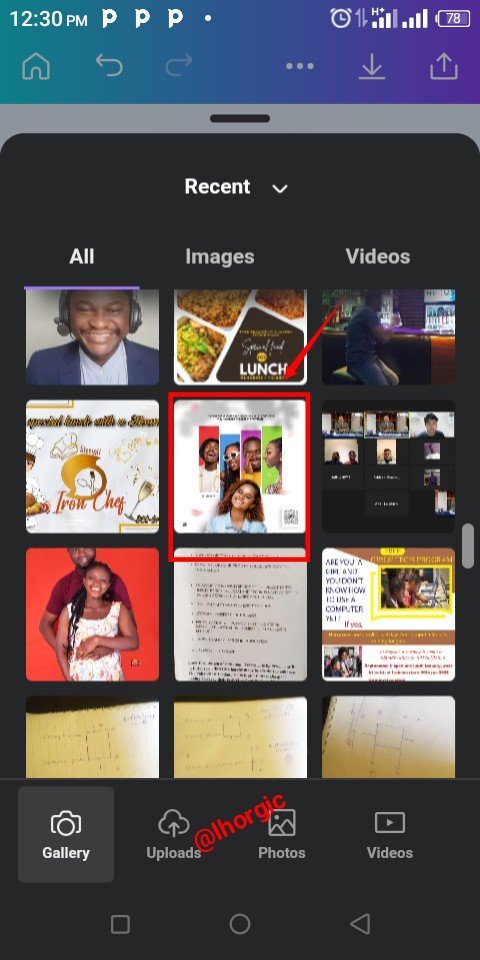
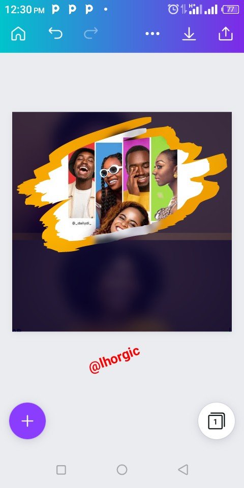
I brought in again the frame I used initially, I wanted to create an effect with it, I then clicked on the "+" to bring in a picture which inspired the design.
It's actually a random design from my WhatsApp status that caught my attention and, I had to download as it's my usual custom of appreciating good designs. When it appeared, it looked appealing and there wasn't any more need for the effect I planned applying. This trial was the game changer for me.
 |  |  |
|---|
Step 8
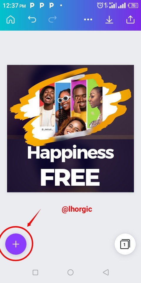
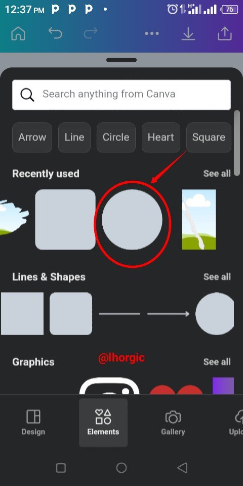
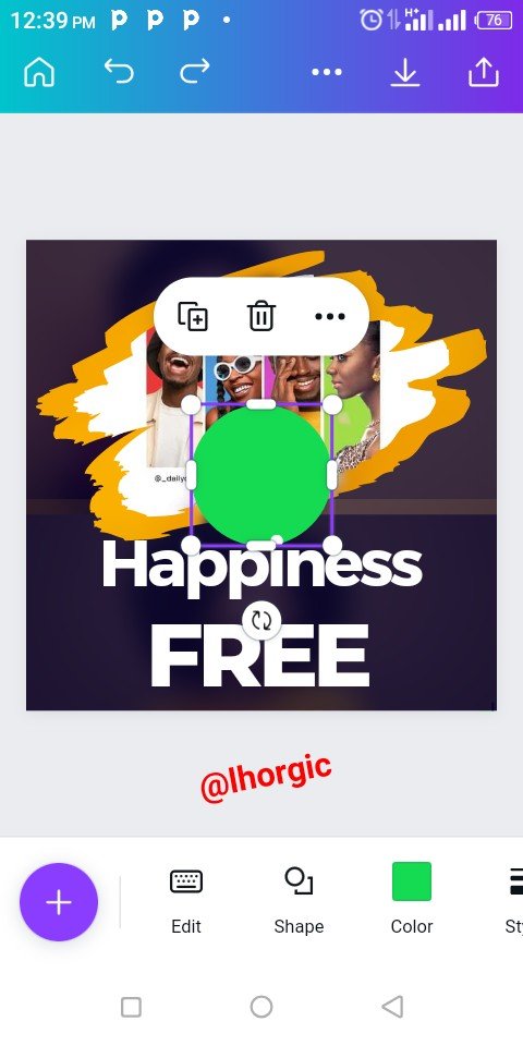
I introduced my text...I believe by now you should know how to bring in your text,if otherwise use the "+". I also introduced my circle shape and then resized just as seen.
 |  |  |
|---|
Step 9
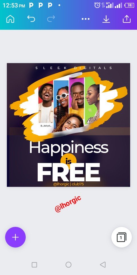
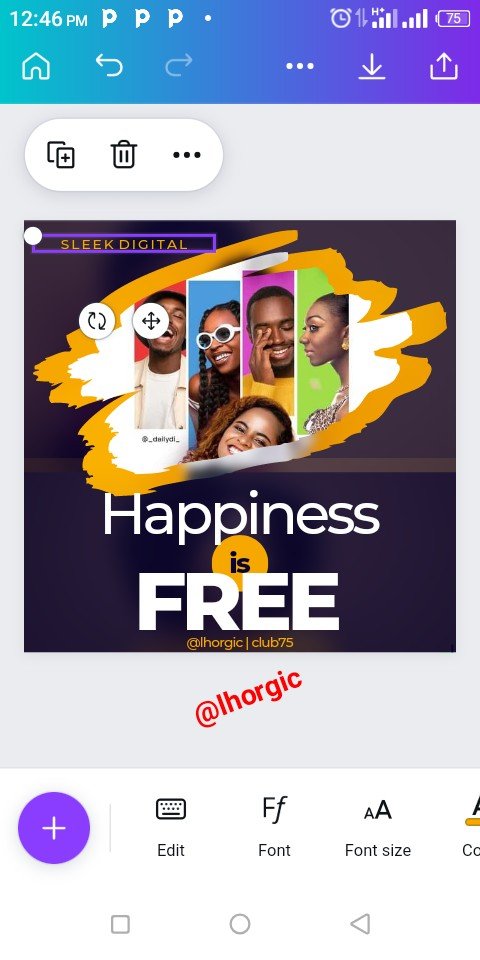
I added other neccessary information to the design...Do well to try fonts that suits your design, and then save when you're satisfied. I did the same with this design.
 |  |  |
|---|
 |
|---|
 |
|---|
 |
|---|
Design is all about creativity, how far can your mind conceive? How open are you to new ideas, how sensitive are you to new concepts? Answering this will go a long way in helping you on this path.
This is where I will be wrapping up our lesson for today. I really appreciate you for coming this far with me. I trust you got value from this lesson. Feel free to share your thought on today's lesson. If there is anything you would love me to add to improve the lesson, be free to share in the comment section.
If you missed the previous posts on this beginners class, kindly check them out here.
G101 introduction post.Lesson 1.Lesson 2.Lesson 3.Lesson 4.Lesson 5.Lesson 6.Lesson 7.Lesson 8.Lesson 9.Lesson 10.Lesson 11
Graphic Instructor
@lhorgic♥️
Cc: @ubongudofot.
