I really don't know where the time goes - it's been 2 weeks again since my last update and it's been a fiddly couple of weeks continuing my work on the communities page.
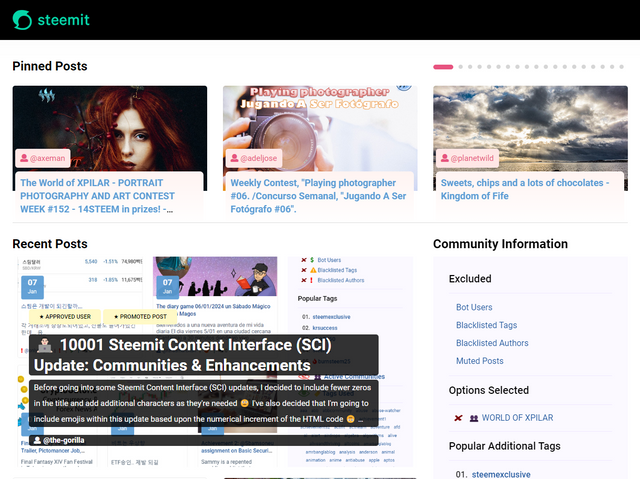
Pinned Posts Carousel
I'm now happier with how the carousel is looking, having followed @moecki's suggestion of fixing the image height as well as its width. This gives the carousel a better feel with fewer, large areas of white space.
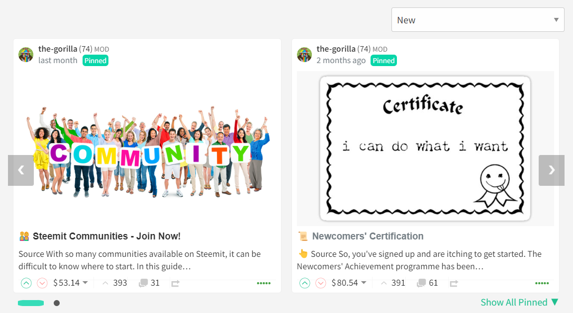
In the same way that the existing list view crops images, the carousel will also crop longer images and where an image is shorter, it will be centrally aligned with white space above and below (this looks better than top or bottom aligning).
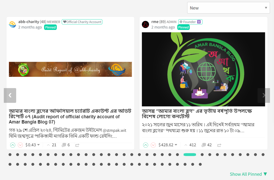
The titles will always be aligned with this approach.
I didn't adjust the number of characters returned for the body text - there's code which crops the text after a full word in the list view which would be of detriment to that view.
Pinned posts that don't have an image won't look as good - similar to how a post in list view doesn't look as good as one which does.
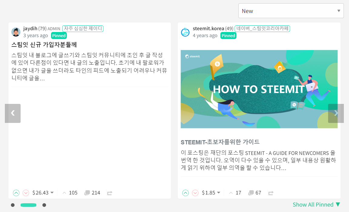
Community Cover Image and Avatar
A community's cover image and avatar is pulled from the @hive-XXXXXX account and not from a community's curation or other account. If you would like your community to be more visually appealing, this is the account that will need updating.
The item that I was least happy about in my last update was how the "Activity Log" and Moderator functions were being included in narrower resolutions. I knew that these somehow needed including within the community banner but struggled to get my head around how to do this without it feeling overly cluttered or looking out of place.
Once again @moecki suggested resizing some elements to assist with this and whilst this helped to make the design work a bit better - it didn't quite solve the problem, especially at the most challenging 760px resolution.
The solution that I opted for isn't too different from how the existing steemit.com handles it:

With (in my opinion) a clearer separation of items:
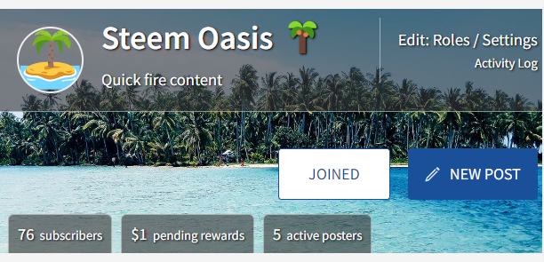
The above is the "worst case" 760px screen width and below is the absolute worst case with longer text and no image:
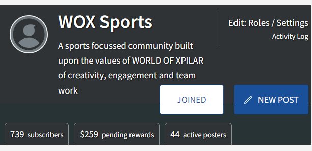
This is definitely an edge case as in general, it would look more like this:

Or like this (once the images have been updated):

Drop It Like It's Hot
I've also included the fix for bug #3919 (raised by @steemchiller) to reintroduce "Hot" into the Sort Order.
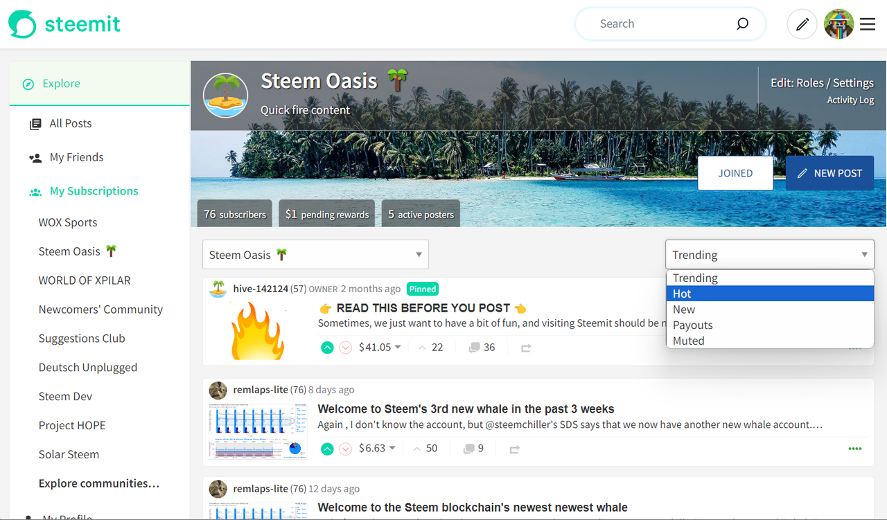

I'm much happier with how this is looking now and feel that it's ready for more rigorous testing.
I've been having RCP issues both locally and on my test servers so it's best to access the test site through a user's profile, rather than directly to the root page. If the steemit page template loads and not the body content, waiting for about 10 seconds and then refreshing tends to resolve the problem.
https://condenser-r64jisicxa-ul.a.run.app/@the-gorilla/communities
I'm also interested in hearing suggestions for other enhancements that can be made to the community page. I'd like to adjust how "New", "Trending", etc. are displayed but want to do this as a separate piece of work due to its impact across all pages where this is included.


the-gorilla's Alternative Steemit Interface
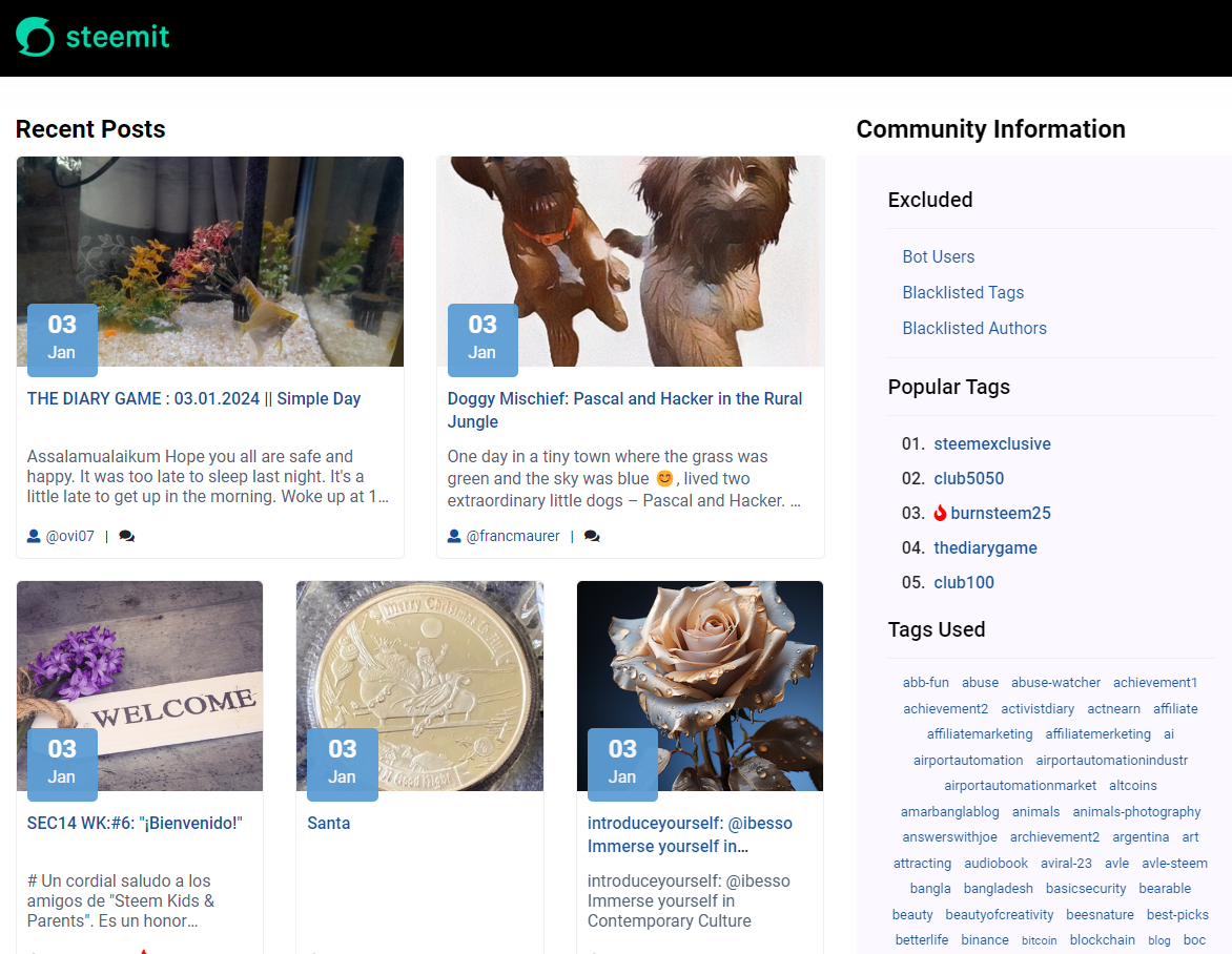
In case you didn't know, I've created an interface to help you find content that you're interested in more easily.
Posts by voting bot users, abusers and spam tags are hidden and you can search by multiple tags - allowing you to find the content that you're interested in more easily.
👉 Launch Alternative Steemit Interface 👈

the-gorilla's Club Status Tool
I've also created a tool to help users review their club status - showing them where their power's coming from, how much they're powering up, transferring out and who they share a wallet with amongst other things.
Please use it wisely.
👉 Launch Club Status Tool 👈

