Has it really been 4 weeks since my last update?
That's far too long and I'm sorry for the delay. Things have been progressing and I've reached a point where I'm about 90% happy - I'll highlight the bits that I'm unsure about as I go along and would appreciate any thoughts that you have.
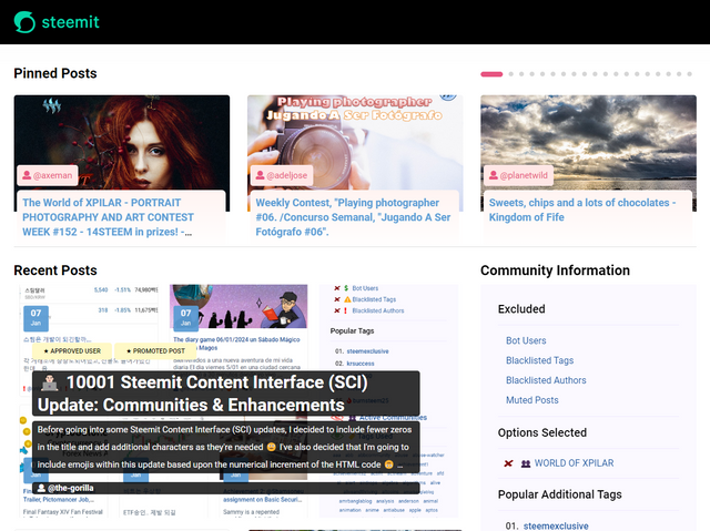
Carousel
Concluding the work that I was doing on the carousel, my focus was on tidying it up and getting it working reliably at all resolutions.
My approach for implementing the carousel, is to add a style to a wrapper component and use this to target and adjust existing styles. This means that the code which pushes out the posts list remains largely unmodified - I'll explain this in detail when we're nearer to deploying the code.
What this approach has meant, is that it can take longer to identify why something is displaying the way it is (and potentially ignoring the properties that I'm setting). This can be frustrating but I get there in the end.
The carousel has a maximum height set and the image is scaled to fill the width of the area. For images that are shorter, there will be additional white space between the content and the voting bar.
This works reasonably well in most scenarios although posts which have a shorter (or no) image won't look as good.
As I mentioned, I also spent a reasonable amount of time adjusting the display for different widths (it defaults to the existing "blog" view on narrow/mobile devices). Some elements were defined not to wrap (like the voting bar) which took some unravelling!
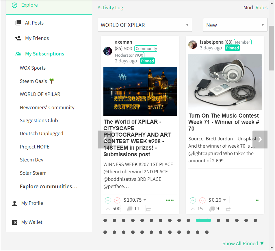
The most troublesome resolutions were the "narrow" widths which appear just before a "snapping point".
For example, 1200px:
And 768px:
Community Banner
I've also spent a lot of time building up the community banner.
For this area, I wanted to pull in information that currently exists in the Right Panel as well as helping the Community Page to be more visually appealing.
The more graphical element relies upon the existing @hive-XXXXXX account having profile and cover images set, otherwise a charcoal background is displayed (like an unedited Profile)
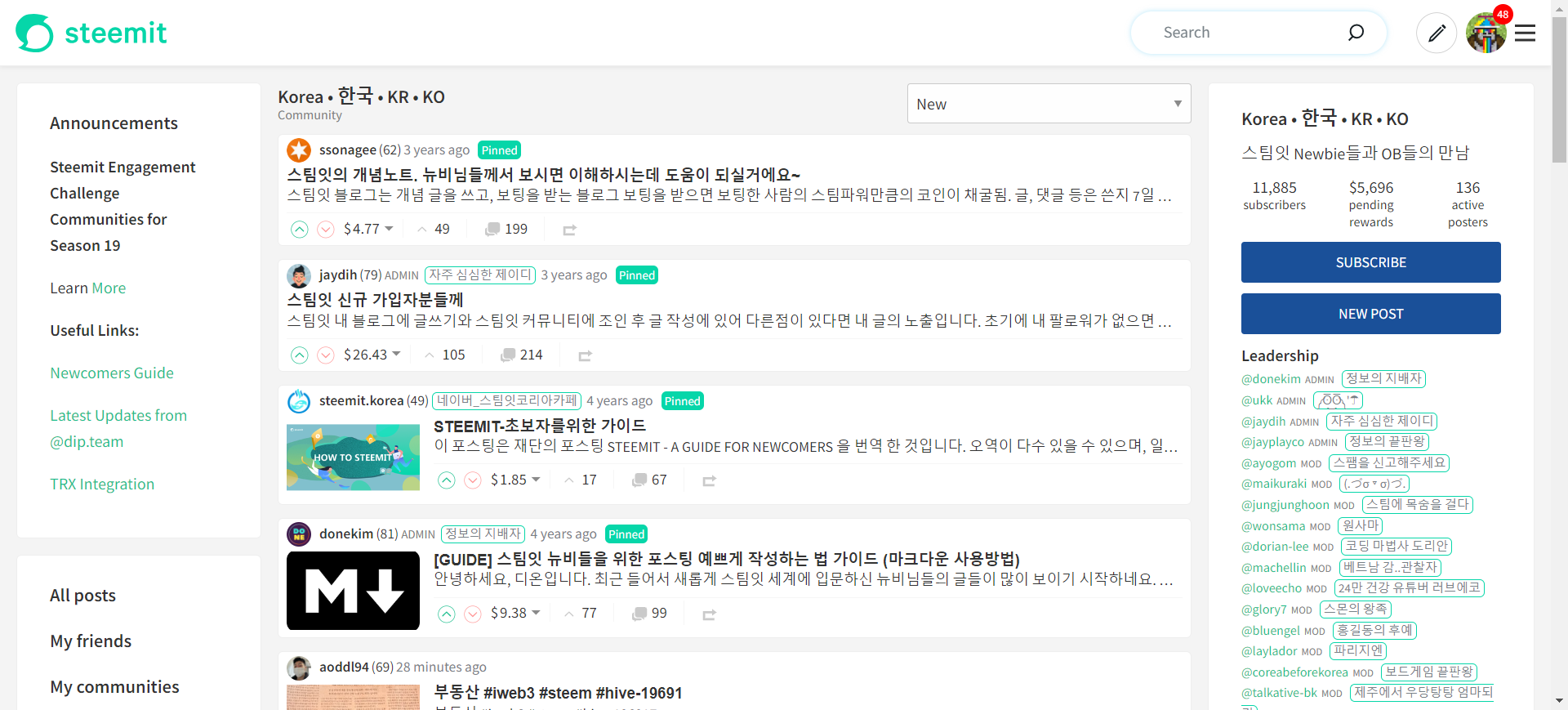
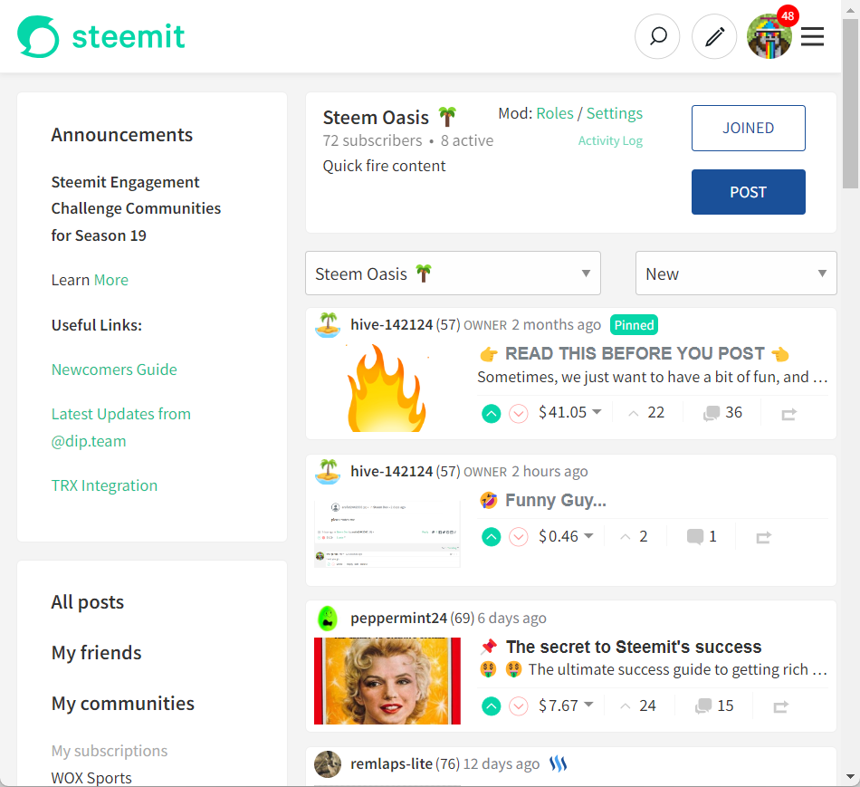
A good example is the Korean Community which currently looks like this:
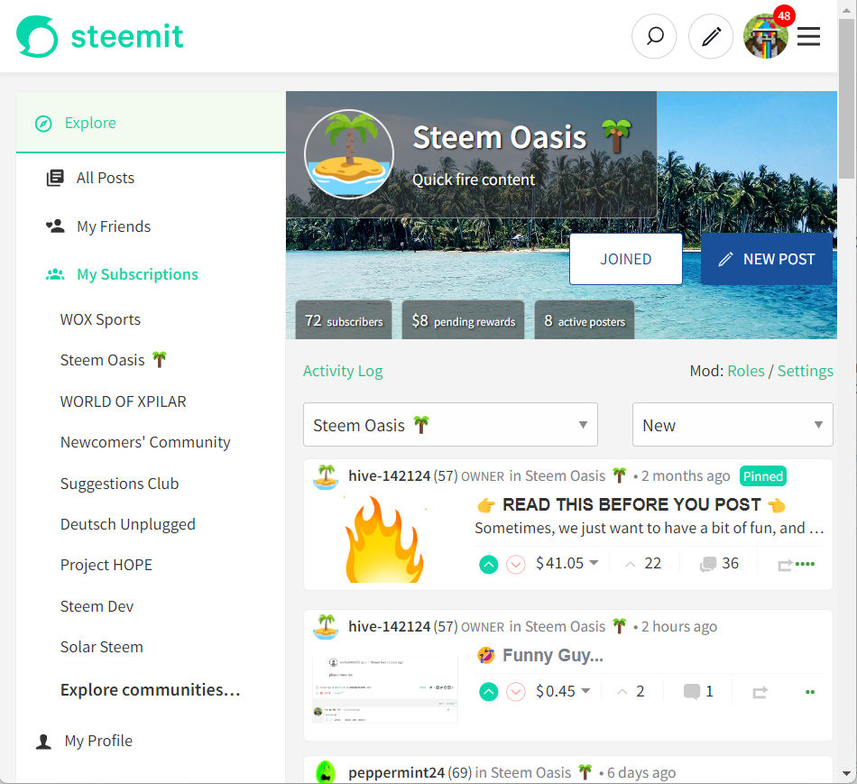
and in new world would look like this:
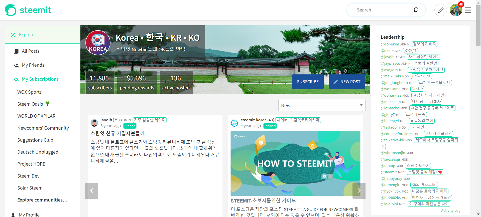
By including the "key information" within the banner, this can be removed from the Right Panel, allowing the other information to shift up. In most cases, this would move the Description "above the fold" (do people still talk about "the fold" in design?)
In the case of Deutsch Unplugged, it would look like this (note that I'm on a widescreen laptop)
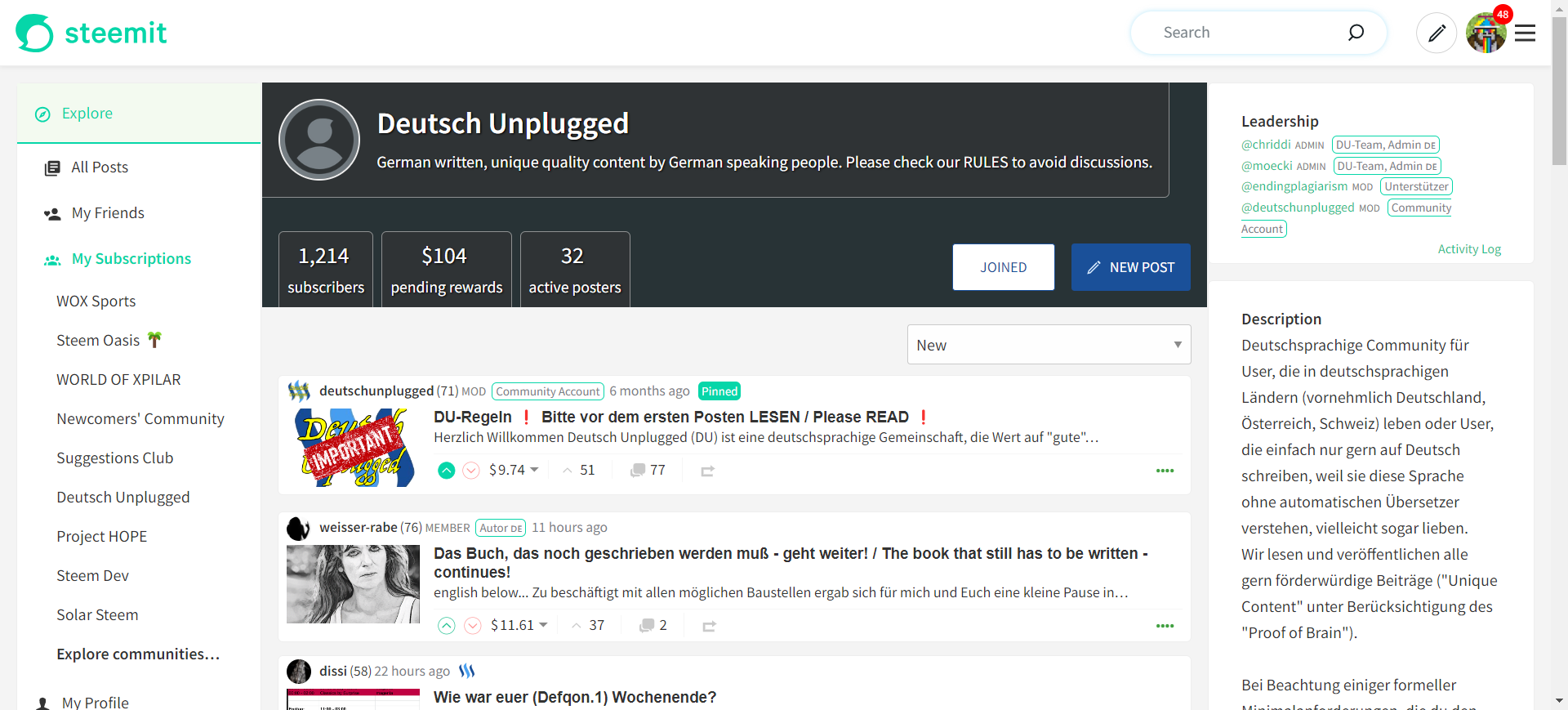
Even without a pretty cover image, this feels a lot more inviting than the existing, text-heavy approach.
All of the existing functionality that has been migrated has also been hooked up.
Once again, this has presented some challenges with narrower resolutions.
When the width gets narrower on the existing site and the Right Panel disappears, a "cut-down" version is included at the top of the page:
Whilst most of this information is now contained within the banner, "Activity Log" and the moderator functions (Roles & Settings) are not - and there's not existing space to fit them in.
This has led to the current solution of including them underneath the banner - a solution which I'm not particularly happy with at the moment (I don't believe they're important enough to be given the prominence that they now have).
This has allowed me to remove the existing CommunityPaneMobile component because everything in the existing component is now managed within my new component.
Test URL
For those interested in having a look, I've uploaded the current version here - https://condenser-r64jisicxa-ul.a.run.app

I welcome any ideas that you might have regarding any of this - particularly related to the Activity Log and Moderator Functions.


the-gorilla's Alternative Steemit Interface
In case you didn't know, I've created an interface to help you find content that you're interested in more easily.
Posts by voting bot users, abusers and spam tags are hidden and you can search by multiple tags - allowing you to find the content that you're interested in more easily.
👉 Launch Alternative Steemit Interface 👈

the-gorilla's Club Status Tool
I've also created a tool to help users review their club status - showing them where their power's coming from, how much they're powering up, transferring out and who they share a wallet with amongst other things.
Please use it wisely.
👉 Launch Club Status Tool 👈