It's been a little while since my last update as I've been quietly getting on with the implementation of the updated navigation. I've been wanting to update you all for a while but every time I sit down to write this post, I end up working on the code instead!
In my last update, I said that:
whilst I wanted the Navigation component to sit within the "App.jsx" (the parent display file), the way that the rest of the page is compiled (specifically the User Profile Display) probably means that I'll need to implement the Navigation Component within Lower level components (i.e. within the Pages).
This change was required and I've implemented the navigation in the "Explore" and "Profile" views, leaving the "Post" view as a work in progress.

Implementation Challenges
1. Inconsistent Styles
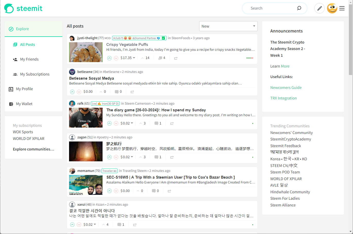
When moving the navigation from App.jsx into the individual pages, it quickly became clear that the styles used across pages were inconsistent. For example, in the "Explore" page, the left sidebar is defined using:

whilst a visually identical left sidebar also appears within a post view, it uses completely different mark-up (and therefore CSS classes):

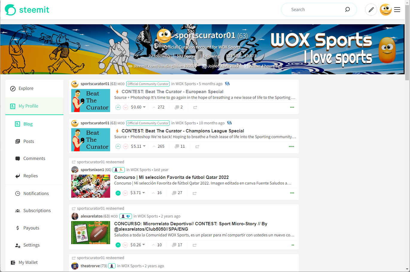
In the user profile view, there was no left sidebar at all.
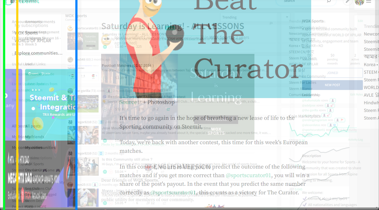
This is one example of how what may appear to be a template-driven site uses different layouts on each page. This might make more sense if I overlay the existing "Explore", "Post" and "Profile" views on top of each other and you'll notice where the variation in where the content appears (by looking at the left margin).
I wanted the navigation to be consistently positioned and not bounce around so I've had to tweak a few of the existing styles to make this possible.
It's very tempting to strip out a lot of the existing implementation but I fear that by taking this approach, there could be unintended consequences elsewhere so for now, I'm taking a more cautious approach and leaving it as it is.
2. Other User's Profiles
When looking at another user's profile, it was straightforward in the mobile view to highlight the "Explore" tab and simply use the "Profile" navigation to differentiate between "My Profile" and somebody else's.
Due to the hierarchical display of the left-navigation, taking this approach would have the "Post", "Comments", etc. menu items still appear underneath the "My Profile" header which wouldn't make sense.
Since you are "Exploring" somebody else's profile, once you have clicked on it, another level of navigation appears underneath the introduction of their username.
This implementation feels intuitive but I wonder if this has become "Icon overkill".
3. Mobile View
I did of course have to implement this without screwing up the existing Mobile View. I had a few volunteers to test the mobile version which has been extremely helpful and @o1eh has written a post about his experience with it.
Design
Whilst I've implemented most of the functionality, I still want to tweak the design. I'm a big fan of the use of white space in layouts to help keep things clear but I also want to keep the navigation elements above the fold at all times so probably need to tweak this and experiment some more - as well as reducing "Icon Overload".
Community Testing
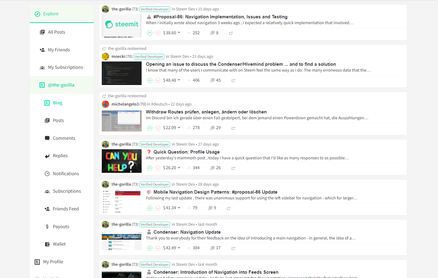
The current implementation is available on a server for some Alpha testing and I'm still keen to get more volunteers to have a look and provide me with some feedback. So if you'd like to do this, please ping me a message on Discord (the-gorilla) or leave your Discord ID in the comments and I'll contact you with a new URL.
To-do List
- Implement Navigation on Post Page
- Include "My Subscriptions" within the navigation (it currently appears underneath)
- Fine Tune the Design
- Test
- Test
- Test
- Test
- Test
- Test

There's loads more detail that I could update you on and if you'd like to know anything specific, please leave me a comment and I'll do my best to reply.