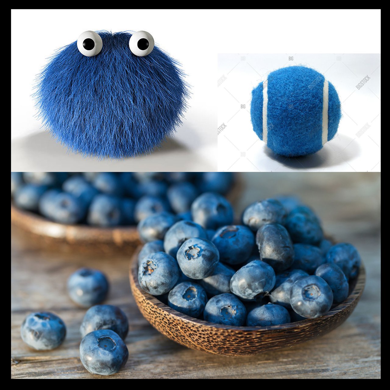
Hey party people! I'm back with a new study and I think it's going to be a bit longer than the last two. Hopefully you've painted up your Yellow bananas and Green tomatoes a few times by now and are pretty comfy with the color choices we make as we're manipulating our images.
I thought long and hard about this and without going into too much detail, I think you are ready to start branching away from bright shiny things. We're going to do our blue study, BUT, we are going to use a few objects that range in material so that we can also challenge ourselves to explore texture at the same time! With the banana we explored a semi-matte surface with a bit of texture. With the tomatoes we went to the ultra shiny waxy zone and got to place a very bright highlight. With this series we are going to go into the "soft zone", but worry, we'll start with something familiar to get into the right set of mind.
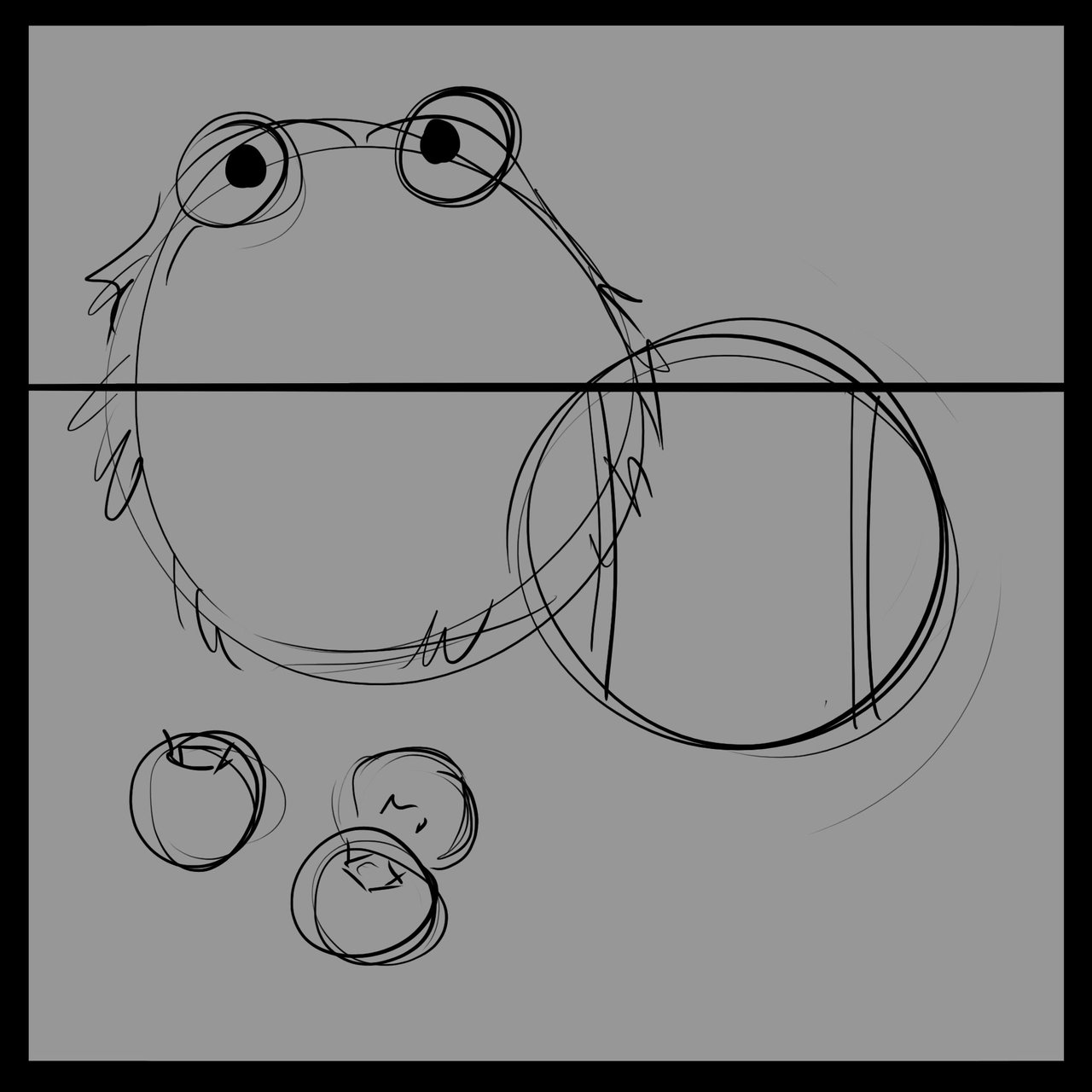
I've set up a sketch to start out. You've done this a bunch at this point so I won't get too into it. We're going to paint over everything by the end so this is just a guide. If you need a little boost to get your drawing skills up I highly suggest heading over to @jorgevandeperre's page. @jorgevandeperre is putting together a very well thought out approach to handling drawing basics, practice, perspective as well as shadow and light and how to express form. Making things look 3D is a difficult subject already so if you're just starting out I suggest you start there!
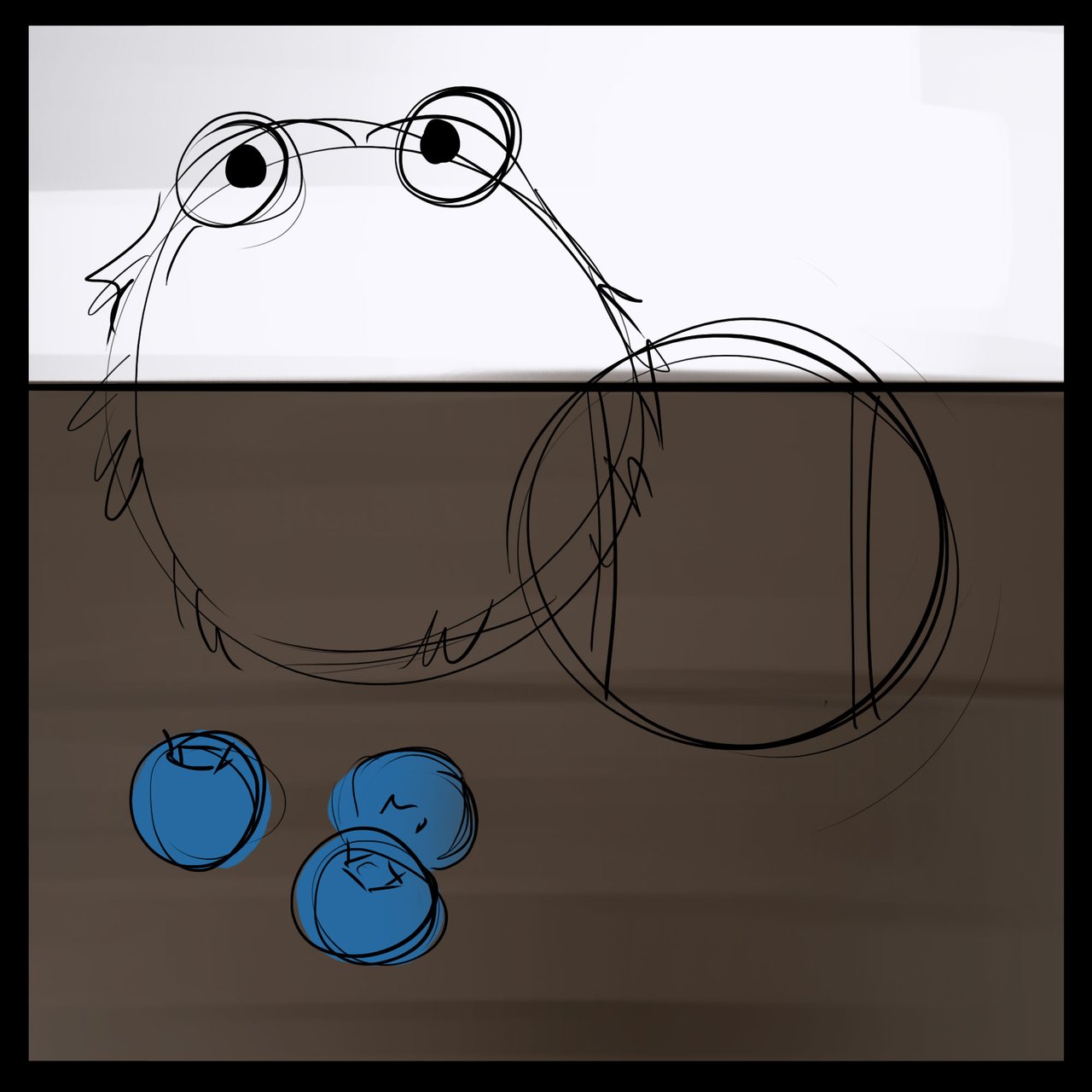
We're going to focus on the blueberries first. I think they are the closest to things we've already explored so starting there makes sense. I'll drop in a simple background and throw in the flat color to start.
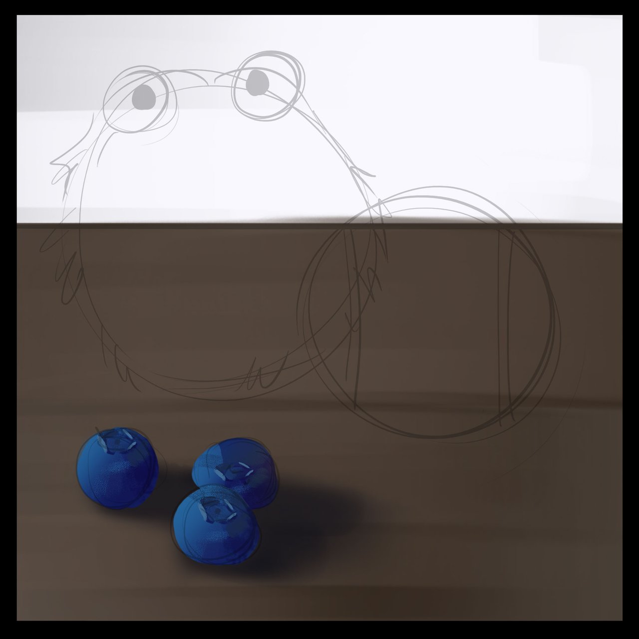
Here we've suggested the cast shadow and shadow shape. To get to the shadow color on the blueberries I've taken our original blue and gone about halfway to black and toward purple which I believe is the cooler side. The blueberry is not quite a smooth surface so I've suggested a bit of squareness and made sure not to interrupt the top side where the blueberry used to attach to a stem. It's really important to lean into the reference at this point to be sure that you are expressing the shadow side as closely as you can get.
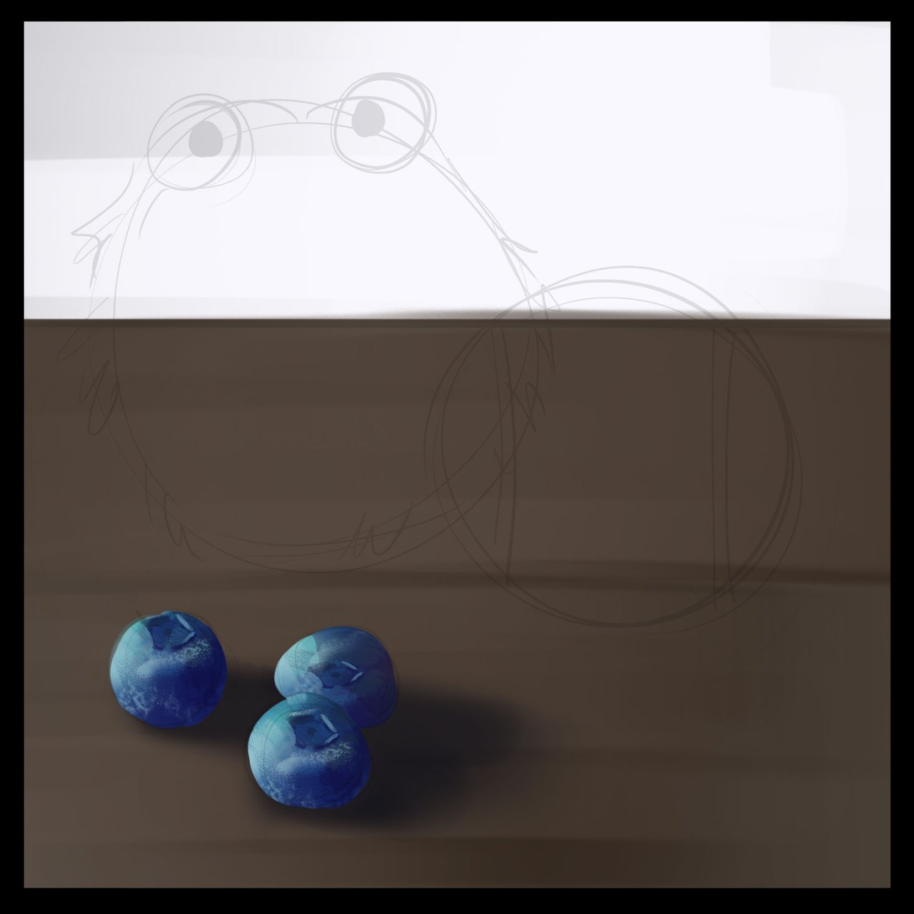
For the light side I've gone toward the yellows and about a quarter of the way toward white. Again, I'm leaning pretty heavily toward the reference and I'm seeing a bit of texture and a kind of "squareness" in the blueberry shape.
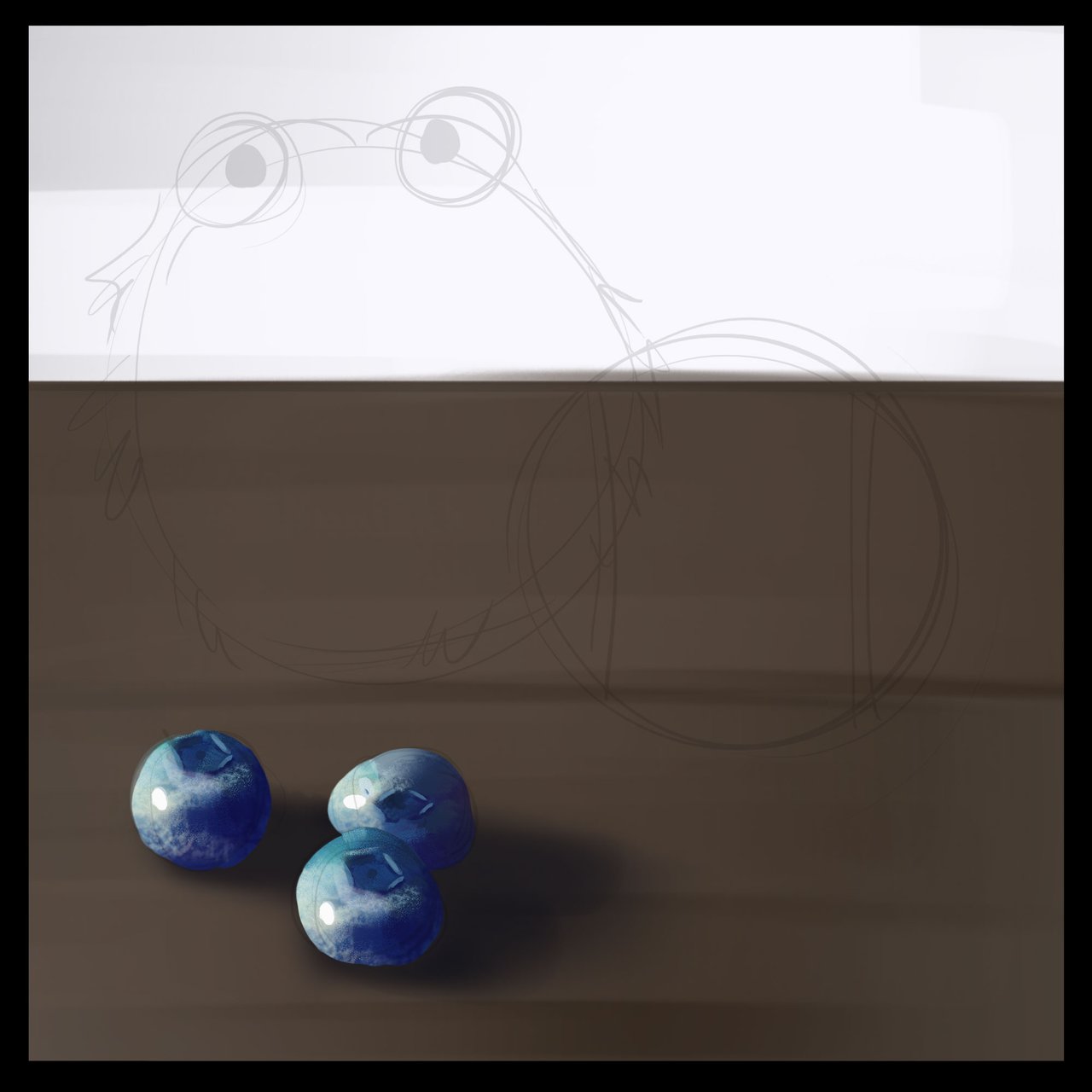
Highlights!! Yes, yes, we aren't quite ready to abandon our favorite part. The blueberry I think is the perfect transition into our softer features study. It has a bit of texture, shape and waxiness with a highlight which gives us an opportunity to solve these problems with our previous knowledge. We're getting super close!
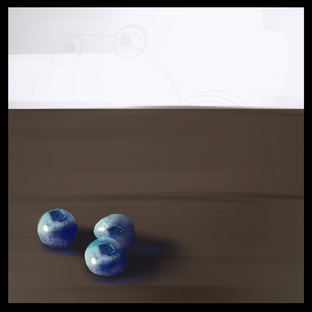
Can't forget those bounced lights. I've taken the color of the table surface, lightened it quite a bit and thrown that on the underside of the blueberries and I've taken the color of the blueberries and thrown that onto the surface below. It's also important to add a bit of skylight onto the opposite side of the light side. For that I've taken a fairly light and de-saturated blue. It's again, important to look at your reference and be sure you aren't overdoing it. I often step away for a moment every so often to refresh my eyes.

Last up is the occlusion shadow. If you've followed along my previous studies you'll remember that this is the space where objects meet a surface and light is unable to get into there . This is really the only place where we will go super dark and it helps a ton to sell the idea that there is gravity in this world and things have weight.
I think this is a good place to stop for now. This series is going to go a bit longer because I want to spend some time on each of the very different materials. The color choices will be the same more or less and the treatment of the light and shadow will be largely similar with some distinct differences. I'm looking forward to taking all of this apart with you!
On a personal note, I've been gone for a little while! I'm very sorry I haven't been able to keep up with my usual schedule and it's not because I've given up or anything. I got caught up in work, both professionally with arts and physically around the house. Unfortunately, I kind of over did it and hurt my lower back pretty bad, I'm definitely more aware of my age than I ever have been. It's been the better part of 2-3 weeks recovering after hurting myself and I haven't been able to sit for longer than 5-10 minutes without getting uncomfortable. Sorry I haven't been around much, but don't worry, I've got plans to take us through the color wheel and at the end I think we'll all have a pretty good grasp on color (and materials, but don't think about that too much, wink, your brain will do most of that work for you!)
I you want to go over how I made some of these color choices in this study you'll find a basic primer here.
If you'd like to get started with color studies we've got yellow and green now ready to go!
Yellow Bananas
Green Tomatoes
If you need help getting started drawing, I highly recommend you head over to @jorgevandeperre's blog and start following along his lesson plans. @jorgevandeperre has over 30+ exercises to get started and is even giving out rewards to students who complete homework!
Thanks a ton, see you soon!
