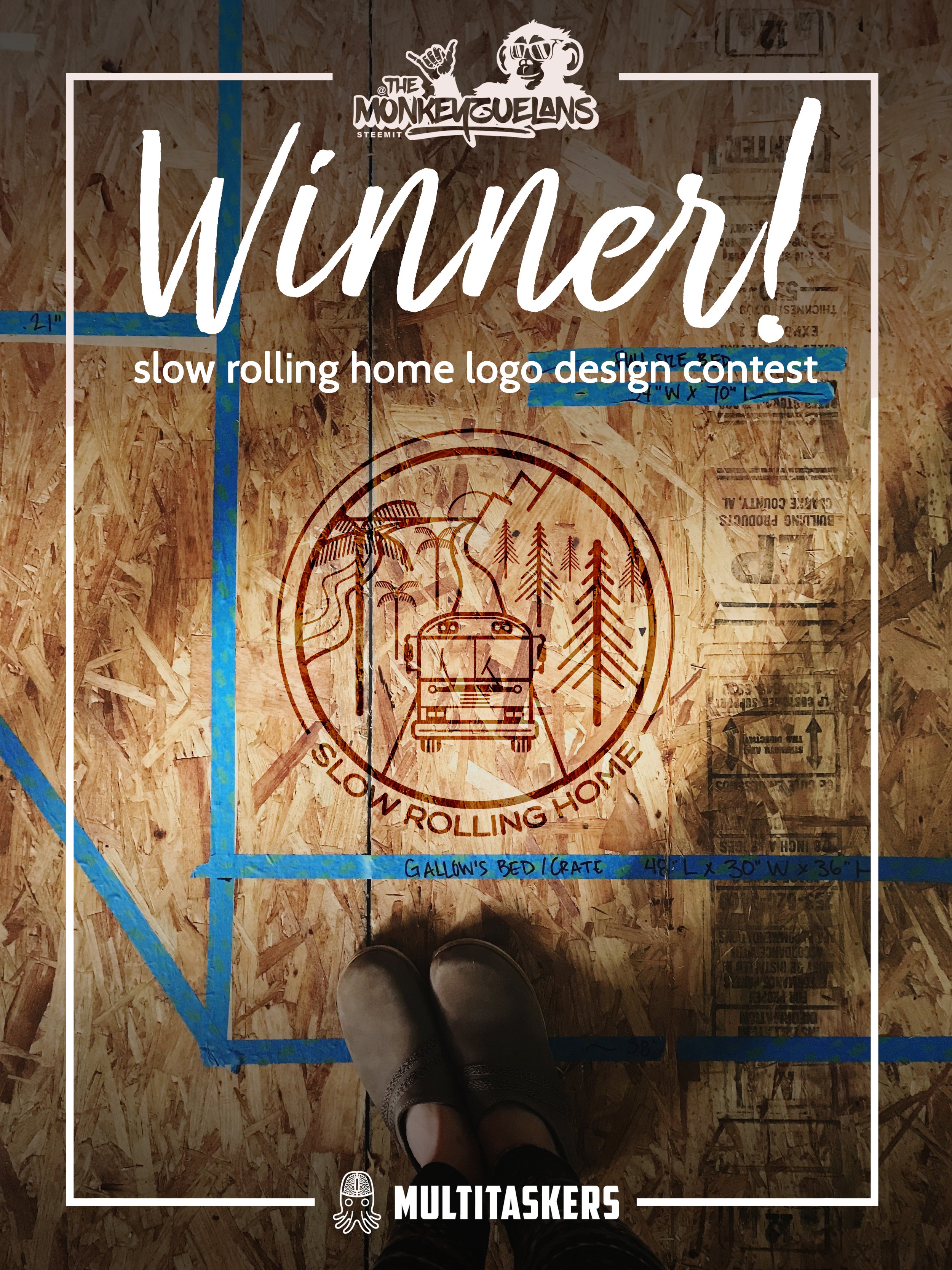
I'm so proud to announce the winner of the Slow Rolling Home logo design contest!
Thank you each of the designers who took time to get to know us, our style, and our bus! This is my first Steemit contest and I'm grateful for each of the designers who submitted logo contenders. See the original contest post to learn more about the bus, our journey, and see what influenced our choice.
Two logos stood out from the rest, and only one could be our choice! The most important aspect I wanted for this logo is that it epitomized our journey, and specifically, our bus.
Meet the Slow Rolling Home
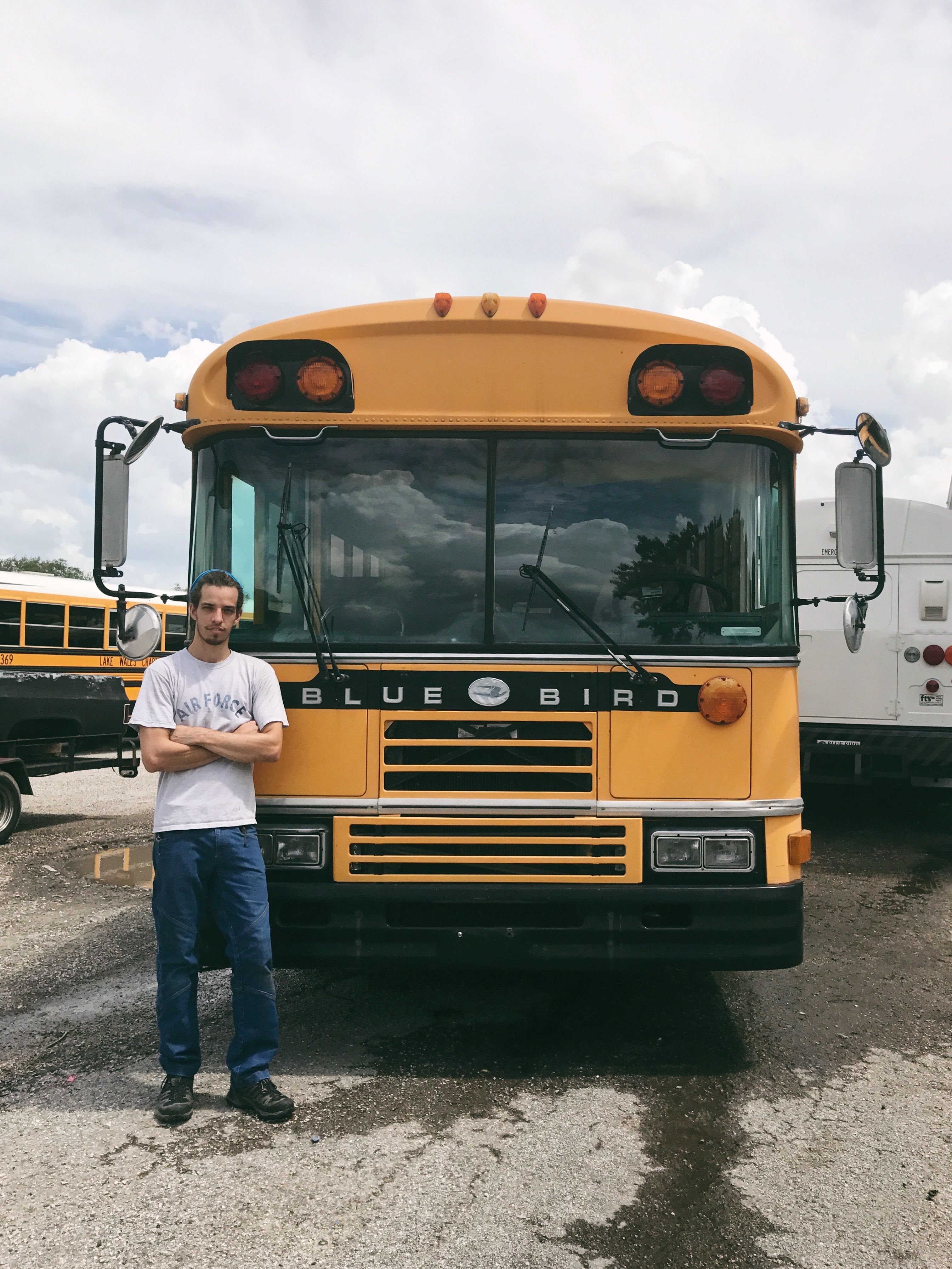
This handsome man is my other half, whose opinion contributed to the winning pick.
These are the two logos vying for the top spot and the ultimate winner of the Slow Rolling Home logo contest.
Honorable Mention: @mrlightning
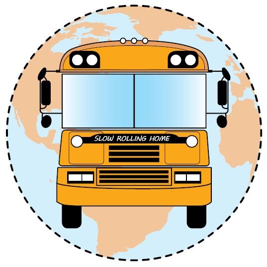
@mrlightning took great care in tracing the shape of our bus from the photo we provided and positioning it upon the world, as we aim to travel as far and wide as possible!
Winner: @themonkeyzuelans
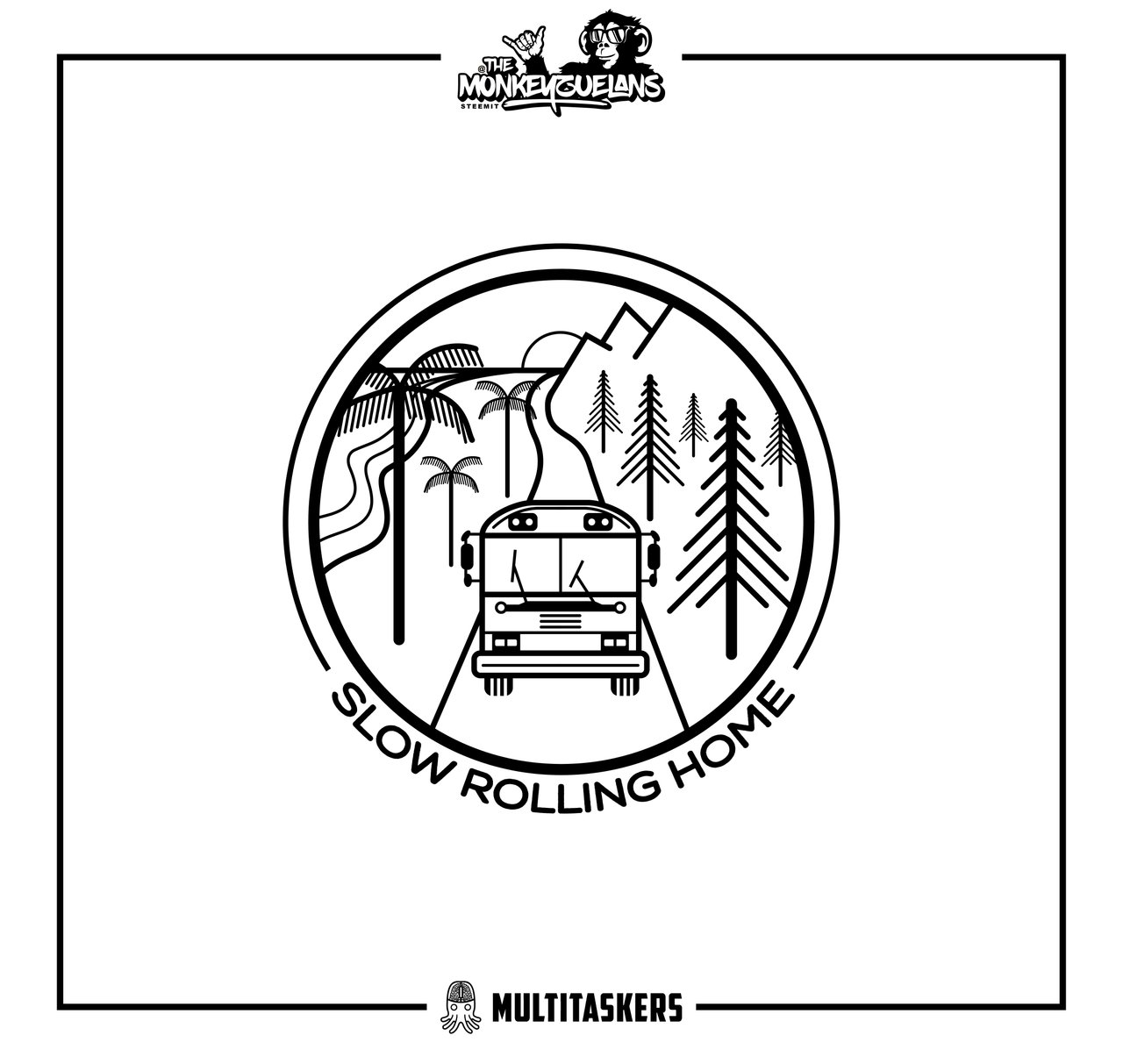
At first glance, I was completely taken aback by their clear understanding of the style, journey, and personality I outlined in the original post. They have created a logo with clean lines, elements that can be used independently or together, and ensured the logo could be utilized in a variety of applications.
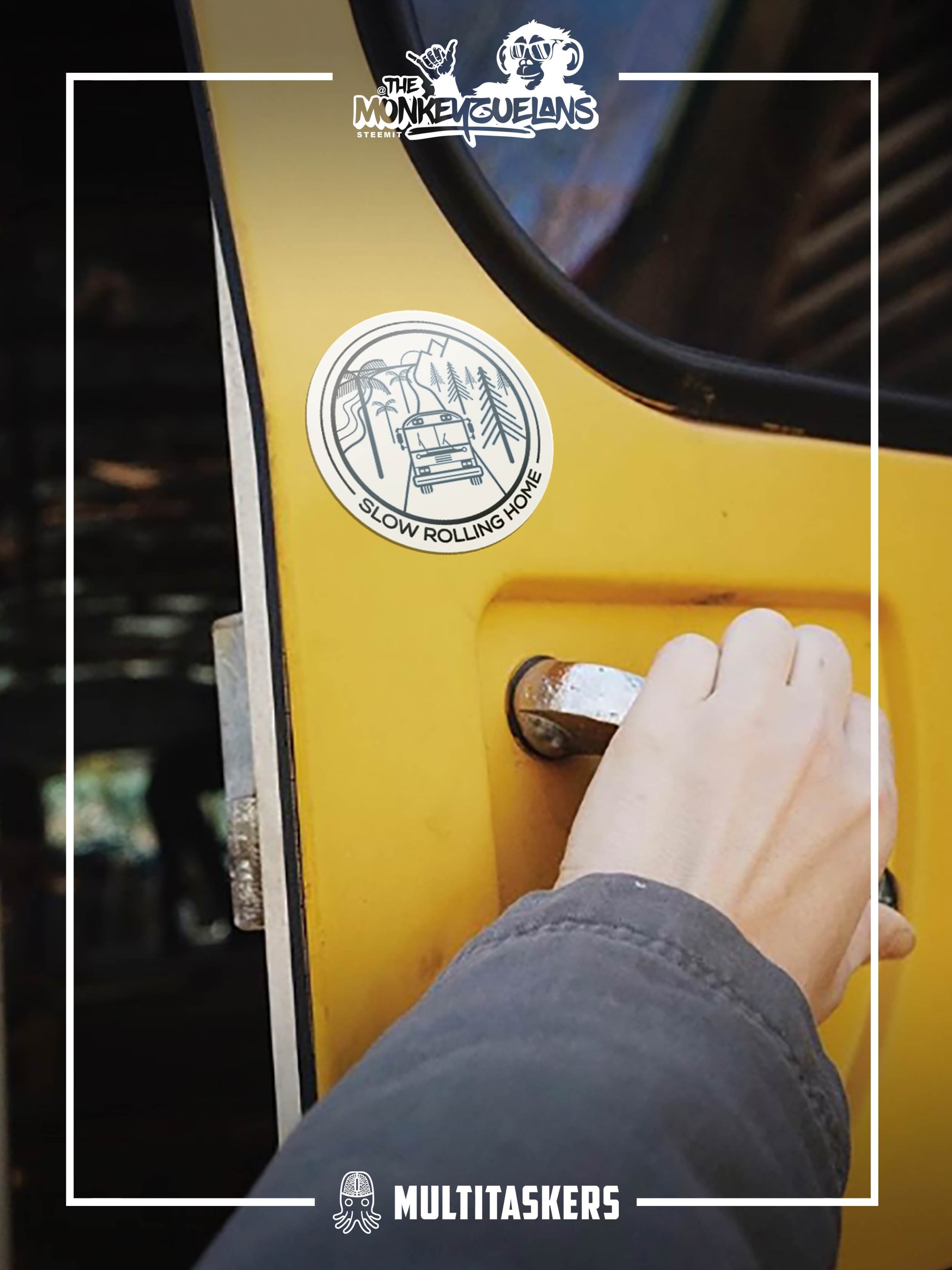
The more I looked at the logo, which looks fabulous on a sticker, the more I saw details that made this an uncanny fit and well-thought out design.
1. The Slow Rolling Home journey intends to go from Canada to Patagonia, invariably on Hwy 1 / Pacific Coast Highway.
Looking at this logo, we see the bus traveling down a road... if it were moving southbound with the mountains to the east and the coast to the west, THAT IS HIGHWAY 1. 🤯
2. In each digital bus graphic, vector, and rendering I've come across, they always looked two-dimensional and somehow incomplete.
Pay attention to a few details that make the (vectorized) Slow Rolling Home so complete:
The bus tires, which - just like any real tire - have 360-degree tread that does not "cease" (to the eye) when it touches the road.
Windshield wipers. I would have never thought of windshield wipers, but they are up in the photo provided and give the windows a focal point, rather than making them something our brains think we should see-through.
A groove in the bumper, which exists on our actual bus and gives depth to the front face, which is otherwise extremely two-dimensional.
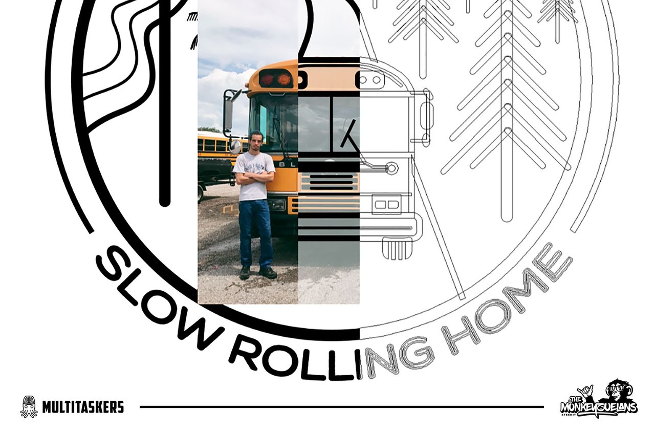
It's crystal clear that @themonkeyzuelans paid attention to every detail
and translated a real-life, dimensional object into a tangible, relatable vector. My beau Alhen (the Captain of the Slow Rolling Home) and I are thrilled with this submission and are excited to share with Steemit how talented @themonkeyzuelans are.
Keep an eye on their profile for a process post this weekend.
My future Slow Rolling Home progress updates, photos, graphics, and products will bear this logo proudly. It's a true representation of our journey, our tastes, and our personalities.
Thank you to everyone who participated!
The second part of this contest was for the logo with the most upvotes! That person would win 50% of the payout from this post, which is 2.79 SBD!
The winner is: @doctorvee!
What do you think of the new Slow Rolling Home logo? Share your thoughts with me in the comments.
Get up to speed with the Slow Rolling Home
Latest Post
Conversion Progress
- The Importance of Planning | Conversion Progress: Week Nine
- In-House Interior Design | Conversion Progress: Week Eight
- Conversion Progress: Week Five
- Conversion Progress: Week Four
- Our Road Trip to Tennessee
- Conversion Progress: Week 3
- Conversion Progress: Week 2
- Conversion Progress: Week 1
- What Are We Going to Do in the Skoolie?
- We Bought a Bus to Convert to a Tiny House
In-Depth Guides
Even though my posts go out-of-date, I hope you'll enjoy the full build documentation through the complete Slow Rolling Home Journey.
Never miss a post! Setup post notifications with GINABot for #slowrollinghome to see the latest conversion progress first!

