Format your posts! Help your reader
by having an easy to read post!
by having an easy to read post!

Beware Walls of Text!!
Have any of you noticed that we've not really talked much about the actual Body of your post? But we did need to get people to actually open your post first though. There being SOOO many fantastic (Markdown) formatting guides out there (I'll provide a link to one below) I'd rather discuss ways of making a post easier to read and scan.

Q: What's makes posts easier to read? Does it really even matter?
Now, there are two ways you make posts readable:
- In the writing style itself; explaining well, good flow, good grammar, etc
- and Visually; differing text size, bold/italics, spacing, centering, etc
The writing style is still important, we'll just discuss it another time. I'm going to specifically talk on Visual readability in this guide. While you won't really get compliments for doing this, most people are repulsed on some level when it's not done well.
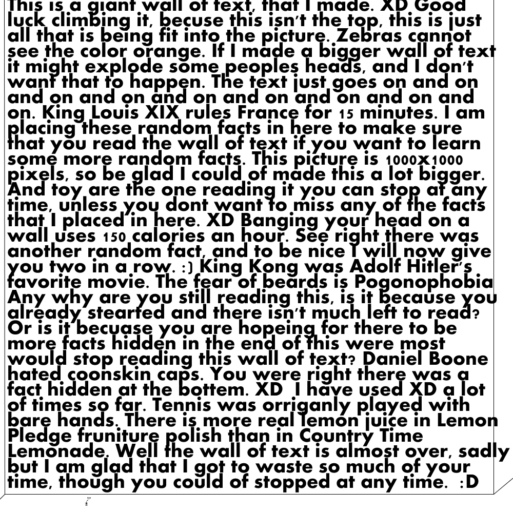
I'm sure you've all seen 'walls of text' before....a bunch of sentences or paragraphs that just seem to go on forever. Just like this:

While this may be a bit of an exaggeration, it still feels this way to the reader.
- Did you get through reading the whole wall of text above?
- Probably not (though I'm sure somebody will comment that they did).
- Can you tell how hard it is to read after getting through a few sentences?
- *More than likely!
Every day there are over 10,000 new Steemit posts. Having a wall of text in your post (especially starting from the beginning) WILL LOSE YOU VOTES for the one's that don't.
If you take nothing else away from this guide...take this! DON'T HAVE WALLS OF TEXT!!
OK...OK...I get it! So how can I break up the text?
This is one of the easier things to fix. Just pick and choose from:
- Double space between paragraphs: I recommend doing this between every paragraph in your post. (see it in mine?)
- Use headings for your sections. You have 6 different sizes to choose from. (Read the markdown formatting guide linked above)
This is a centered heading! :D
- Put in a Picture: You all know how to put pictures in your posts already. If you find there too many paragraphs together, maybe you can move a picture around or put another in there (only if you think it adds to the post...don't just throw in random pictures.)
- Use a divider to separate sections of your post: this can be anything from:
- a 'horizontal rule' (by putting three *'s or
<hr>at the beginning of a line.) which looks like this...
- a 'horizontal rule' (by putting three *'s or
- or a page divider image (make your own or find a free one on google)...you can see mine in this post
- fill the line with emojis like these (which I centered)
❤️ ❤️ ❤️ ❤️ ❤️ ❤️ ❤️ ❤️ ❤️ ❤️ ❤️
Alignment
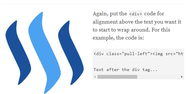
Once you've gotten the text broken up, you'll find that you get more pleasing is choosing what things are on the left margin, centered, etc. You can also play with 'word wrapping' text around a picture using THIS POST.

You'll find how many paragraphs you're comfortable having together (without an image or divider) and what you actually use to accomplish this. This ends up being a part of your style and helps your branding (as discussed HERE.)

Q: What is Scanability? Does it really even matter?

This is a bigger deal for longer, especially written posts
It's hard to keep people's attention in general. But here on Steemit...its ten times harder. So many people here at writing, reading, commenting, chatting, etc! As much as I hate to say this to you...Many people start scrolling down after reading about two paragraphs!
There are some fantastic content consumers on here, that read posts in full! But they are in the minority...I guaranty you. Since this is a guide to get more VOTES versus more READERS...this matters. Have the expectations that your reader is going to scroll through large portions of your post...they're likely not going to read it all.
So use things like headings and pictures to let them follow along and get the gist of your point, while scrolling. You can think of them as being point 1, point 2, etc and writing the headings and choosing images with this in mind. You can also use ALL CAPS, bold or italicized words to make then stand out and/or give extra inflection.
If you look at any of my other posts you can see how easy it is find the questions you were wanting answers for. (Having the extra headings, page breaks, etc. make this post look a bit ugly to me.) If you try scrolling through your own posts, you should be able to see if things are in a good order and able to follow the point.
One additional option that some people like doing is to had a TL;DR (too long, didn't read) section. This takes your entire point of the post and explains it in 3-4 sentences. You can put this section either at the beginning or the end, which ever you prefer. Just make sure to label it TL;DR, summary, or something like that.

❓Answering Common Questions: How do I get more Votes?-
Part 1-Part 2-Part 3-Part 4-Part 5
Part 1-Part 2-Part 3-Part 4-Part 5
❓Answering Common Questions: Why do my Post Payouts and Account Value go down ❓
Click HERE for a list of All my Guides!
Please Follow, Upvote and Resteem if you found this Guide Helpful.


Image Sources:
Book
Wall of Text
Blurred Car
