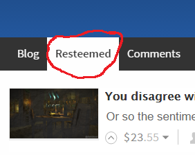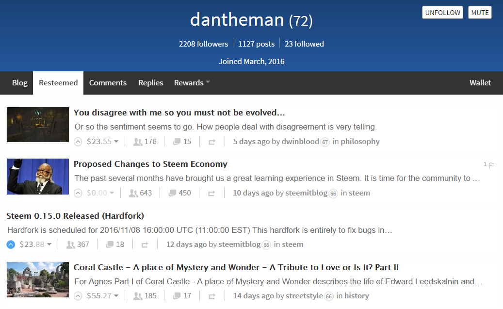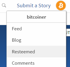
Resteemed tab
This has been a much wanted feature even since the resteem function was introduced more than two months ago. In essence, resteemed posts clog up a user's blog and make it hard for others to see the user's work. When I visit someone's blog, I mainly want to see their work, resteemed is secondary.
Many posts have been written about this including:
- @kurtbeil - STEEMIT Design Tweak Proposal - Resteemed Tab
- @timcliff - Attention: Calling All Developers - Let's Polish The Steemit.com Mothership!
- @timcliff - Steemit.com Developer Bounty: Split Blog into Blog and Resteemed 💰 $50 SBD + STEEM/SBD Author Payout From This Post 💰
- @ats-david - Steemit – We have a Problem
Quoting from @ats-david's post:
“Re-Steeming” is a nightmare for many users. The Re-Steemed posts really need to be separated from user posts on their blog page. Create a new tab for it and send the Re-Steems there. Again – this is something that shouldn’t take long to code and implement. Why it hasn’t been done already is a complete mystery. This has been mentioned by many users since immediately after the function was implemented.
Well, for what it was worth, a while ago I did put the "Resteemed" label on the top of resteemed posts in the user's blog, similar to how it is in the feed. This is currently live on the site, and at least this has made it easier to spot which of the posts were the users and which were not. See the following code submission Show Resteemed on Blog #426.
Features
Blog tab

Resteemed tab

Dropdown

Submission
The code submission can be found on this GitHub pull request:
Split Blog tab into Blog and Resteemed tabs #626
