So it's down to 2 designs in this final and head to head round.
We started with over 25 designs, many were absolutely amazing, but there can be only one!
The winner of this round will be minted into a 1 oz silver round and sold online for any steemit members to purchase. We will host them on our website www.phelimint.com and presale and order instructions will come after the design is choosen so please no inquiries at this time.
Sorry for the delay between rounds, but we wanted to give the designers a chance to make any final changes and incorporate any feedback they received from the earlier voting rounds.
The Rules
This round will be a straight head to head vote, we want maximum participation from all of steemit. So anyone can vote and we encourage you to canvass for your favorite design and get out there and promote the project.
- It will be calculated by number of votes and not the value of the votes.
- Bot votes or automated or trail votes will not count so please no cheating.
- Vote will be cast on one of the official comments made my this account, and only those votes will count.
- Additional comments will not be counted.
The Designs
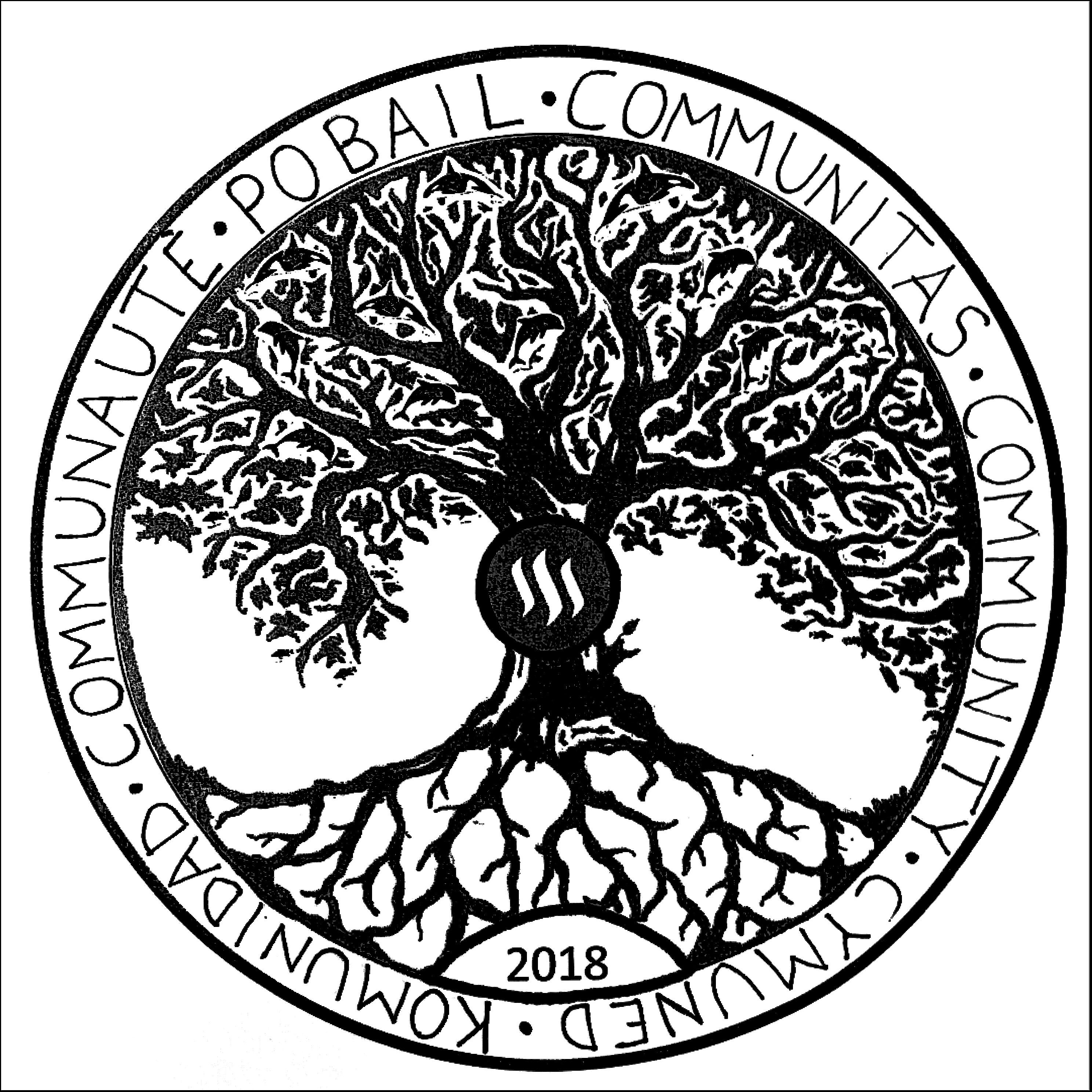
1. @Welshstacker
Here is his post explaining the revision process
The design in his own words;
So I've called the idea THE COMMINI-TREE (community) for obvious reasons, it's based on the tree of life pattern. So sit back, grab a cold beer and allow me to take you through my thought process... Hold tight, it's a mine field of random thoughts!!
So the tree is meant to represent growth, not only as an individual on Steemit but as the platform as a whole. It needs strong roots and will continue to grow bigger for as long as its foundations are strong!! Told you it was cheesy..
The design of the coin itself, I feel needs a chunky rim to it, very similar in size to last years one. It gives a good balance to the design inside and leave plenty of space for writing around the outside.
I loved last year's design and would like to use the idea of minnow to dolphin to whale as part of this design. So my thought was, as you progress further up the tree, you move from minnow to dolphin in to whale. There can be a few leaves scattered amongst the branches too. There should be a lot of minnows around the lower branches and get slightly bigger the higher up. These could be mixed in with dolphins and overlap as you go up. There should be less dolphins than minnows and obviously less whales than dolphins sitting at the top. There should be no whales at the very top(leave a tiny space of free branches) as who knows what the future may bring.
So I decided to change up the outer rim message. I know a few thought the "from little acorns might oak trees grow" message was meaningful enough, but for continuity I used the "community" designs from last years round and added 2 new words of my own, one Welsh and one Irish.
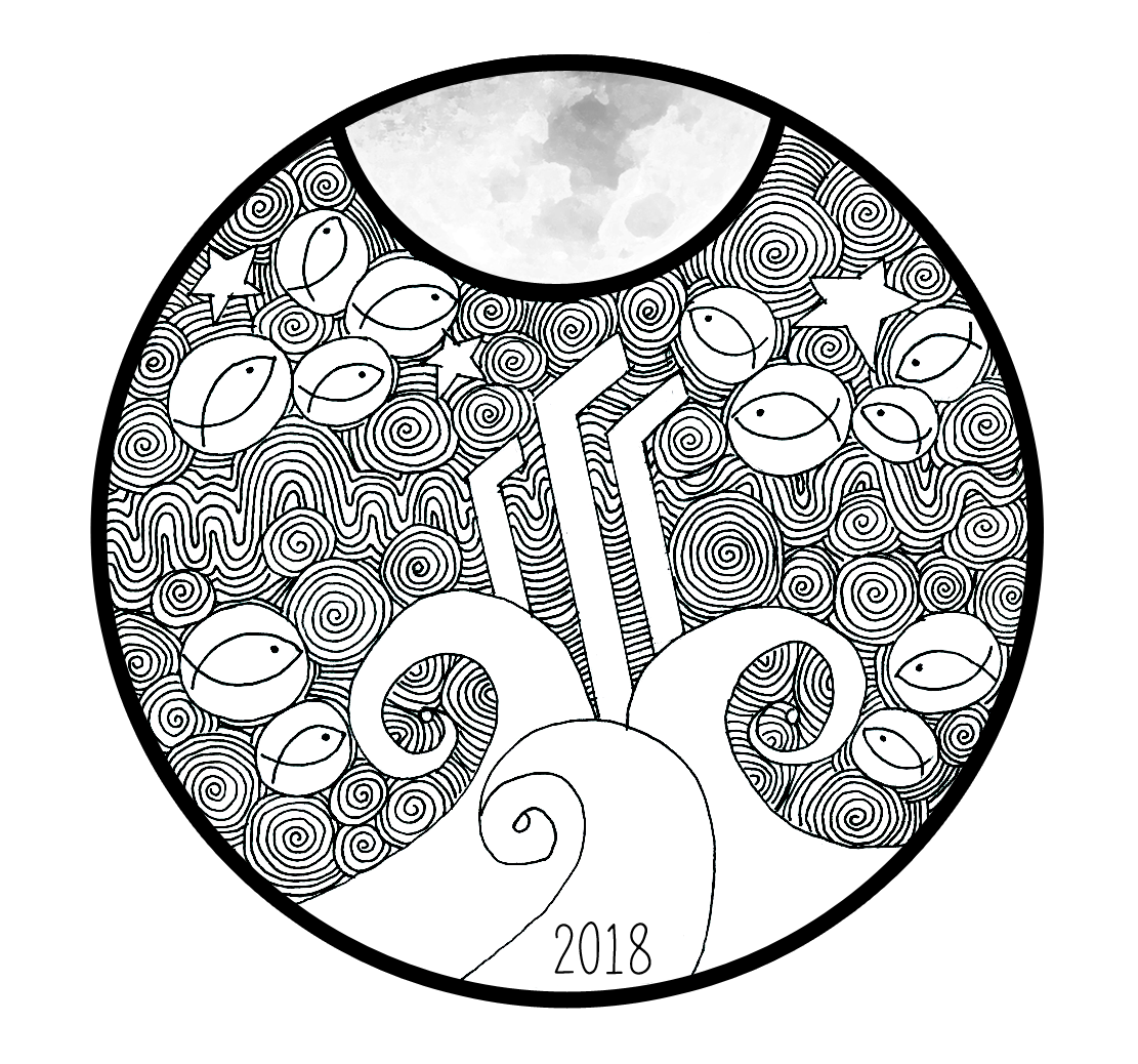
2. @bearone
Her revision process and post-also alternate versions
What in means in her own words;
Steemit to me is all about community and that is represented by the MINNOWS. Yup the minnows. No dolphins and whales this time, just the minnows.
I feel it's important that we remember what it's like to be a new fish swimming in new waters.
The SWIRLS represent the constant movement and changes on the platform.
This constant change was emphasised when I took a week off for The Move, when I got back this week I found so many new things going on within the communities I am a part of. I was only semi gone for a week.
The 'CHANGING TIDES' when you look at it, looks like it's propelling the "Steem" logo towards the full moon.
This is exactly how I feel about Steemit. It's just a matter of time before the tides change and people really embrace the next generation that we represent.
The RIPPLES represent our interaction with each other and how we have the ability to touch each other's lives.
I find this especially true in my time here. It has been my pleasure to have come across many beautiful souls and because of Steemit, we are able to touch other people's lives outside of the platform.
What we do here, now, makes a difference wether we realise it or not.
The long WAVES represent the dips and gains, the ups and downs, that we as a community go through.
The STARS...
"Reaching for the Stars. Going to the Moon."
Lastly. You would have noticed I revamped the STEEM logo.
Honestly? I was having issues getting the proportions right to make it look exactly like the logo so I sketched in a rough outline, which ended up sticking because it reminded me of the 2001 Space Odyssey Monolith.
Which in this design seems so appropriate, as the Monolith, in the movie, triggered a shift in evolution.
Steemit certainly is the next step to evolution.