Political Data
The ability to visualize data in a spatial context can be helpful in many disciplines. In previous posts, I have discussed how GIS might be used to hunt for morel mushrooms or Keokuk geodes. Another data type that lends itself to spatial analysis is associated with politics and elections. Elections greatly influence the direction that a country evolves through changes in law. The stakes are so high that billions of dollars were spent during the last presidential election in the United States.Allocating Funds
Knowing where and when to focus efforts in a political campaign can make the difference between winning and losing the election. In the United States, presidential elections are ultimately decided by a process known as the 'Electoral College' rather than by popular vote. There are 538 electors and a majority of 270 electoral votes must be secured to become president. The number of votes that each state provides is based on the number of senators and representatives that the state has, meaning that some states have many electoral votes (California, 55) while others have few (Wyoming, 3). Source
Determining the best way to spend campaign money and the most important places to hold rallies may seem like guesswork, but when election data is visualized spatially and with time there are undeniable trends in the spatial migration of political ideologies that can help inform campaign strategy.
Obtaining the Data
The first step in analyzing election trends is to find spatial data. While state-level data is available from a number of sources, this data is only a coarse average of regional trends. Fortunately there is also county-level data available for the most recent presidential elections that provides much more detail!2004-2012
The 2004, 2008, and 2012 county-level election results have been compiled, summarized, and transformed into a shapefile by the US Federal Government. This data is ready to go and only has to unzipped and loaded into your favorite GIS client.2016
The most recent 2016 election data has not been officially released by the Federal Government. This has not stopped news agencies and data enthusiasts from compiling the county data into a convenient comma delimited file. This file can be joined to a shapefile of US counties to visualize it alongside the 2004-2012 data.2000
Compiled county election data prior to 2004 is difficult to find. I was interested in comparing the 2000 and 2004 elections, but most of the data I found is behind an academic paywall. After a little searching there proved to be another source for the 2000 county data in CSV format. Similar to the 2016 data, this file needs to be joined with a county shapefile to be visualized. In this case, the 2000 data must be edited to account for county boundary changes between 2000 and present day. The main difficulty is in getting the join fields to have the same key, in this case a field called GEOID that is a numerical code representing the state and county. It requires a little more data massaging than the 2016 results, but is the best available source I have found.Visualizing the Data
After the data has been imported into a GIS client and properly projected, the fun begins! For this project I used a WGS 84 projection, but there are many others that work.In QGIS, you can change how the data displays by changing the style in layer properties. I decided to look at the vote percentage and vote count for each party in each of the 5 elections. To view the data this way, choose 'Categorized', style the data based on the preferred column, and stretch to a color ramp of your choosing. The names are mostly self-explanatory and are named by political party (Republican, Democratic) or candidate, but the metadata can be referenced for more details.
Temporal Component
The data that we are attempting to visualize spans 5 elections and 17 years. Because of the temporal component of this project, an animation will make election trends with time easier to spot. To make an animation I take several screenshot images of the different views and import them into an image manipulation program like the free and open-source project GIMP. Here titles can be added and the images can be aligned before exporting the prepared images to a GIF maker. There are several websites and software packages that can generate GIFs, but I often use GifMaker.With animated presentations of election results in hand, the only thing left to do is look for trends! I am not a political theorist and will not analyze the data too deeply, but I'll try to point out a few trends that I notice and let you speculate in the comments!
Democrat Vote Percentage
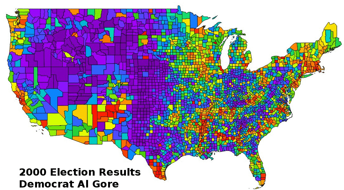
Percentage of votes for the Democratic candidate from 2000-2016. Cooler colors (purples and blues) represent very low percentages, while warmer red and orange colors represent high percentages. Green is generally just less than 50% of the vote and yellow is just over 50%
Republican Vote Percentage
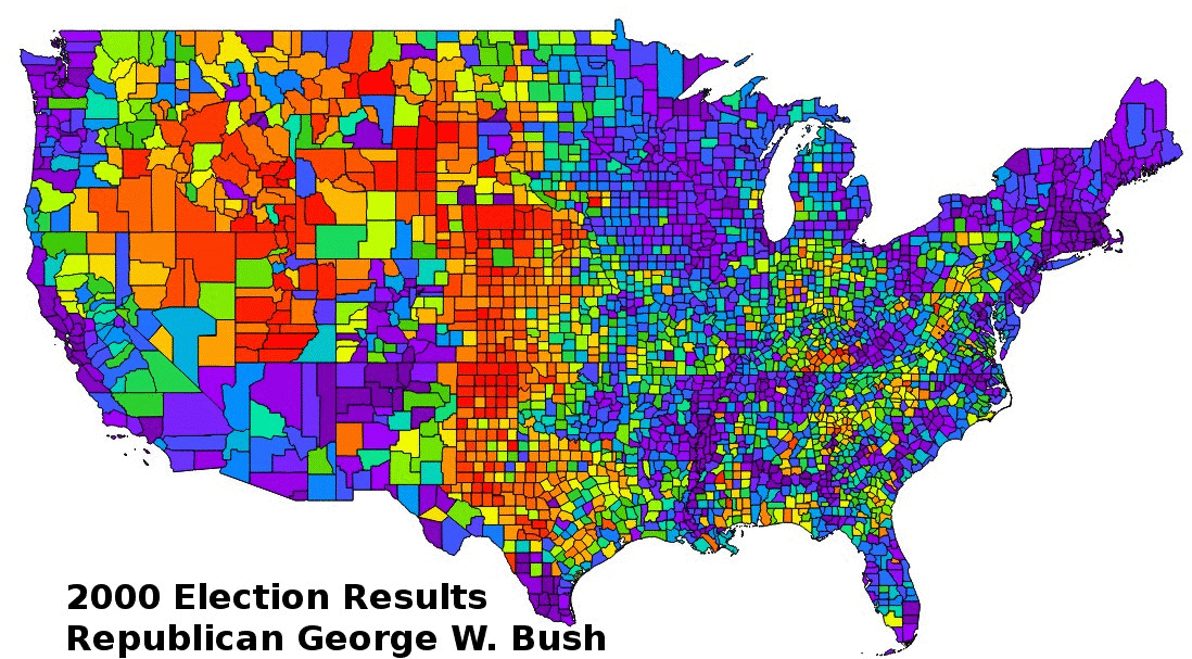
Percentage of votes for the Republican candidate from 2000-2016. Cooler colors (purples and blues) represent very low percentages, while warmer red and orange colors represent high percentages. Green is generally just less than 50% of the vote and yellow is just over 50%
Democrat Vote Count
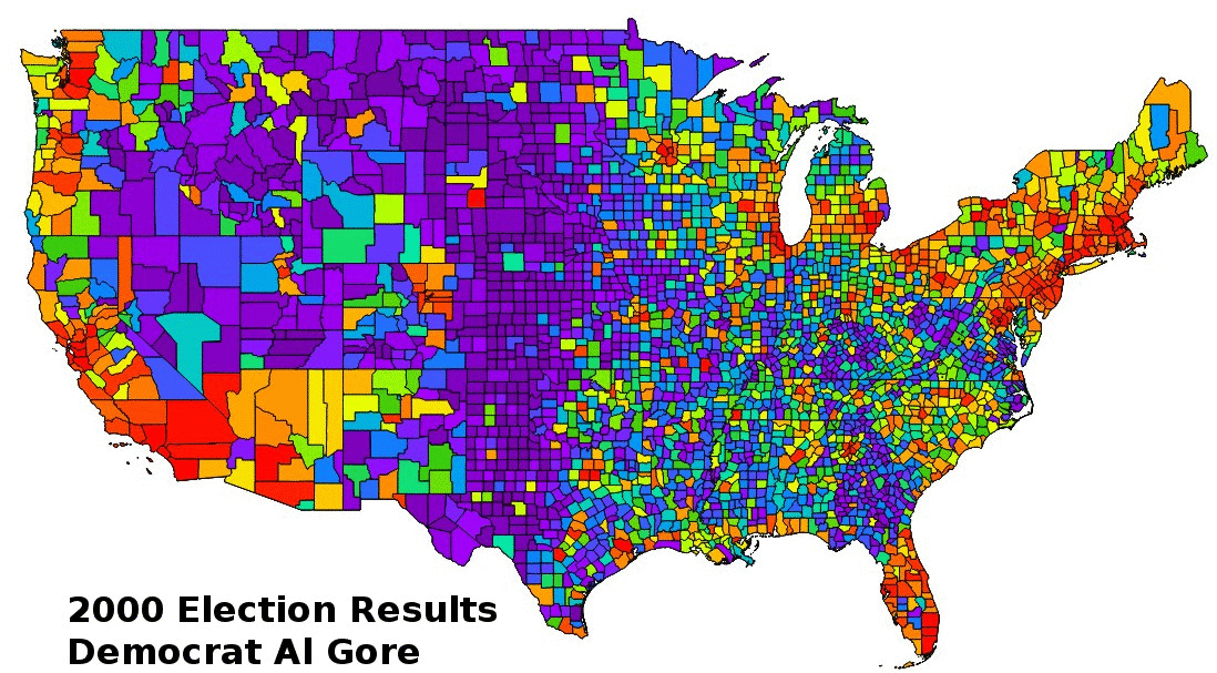
Number of votes for the Democratic candidate from 2000-2016. Cooler colors (purples and blues) represent a small number of votes (10s to 1000s), while warmer red and orange colors represent larger vote counts (100,000s to 1,000,000s).
Republican Vote Count
Number of votes for the Republican candidate from 2000-2016. Cooler colors (purples and blues) represent a small number of votes (10s to 1000s), while warmer red and orange colors represent larger vote counts (100,000s to 1,000,000s).
Other Considerations
This analysis is only looking at county level data, not the Electoral College votes that determines presidency. To get a more complete analysis of the different elections, this data should also be considered.Additional trends might be realized if a longer time span is considered. The difficulty is compiling county-level data from historical election data. This requires a lot of effort and until this is done, state-level data is the best available proxy. Other types of information could be extracted from the available county data by combining different fields and running statistical operations.
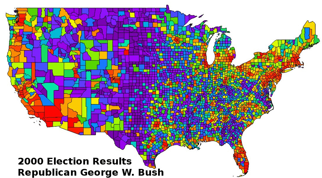
When importing data, be aware that fields have different data types. If integer values like vote counts are imported as text string, the category style will not sort the fields as expected. An example of the randomness caused by this misake can be seen in the lead photo of this article!
What trends do you see in the data that I did not mention? What other types of data would you like to visualize spatially?