 |
|---|
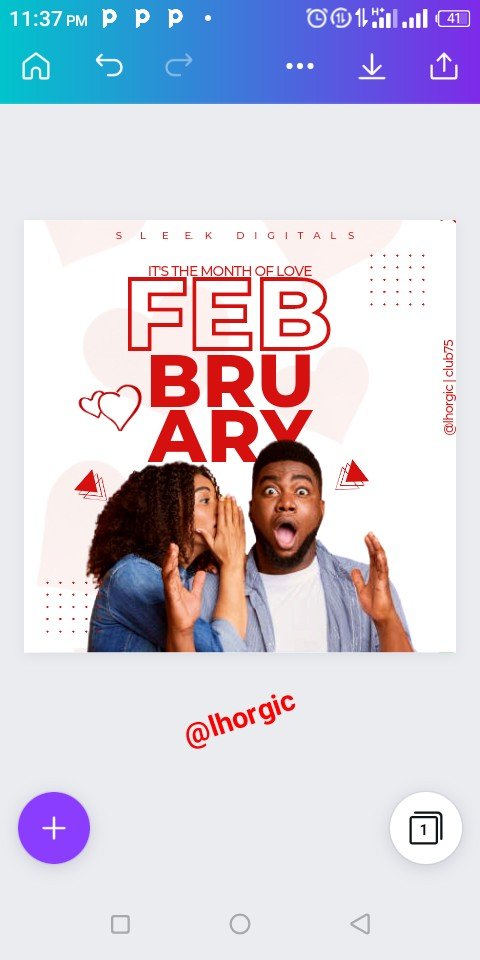
Hello friends and famz, trust you're good...of course my super cool flier is my little way of Welcoming you into the new month, it's the month of LOVE. I thought it expedient to design something along that line hence the flier you see.
Just like I said in my previous post, we are done with the first phase of this class and we are about to launch into the next phase of our design class. I remember telling us that we would be doing series of practicals before the next syllabus is completely out so that learning can continue.
I will be showing us how I came about our cover flier as usual. By now I believe you must have practiced these things and have been getting nice result from following these lessons. If you've not, this lesson is giving you another opportunity to... So, let's get down to work.
As usual, we would be building from scratch, choose your template and then wipe it clean before getting into the design.
Step 1
I made my template completely clean and then click the "+" to bring in the image needed for my background. The image was already saved up in my gallery. I just had to fetch it.
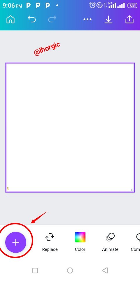 | 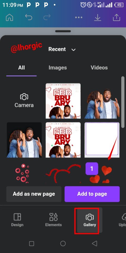 | 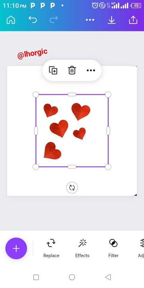 |
|---|
Step 2
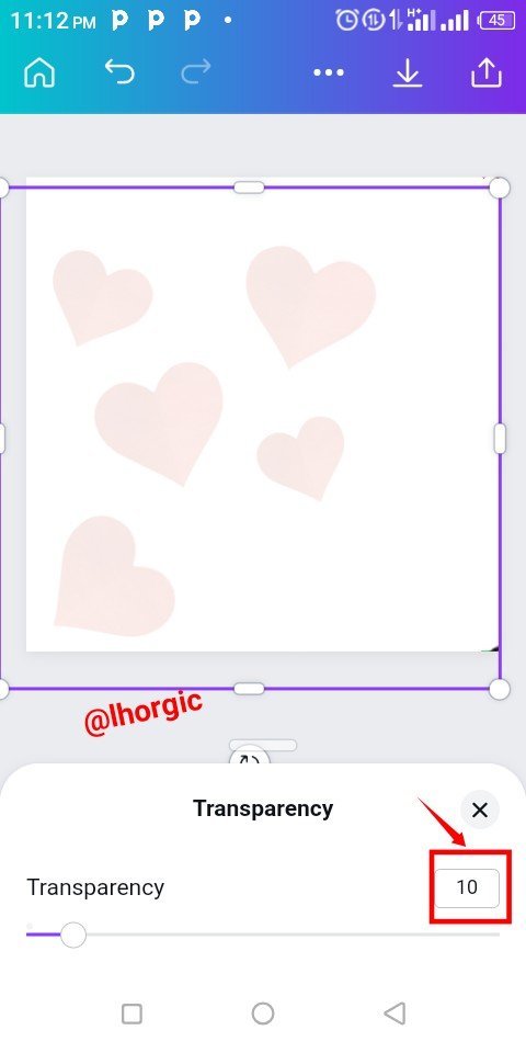
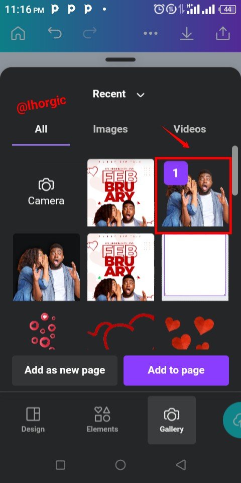
The background image brought in was was enlarged to my taste and then position. I also reduced the opacity (appearance) by using the Transparency option to fade the image into the background. I then went further to bring in my catchy image by clicking the "+" icon once again.
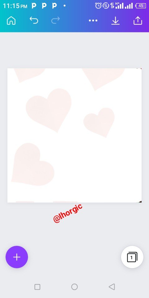 |  |  |
|---|
Step 3
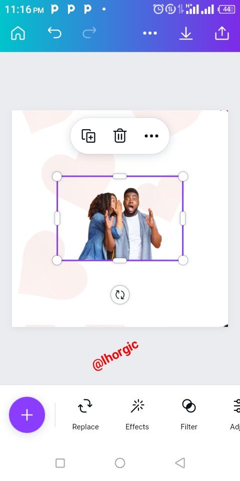
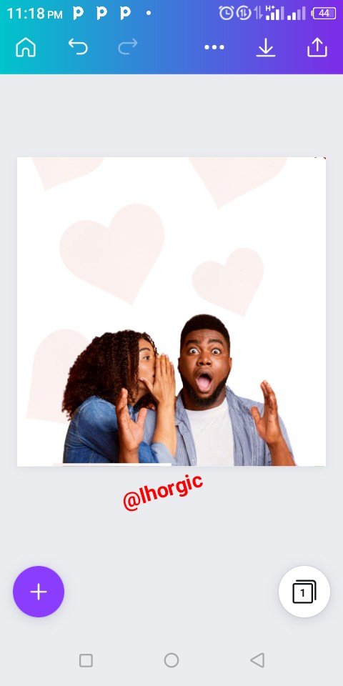
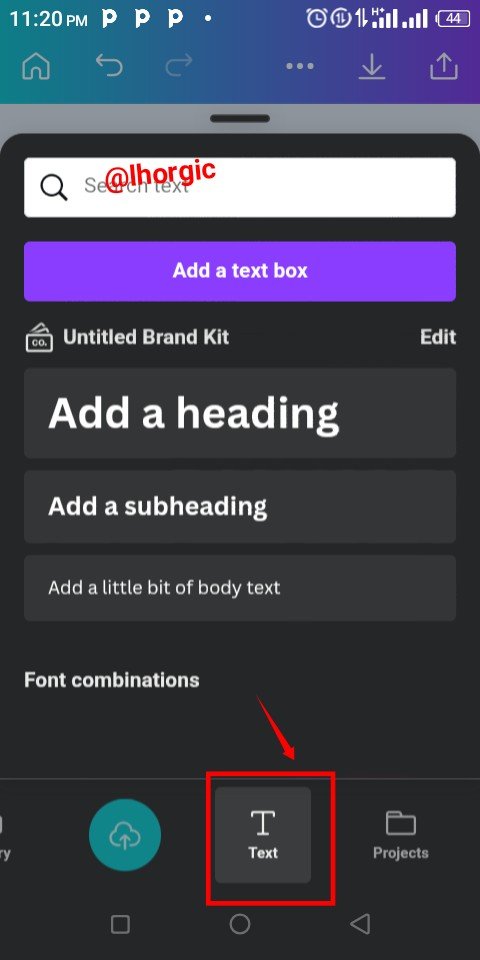
After choosing the catchy image,the image was brought into the workspace just as seen and I had to resize it by dragging it edges. I then decided to introduce my text. You do that by clicking our "+" as usual and selecting the Text option.
 |  |  |
|---|
Step 4
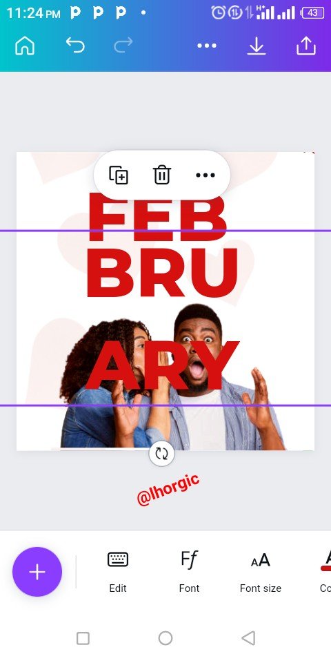
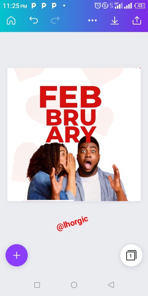
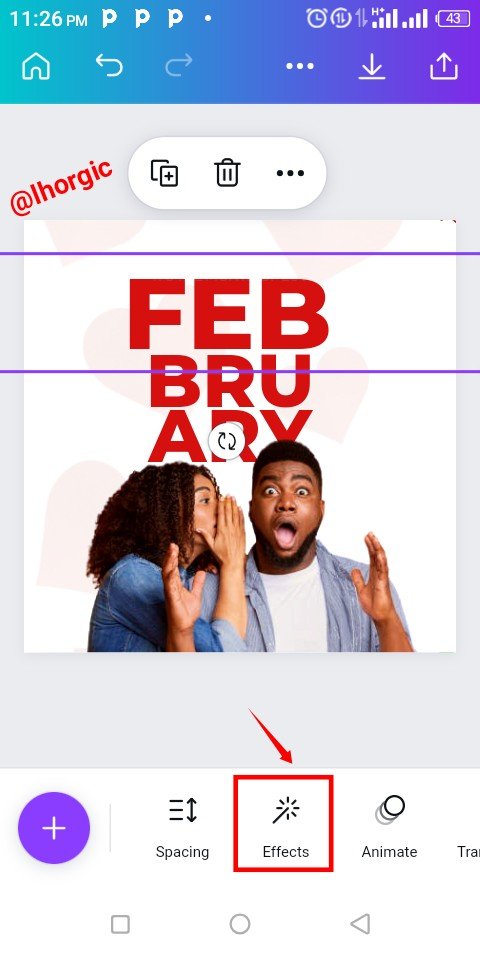
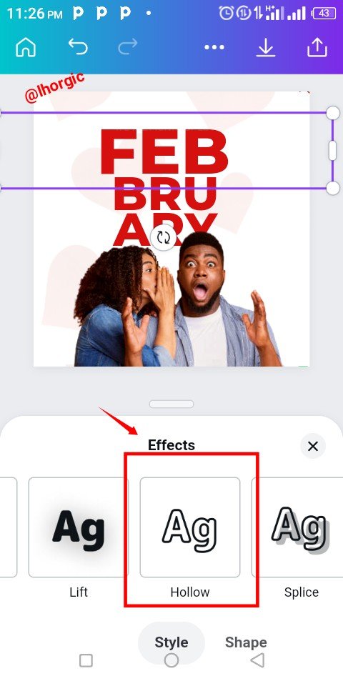
I introduced the text for the design which is FEBRUARY,broken into 3 parts and aligned strategically. You can enlarge your text like I did by dragging the tip of the text. I also applied a text effect on FEB... See that in step 5
 |  |  |
|---|
Step 5
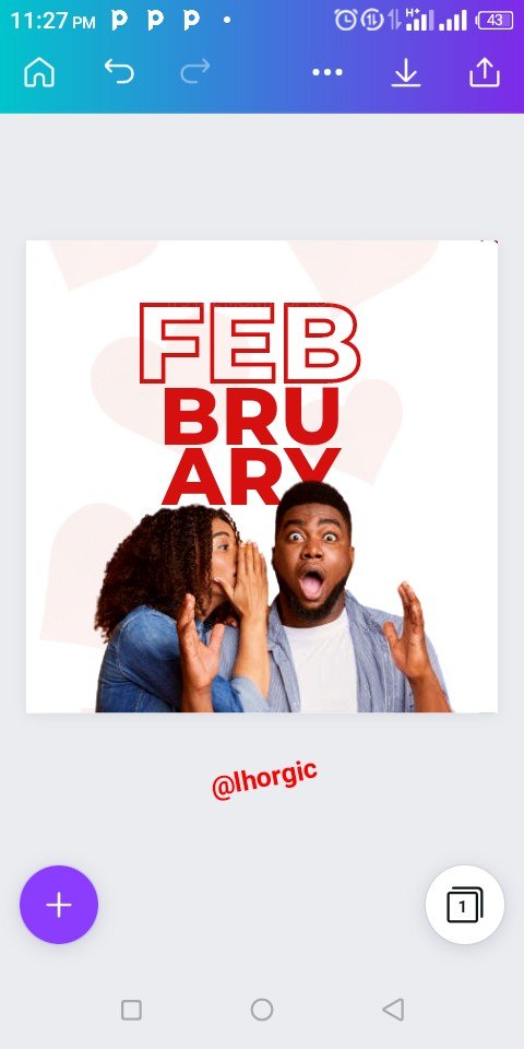
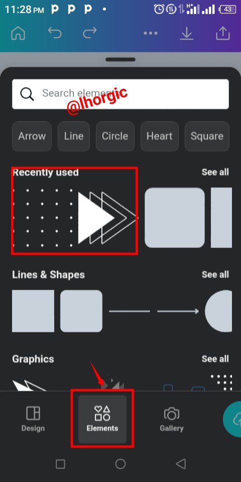
After clicking on "Effect" and then I selected the Hollow option. We can see the result in the images below. Afterwards I went in search of some key elements for this design just as seen below.
 |  |  |
|---|
Step 6
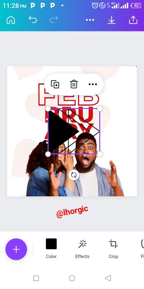
I brought in the elements and then I had to resize, change the colour and then position it skillfully in the design. I duplicated the elements where I needed more than one of the same element by using the "+" just as highlighted in the screenshots below.
 | 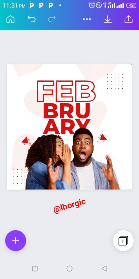 | 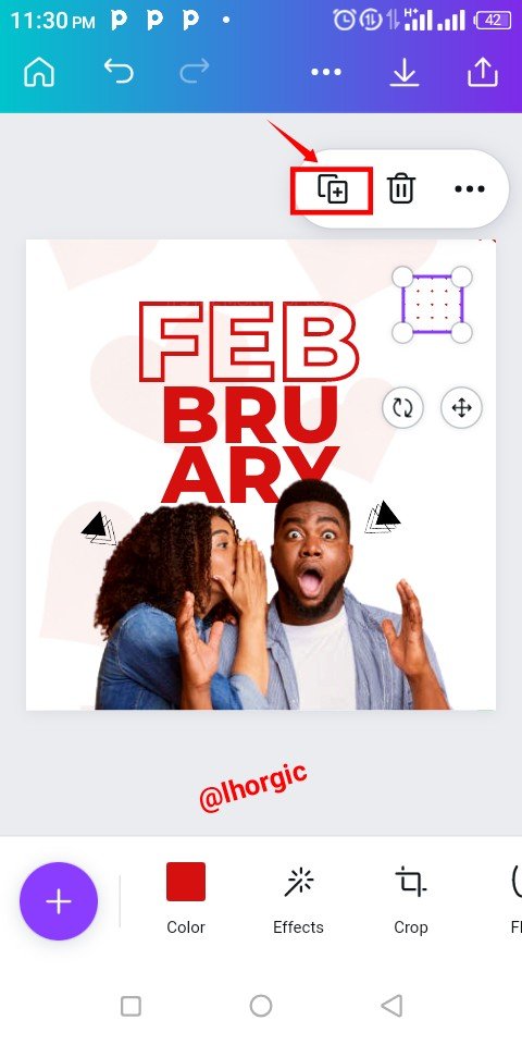 |
|---|
Step 7
I introduced another element, an image of love from my gallery using the "+" and when it came, I had to resize it and position it strategically just as seen in the screenshots below. Lastly I added other text to complete the design.
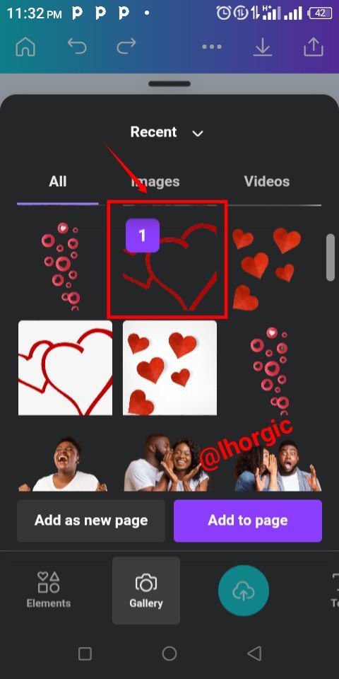 | 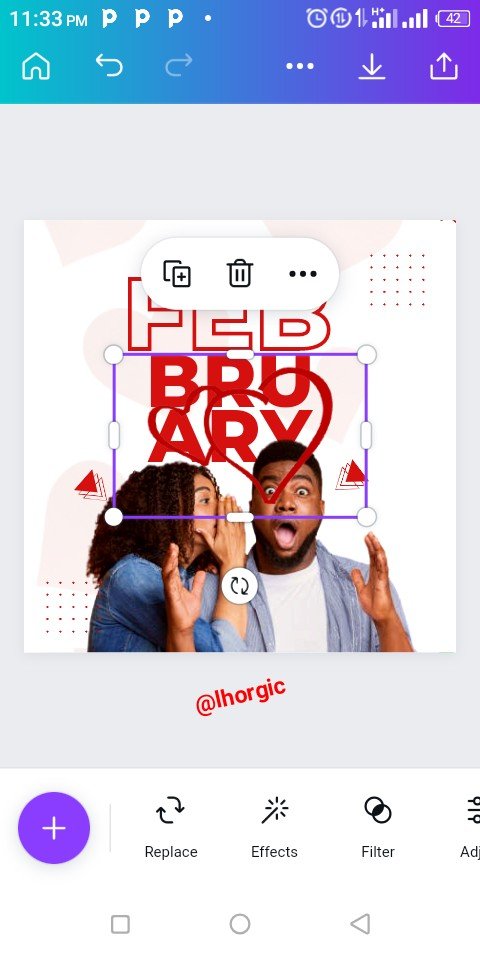 |  |
|---|
Here is our final design coupled with another with a slight difference. The second was actually the first design I made before the one used for this practical.


This is where I will be wrapping up our lesson for today. I really appreciate you for coming this far with me. I trust you got value from this lesson. Feel free to share your thought on today's lesson. If there is anything you would love me to add to improve the lesson, be free to share in the comment section.
If you missed the previous posts on this beginners class, kindly check them out here.
G101 introduction post.Lesson 1.Lesson 2.Lesson 3.Lesson 4.Lesson 5.Lesson 6.Lesson 7.Lesson 8.Lesson 9.Lesson 10.Lesson 11.Lesson 12
Graphic Instructor
@lhorgic♥️
Cc: @ubongudofot.
