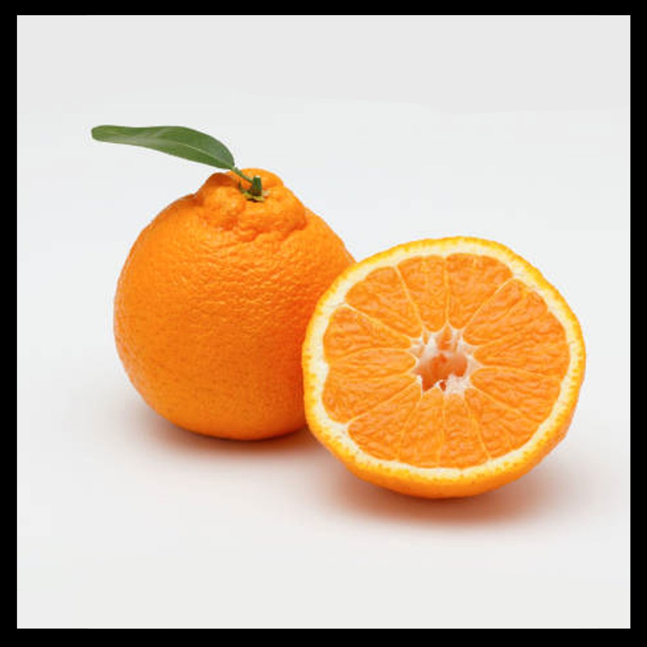
Hello party people, I hope you've had a nice break and are ready for another color round with me. We're going to tackle orange here and I think it will be a nice break from the fuzzy stuff from our Blue Study.
The orange here has mostly a round shape and that's going to let us relax into the familiar. The places where there is some challenging stuff is mostly in the bumpiness of it and the shiny zone of the cut up portion. Let's get started!
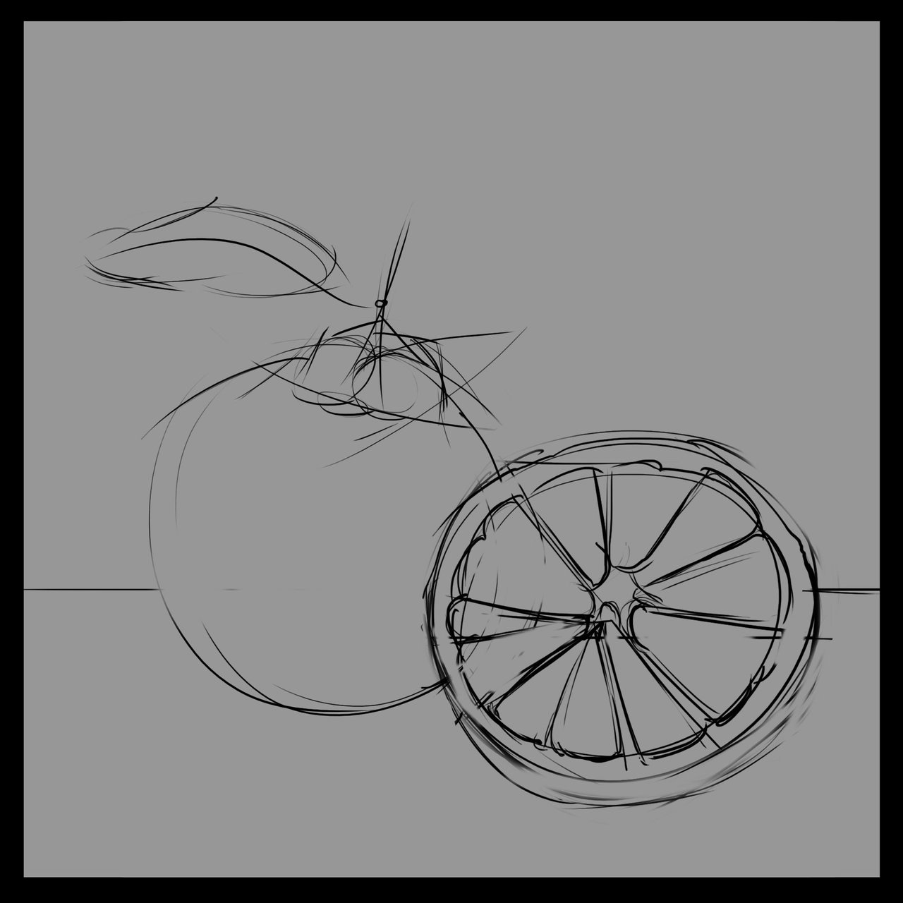
Sketcheroo! Nothing too fancy, just some basic outlines to keep us in the right zone.
Mantra time: Base Color, Shadow Color, Light Color, Highlights, Bounced Lights, Sky Lights, Occlusion
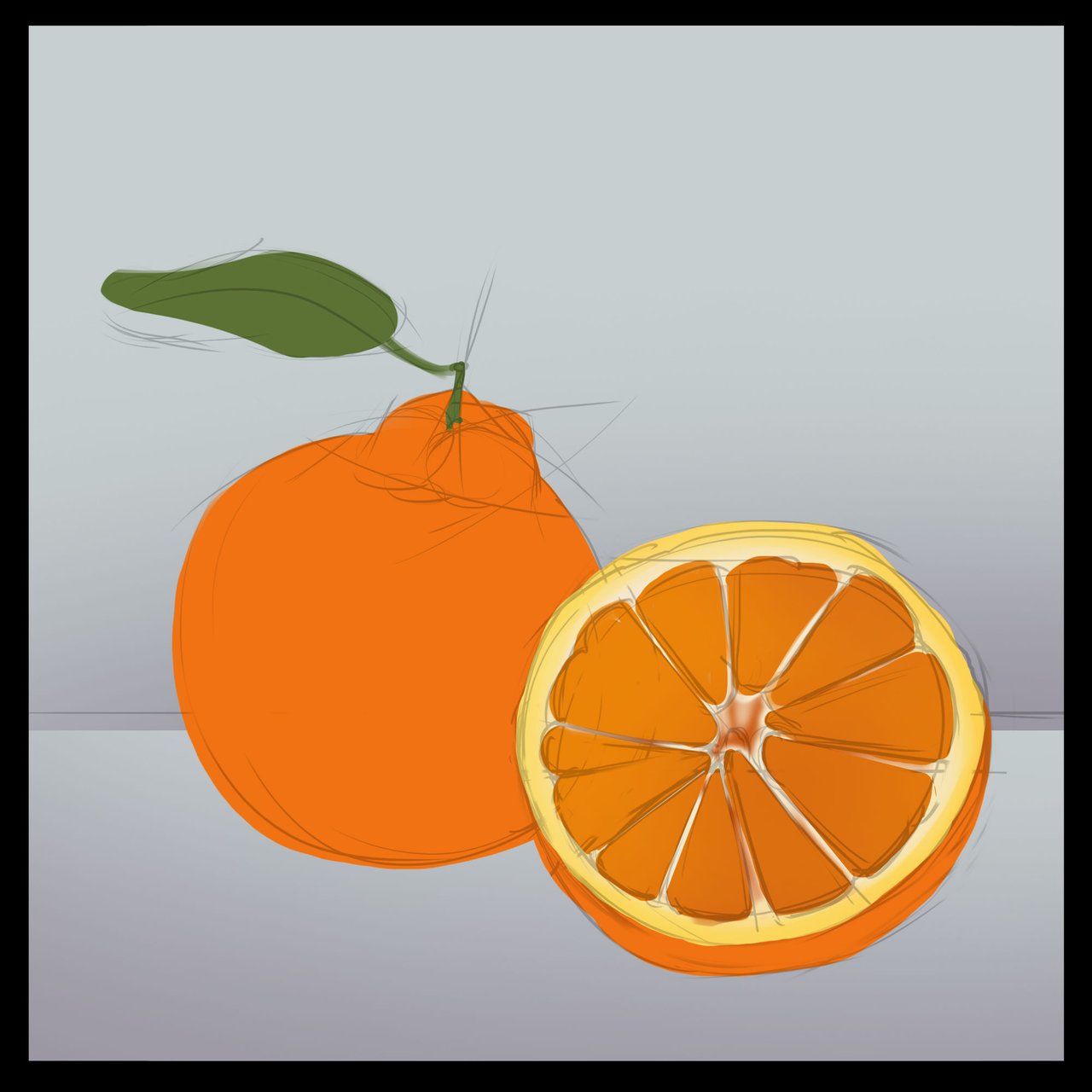
Base Color
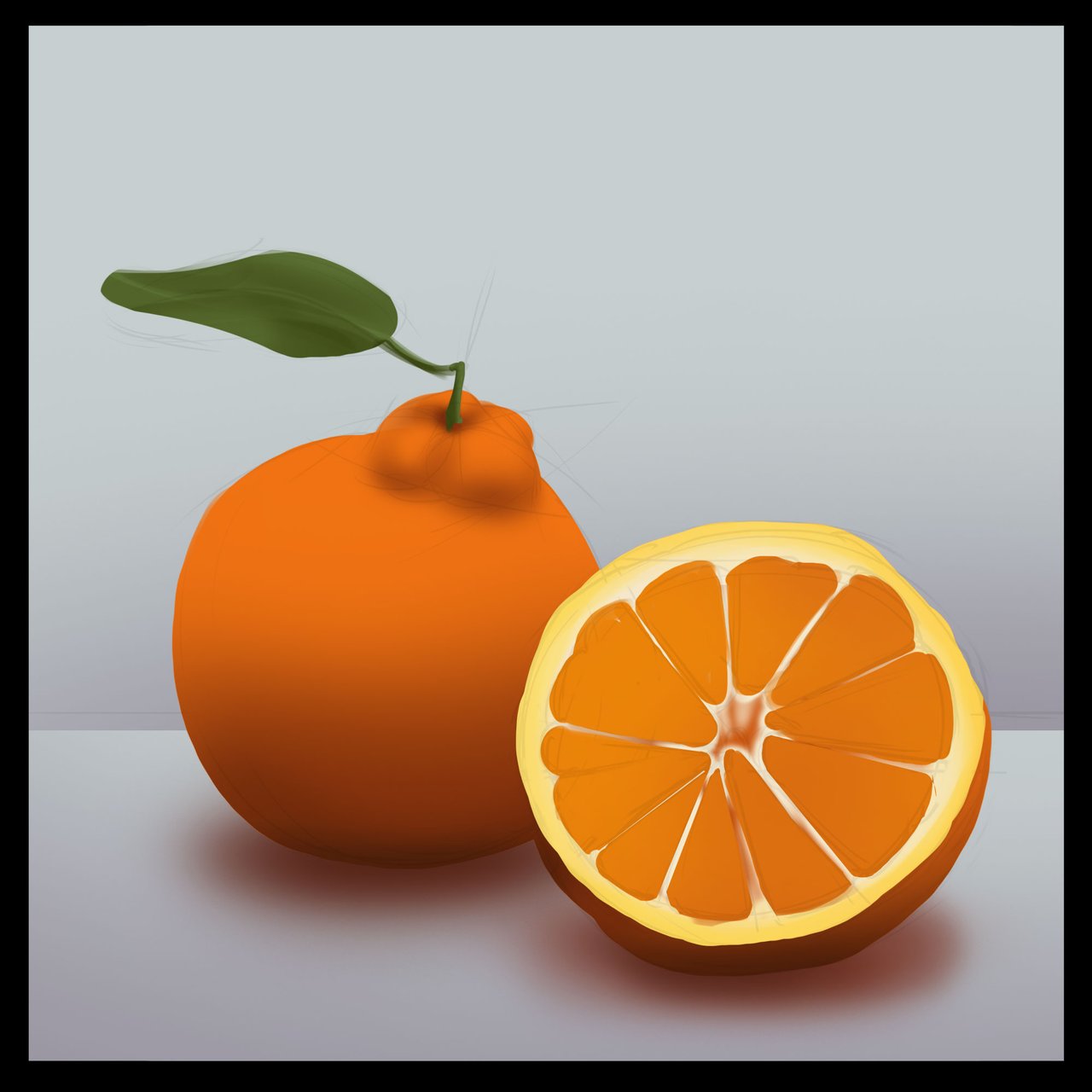
Shadow Colors
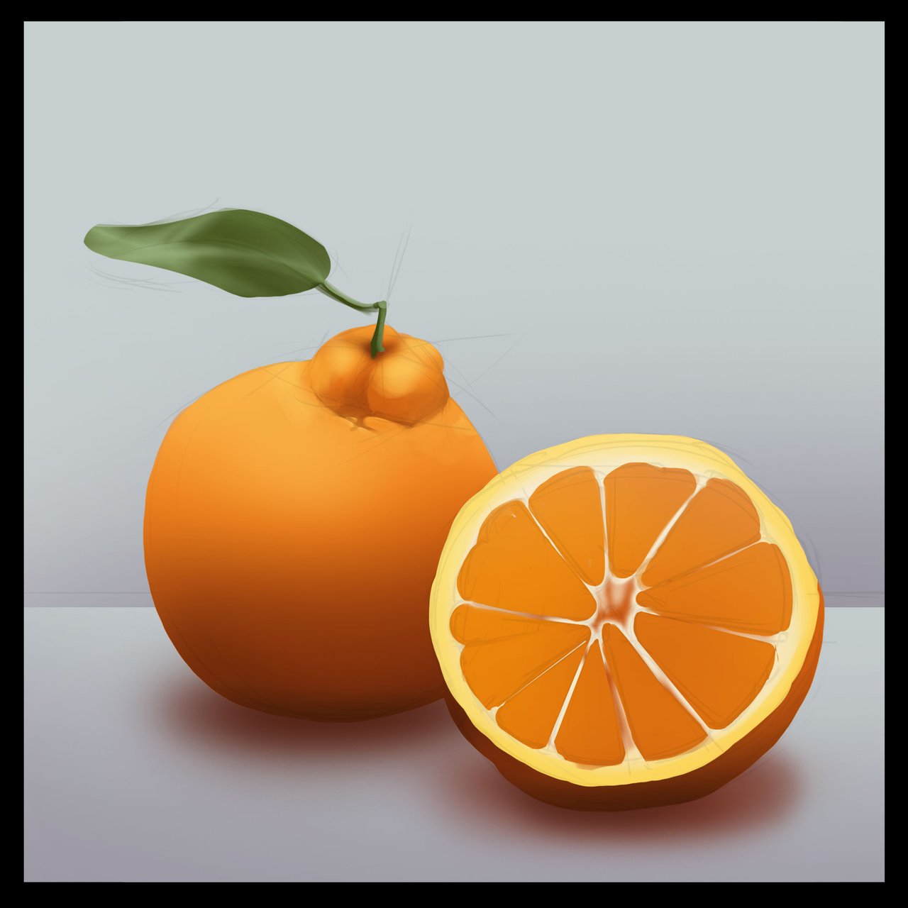
Light Colors
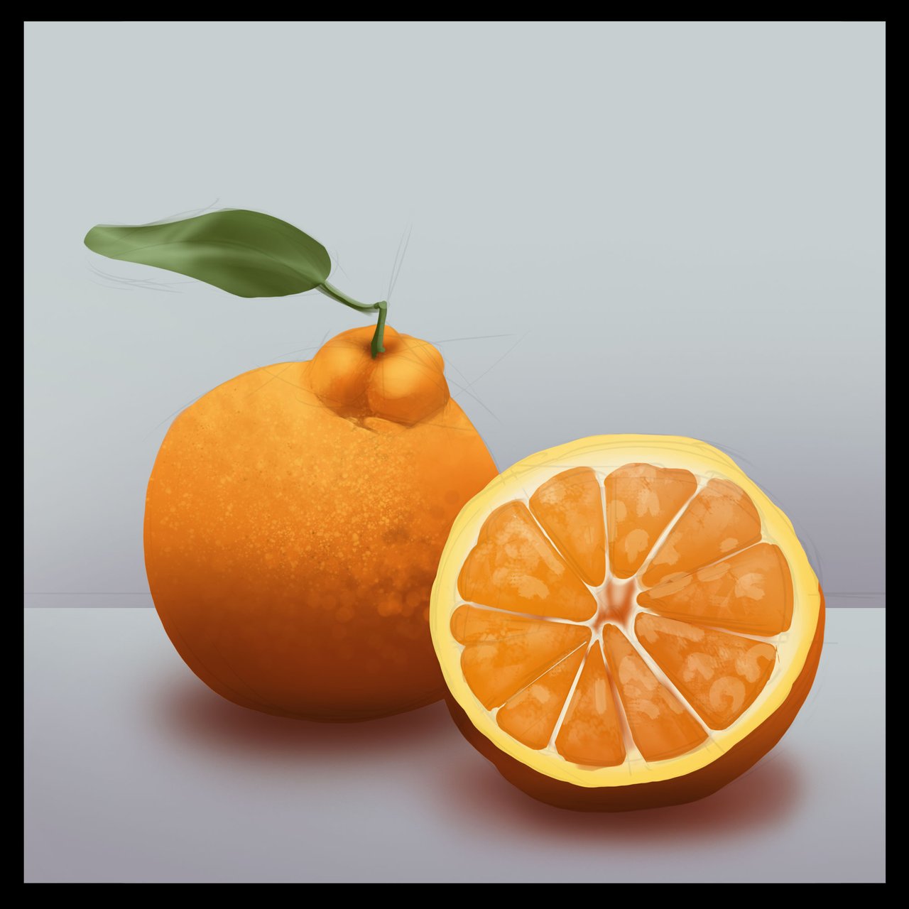
Before I move into the Highlights, Bounced Lights and Sky lights I want to address the bumpiness of the orange. I've done a bit of a texture pass here to break up the shadow and light shapes along the transition as well as added a bit of a glossy suggestion on the cut orange.
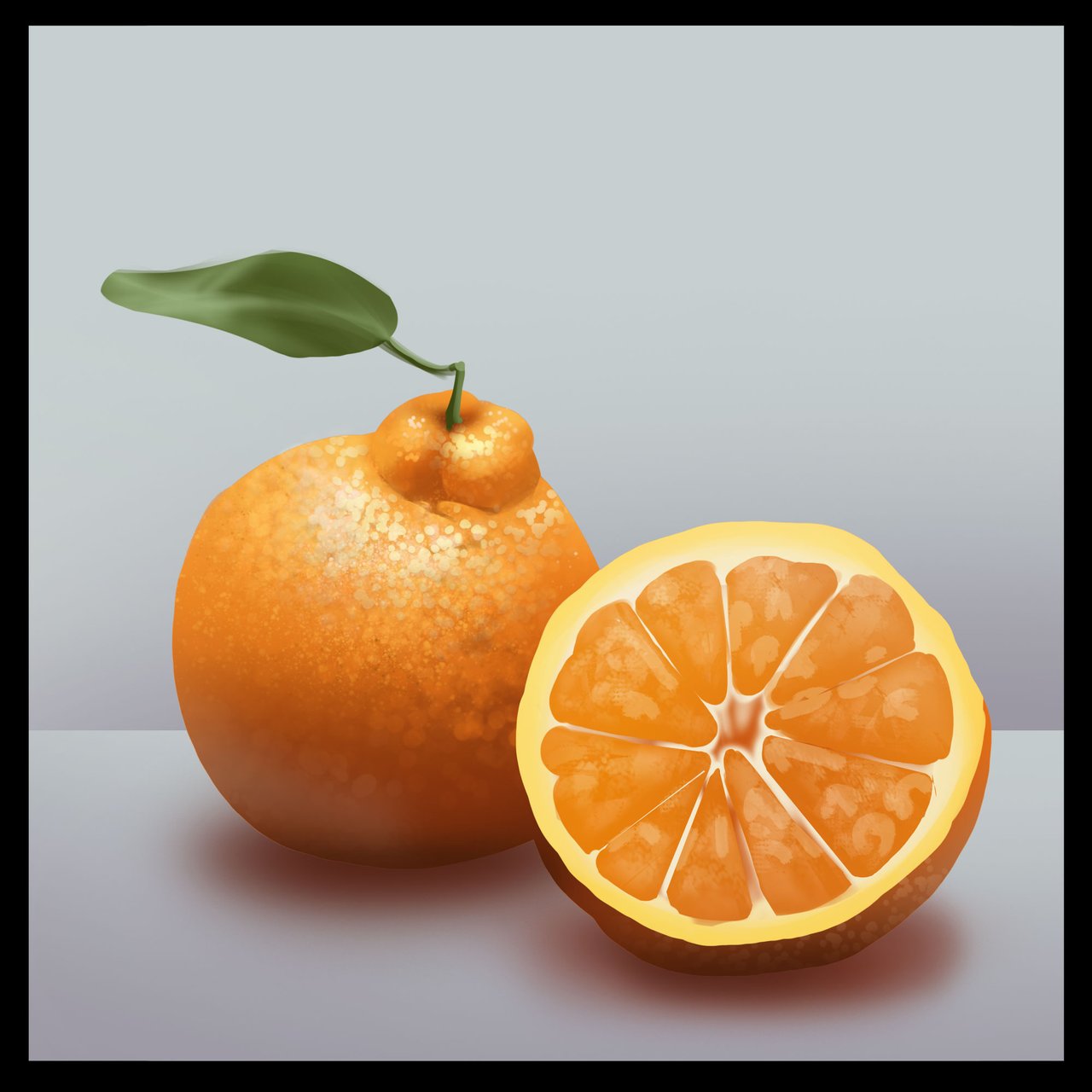
Highlights, Bounced Lights and Skylights
Be sure to look at your reference a lot for this first round of study. We are trying to as closely as we can match up to the textures and lighting of the reference we have. I'm paying close attention to the general texture shapes and lighting as I can for this first round. At many points during the study phase it's helpful to squint a little bit to remove detail. We're not trying to make every single thing look 'exactly' like the photo but to get the gist of the texture and lay it in with a brush stroke or two. In this case, the dotty texture was put in with a very messy scruffed up brush. I made this in photoshop, but the same effect could be done using a very old brush that's messed up or a sponge, get creative when you're trying to get texture, the point is to simulate the detail rather than to paint it.
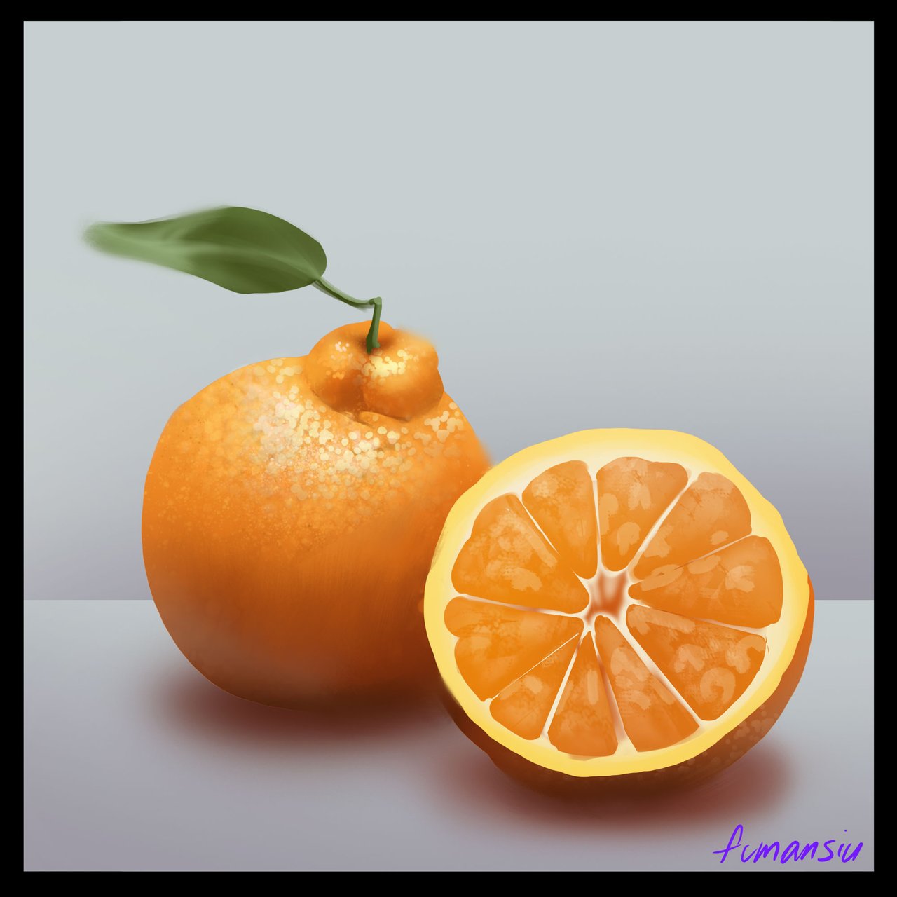
A bit of Occlusion, and Softening/Reducing Detail
We made it! Looking back I think there are a few things we can improve in our next round. The shiny zone of the cut orange might be able to be pumped up a bit. I think I don't want to let it take too much attention, but possibly with some work on the areas of focus I might be able to spend more time in a very specific area to really encourage the shiny "wet" look. The other thing I'd like to push would be the lighting of the leaf. I think we could make the underside more glowy because the light will generally pass through and cause the green to go more saturated. I also think that the light will bounce around a bit inside of the flesh of the orange on the cut open one so I will explore some sub surface scattering on the next round. I hope you'll join me!
If you want to go over how I made some of these color choices in this study you'll find a basic primer here.
If you'd like to get started with color studies we've got yellow, green and blue now ready to go!
Yellow Bananas
Green Tomatoes
Blue Buddies
If you need help getting started drawing, I highly recommend you head over to @jorgevandeperre's blog and start following along his lesson plans. @jorgevandeperre has over 60+ posts now to get started!
