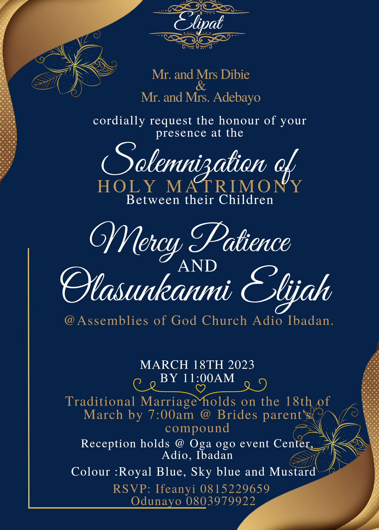
I hope you didn't take a critical look at the I.V to check for my name...well it's "our" wedding but not my wedding. Don't worry am definately gonna be dropping my my I.v here when it's my time... So welcome back to this space friends. Am super glad you're here once again. As you can see we have yet another design to explore in today's lesson. I actually made this design on demand.
In the course of this week, I got a message from my sis to help with the design of her wedding invitation. Well, it's been a while I did something of that nature and so I saw it as an opportunity to create one and also show us how I did it.
Well I resolved to our household design app called canva. This time I didn't build from the scratch, I only leveraged on an existing template on the strength of my knowledge about design. The result is what we all see here. But kindly note that I edited some of the original information sent to me because my designs are just for learning purpose. So let's get down to work.
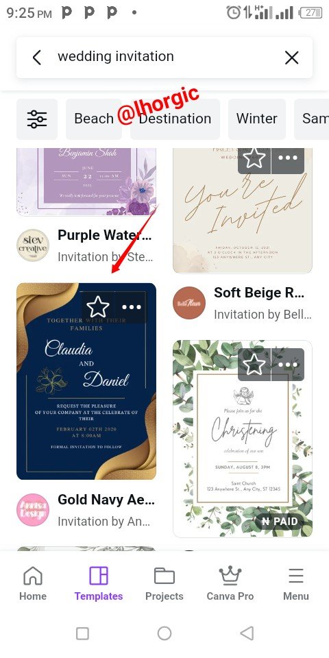
Since I didn't plan building from scratch, I went in search of template that suits what I was asked to design based on the colour chosen by the couple to be.
- Step 1
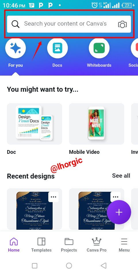
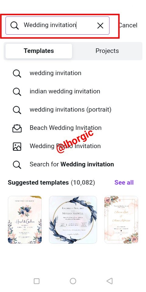
On your home page utilize the search bar by searching for suitable wedding I.V just as seen in the screenshot below. As you can see, I saw one that suites the kind of design I want.
 |  |  |
|---|
- Step 2
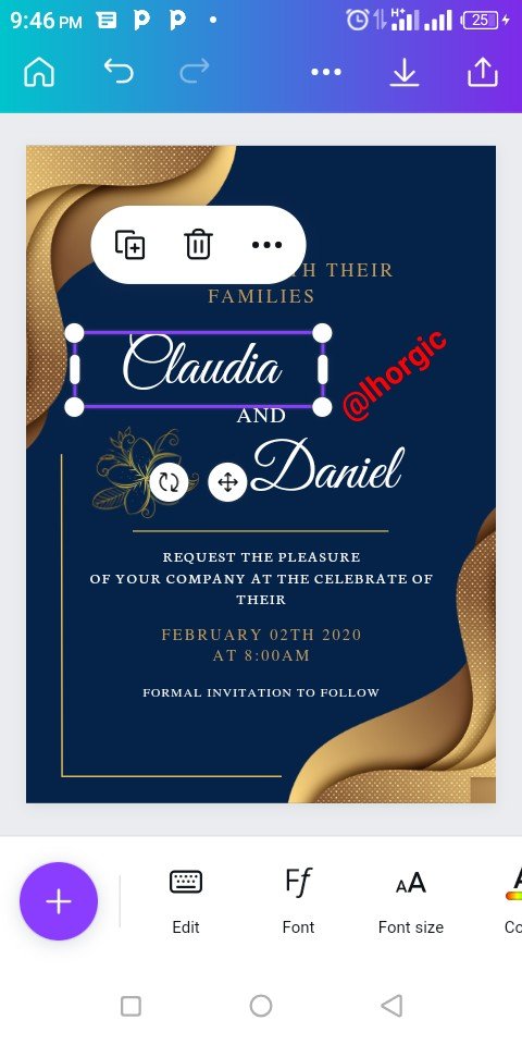
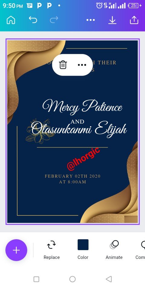
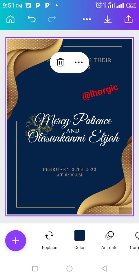
I deleted some unwanted elements and then edited the scripted fonts to input my own write up which is the name of the couple to be and then resized.
 |  |  |
|---|
- Step 3
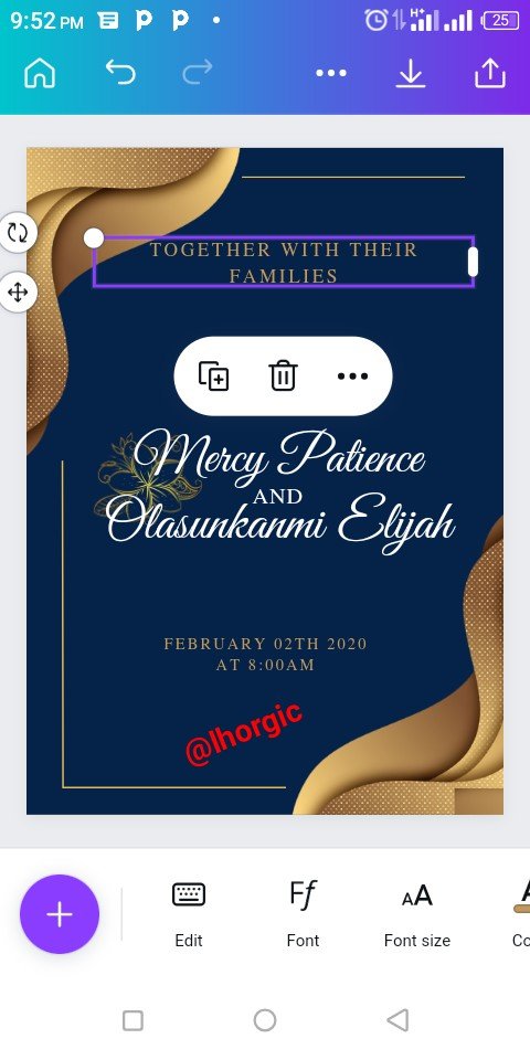
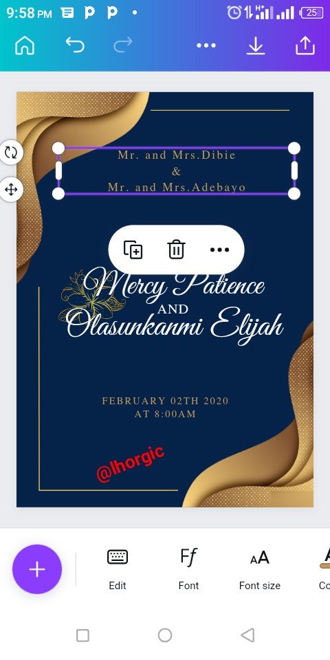
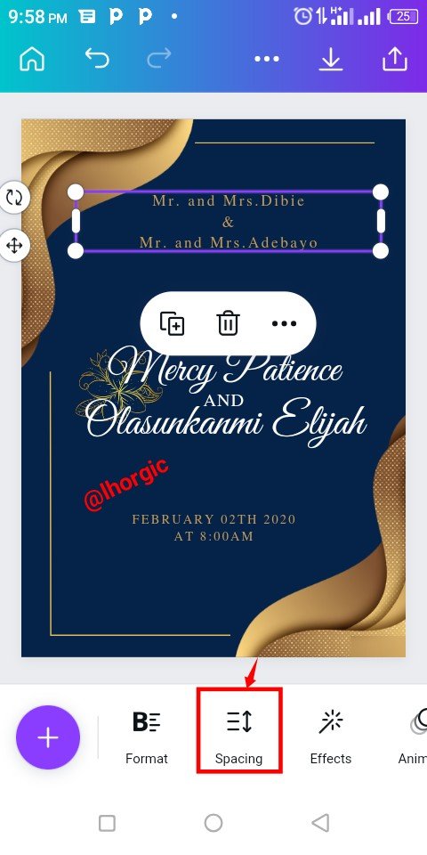
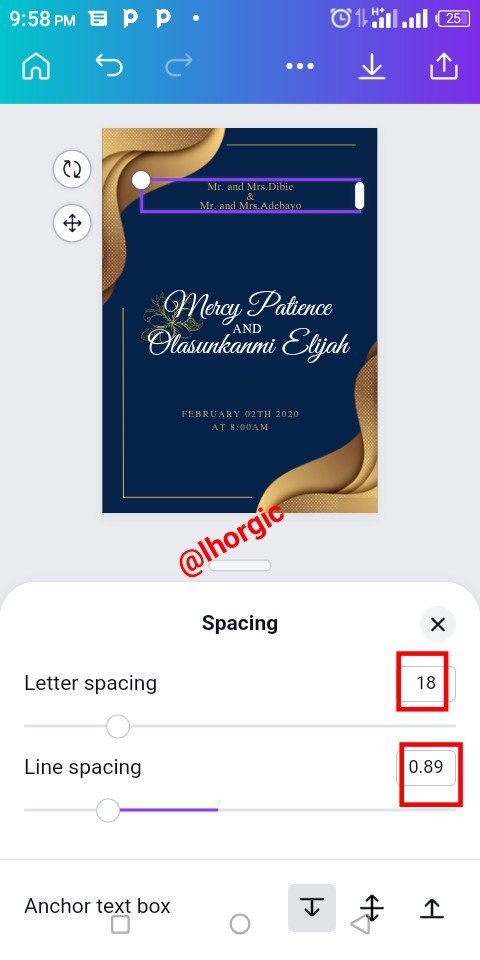
I also edited the "TOGETHER WITH THEIR FAMILY" and then replace it with the family names of the couple to be just as seen below. I also used the "space tool" to adjust my text
 |  |  |
|---|
- Step 4
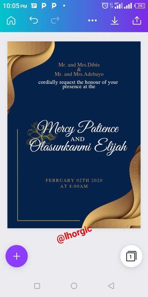
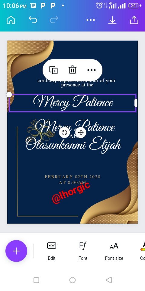
Basically I was duplicating and editing the text with my desired text and then resized. I was also arranging them strategically just as seen.
 |  |  |
|---|
- Step 5
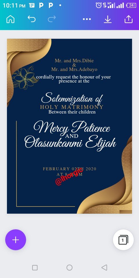
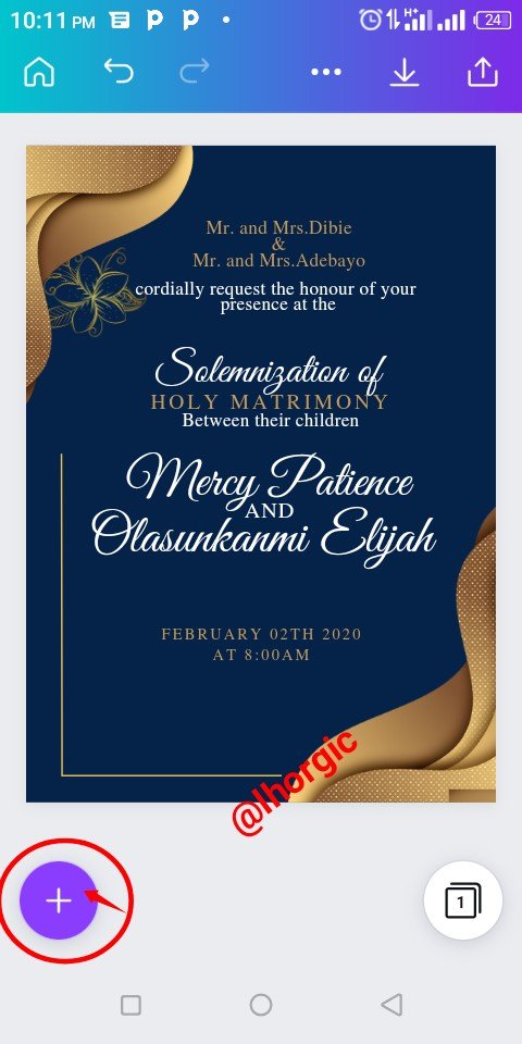
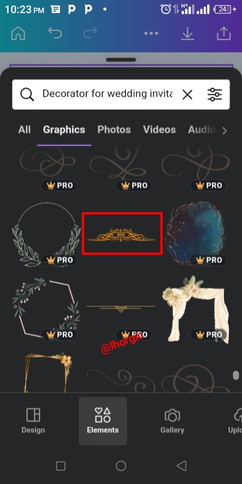
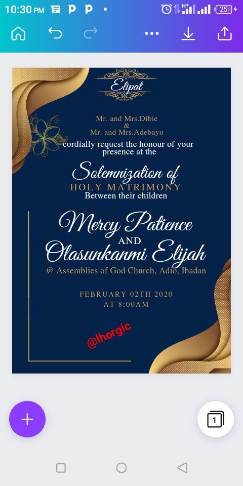
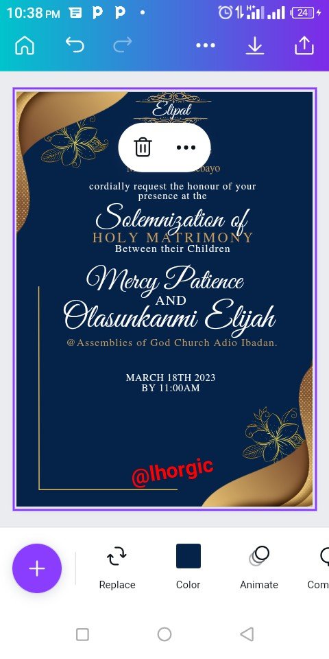
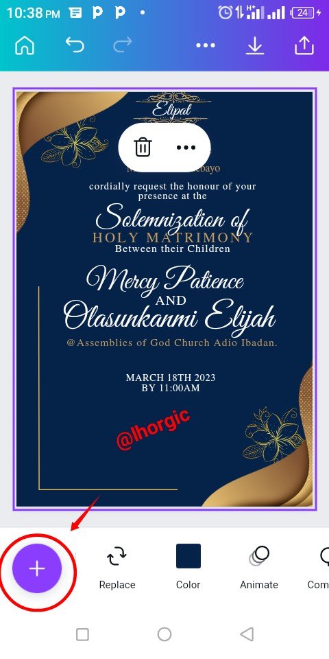
I continued with the duplication and editing, inputing my desired text as provided by the couple to be. I then use the "+" to search for decorative wedding I.v divider which I got. You can see from the screenshot below.
 |  |  |
|---|
- Step 6
Here the I.V divider was brought in and duplicated to create the effect around "Elipat" just as seen. I then edited the default date and then duplicated the flower in the design putting one at the top right corner and the other at the bottom left corner.
 |  |  |
|---|
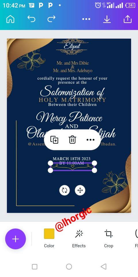
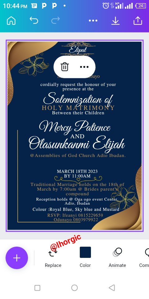
- Step 7
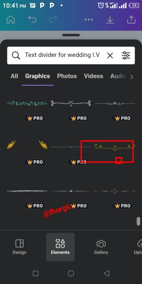
I used the "+" to bring in another divider just as seen below. You could search for it using the same key word I used. Afterwards I added the rest of the relevant information.
 |  |  |
|---|

This is where I will be wrapping up our lesson for today. I really appreciate you for coming this far with me. I trust you got value from this lesson. Feel free to share your thought on today's lesson. If there is anything you would love me to add to improve the lesson, be free to share in the comment section.
If you missed the previous posts on this beginners class, kindly check them out here.
G101 introduction post.Lesson 1.Lesson 2.Lesson 3.Lesson 4.Lesson 5.Lesson 6.Lesson 7.Lesson 8.Lesson 9.Lesson 10.Lesson 11.Lesson 12.Lesson 13.Lesson 14
Graphic Instructor
@lhorgic♥️
Cc: @ubongudofot.
