 |
|---|
Yay! Welcome back to class guys! Break is over. You know a normal class setting should have recess for rest in order to refire. Well, I just came back from a short break...smiles.
Did you just say the break was long? Sigh! Am sorry, I didn't know it would be this long, my hands got tied at a point because of many engagements off-chain, it then became a bit difficult to keep up with the lessons. Not like I couldn't make a post on design but then I was careful not to make just anything as lesson in the name of trying to keep up.
I told myself I would always give the best each time I come out to post my lessons. For me it's quality and value over every other thing...Most times I spend nothing less than 2 days with breaks in between (for other offline and online activities) to put up the lessons . This is just to give you a glimpse of what it takes to put those lessons.
Trust me I love Graphic Design, I love what I do and we will do much more together as we resume. Just sit back, relax and follow up the lessons. Let me specially appreciate those who reached out asking about the class while...am grateful and I feel satisfied knowing fully well that someone out there gets value from what I do.
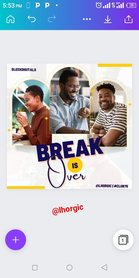
As usual I won't go without leaving you with a lesson, of course am going to be showing you how I came about my cover design for this post. Am sure you fell in love with it the very moment you saw it, do well to check out the steps below.. enjoy
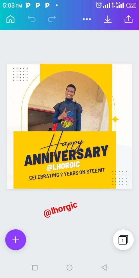
I actually got the inspiration for this design from another design I made a month ago. All I did was to remove unwanted element and then redesign to express the new picture I have in my mind. I think it's important to mention here that creativity is in the mind, if you can conceive it, you can do it! Alright friend Let's get down to work!
Step 1
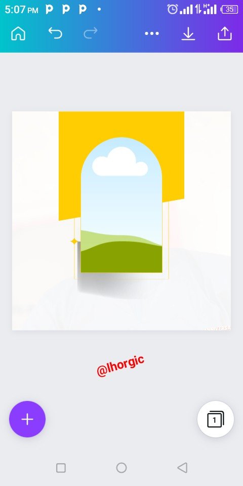
Just as seen from the screenshot below, I deleted the elements till am left with just a frame and a rectangular shape like element. Afterwards, I resized the shape and pushed it to the top right corner of my design leaving our frame in the middle.
 |  |  |
|---|
Step 2
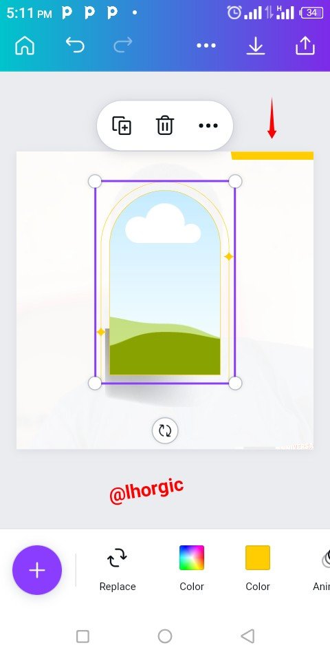
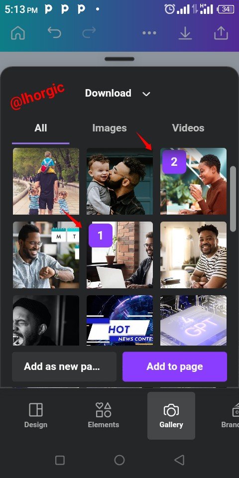
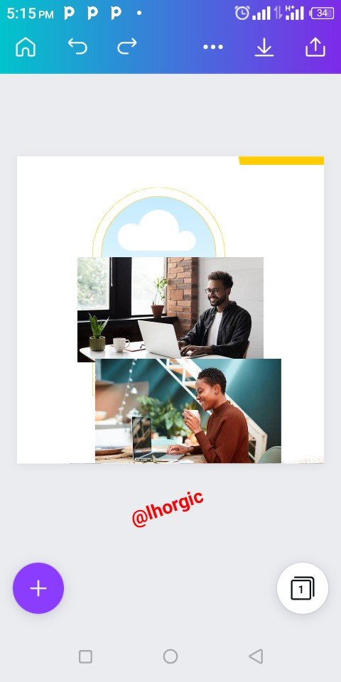
I needed an effect for my default white background, so I click on the "+" icon to bring in image for my background. I brought in two images just as seen in the screenshots below
 |  |  |
|---|
Step 3
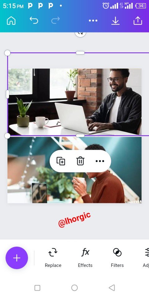
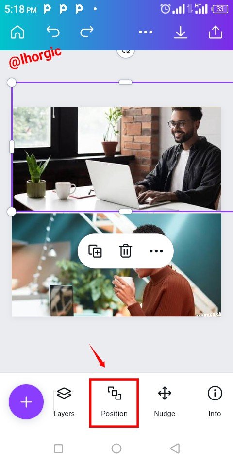
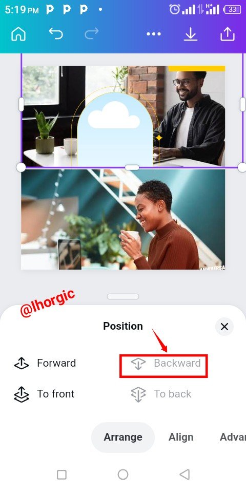
I resized by zooming them out. You do this by dragging the tip of the image such that it fills up the workspace. I then click on the Position icon to send the image backward since it's meant for background.
 |  |  |
|---|
Step 4
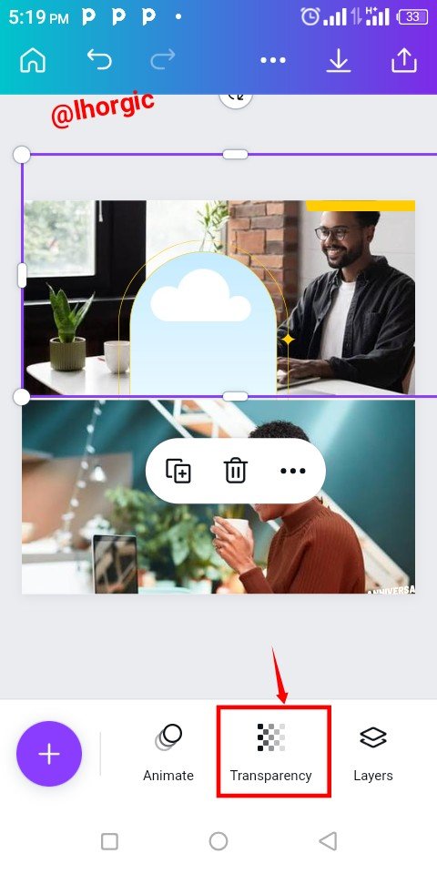
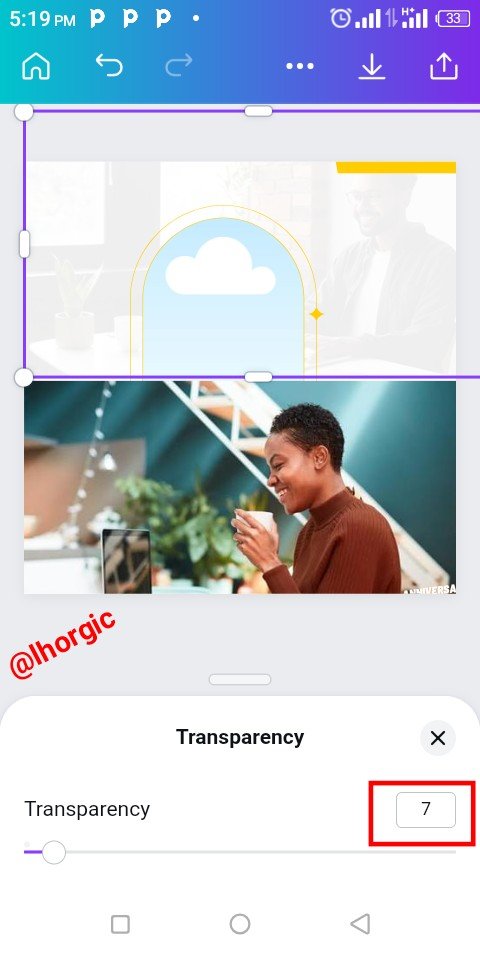
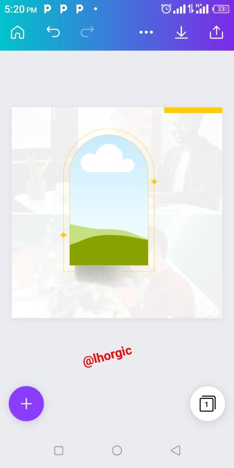
Afterwards, I clicked on the Transparency icon to fade the image into the background. 7% was what I used in the parameter. I repeated the whole process for the second image as well and the result is as seen below.
 |  |  |
|---|
Step 5
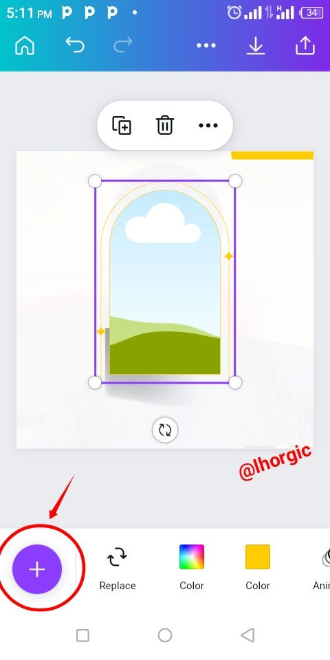
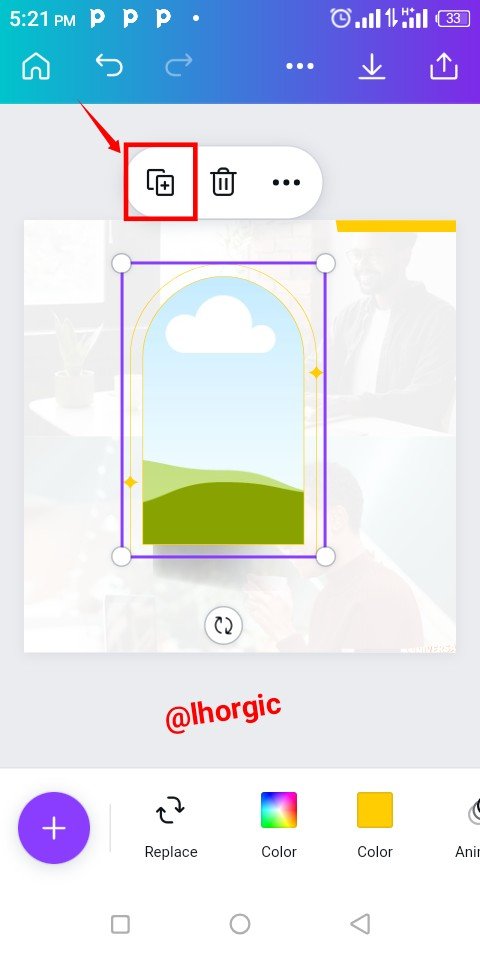
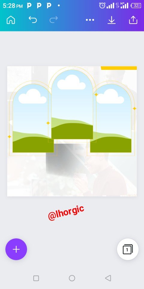
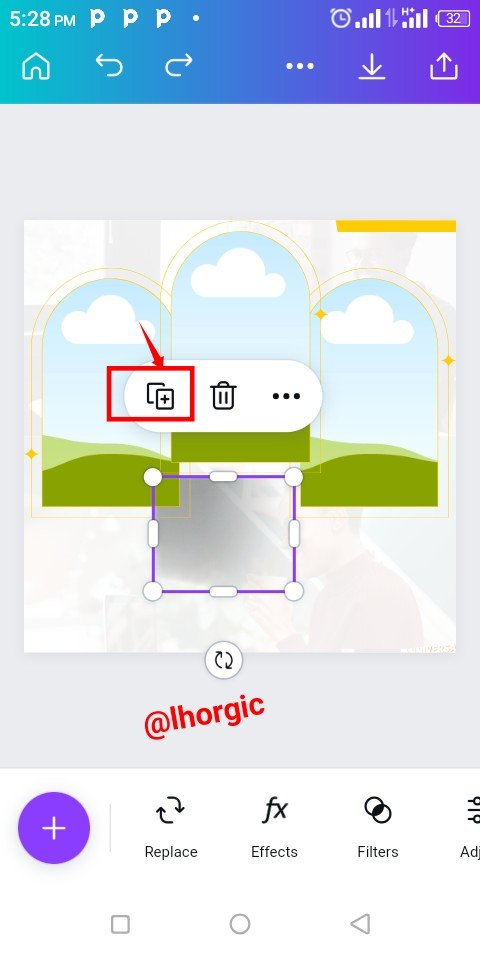
At this juncture, I duplicated my frame using the "+" just as highlighted below and then strategically positioned it. I also duplicated the shadow in my design using the same method.
 |  |  |
|---|
Step 6
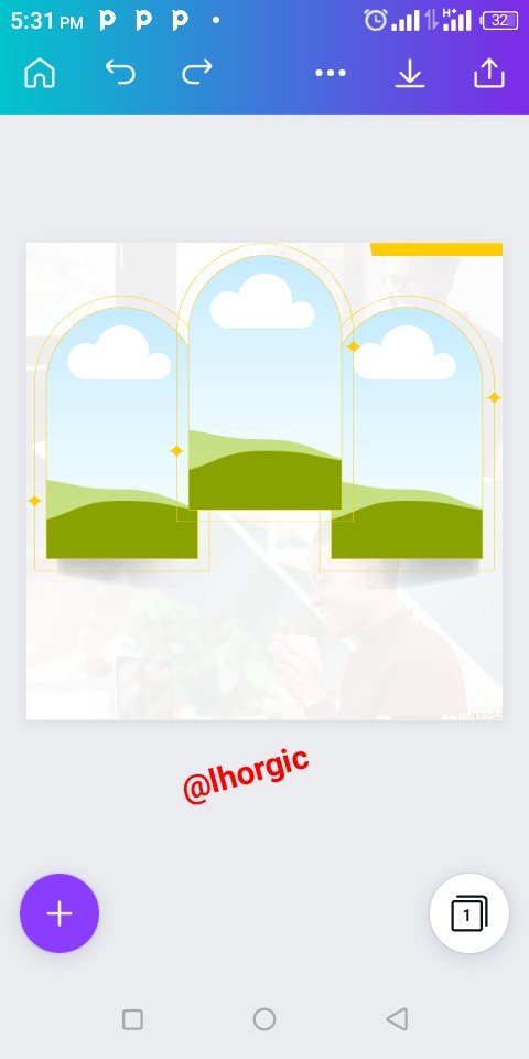
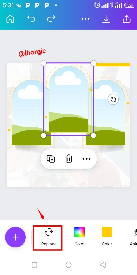
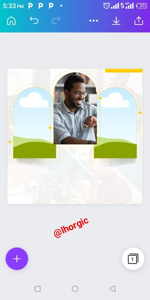
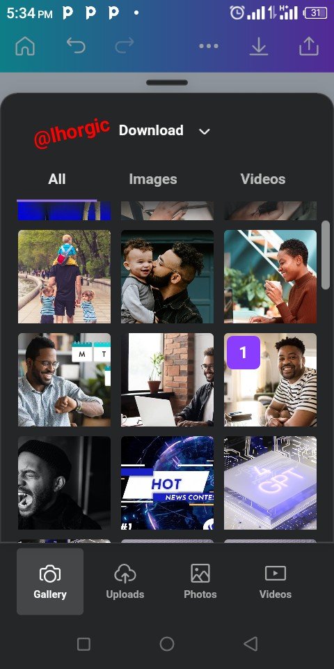
The duplicated shadow was well positioned beneath my frames on the left and on the right. Afterwards I clicked on Replace to bring my image into the frame. Replace icon automatically takes you to your gallery where you pick your pictures/images.
 |  |  |
|---|
Step 7
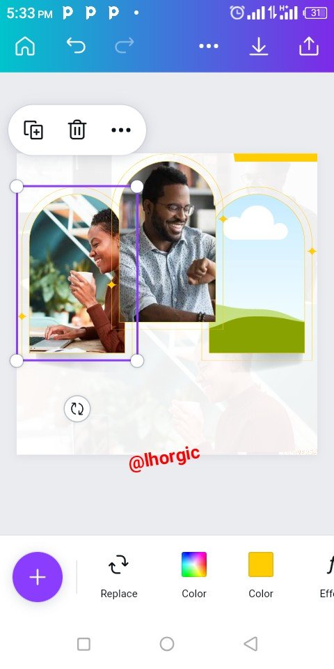
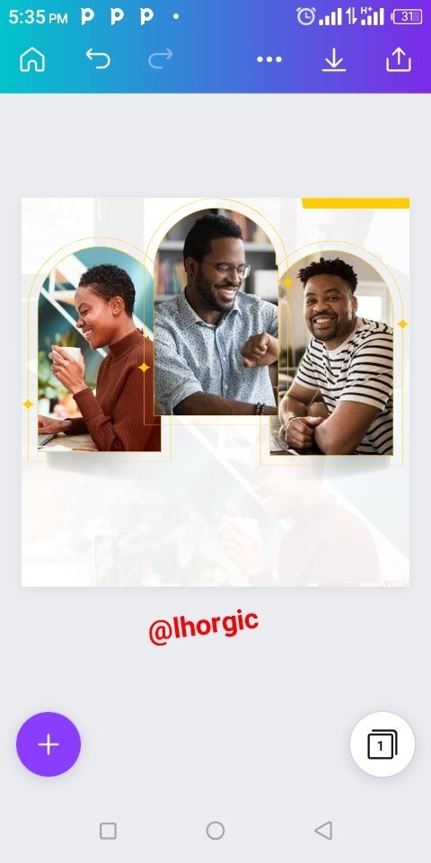
I applied the same method to bring my image into the second and third frame,just as seen below.
 |  |  |
|---|
Step 8
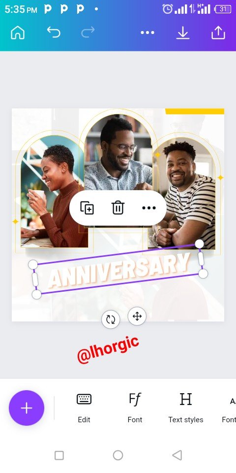
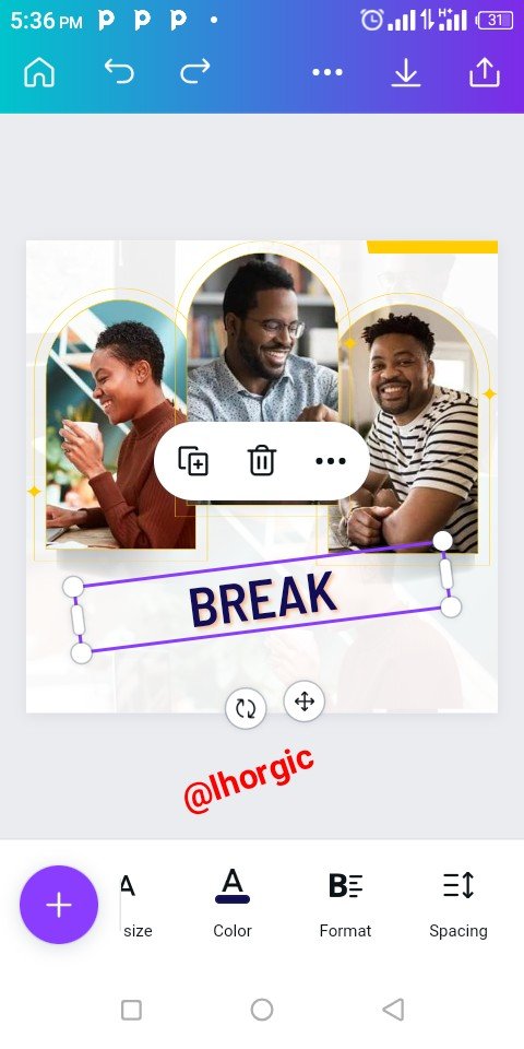
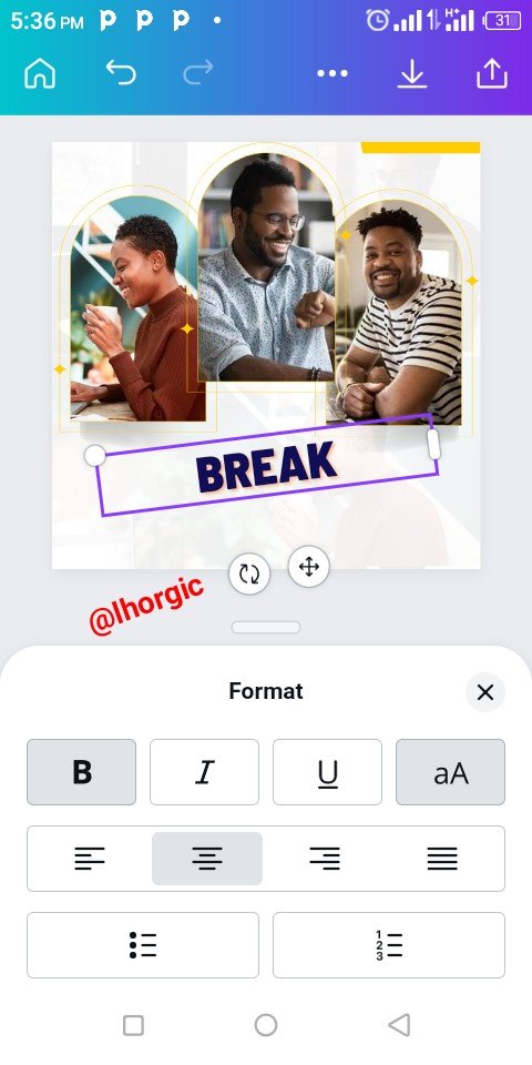
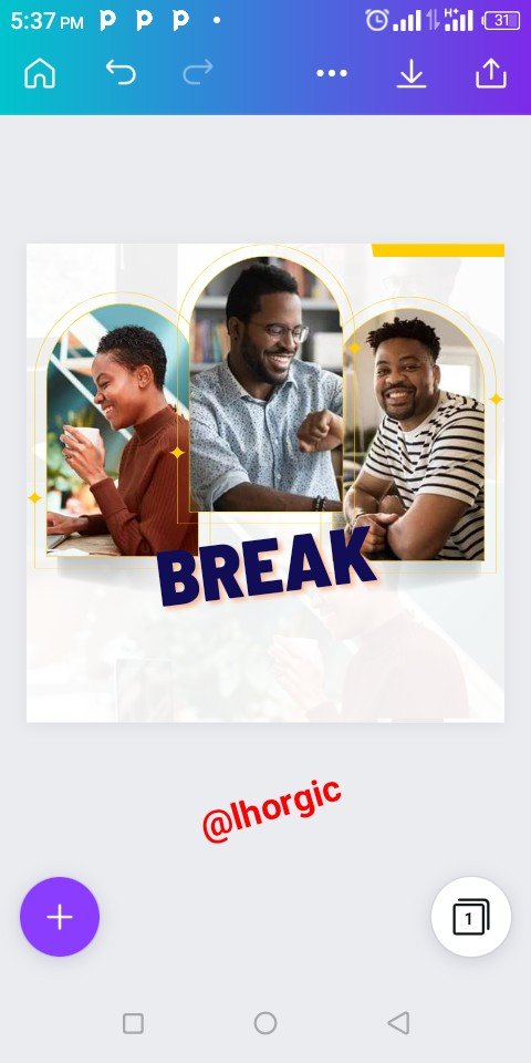
I introduced my text, the message to be passed. I edited the default Anniversary, changing it to BREAK with enough emphasis. I increased the size and selected my colour to make it obvious and catchy. Do well to also format your text to your taste.
 |  |  |
|---|
Step 9
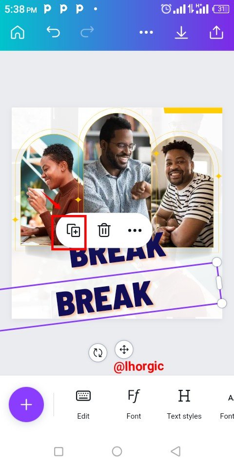
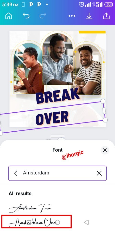
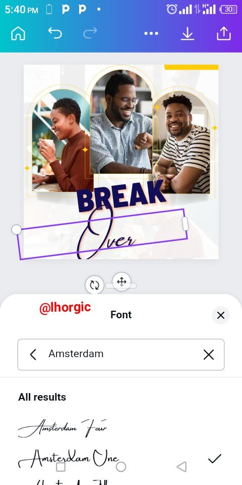
I introduced the other text by duplicating the first text just as seen below and then edited it to accomodate "Over" Whose font is clearly seen below. The name of the font is Amsterdam one
 |  |  |
|---|
Step 10
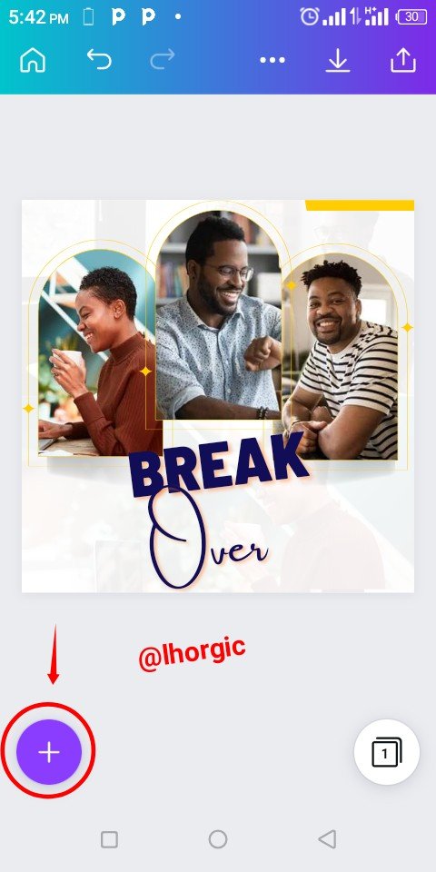
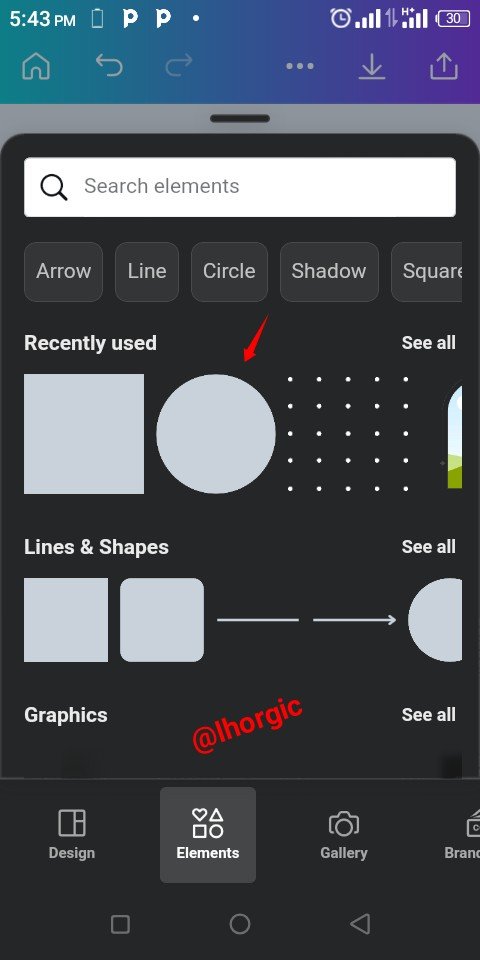
As you can see, the font looks complementing, I also formatted it by making it bold. Afterwards I clicked on the "+" to Introduce a circle shape on which I was going to place a text to make my thoughts complete.
 |  |  |
|---|
Step 11
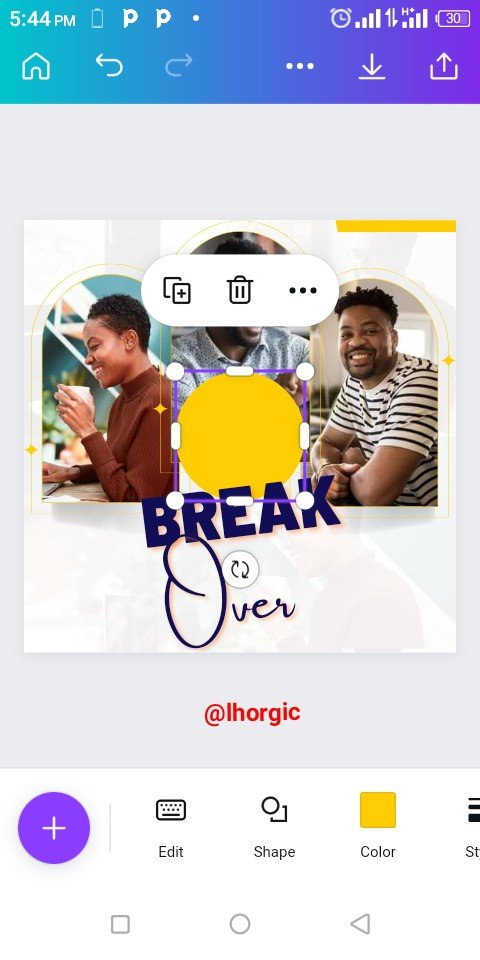
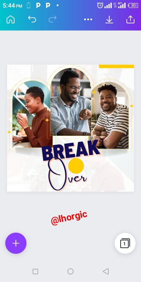
The circle shape was brought in just as seen, I had to resize and then position it before placing my text on it. The other text such as lhorgic | #club75 and sleekdigitals was also Introduced and well positioned in a complementary manner.
 |  |  |
|---|
 |
|---|
This is where I will be wrapping up our lesson for today. I really appreciate you for coming this far with me. I trust you got value from this lesson. Feel free to share your thought on today's lesson. If there is anything you would love me to add to improve the lesson, be free to share in the comment section.
If you missed the previous posts on this beginners class, kindly check them out here.
G101 introduction post.Lesson 1.Lesson 2.Lesson 3.Lesson 4.Lesson 5.Lesson 6.Lesson 7.Lesson 8.Lesson 9.Lesson 10.Lesson 11.Lesson 12.Lesson 13.Lesson 14.Lesson 15
Graphic Instructor
@lhorgic♥️
Cc: @ubongudofot.
