Hi friends!
I'll tell you about the tones.
As you may already know, nothing is absolute, even more in art and in particular in drawing when we talk about shades or tones.
A hue is more or minus black, grey, or white in relation to another hue.
Let's see this in images.
Below you can see shades ranging from black (left) to very light grey (right) on a white background.

Here, in the image below I changed the white background to black, the ribbon with tones is the same as in the previous image. You see now the tones going from a dark grey (left) to a white hue (right). The darker shade appears lighter than the previous sample and the lighter grey appears to be white despite being identical to the previous image.
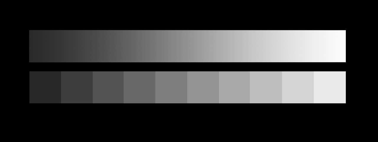
This is a clear example of the relativity of tones or shades.
Then, when you draw, always keep in mind that the value of the tones is directly related to the tone that goes with it or the tone that surrounds it. In drawing, if you want highlight a white shade you must surround it whit a grey or black shade.
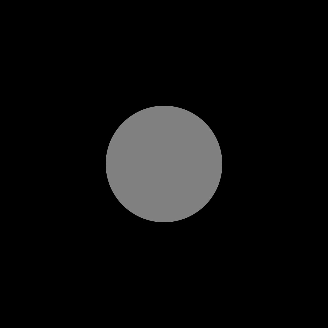
This is another example of the relativity of one tone with respect to another.
In these images, the circle is filled with a neutral shade of grey. This neutral grey circle on a white background looks darker than it does on a black background.

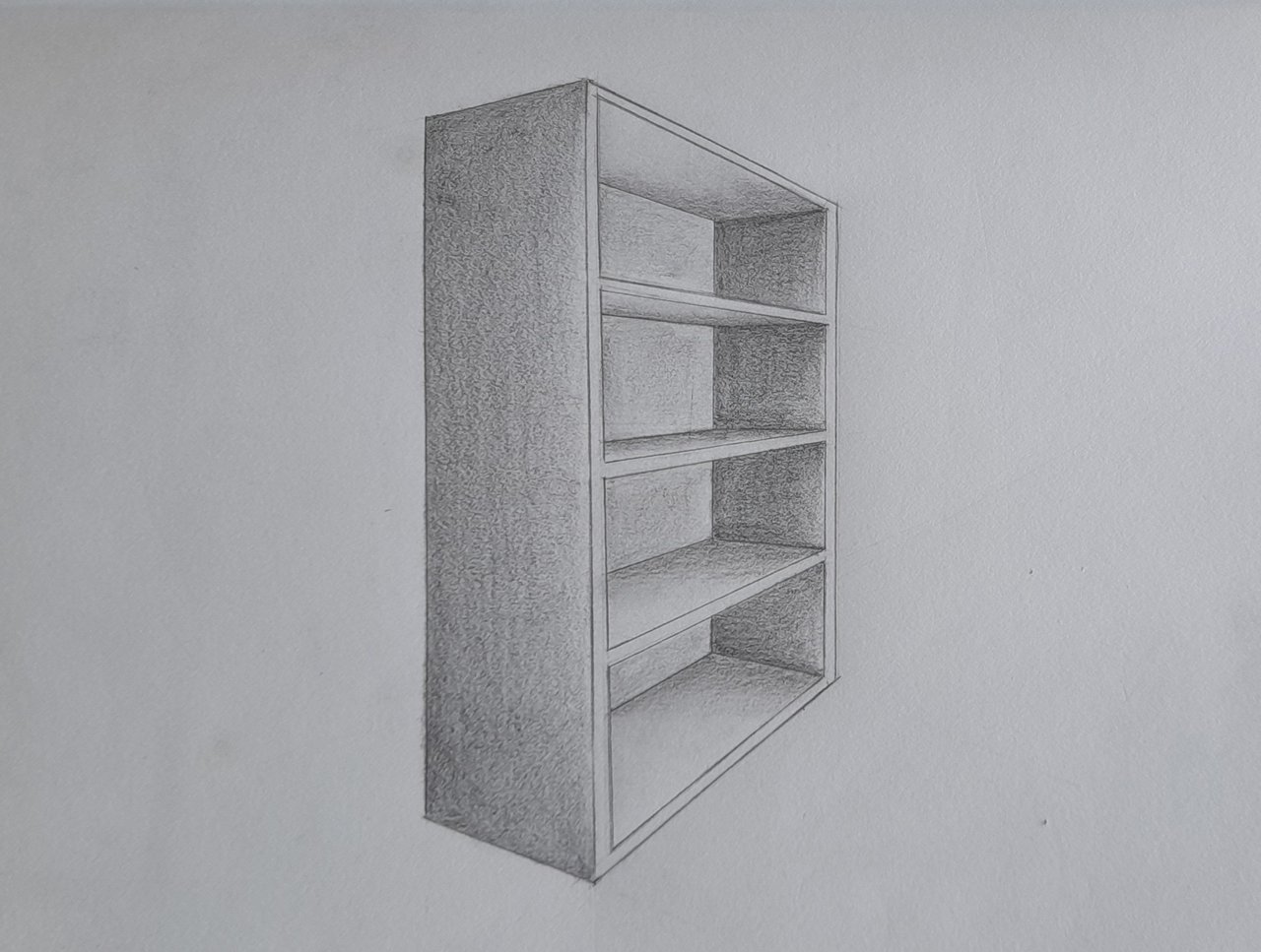
This is the piece of furniture drawn in the previous lesson.
I want to show you this drawing as an example, so... please, pay attention.
I have fixed some lines that were not in a good perspective.
I used HB graphite to draw here.
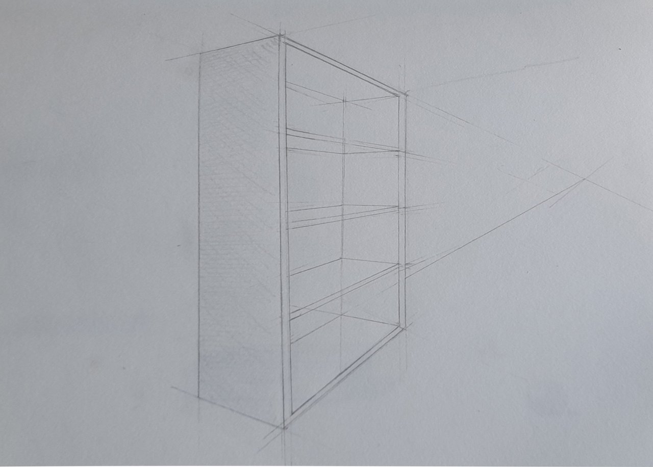
Then, I have drawn different shades of grey using the hatching method. I used graphite B and 2B to make it.
As you can see, I have erased all the help lines without leaving any trace because I did not damage the paper, drawing as I have explained in previous posts.
Note that the shadings are not flat, that makes the drawing more interesting, also notice how the grain of the paper is noticeable, which makes the drawing look more beautiful. To achieve this result it is important how you hold the pencil to draw.
As exercise, draw different shapes and fill them with different shades of grey.
I wish you a very nice day and good exercise!
Latest day to take part in this week's HOMEWORK CONTEST!
Here are the links to the previous related posts.
1-Introduction - 2-Introduction - 3-Introduction - 4-Introduction - 5-Introduction - 6-Lesson - 7-Lesson - 8-Lesson - 9-Lesson - 10-Lesson - 11-Lesson - 12-Lesson - 13-Lesson 14-Lesson - 15-Lesson
100% SP (manual transfer to SP)
#club100