▶▶1 [引言/preface]
今天在 @nicolemoker 那里看到制作封面照片的博文。
细心的朋友会发现 steemit的字体有了小小的变化
Circumspective can find that there's something changed in the font of head of steemit.
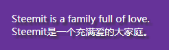
We can see clearly from the picture below:
看下面这里会更明显一些

是的,字体下边多了投影。这种效果是通过css3的实现的(IE9以及以下版本不支持)。
That's right, there apears shadow under the words. This effect is realized by CSS3(IE9 and the following versions are not supported).

第二天可能是发现这里不太顺眼,又改回去了。The second day, the designer found this not good-looking, then change back to the original.
▶▶2 [实践/practice]
于是我也试了一下: Then let me have a try:
<style>
.test{
    background:#639;
    padding:20px;
    font-size:14px;
    color:#fff;
    text-shadow:4px 4px 3px #333;
    -webkit-text-shadow:4px 4px 3px #333; //just for compatibility 只是为了兼容性,测试过没啥用,留着以防外一
    -moz-text-shadow:4px 4px 3px #333;//just for compatibility 只是为了兼容性,测试过没啥用,留着以防外一
}
</style>

<div class="test">
Steemit is a family full of love.
<br>Steemit是一个充满爱的大家庭。
</div>
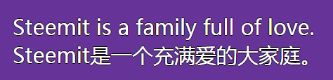
效果如下:effect is as follow:
 向右下方投影/bottom right shadow
优点就是在不支持css3的浏览器下,也不影响正常的显示。而在支持css3的浏览器上,可以增加美感。
Advantage is in the browse not supporting css3, we also can see the ordinary design. While in the browse supporting css3, we can get better-looking.
▶▶3 [详解/description]
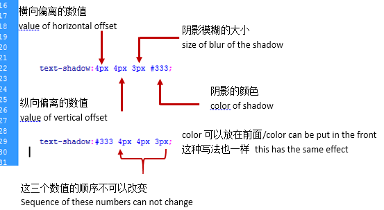
第一个数值:向右偏离的数量,负数表示向左偏离的数量。
The first number: ammount of right offset, and the negative number is ammount of left offset.
第二个数值:向下偏离的数量,负数表示向上偏离的数量。
The second number: ammount of bottom offset, the negative number is ammount top offset.
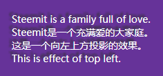 text-shadow:-4px -4px 3px #333;
第三个数值:阴影模糊的大小。该数越大,阴影扩展的面积也就越大,当然颜色会越浅。
The third number, the size of shadow blur. The larger the number is, the area of the shadow is bigger, and the color of the shadow is lighter.
color:投影的颜色。
color: the color of the shadow.
▶▶4 [扩展/spread]
①描边/stroke
<style>
.test{
    background:#639;
    padding:20px;
    margin-bottom:50px;
    font-size:30px;
    color:#fff;
    text-shadow:0px 1px 0px #000, 1px 0px 0px #000, -1px 0px 0px #000, 0px -1px 0px #000;
    -webkit-text-shadow:0px 1px 0px #000, 1px 0px 0px #000, -1px 0px 0px #000, 0px -1px 0px #000;
    -moz-text-shadow:0px 1px 0px #000, 1px 0px 0px #000, -1px 0px 0px #000, 0px -1px 0px #000;
}
</style>
<div class="test">
Steemit is a family full of love.
<br>Steemit是一个充满爱的大家庭。
</div>
text-shadow:0px 1px 0px #000, 1px 0px 0px #000, -1px 0px 0px #000, 0px -1px 0px #000;
这种写法是把四个方向分开来号,中间用逗号隔开。
四个方向分别偏移1px,刚好是在字体周边1px。而模糊值设为0,表示是清晰的,也就是描边的线条。
Write four directions separately, then use comma to separate them.
The offset of four directions is 1px, aroud the font. The blur is 0, that makes clear linellae to stroke.
②外发光/outer glow
<style>
.test{
    background:#639;
    padding:20px;
    margin-bottom:50px;
    font-size:30px;
    color:#fff;
    text-shadow:0px 1px 15px #ff9933, 1px 0px 15px #ff9933, -1px 0px 15px #ff9933, 0px -1px 15px #ff9933;
    -webkit-text-shadow:0px 1px 15px #ff9933, 1px 0px 15px #ff9933, -1px 0px 15px #ff9933, 0px -1px 15px #ff9933;
    -moz-text-shadow:0px 1px 15px #ff9933, 1px 0px 15px #ff9933, -1px 0px 15px #ff9933, 0px -1px 15px #ff9933;
}
</style>
<div class="test">
Steemit is a family full of love.
<br>Steemit是一个充满爱的大家庭。
<br>我是凹字/I'm concave.
</div>
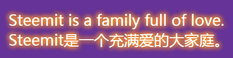
将第三个数值设置大一些,就会在字体周围形成外发光的效果。
Set the third number larger, that can make the outer glow effect.
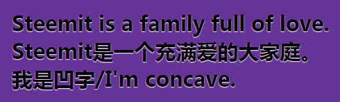
③3D凹字/3D concave text
<style>
.test{
    background:#639;
    padding:20px;
    margin-bottom:50px;
    font-size:30px;
    font-weight:bold;
    color:#000;
    text-shadow:0px 1px 1px #fff;
    -webkit-text-shadow:0px 1px 1px #fff;
    -moz-text-shadow:0px 1px 1px #fff;
}
</style>
<div class="test">
Steemit is a family full of love.
<br>Steemit是一个充满爱的大家庭。
</div>
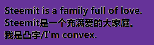
④3D凸字/3D convex text
<style>
.test{
    background:#639;
    padding:20px;
    margin-bottom:50px;
    font-size:30px;
    font-weight:bold;
    color:#000;
    text-shadow:0px -1px 0px #999, -1px 0px 1px #ddd, 0px 1px 0px #333;
    -webkit-text-shadow:0px -1px 0px #999, -1px 0px 1px #ddd, 0px 1px 0px #333;
    -moz-text-shadow:0px -1px 0px #999, -1px 0px 1px #ddd, 0px 1px 0px #333;
}
</style>
<div class="test">
Steemit is a family full of love.
<br>Steemit是一个充满爱的大家庭。
<br>我是凸字/I'm convex.
</div>
⑤3D字/3D text
<style>
.test{
    font-family:Arial, Helvetica, sans-serif;
    background:#639;
    padding:20px;
    margin-bottom:50px;
    font-size:60px;
    font-weight:bold;
    color:#000;
    text-shadow: 1px -1px 0px #ccc,2px -2px 0px #ccc,3px -3px 0px #ccc,4px -4px 0px #ccc,5px -5px 0px #ccc, 6px -6px 0px #ccc;
    -webkit-text-shadow:1px -1px 0px #ccc,2px -2px 0px #ccc,3px -3px 0px #ccc,4px -4px 0px #ccc,5px -5px 0px #ccc, 6px -6px 0px #ccc;
    -moz-text-shadow:1px -1px 0px #ccc,2px -2px 0px #ccc,3px -3px 0px #ccc,4px -4px 0px #ccc,5px -5px 0px #ccc, 6px -6px 0px #ccc;
}
</style>
<div class="test">
Steemit is a family full of love.
<br>Steemit是一个充满爱的大家庭。
<br>我是立体字/I'm 3D.
</div>
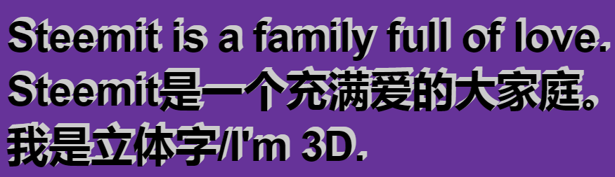
text-shadow属性是可以叠加的,通过叠加可以实现以上立体的效果。通过灵活使用,可以实现更多的漂亮的字体,期待你的发现!
text-shadow can be used togethor, that can make the 3D effect above. By creative using, we can get more beautiful text!