 |
|---|
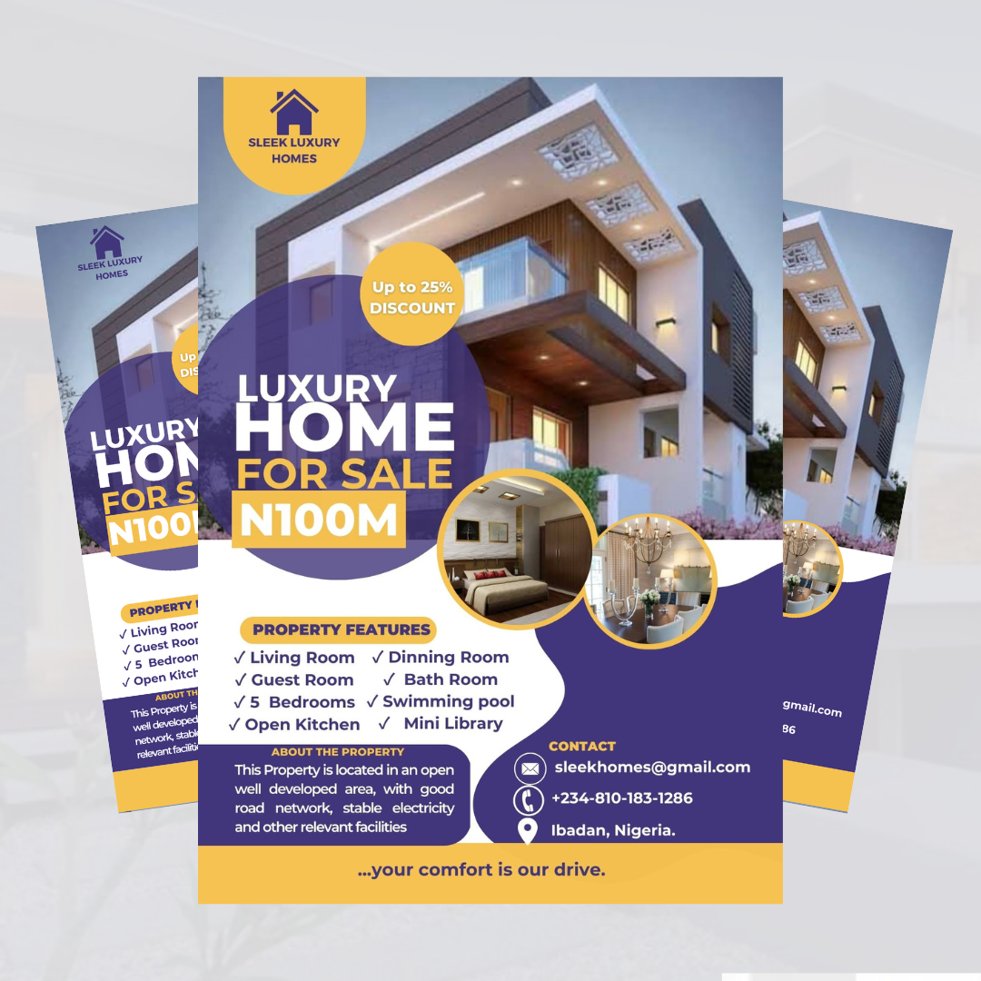
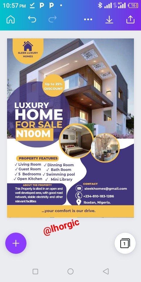
Wao! Right?...smiles, you're free to admire the design friends but always bear in mind that you can do the same and even better if you really want to.
Welcome back guys, I trust you're fully ready for today's class. As you can see you have something fascinating on your screen, I'm 101% sure you love what you see and you're equally surprise something like this could be done with Canva. Well that's why I put up lessons like this.
Can I really remember the inspiration behind this design?🤔 Not sure I can. Maybe I would be looking into this line of business in the future, who knows? But the truth is I have never tried out a design along this line. This class has broadened my horizon as it keeps me on my feet every week. I can say am even more vast now compared to what I used to be before starting off with this class.
Real Estate agents would really find this design useful and could reproduce it to market their products. I think I will be doing more designs covering various business people do off chain so that they could reproduce them to promote thier businesses...at least they can pocket the few bucks they would have given to professionals like us...😃
Step 1
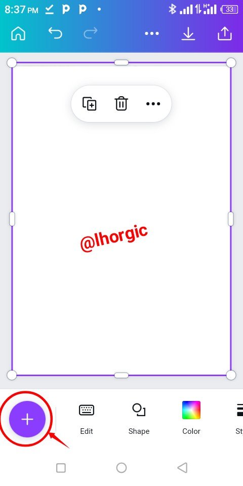
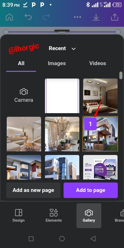
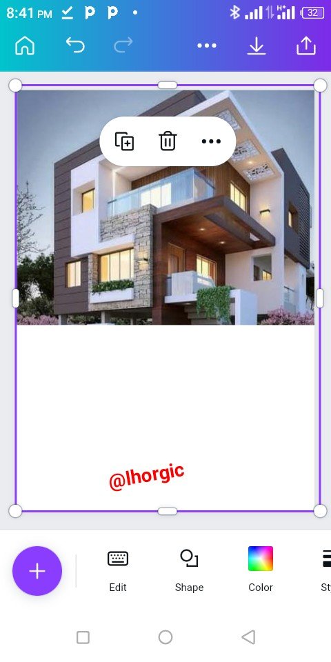
As usual wipe clean your template and then click on the "+" as highlighted below and then go for your beautiful luxury home image just as seen.
 |  |  |
|---|
Step 2
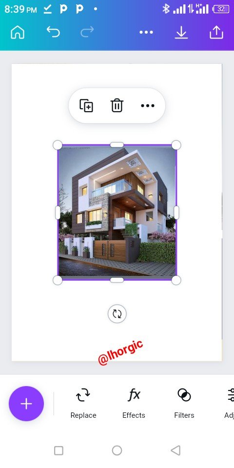
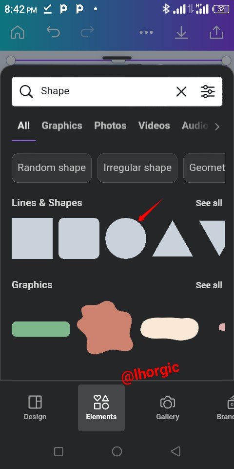
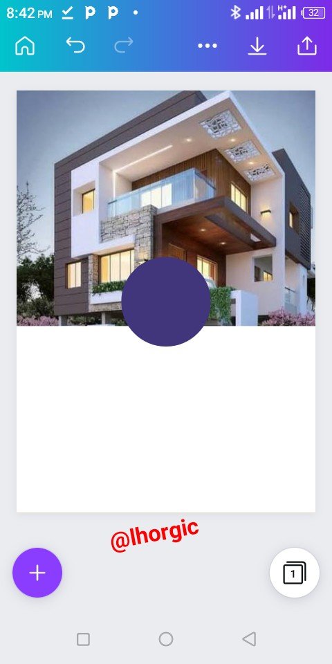
Resize the image to fill up to half of the workspace just as seen below and then go for a circle shape as we will be needing it.
 |  |  |
|---|
Step 3
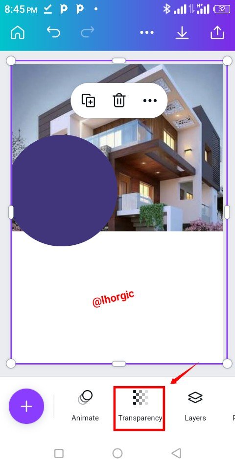
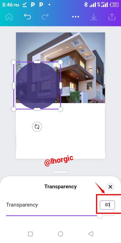
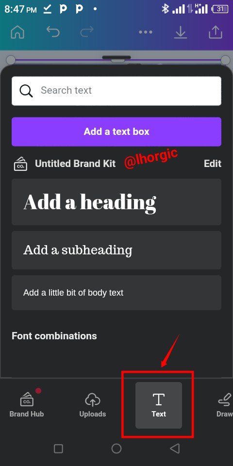
Resize the circle shape to be a bit bigger and then position it as seen. The next thing is then to reset the Transparency at 80%. This gives it a kind of nice effect over our main image. Lastly introduce your text.
 |  |  |
|---|
Step 4
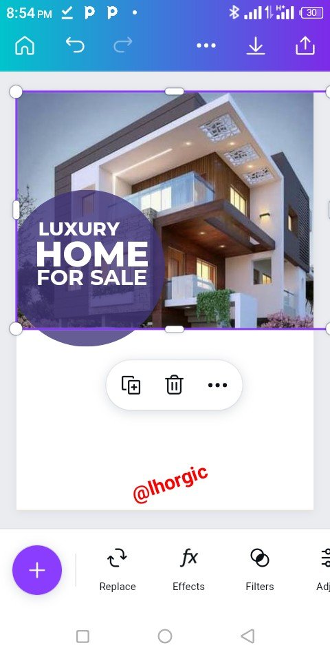
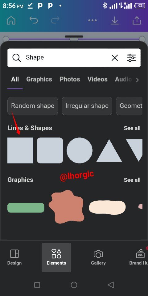
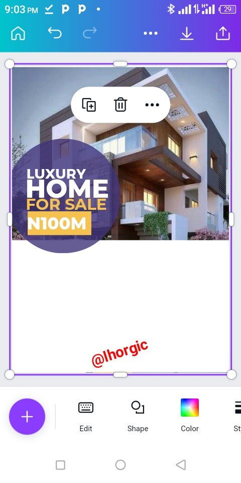
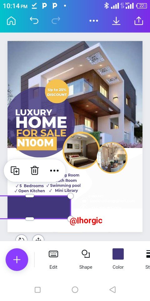
I added my text which is the main catchy message. I brought in another rectangular shape which accomodated a vital message as well.
 |  |  |
|---|
Step 5
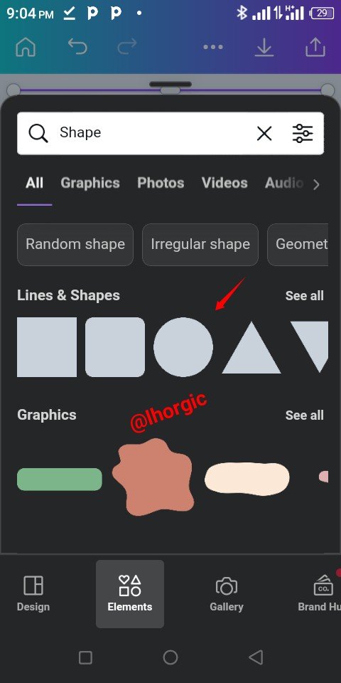
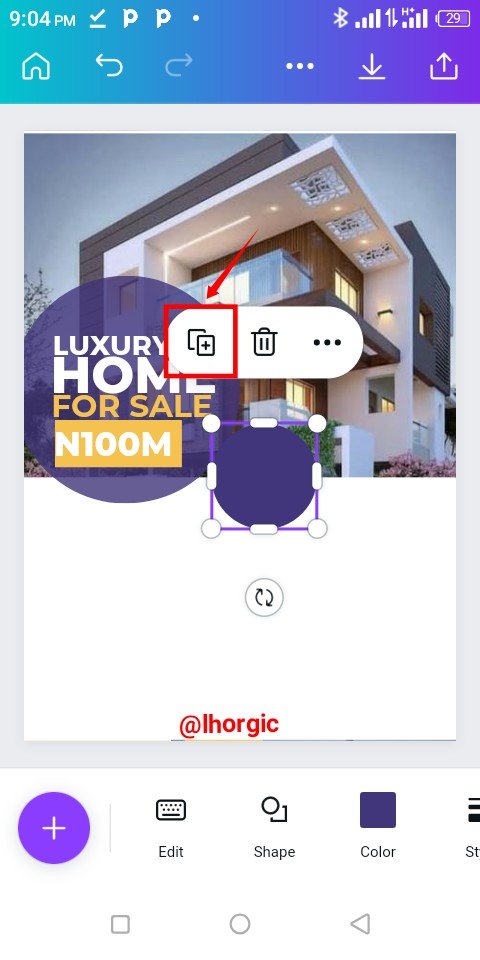
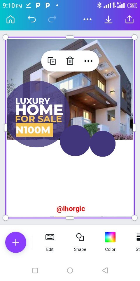
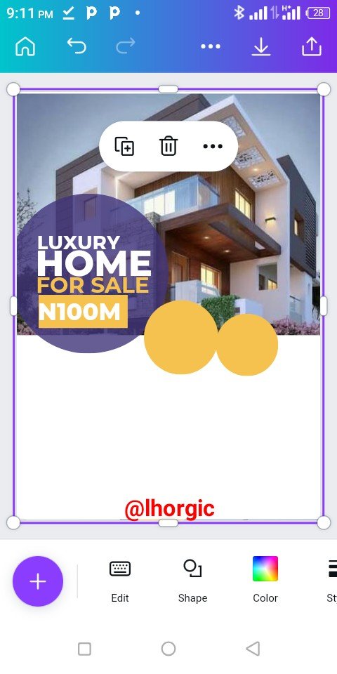
I introduced another shape (circle), duplicated it using "+" and then positioned it strategically just as seen.
 |  |  |
|---|
Step 6
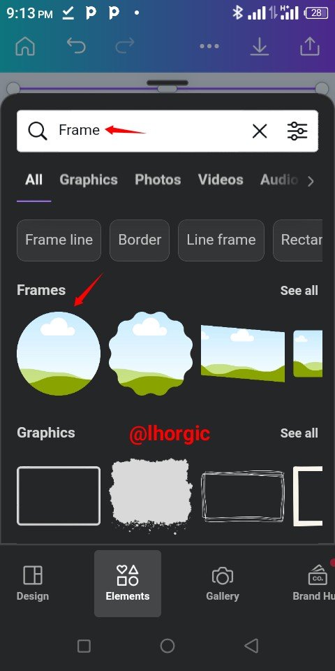
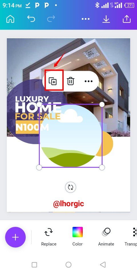
I changed the colour just as seen and then brought in a circle frame to complement the circle shape.
 |  |  |
|---|
Step 7
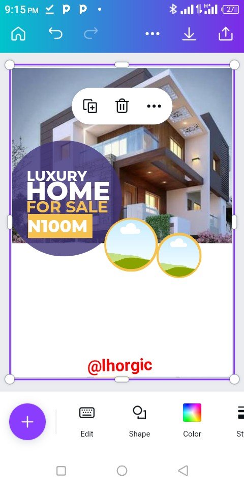
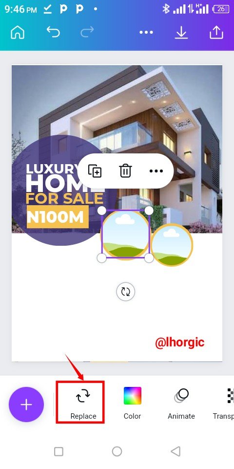
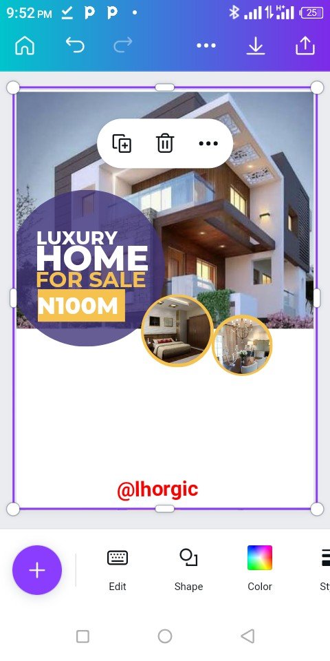
The frame was duplicated and resized to fit into our circle shape. Afterwards I clicked on the Replace icon to bring in my desired image...this is just as seen below.
 |  |  |
|---|
Step 8
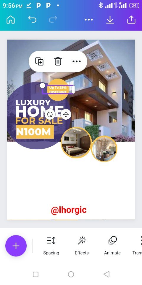
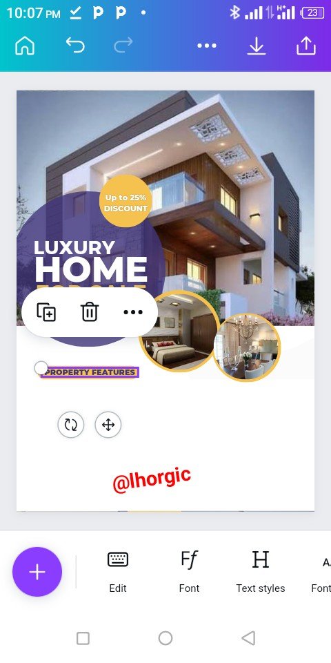
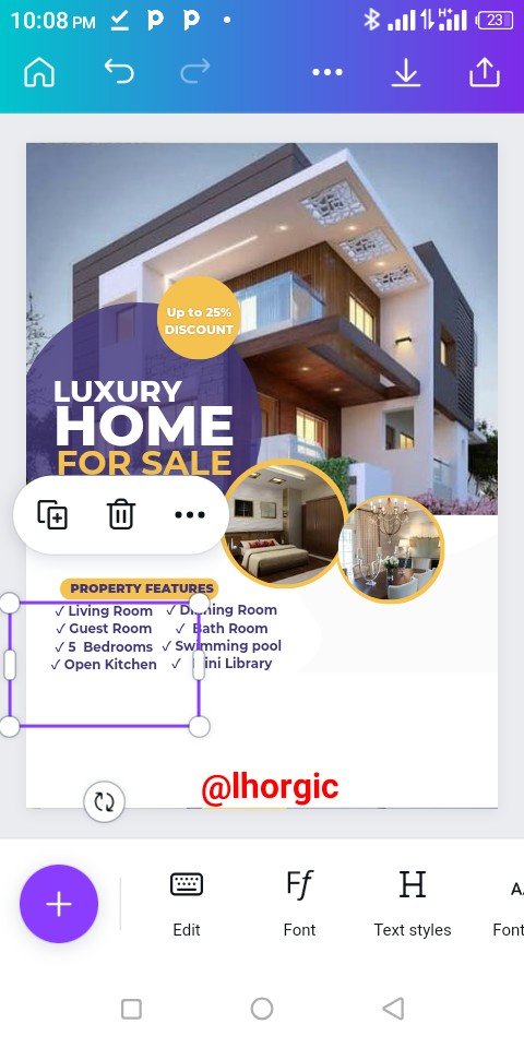
Other important information was captured such as "Up to 20% Discount" and the property features.
 |  |  |
|---|
Step 9
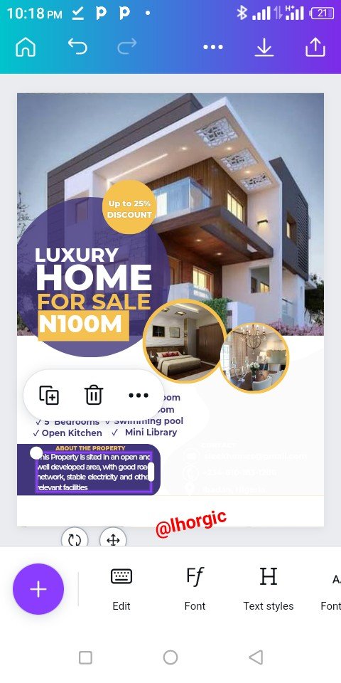
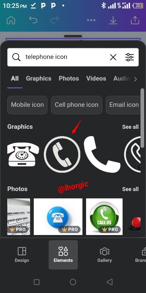
I continued with the supply of information strategically placing then on suitable shape. I also introduce icon for Email,Telephone and location. You can do the same by searching for them under elements. Use key words like Telephone icon
 |  |  |
|---|
Step 10
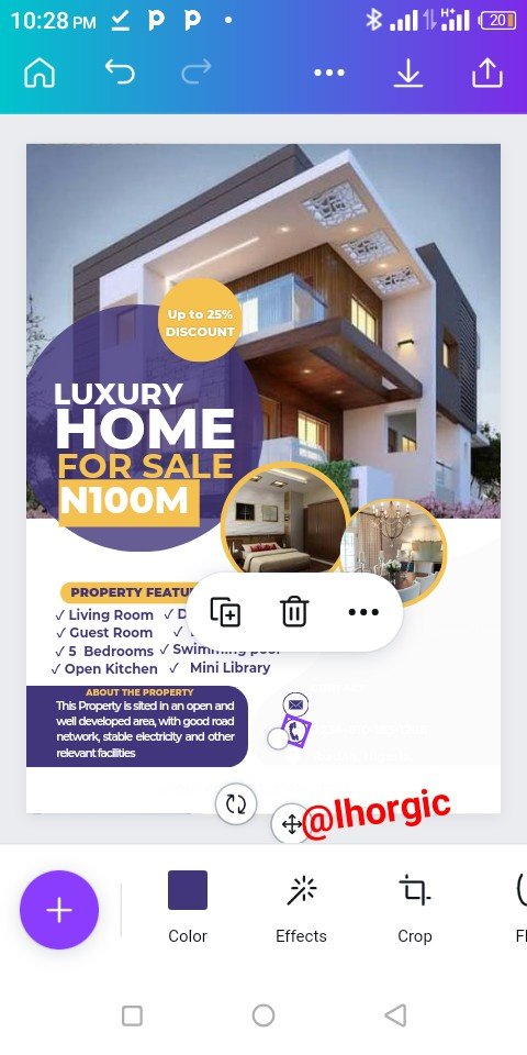
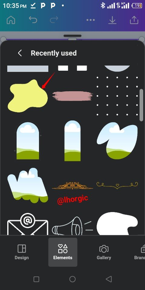
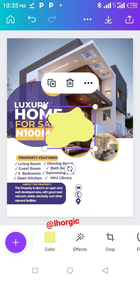
I needed to fill up some of the white space in the design so I went in search of an irregular shape. I changed the colour and then resized it to fill up the part I wanted just as seen below.
 |  |  |
|---|
Step 11
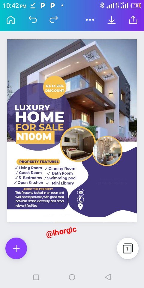
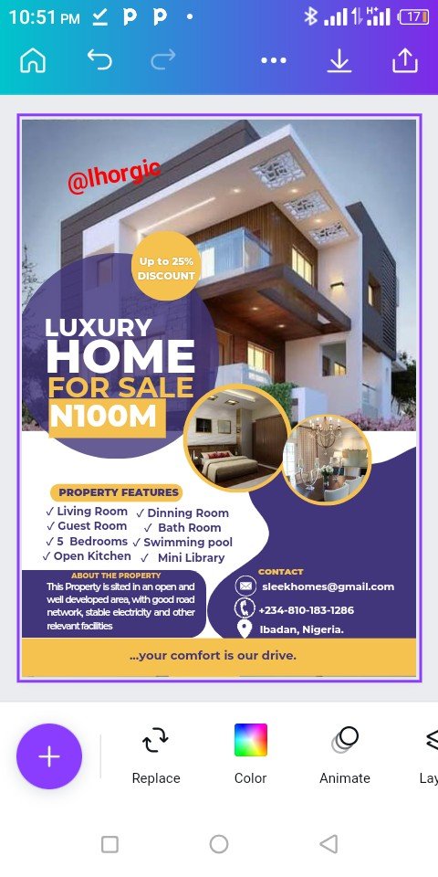
I supplied more information such as email, mobile number and address just as spotted below.
 |  |  |
|---|
Step 12
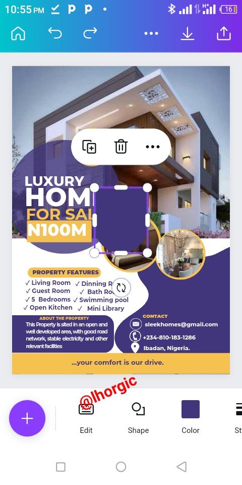
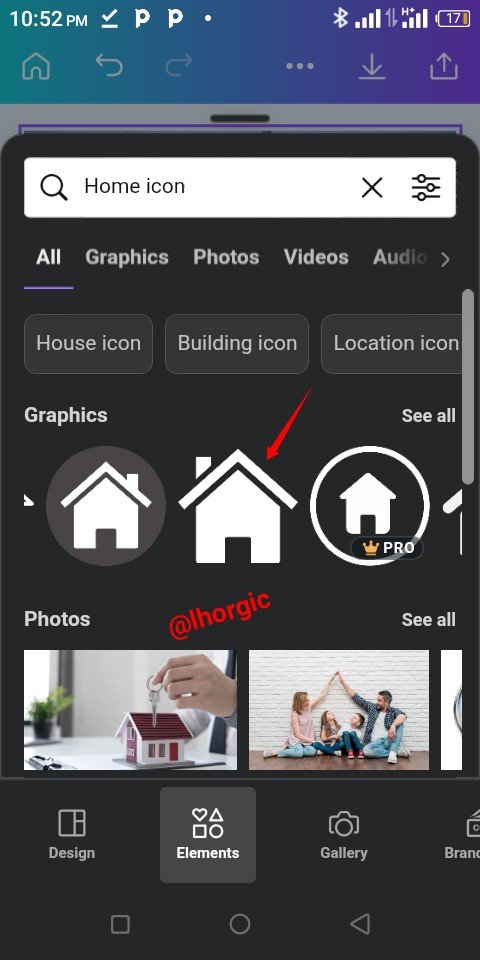
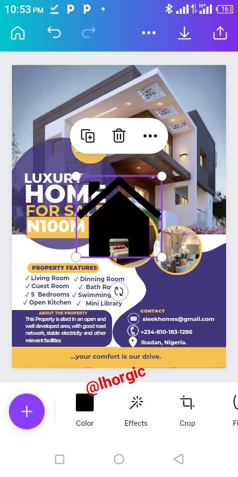
Lastly I thought of a logo and then introduce a shape and an "home icon" adding the name of My firm, sleek homes 🤪 and then all is set.
 |  |  |
|---|
 |  |
|---|
This is where I will be wrapping up our lesson for today. I really appreciate you for coming this far with me. I trust you got value from this lesson. Feel free to share your thought on today's lesson. If there is anything you would love me to add to improve the lesson, be free to share in the comment section.
If you missed the previous posts on this beginners class, kindly check them out here.
G101 introduction post.Lesson 1.Lesson 2.Lesson 3.Lesson 4.Lesson 5.Lesson 6.Lesson 7.Lesson 8.Lesson 9.Lesson 10.Lesson 11.Lesson 12.Lesson 13.Lesson 14.Lesson 15.Lesson 16
Graphic Instructor
@lhorgic♥️
Cc: @ubongudofot.
